A Rusty Brush

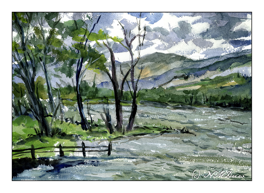
It feels as if ages have passed since I picked up a watercolor brush to paint. Out of all the media, watercolor is by far the hardest and to do it well it needs to be done often. I tend to be a bit “precious” – and by this I mean it is far too easy to look at too many details and fail to simplify and pay attention. When I haven’t painted in a while – in watercolor – I tend to just dive in and see what sort of mess I can make, or not make. This first painting exemplifies this.

One good thing, I didn’t create mud, but my sense of depth and contrast was not well done. The sky was dramatic, but I made it too dramatic. The mountains and far edge of the water is poorly defined and overly defined at the same time. They all could be a bit more pale so that the trees on the left could look better. And then the leaves on the trees themselves are not well projected against the sky. But, as a bit of a save, the choppy water has a rather nice energy.

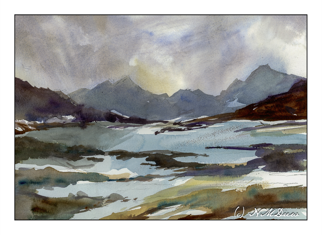
So, a bit too much altogether in the above painting. When I find myself doing too much (IMO), I always like to look to Edward Wesson or Edward Seago for simplicity. I found a painting by Wesson which is just simplicity itself, and did a bit of a quick study of it. Unfortunately, I cannot give the name or year he did this particular watercolor.

The first painting was done mostly with rounds and a small flat. For this one, I used a 1 inch wide flat brush with stiff bristles. I wet the paper a lot and then just painted. This how I try to get that gracefulness and simplicity so characteristic of so many of Wesson’s landscapes. I feel this is far more successful than the first one, and it makes me feel a bit happier with the painting process – like meeting up with a comfortable friend.

Watercolor, Arches Rough, 10×14 paper.

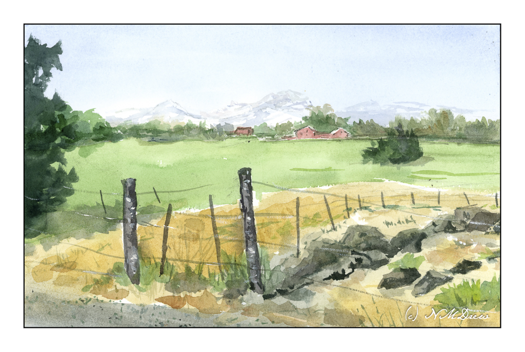
Back Road Near Sisters, OR

The other day I was browsing through a bunch of snapshots I took when I was up in Oregon for a week visiting a friend. We spent time on the coast and inland. This painting is from a picture I took as we were driving back to her house near Sisters, Oregon.

As you can see, in the distance are a number of snow-covered mountains. The are called the Three Sisters. I have a photograph I took from the car of this scene, and of the mountains. In the photo, the mountains blend into the blue of the sky, but when enlarged, you can easily see them. I kept the proportions of the photo but made the Three Sisters more visible. The photo is below, and clicking on it will take you to Flickr. Clicking on the Flickr picture until it is maxed out will make the distant mountains visible.

Outside Sisters, OR

It’s interesting how the atmosphere just blends the mountains into the sky. On the drive, they were visible, but very faint.

I did not strive for accuracy in representing the Three Sisters. I just wanted to make sure they were there. I also changed the landscape to my liking in my painting, and does it work? Hmm. My focal point is a bit vague to me, but the red buildings below the treeline are hopefully getting you where you need to be.

Watercolor, BaoHong 100% cotton CP paper, 9×12.

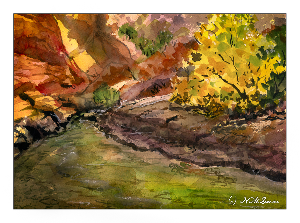
Deep in the Canyon

Utah is home to many amazing national parks. These include Zion, Bryce, Canyonlands, Arches, and Capitol Reef. All of these are located in southern Utah and feature many different geological formation. In addition to the deep red canyons, there are ginormous hoodoos and sandstone arches. Rivers and streams run through the canyons, sometimes dry, sometimes filled with raging torrents, other times calm and serene. Flash floods are something to beware as they can come out of nowhere – storms elsewhere can cause floods miles away.

Here, an imaginary canyon in the autumn, complete with red sandstone and cottonwoods and evergreens. Colors are strongly contrasted when the sun slants into the canyon, bright and dark.

Getting the colors and the contrast “just so” is really challenging. I am playing around here with applying thin washes to tint large areas of the paper and then moving to more highly pigmented paint for deeper and brighter colors. I don’t normally paint like this, and it really makes me think a bit. More practice with this technique is necessary to find that fine balance.

Anyway, Arches 10×14 rough 140# paper; watercolor.

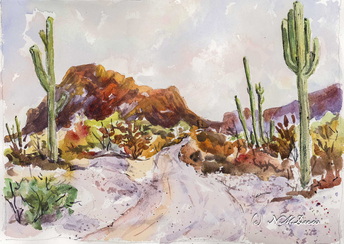
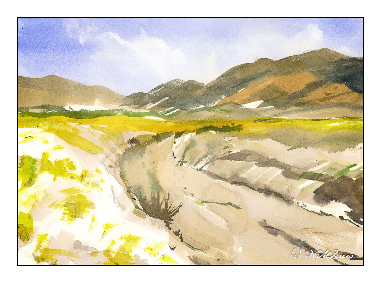
Desert Spring

I have been painting too much in oils – slow process, very satisfying, but it doesn’t come close to watercolors. I needed to take a break from it and return to my first love . . .

We have had a few good rains this year, and that can mean the desert blooms! The plain beige becomes green and flowers blossom. Sparse, harsh landscapes become far more gentle and welcoming. Death Valley was filled with life this year.

Watercolors, 10×14 Arches 140# rough paper.