I don’t like flies. I have a couple buzzing around. Mosquitos are worse. So, in my irritable mood, a few poems recognizing the fly, for whatever reason!
The Fly – by Ogden Nash God in His wisdom made the fly And then forgot to tell us why.
The Fly – by William Blake Little fly, Thy summer’s play My thoughtless hand Has brushed away. Am not I A fly like thee? Or art not thou A man like me? For I dance And drink and sing, Till some blind hand Shall brush my wing; If thought is life And strength and breath, And the want Of thought is death, Than am I A happy fly, If I live, Or if I die.
Summer Serenade – by Ogden Nash When the thunder stalks the sky, When tickle-footed walks the fly, When shirt is wet and throat is dry, Look, my darling, that’s July.
Though the grassy lawn be leather, And prickly temper tugs the tether, Shall we postpone our love for weather? If we must melt, let’s melt together!
Summer is ending, but birds sing, bees buzz, flies annoy, the beach beckons, and life goes on!
A local group, Plein Air Ventura County, is having weekly meet-ups at the Buenaventura Art Association’s gallery during the month of August. Located in the local marina on the second floor, with galleries all around, there are views of the boats and the ocean and buildings. It’s a rather nice place to be and I have spent a lot of time there when I lived a few miles away. A friend and I packed up our supplies and trekked across the county. Traffic was a bit awful as everyone was leaving Los Angeles, but we drove on and arrived to a beautiful day at the beach.
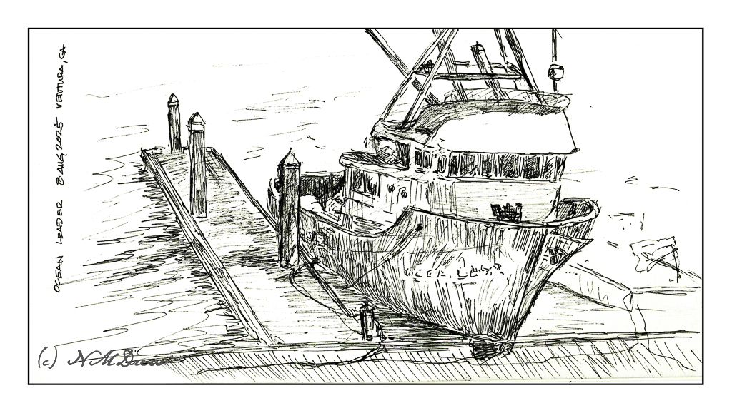
This was my first sketch and it took the longest. Normally with ink pen I like to just get to work without an underlying pencil drawing. Here, I decided to just go ahead and do a pencil sketch as I am no expert at boats or proportions. I am glad I did as I spent a lot of time erasing before I was happy with the results to begin the inking. I spent about 90 minutes on this.
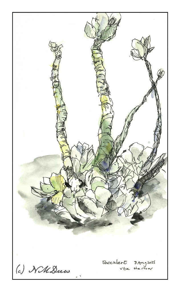
Next came this little weird succulent. It was on the gallery overlooking the marina, so I sat down and sketched it directly in ink. Plants don’t open you up to complaints about proportion (too often, anyway!), so off I went. I also wanted to see how the paper in this sketchbook would hold up to watercolor and I didn’t want to risk my boat to a poor water-paper combination. Luckily, it worked out quite well. I spent about 45 minutes on this drawing because I had to think about my colors and how thin I wanted the washes to be. In truth, this succulent was basically a silvery grey with a touch of subtle rust and green, but I needed to brighten it up.
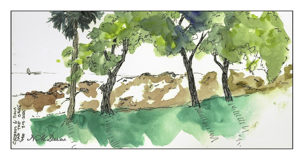
This was my final drawing, done in about 15 minutes. It was getting into the third hour and I was getting pretty tired. So was my friend. Here, I focused on the cypress trees and a single palm, the dunes beyond the road, and the Pacific beyond the dunes. The little sail boat really was there – it was the boat or flying pelicans, and the boat was the easier choice!
It was a cool, breezy, bright day at the beach. Salty wind. I got sunburned, something I didn’t think about as I don’t hang out in the sun like I used to! It was worth it, though, as I had a good time and came home pleased with my forays, especially into the boat drawing. The succulent was easy and fun – nothing I took too seriously. On the other hand, the cypress trees always throw me a bit because of the way the foliage seems to lie flat across a tree with a few branches – simply put, a complicated flat texture is the only way to describe it.
In between each sketch, a bit of wandering around and socializing before getting back into the sketching.
Estuaries are important connections between rivers and fresh water to the sea. The land may be marshy, the water brackish, and adapt to the influx of waves and sea water and the outward movement of fresh water. Consequently, the estuary provides high levels of nutrients in both the water and the sediment, creating highly productive habitats. Plants, animals, birds, fish, and all sorts of life thrive in the estuaries.
Additionally, the estuaries form a protective barrier between land and sea, but with the loss of estuaries, the damage from the sea increases. A good example of this is in areas where hurricanes and other fierce storms sweep inland, causing great damage – estuaries can survive such storms and recover, but further inland where the land and water are not adapted for saltwater, valuable land may be lost.
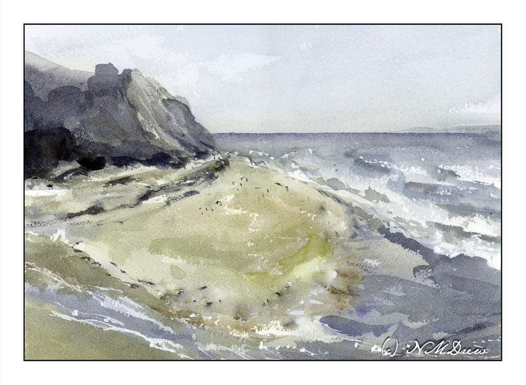
Estuaries are found worldwide. In northern California, the Pescadero Marsh Natural Preserve is found near San Francisco, and offers a wonderful environment for hiking and observing birds and plants. Currently, many trails are closed, but the visit to Pescadero State Beach is beautiful, as are many of the beaches found the length of the coast of California.
And, if you didn’t know, all beaches are public in California, so even if someone’s house fronts the shoreline, the beach is there for all. There may be a couple of exceptions to this law, but by and large, no one can tell you that you cannot walk along the shore.
After a busy several days, including the winding down of my summer painting classes, I needed to do some watercolor and landscape painting! Oil painting and portraiture require a lot of focus, but it is so restful to just think about colors and shapes, as I do in watercolors.
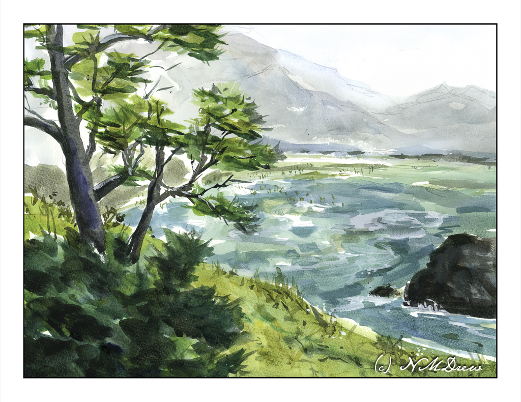
This painting is inspired by travels along the Oregon coastline. I tried to capture both the color of the sea as well as the mistiness of the distant mountains. The little dots representing a beach filled with people was a bit inspired because I needed to do something with some empty space in the middle. Nothing like being the god of your landscape, eh?
Watercolor, St. Cuthbert’s Mill Bockingford paper, 140# CP, 12×16.
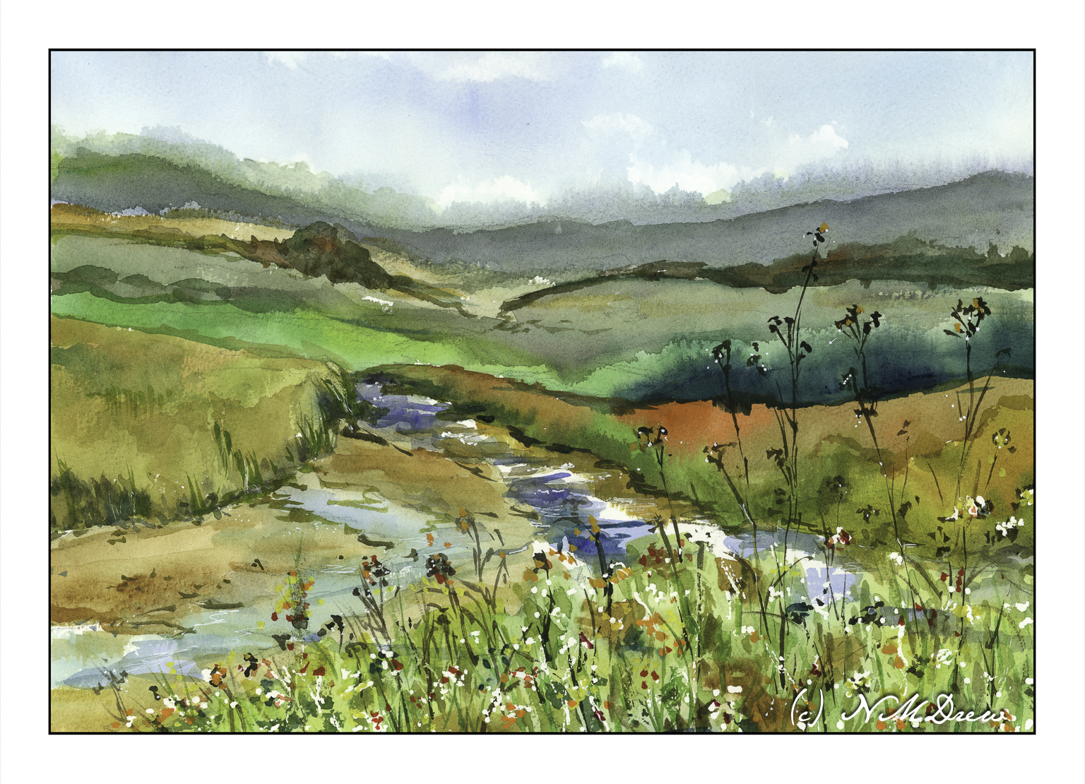
After considering the intensity of colors of my last posted painting, I thought about trying something a bit more subtle. In landscapes that usually means fog and damp – and that can be a challenge in itself. Muted colors, subtle gradations, diffused light, soft edges – with watercolor, a lot is chance and a lot is forethought, and a lot is knowledge acquired by experience. I see each watercolor painting as an experiment and adventure and while sometimes things “just happen” or I am too impatient, a bit of thinking ahead doesn’t hurt.
Here, a pretty limited palette of indanthrene blue,ultramarine blue, yellow ochre, burnt umber, and perhaps a dab of this or that. I use carbazole violet often when I make deep darks, sometimes a bit of ivory black to neutralize a color a bit. Here, I also used a bit of liquid frisket to keep some areas of paper white, such as in the water and along the shore. Titanium white gouache also was applied intermittently for a bit of bright white.