Landscape in Ink & Color

Traditional landscape painting in ink does not focus on realism. Instead, it works to capture the spirit of a place. Brush strokes are key as painting in black, white, and shades of grey can be challenging. Once the brush touches the paper, you leave a mark you cannot remove. So – think! Landscapes can be complex and it is very easy to make a mess. Even thinking in terms of masses of shade and shape is hard, because how do you convey the texture of a flowery field in ink without color?

The absorbent qualities of the xuen paper really make me work. It holds onto water and ink a long time before it dries. I found this out as I painted – the black kept spreading outward from my brush tip, and if I hadn’t pressed the water out of my brush before picking up more, the black became grey and the water was on the paper and in the paper forever! It seemed to spread forever. Even using a hair dryer didn’t seem to speed up the drying process. The challenge of ink painting is forethought.

Not a great landscape. Will color make it any better or interesting?

Kuretake makes traditional Japanese Gansai paints, of which I have a few colors! I decided to use these a day after the original landscape had been painted. Most of the painting I re-wet in sections to see how the colors would blur into one another. Some areas, like the rocks in the lower right hand side, I did on dry paper with a fairly dry brush but diluted paint. The Gansai colors vary in intensity, so the diluted paint seemed to be a good starting point. The bright yellow is a mistake – too intense although diluted. At this point I used a bit of scrap paper to test colors before painting.

Most of the colors were applied wet-on-wet. In the end, this painting makes me think of hand-colored photographs from the early 1900s.

Yasutomo Liquid Sumi Ink, “Jade Plate” double xuen paper.

Back Road Near Sisters, OR

The other day I was browsing through a bunch of snapshots I took when I was up in Oregon for a week visiting a friend. We spent time on the coast and inland. This painting is from a picture I took as we were driving back to her house near Sisters, Oregon.

As you can see, in the distance are a number of snow-covered mountains. The are called the Three Sisters. I have a photograph I took from the car of this scene, and of the mountains. In the photo, the mountains blend into the blue of the sky, but when enlarged, you can easily see them. I kept the proportions of the photo but made the Three Sisters more visible. The photo is below, and clicking on it will take you to Flickr. Clicking on the Flickr picture until it is maxed out will make the distant mountains visible.

Outside Sisters, OR

It’s interesting how the atmosphere just blends the mountains into the sky. On the drive, they were visible, but very faint.

I did not strive for accuracy in representing the Three Sisters. I just wanted to make sure they were there. I also changed the landscape to my liking in my painting, and does it work? Hmm. My focal point is a bit vague to me, but the red buildings below the treeline are hopefully getting you where you need to be.

Watercolor, BaoHong 100% cotton CP paper, 9×12.

A Bit of Summer

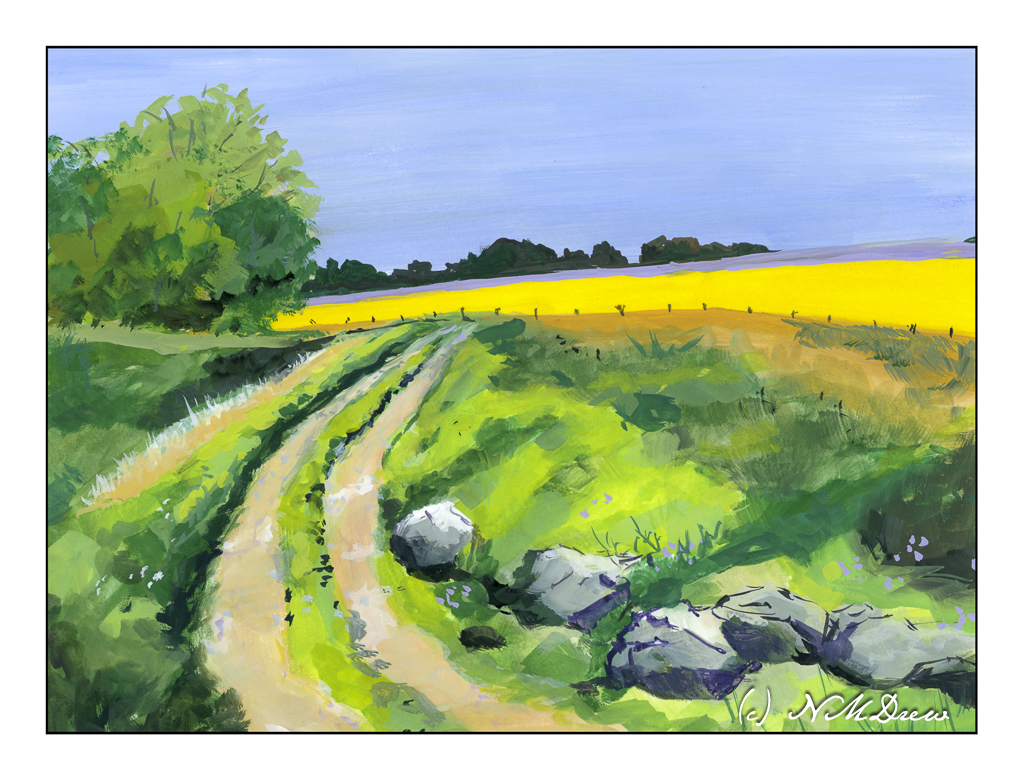
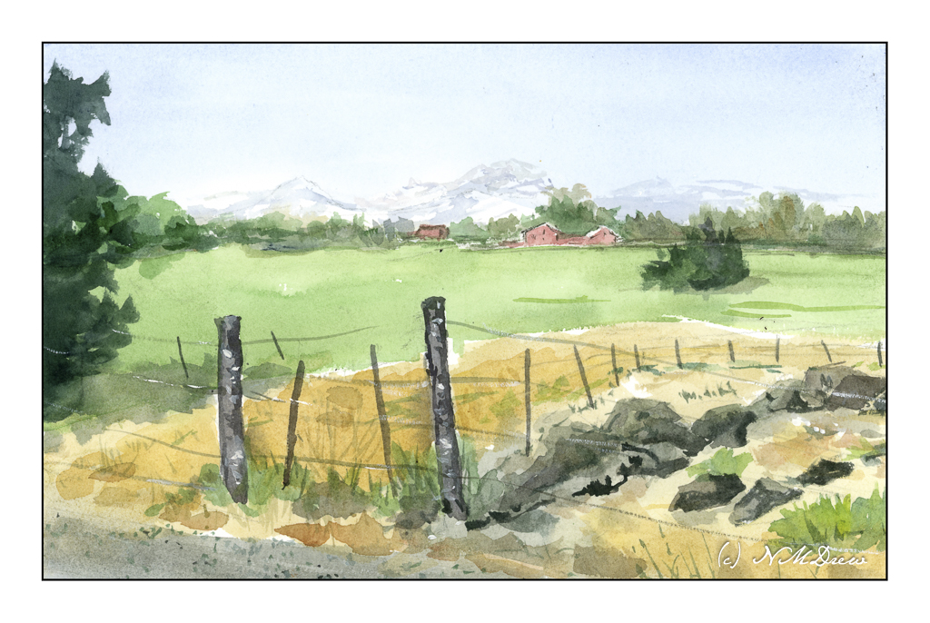
My sister lives in Colorado where they are expecting some nasty, cold, snowy, icky weather. Nice to visit, but I don’t like living in it! As a result, a bit of summer, or certainly a bit of desert heat. As there is rather lush vegetation out in this neck of the woods, or desert, I think it must be early summer. And where I am in California, our 63F day has not been exactly summery. I need some heat – just like a lizard – to bask in. We’ll get it this weekend.

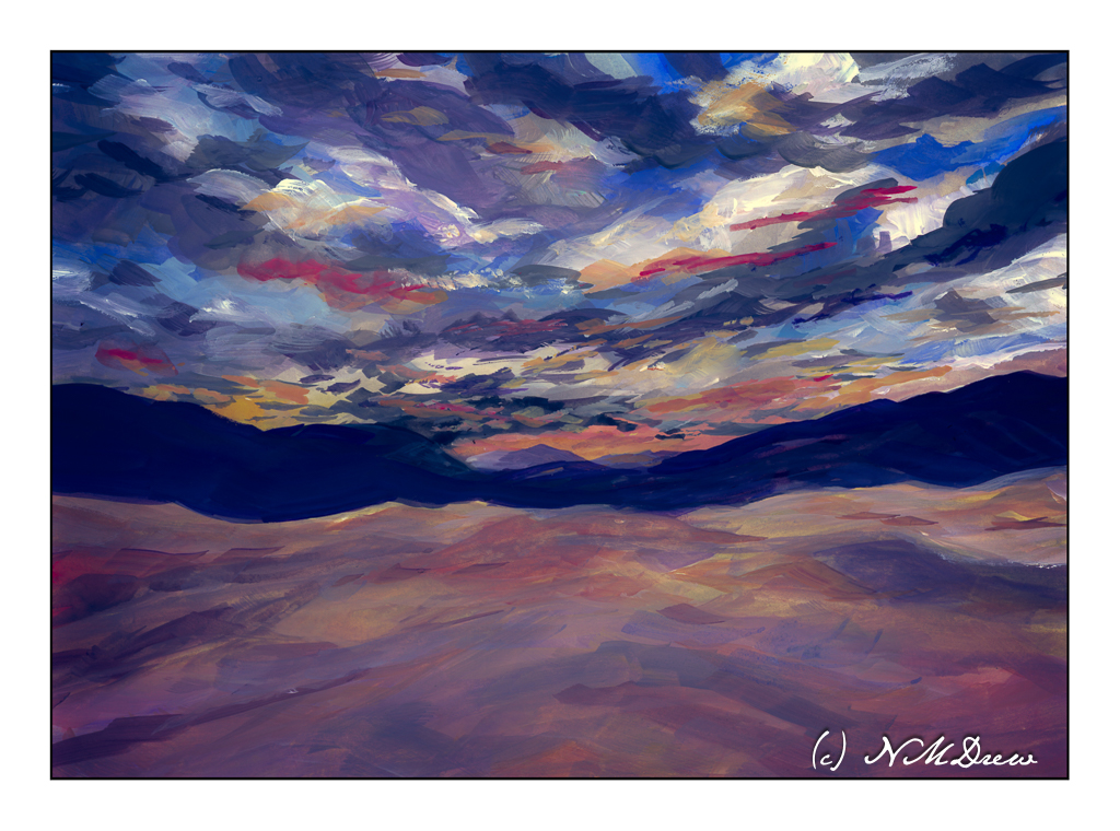
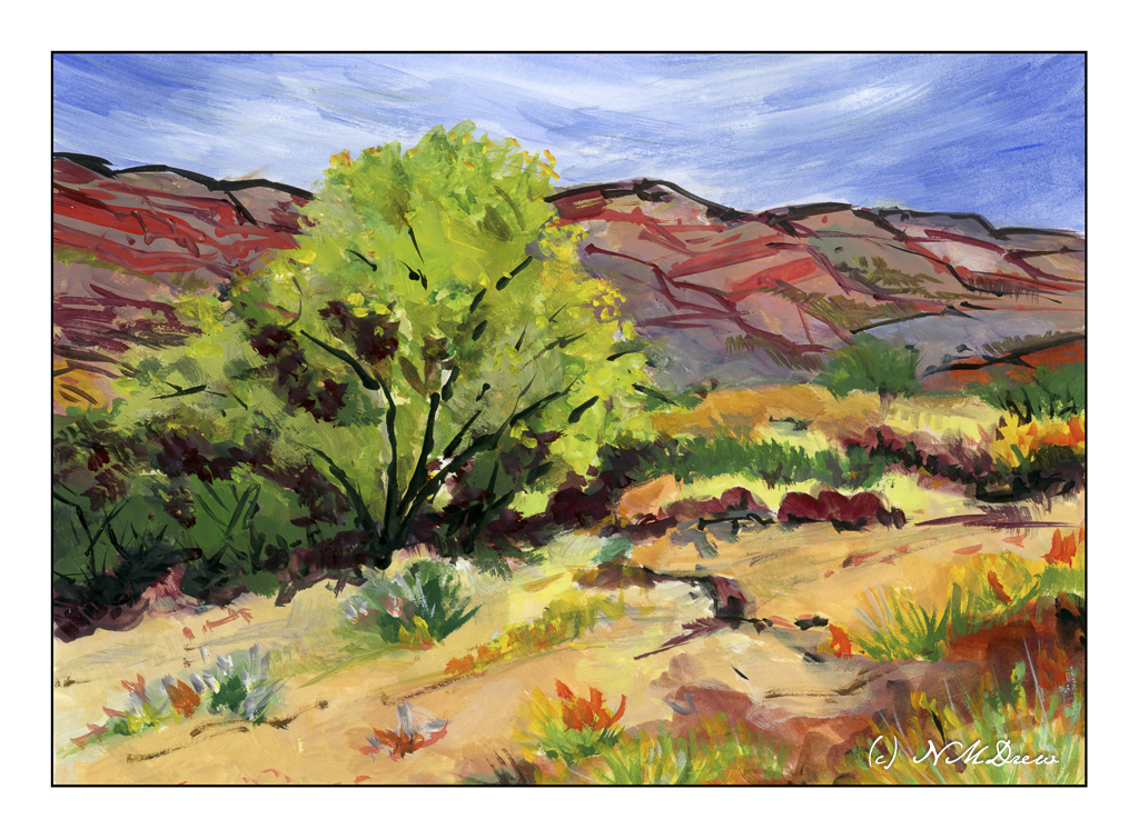
The more I look at the desert, the more I like it. The colors are a challenge as are the rock formations and plants. The light can be harsh and bright compared to the coast. The dirt varies from pale ochre to deep reds and oranges, with everything in between. Even the sky has its intensity and harshness, from sunny and bright to dark and foreboding with the threat of cloudbursts and thunderstorms.

I took my gouache paints with me to my painting class. I’ve missed a number of sessions just because my back was not happy and lifting or carrying became a challenge for several days. My oil paints are heavy to lug around, but gouache takes up a lot less room and weighs a lot less, too. Paper is less cumbersome than canvas, and what I used to paint on weighs very little as well. I made it to class with a shopping bag and my purse for all I needed.

Gouache always makes me happy – the colors are so ridiculously gouache-y! They have a vibrancy which nothing else equals, and so they are fun to use. Some people dislike their in-your-face quality. Add to that, the artists gouache is water soluble and clean up is a breeze. A few soft brushes, some water, smooth paper (I prefer Arches hot press 140# all-cotton paper, FYI), and a fairly extensive color selection. Zinc white is used for mixing, but titanium white is useful where you need a bright white or a bit more opacity. Ivory black is also part of the color selection. Altogether, gouache has a lot of qualities that other media have while have a unique quality all their own. Fast drying, opaque, dilutable, etc., etc., etc.

Try them, you might like them.

Gouache, Arches 140# cotton hot press watercolor paper, 9×12.

Tecopa Hot Springs

I’ve been too focused on too many things rather intensely and it makes me unsociable and not interested in the small and seemingly unimportant stuff that makes up daily living. One of these focal points has been painting. I have been working on this oil painting off and on for several weeks, and think it is finally done to my liking.

Tecopa Hot Springs is located in the Mojave Desert in Inyo County, California. It is not a very populated area. The hot springs are odorless, mineral springs considered to have healing properties. In my area the hot springs are quite sulfurous and smell like rotten eggs, so odorless is nice! The view from the springs is spectacular, taking in the land and the mountains beyond. This is a bit of the grandeur that is California.

I took a bit of a colorist approach to this painting, a bit of imagination and improvisation as well. Realism is for photography, so here I could play around while working to capture a sense of the place. I like semi-abstract or colorist paintings which keep the subject recognizable.

Oil on canvas panel, 16×20.

Deep in the Canyon

Utah is home to many amazing national parks. These include Zion, Bryce, Canyonlands, Arches, and Capitol Reef. All of these are located in southern Utah and feature many different geological formation. In addition to the deep red canyons, there are ginormous hoodoos and sandstone arches. Rivers and streams run through the canyons, sometimes dry, sometimes filled with raging torrents, other times calm and serene. Flash floods are something to beware as they can come out of nowhere – storms elsewhere can cause floods miles away.

Here, an imaginary canyon in the autumn, complete with red sandstone and cottonwoods and evergreens. Colors are strongly contrasted when the sun slants into the canyon, bright and dark.

Getting the colors and the contrast “just so” is really challenging. I am playing around here with applying thin washes to tint large areas of the paper and then moving to more highly pigmented paint for deeper and brighter colors. I don’t normally paint like this, and it really makes me think a bit. More practice with this technique is necessary to find that fine balance.

Anyway, Arches 10×14 rough 140# paper; watercolor.