A Way to the Sea

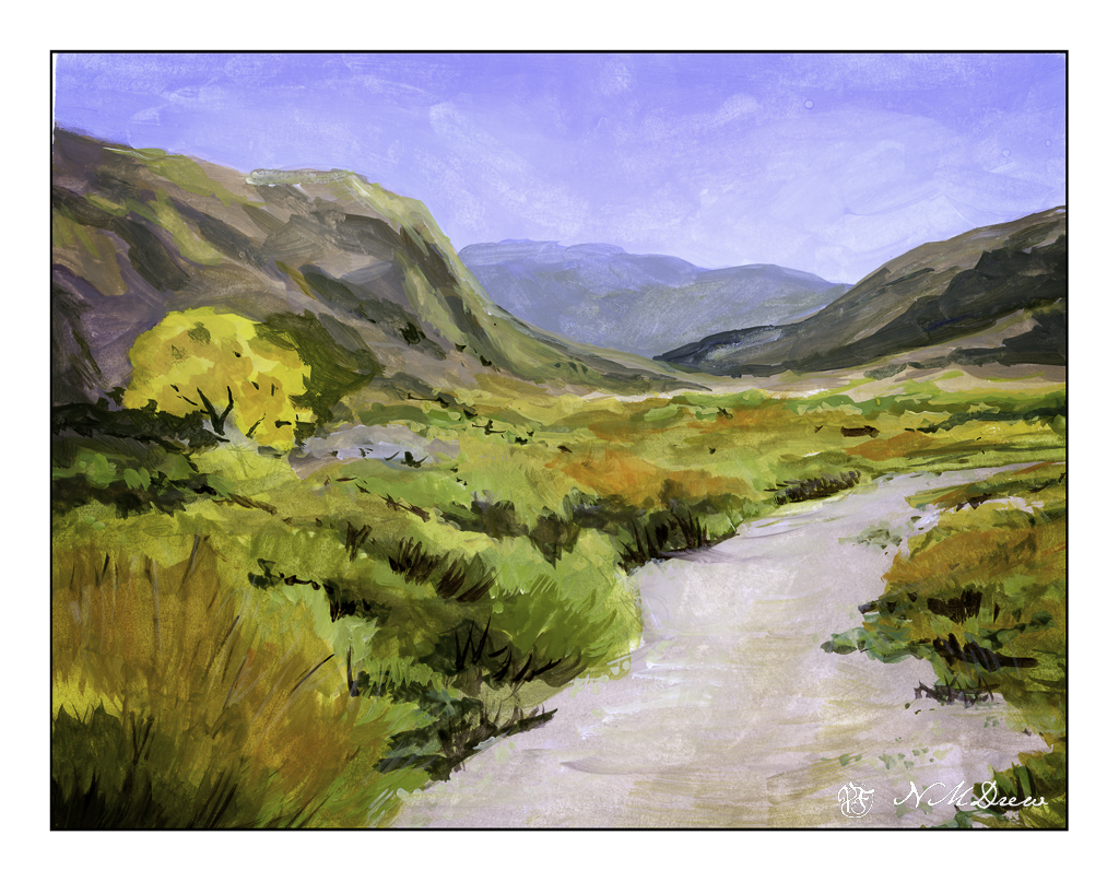
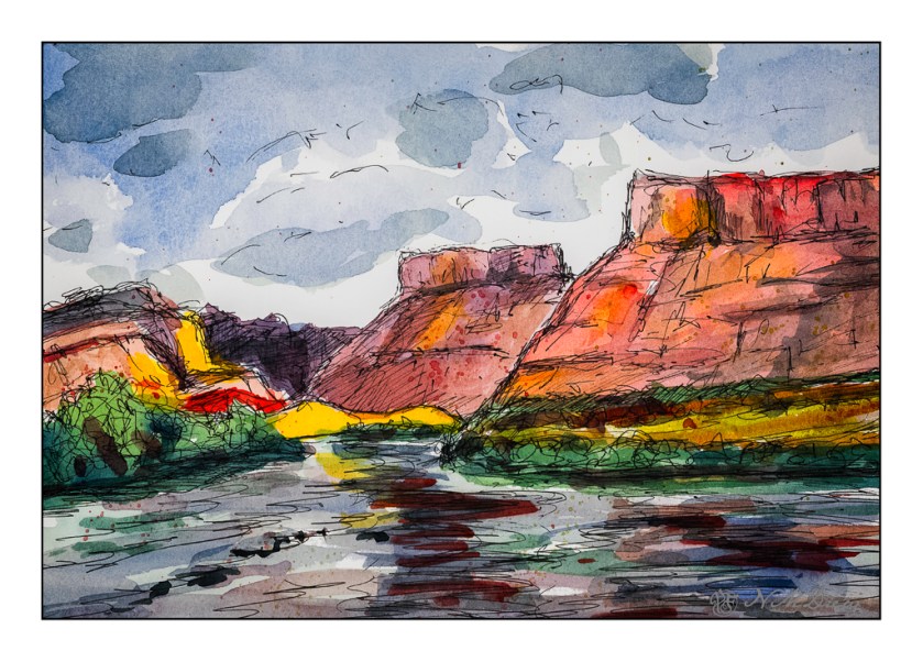
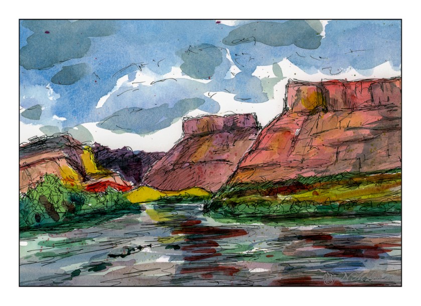
There are just times when life is too busy or not busy enough. Either way, a deliberate decision to just goof off and let life happen helps me out. So, nothing planned but following my mood. My mood usually requires some kind of art work, and this weekend’s was a bit of gouache. I spied my gouache pan in the refrigerator where I keep it stored to reduce mold growth. Pulling it out, just a bit on my red, rinse it out in the sink, and find some paper and subject matter.

It’s been quite some time since I did gouache, but every time I do it is always a pleasurable experience. It’s opaque like oils, and paints anywhere from dilute like watercolor to opaque. Using artist’s gouache lets me re-wet it and fix things as I go along.

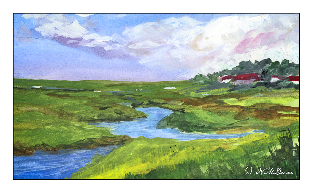
As always, when I am feeling rusty with painting in any medium, I fall back on a landscape. Of late, I have been looking at the works of Wesson and Seago, two British painters who specialized in the eastern bits of England, focusing on marshes and landscapes which are probably long gone now. The landscape is often flat with rivers used for boats. High and low tides run through these areas and the paintings and photos I have seen have boats in the water or tilted on their sides, waiting for the tide to return.

So, based on a lot of paintings and photos, here we are: “A Way to the Sea” – a bit of a pun on “Away to the Sea” – you choose!

Gouache, Bristol paper, about 8×10.

Along the River

This painting is based upon a pubic domain photo by Natividad Chavez of the BLM (Bureau of Land Management) taken at the Cronan Ranch Regional Trails Park in Pilot Hill, CA. Northern California has some absolutely beautiful landscapes. As well, the BLM showcases some truly magical parts of the country, areas both easy to get to and others quite remote, requiring hours to reach.

What I liked about the scene was the curve of the water and the people standing on the river’s shore beneath the trees. While my execution of the light was not what I wanted, I am rather pleased with other parts of it. And, it has people in it!

Millford paper, 140# CP, 16×20, watercolor.

Life on Wonky River

Scanning my watercolors shows me the flaws so readily – ones I don’t see when painting!

When I looked at this scan, the creek in the foreground looks definitely off! I went in and repainted it, and the second scan showed more wonkiness. Finally, just a heavy application of blue on the river / creek (whatever!) and some zinc white gouache in straight lines, and the geographical problems were somewhat solved.

Overall, not really thrilled with this painting. I like my sky and the spindly trees in the distance. The barn and house were one of my rare attempts at buildings. The barn seems really out of place for the environment – too big or something. The little house is okay. I tried to show the banks of the creek and the terrain leading down to it using color swaths in directional lines, horizontally and vertically. Meh.

Fabriano 140# CP paper; watercolors; 9×12.

Back Country, Amargosa River

The Amargosa River is located in Nevada and California, moving into Death Valley National Park of the Mojave Desert. As a river, it flows freely both above and below ground, providing much needed water in an otherwise dry climate. Because of it, there are many rare and unusual plants and animals, some found nowhere else in the world. It is managed by the Bureau of Land Management (BLM) to conserve it . . .

This is another gouache painting. I wanted to capture the contrast of the river basin to the mountains it runs through, as well as illustrate the wonderful colors you can see in a desert or riparian area. Dry, rocky mountains, flat areas from flash floods and trails, the occasional tree, low-growing plants adapted to a dry environment. Plant colors are generally pale – sage green being a dominant one as well as bright yellow flowers. Dry air lets you see for miles into the distance and at times you wonder if you will ever see a cloud in the endless blue sky.

Gouache, Strathmore Vision 9×10 140# CP paper.

Along the Colorado

Two different scans, and neither is truly exact. That was planned. I decided to change the mood of the scans – one in Epson Scan and the other in VueScan. Don’t remember which is which. The moods were to be bright and sunny, breaking through rain clouds perhaps, and the other just rather cold and gloomy when the sun has vanished behind heavy clouds.

Above, the warm colors are being pushed – yellow, orange. A bit of glow to try to express that sudden brightness you see when the light changes rapidly because of the weather.

And now the light has changed – potential rain and bad weather. I expect there is a bit of wind, too!

Technically, I drew in the landscape with a waterproof pen, painted, and then drew some more. The mesas’ slopes are a bit steeper than reality as these are about 45 degrees, and in real life, I think they are more shallow, about 30 degrees. Artistic license?

Watercolors, ink, Hahnemuhle 300gsm CP paper, about 9×12.