Summer is always a busy time and I really have done very little as far as artwork or painting. Other things seem to be getting in the way. This afternoon I finally had an open spot and painting in gouache seemed simple enough – simple meaning everything was at hand, the clean up is easy, and I rather liked the challenge of a sunset.
For the past 5 weeks I have been attending a gouache class. It has been one of the most fun and creative classes I have taken. Painting all of a sudden took on the element of play. My tight-ass self was so happy to untight-ass! I totally believe in play and we all, old and young and in between, benefit from that wildly creative and unrestrictive garden of no rules (well, within reason!)
As I mentioned before, my teacher worked for Disney and Warner in animation. 40+ years of experience brings knowledge of techniques and tricks. 5 weeks was short but in the fall there will be an 8 week class, and I will be there. Because of her background in animation, her knowledge of technique is very different than many online teachers and it is based on practical experience. She takes this knowledge and applies it in a clear and creative way. Though we got “samples” to copy from, there was never a “do it this way” but rather a “use your skills to figure out how to do this” as well as applying new skills.
First off, some of the samples we got to work with were clearly identified, and others I have forgotten. If you are an artist whose work we used, let me know if you see your work here.
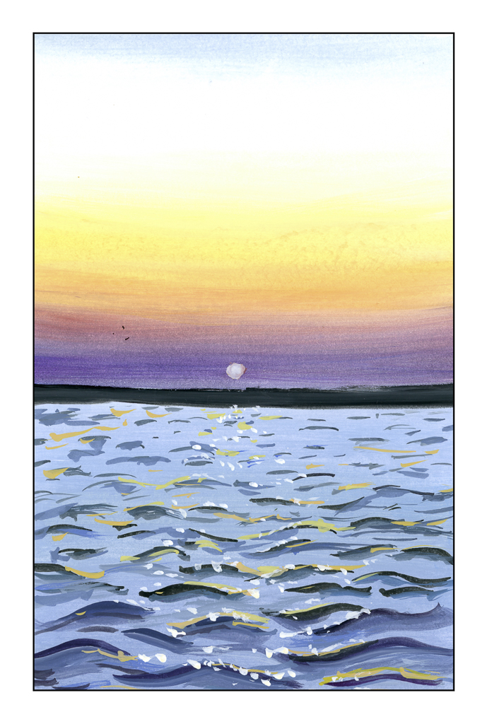
This exercise was assigned to the class to learn how to do color gradations. Jess Chung, on You Tube, had a study to which we linked and followed along as homework. It was easy and not easy – gradations can be difficult in gouache. What really worked for me was doing the waves. That was an eye-opener. Her video is below.
From this tutorial we moved on to Mary Blair, a famous Disney animation artist who rose to a prominent position because of her creative prowess in a time when most (if not all) animators were men. If you are familiar with “It’s a Small World” at Disneyland in Anaheim, CA, or from the 1964 World’s Fair in NYC, you will be familiar with her work.
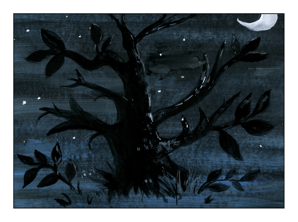
The above tree is done on black paper and is derived, I think, from some of Blair’s sketches for the animated film “Alice in Wonderland” by Disney. We did the tree, but the Cheshire Cat was in the picture as well as Alice.
To get the blue-white streak, we mixed blue and white together, very dry, and brushed it all across the black paper upon which we painted. From there, the tree was painted in, over the blue-white streaks (yep, black on black!). Gouache’s opacity worked very well here, as you can see. Then the moon and highlights were added. It makes for a wonderfully mysterious scene.
When I first saw the picture I was thinking “how am I going to paint the blue and white around the tree shape?” This is negative painting and it would be hard. The solution of painting over the colored paint was an eye-opening bit of information and technique.
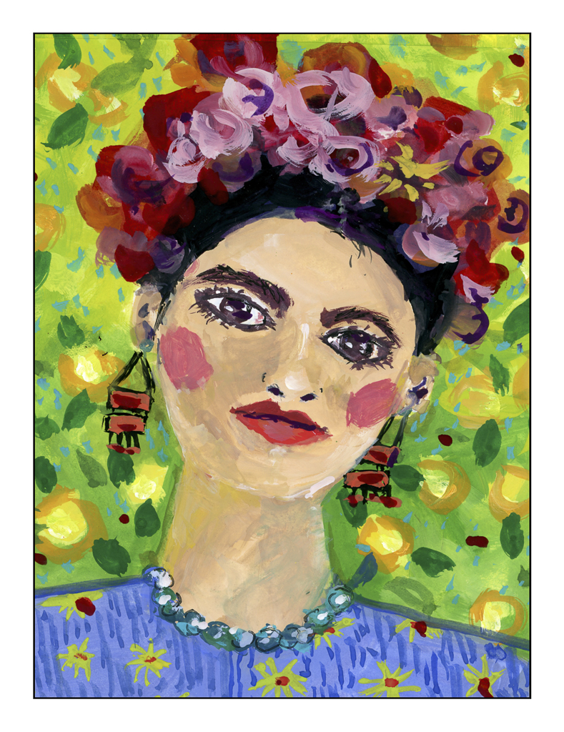
From Blair we moved on to Frida Kahlo, the Mexican artist who always surprises with her intense colors, rather primitive and surrealistic paintings. Our samples were, I think, derived from people who did Kahlo’s portrait in gouache. Kahlo did not work much – if at all – in gouache, but instead preferred oils. The simple and colorful style of the samples involved utilizing different techniques we learned as well as letting our inner child out to play with colors and non-realistic portraiture. The patterns and colors were fun to do.
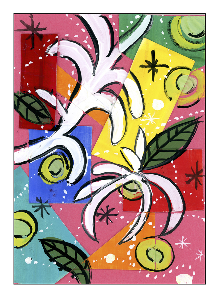
And our final artist for inspiration were the paper cutouts by Henri Matisse. Most of us are familiar with his work, so I will not go into details here.
For this project, we painted shapes, such as rectangles and squares, in gouache and then cut them out. From there, we mounted them on a colored piece of paper using glue. I am not sure if we were supposed to do it all on paper painted in gouache – such as leaf shapes – and then cut and paste to the paper and underlying bits already glued on. I just used thick gouache and painted on the white shapes, leaves, circles, dots, and stars in various gouache colors and black and white gouache.
Playtime and different perspective – it was by far a fun, fun class! I wonder what I will do with what that class gave me.
A lot has been happening here, and time just slips away. Additionally, my painting journey has been mostly oil painting, and that takes time. I have been pleased with my progress there. Along with my usual painting class, I have been taking a gouache class, and I have been having so much fun. Our instructor worked for decades in animation at Disney and Warner Brothers, so her background is very different than mine. As a result, it’s a lot of technique gleaned from her 40+ years of experience and exploration into gouache being used differently from my own more painterly approach.
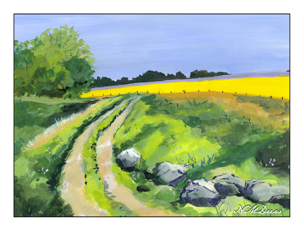
While this painting is more in my usual style, the lessons I have been learning each week are apparent here to me. Maybe not you, but me! The class has made me see and visualize gouache painting differently as well as how to apply it. I could get into the details here, but it’s something I am not in the mood to try to explain. Let it suffice to say I had a delightful time painting this little scene of a track leading to a rape seed field – the bright yellow – and a lavender field beyond. I thought some boulders would be a fun thing to try, and I think they worked out rather well.
Artists gouache, Arches HP 140# paper, approximately 9 x 12 inches.
Tuesday is painting class day, generally oil or acrylic, but for the time being I am working with artists’ gouache, a water-based medium. It can be reworked, and thus, perfect for practice, quick drying, ease of use, and so on. Also, I can travel light. I don’t need to lift things up and down – I have a heavy cart on wheels for my oil paints – and that is another reason I am currently using gouache. I pulled a muscle in my back and don’t want to push it – the flood did that, so let’s be lazy. Like a cat.
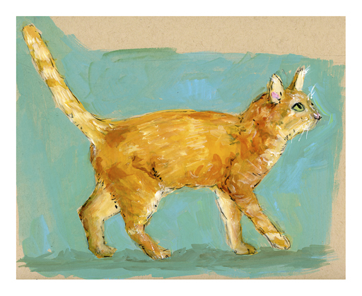
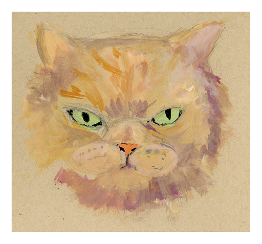
You can see I used the basic elements of proportion and design from Willshire’s book I mentioned in my previous post. Reference photos for ginger cats were used for fur patterns. The ears are a bit wonky and the muzzle is not the best, but this is also my first foray into cat painting in gouache!
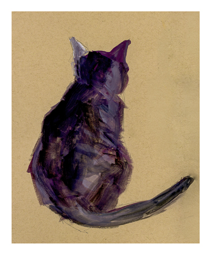
After this, I did a silhouette of a cat. While I remembered the overall proportions of a cat, I referred to general sizes and proportions for this view of a cat. I rather like it. Again, gouache.
This painting is less fiddly than the first one, and it was fun to just be expressive about the critter. I like it pretty well.
And now we come to Mr. Grumpy Britches! This is a work in progress and I hope to do more on it later today and post the final painting when it is done. This is a very fluffy, furry cat. Cats just crack me up!
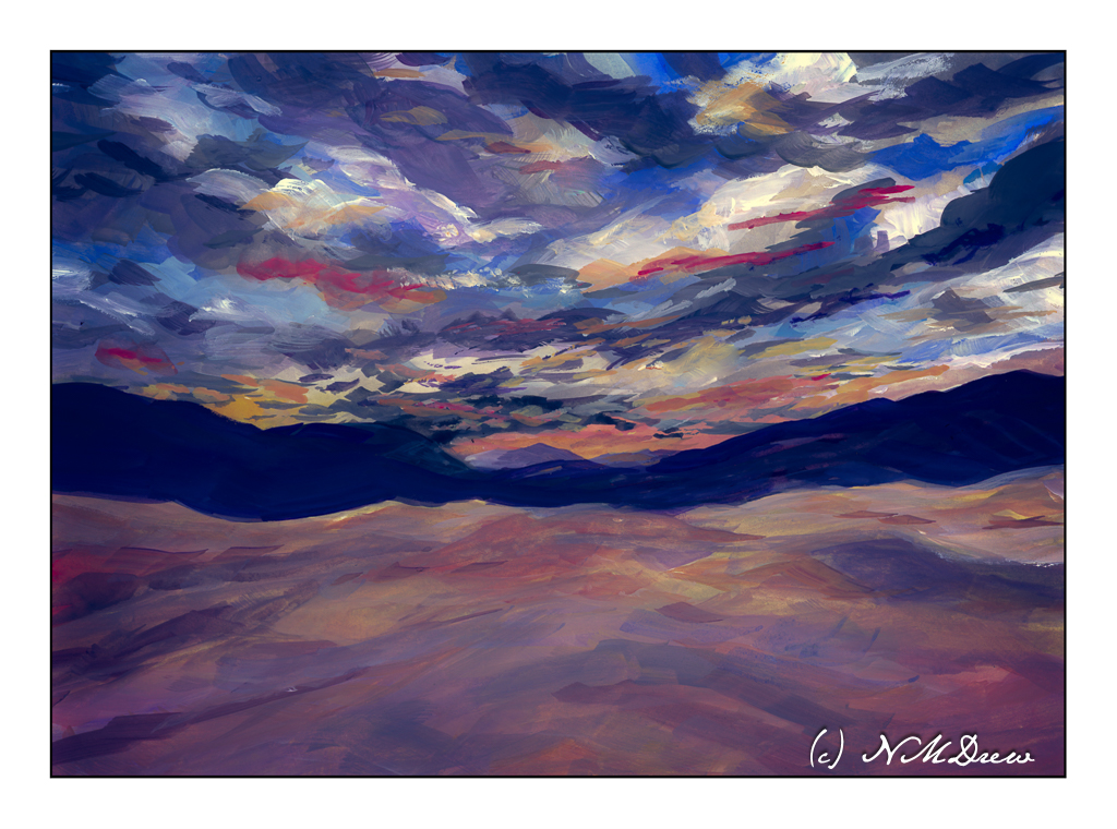
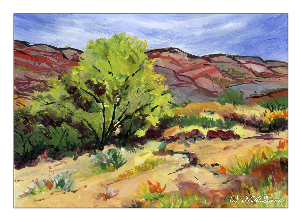
My sister lives in Colorado where they are expecting some nasty, cold, snowy, icky weather. Nice to visit, but I don’t like living in it! As a result, a bit of summer, or certainly a bit of desert heat. As there is rather lush vegetation out in this neck of the woods, or desert, I think it must be early summer. And where I am in California, our 63F day has not been exactly summery. I need some heat – just like a lizard – to bask in. We’ll get it this weekend.
The more I look at the desert, the more I like it. The colors are a challenge as are the rock formations and plants. The light can be harsh and bright compared to the coast. The dirt varies from pale ochre to deep reds and oranges, with everything in between. Even the sky has its intensity and harshness, from sunny and bright to dark and foreboding with the threat of cloudbursts and thunderstorms.
I took my gouache paints with me to my painting class. I’ve missed a number of sessions just because my back was not happy and lifting or carrying became a challenge for several days. My oil paints are heavy to lug around, but gouache takes up a lot less room and weighs a lot less, too. Paper is less cumbersome than canvas, and what I used to paint on weighs very little as well. I made it to class with a shopping bag and my purse for all I needed.
Gouache always makes me happy – the colors are so ridiculously gouache-y! They have a vibrancy which nothing else equals, and so they are fun to use. Some people dislike their in-your-face quality. Add to that, the artists gouache is water soluble and clean up is a breeze. A few soft brushes, some water, smooth paper (I prefer Arches hot press 140# all-cotton paper, FYI), and a fairly extensive color selection. Zinc white is used for mixing, but titanium white is useful where you need a bright white or a bit more opacity. Ivory black is also part of the color selection. Altogether, gouache has a lot of qualities that other media have while have a unique quality all their own. Fast drying, opaque, dilutable, etc., etc., etc.
Try them, you might like them.
Gouache, Arches 140# cotton hot press watercolor paper, 9×12.