A lot has been happening here, and time just slips away. Additionally, my painting journey has been mostly oil painting, and that takes time. I have been pleased with my progress there. Along with my usual painting class, I have been taking a gouache class, and I have been having so much fun. Our instructor worked for decades in animation at Disney and Warner Brothers, so her background is very different than mine. As a result, it’s a lot of technique gleaned from her 40+ years of experience and exploration into gouache being used differently from my own more painterly approach.
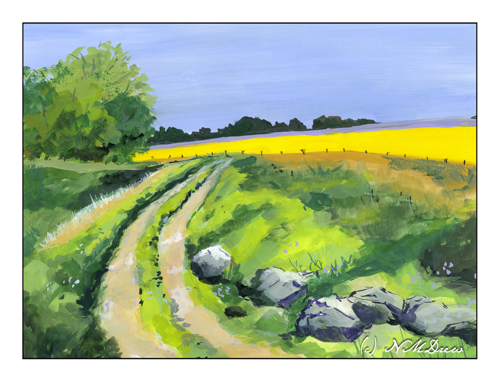
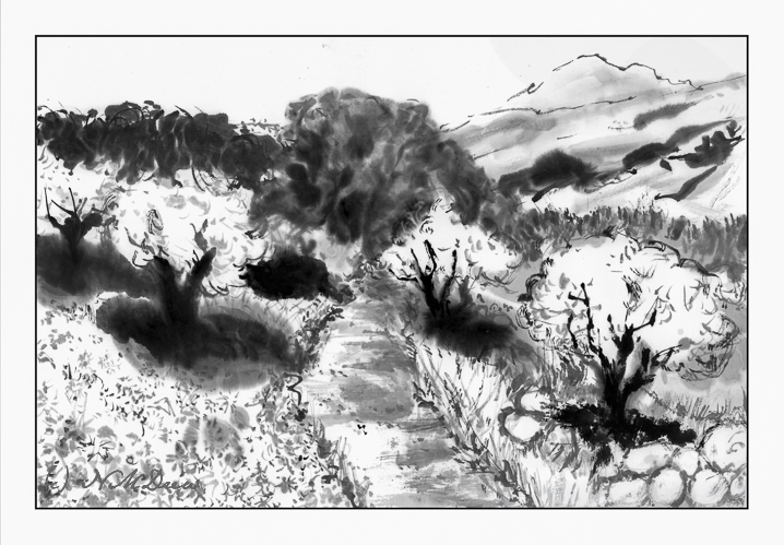
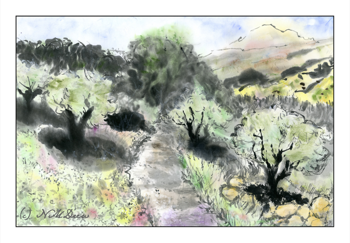
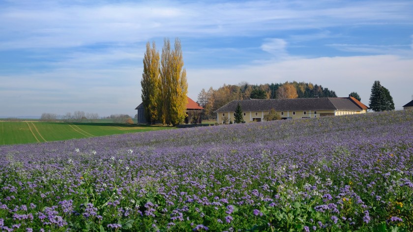
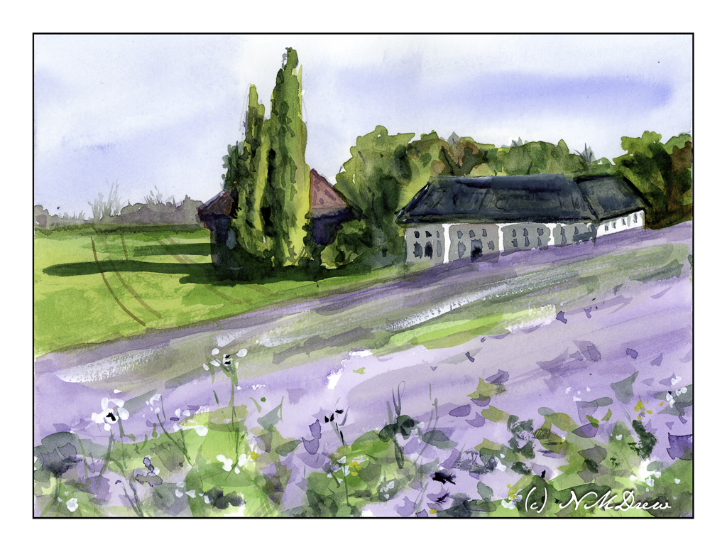
While this painting is more in my usual style, the lessons I have been learning each week are apparent here to me. Maybe not you, but me! The class has made me see and visualize gouache painting differently as well as how to apply it. I could get into the details here, but it’s something I am not in the mood to try to explain. Let it suffice to say I had a delightful time painting this little scene of a track leading to a rape seed field – the bright yellow – and a lavender field beyond. I thought some boulders would be a fun thing to try, and I think they worked out rather well.
Artists gouache, Arches HP 140# paper, approximately 9 x 12 inches.