Landscape in Ink & Color

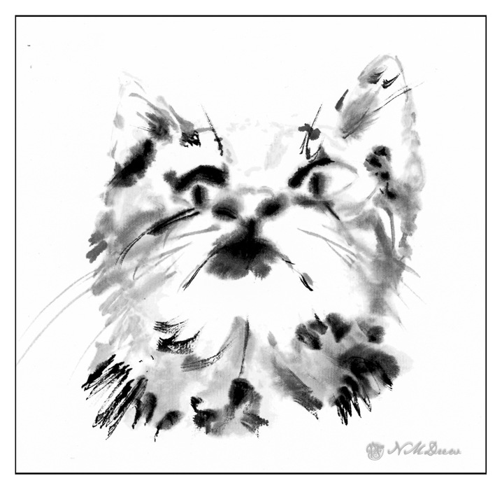
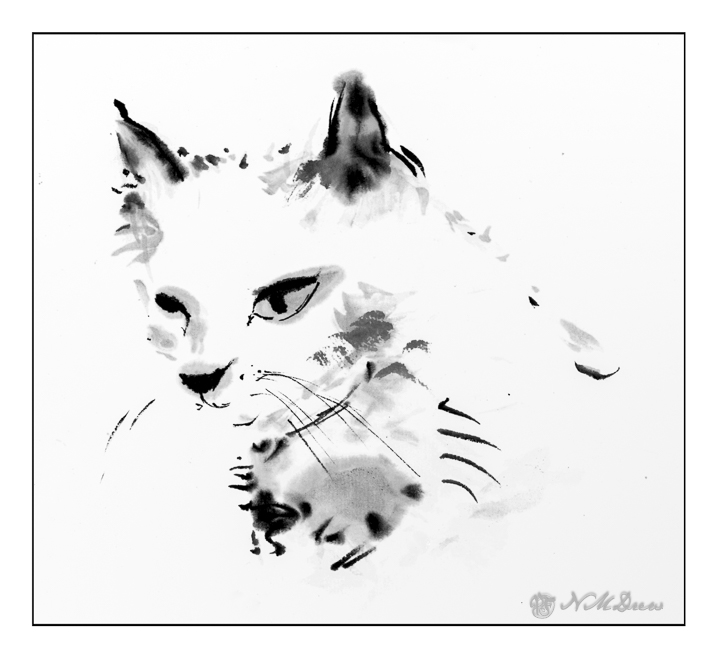
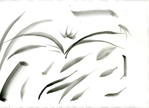
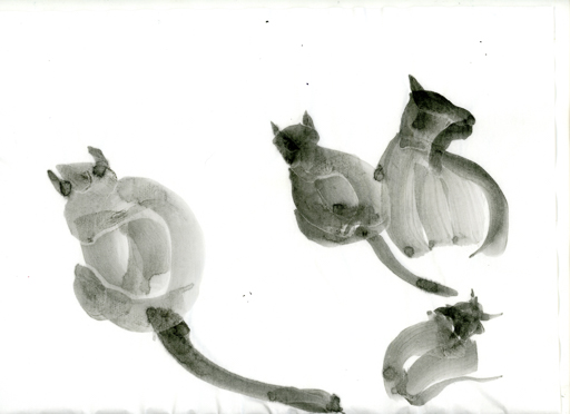
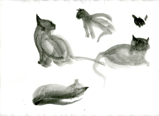
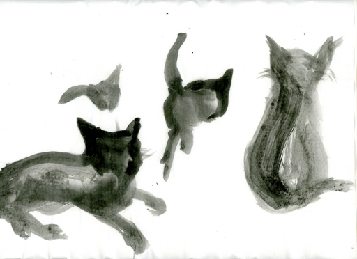
Traditional landscape painting in ink does not focus on realism. Instead, it works to capture the spirit of a place. Brush strokes are key as painting in black, white, and shades of grey can be challenging. Once the brush touches the paper, you leave a mark you cannot remove. So – think! Landscapes can be complex and it is very easy to make a mess. Even thinking in terms of masses of shade and shape is hard, because how do you convey the texture of a flowery field in ink without color?

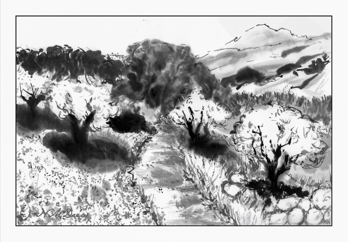
The absorbent qualities of the xuen paper really make me work. It holds onto water and ink a long time before it dries. I found this out as I painted – the black kept spreading outward from my brush tip, and if I hadn’t pressed the water out of my brush before picking up more, the black became grey and the water was on the paper and in the paper forever! It seemed to spread forever. Even using a hair dryer didn’t seem to speed up the drying process. The challenge of ink painting is forethought.

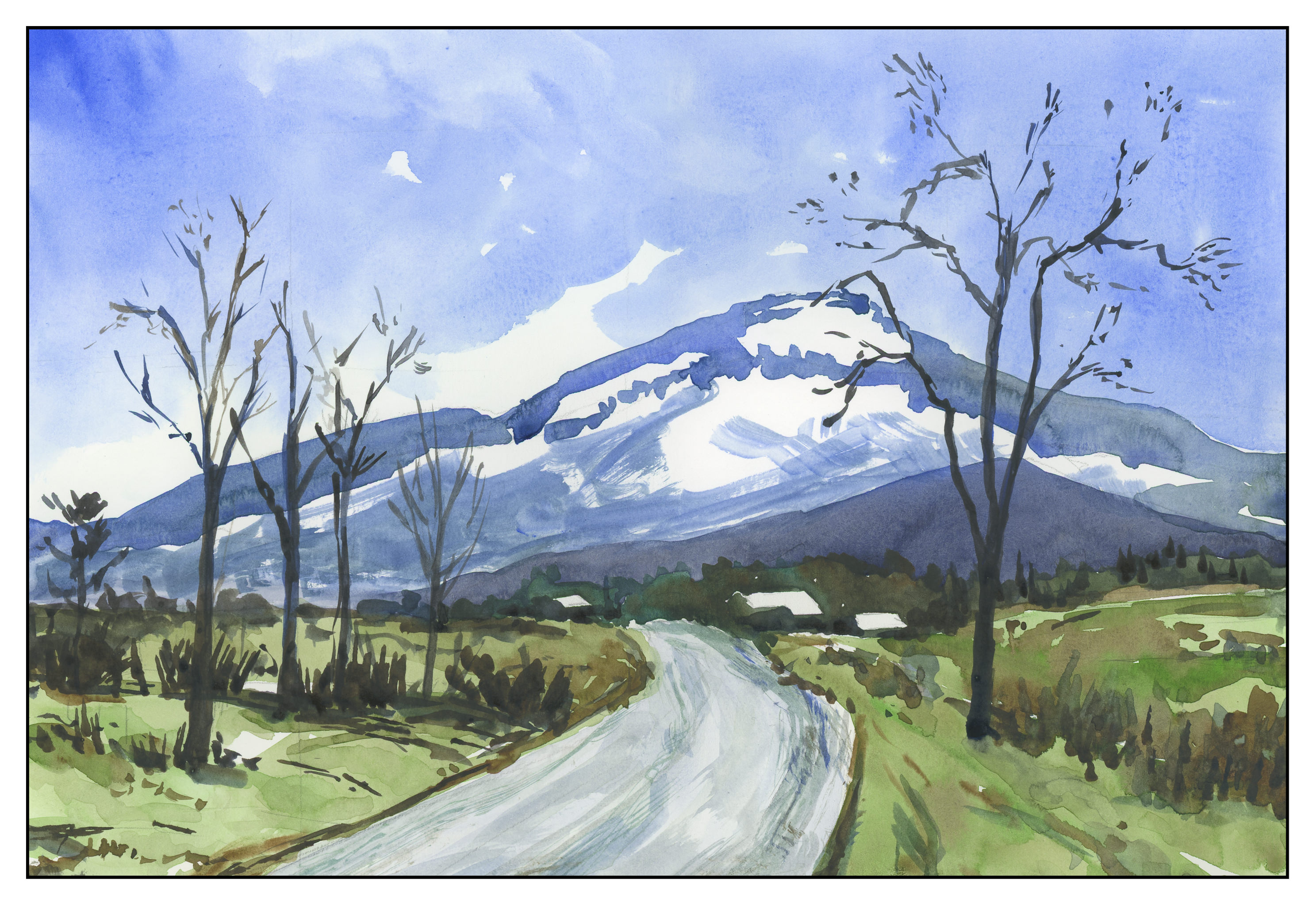
Not a great landscape. Will color make it any better or interesting?

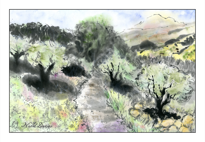
Kuretake makes traditional Japanese Gansai paints, of which I have a few colors! I decided to use these a day after the original landscape had been painted. Most of the painting I re-wet in sections to see how the colors would blur into one another. Some areas, like the rocks in the lower right hand side, I did on dry paper with a fairly dry brush but diluted paint. The Gansai colors vary in intensity, so the diluted paint seemed to be a good starting point. The bright yellow is a mistake – too intense although diluted. At this point I used a bit of scrap paper to test colors before painting.

Most of the colors were applied wet-on-wet. In the end, this painting makes me think of hand-colored photographs from the early 1900s.

Yasutomo Liquid Sumi Ink, “Jade Plate” double xuen paper.

Inky Kits

Cats continue!

This time, I worked free hand (no preliminary sketches on the paper) using “Jade Plate” Double Xuan paper from Oriental Art Supply in Huntington Beach, CA. It is a paper where the moisture is more easily controlled. This is the first time I used it. Like watercolor paper, sizing and so on determines how quickly the paper absorbs moisture. So far, so very good.

The ink I used is the Yasutomo Liquid Sumi Ink, a pre-mixed ink that uses the same ingredients which make up traditional Japanese ink sticks. It smells very nice, too. I chose to use bottled ink because I was more interested in painting than using an ink stick. Be aware that not all liquid sumi ink is of good quality – my opinion, this is the best.

Of course you are looking at this and going, “Huh?!” I do, too. But, the fact is, I had a sheet of paper and made sketches of cats, starting in the center, and rotating the paper to create the next cat. Below, I present them to you in the order I did them.

This is the first one I did, centered on the paper. Not having used this paper before, I needed to use washes and ink of varying degrees of value to get a better sense of the paper. My brush was fairly dry as I blotted it on paper toweling a lot, usually in between adding ink.

And then the one above. The second one. Here, more focused on sketching with a dryish brush using very light ink mixed with water. After letting the wash dry, the darker ink was applied using a very dry brush.

This third painting, as with the second, had a light outline in pale ink, but from there I moved into stronger ink and bolder brush strokes. I focused maintaining the white of the inside of the nearest ear while working to express the dark fur of the cat.

Kitty #4 is a kitten, looking up. Here, I wanted to work on that perspective – the upward movement and the shape of the cat’s head and ears. I was getting lazy, perhaps, as I did not focus as closely on monitoring my brush dampness when applying my ink. You can see it in the way the ink blooms outward a bit and there are not sharp lines.

And the last, a totally white cat on a white background on white paper. The ways to do this is to suggest by a few discreet brush strokes and pale ink.

I forgot how much I enjoy ink by itself. Working free hand with a brush or pen is a challenge, but it feels so comfortable and natural. The double xuan paper adds to the experience as the tactile elements just extend into the hand and brush and back. I used only one brush, too, for all these paintings. Asian brushes, when I first began to use them, annoyed and frustrated me. They are very different from most traditional Western ones because they are very flexible. They feel soft and floppy but come to a fine point when shaped on the edge of the water container or ink stone. Learning how to control them is like herding cats – it seems impossible, but it can be done.

More to come – cats and ink and who knows what!

Inky Black Cats

One thing about having to clean up and discard damaged items from the flood is that I found a lot of things I had lost, buried in the debris. I also cleaned out the garage for 4 hours the other day, reorganizing my loads of loads. My muscles are sore and my mind is blank. There are still some things in the living room, but as the bins are full, I am forced to take a break. That’s good.

One thing I found was some sumi-e ink and thin paper for practicing traditional painting strokes. I still had a bit of a knack for ink painting – one of the founding subjects of this blog, too – but don’t have quite all I need. Nonetheless, I decided to try my hand with my ink stick, suzuri, brushes, and rice paper.

Nothing spectacular. I managed to remember a few things. I also realized I had to find a few other things, like a felt mat and some paper weights to hold my paper steady. Easily done.

From there, I drew a cat in purple ink, thinking about painting cats could be fun.

And easy.

And I found out they are not easy!

So, I tried to follow a few “how-to” videos on YouTube, I got frustrated and had an epiphany: I much rather paint in my own way, not following traditional formulaic representations. And this is not to put these traditional ways down – they are amazing in their own right – but I find it very frustrating to paint like someone else. Learn from someone, from tradition, but ultimately go on my own path.

So, I painted some cats. I copied some, I looked at photos of cats, and that is when I realized I need to learn more about controlling my brush and the shades of grey and black and manage the moisture on the paper. So, inky black cats, some of which may give you nightmares, but working on their shapes and using my brush has opened my mind to a lot of potentials. That is the exciting part!

The Black Cat Rebellion is here.

Trying, Keeping, Discarding

I’ve returned to watercolor in the past year, trying a lot of things, and realizing that some things are just not “me” and others are “me.”  This means there are styles of painting I just don’t care for – and ones I do – and what to do?

First, I think it is important to try something.  This way you gain a working knowledge.  This means repeat the situation a few times to learn the subtleties.  The brain works on an unconscious level and incorporates that knowledge.  Whether or not you continue down that path, you learn something and it is stored away somewhere in the mystery of the brain.

The painting above is a study I did out of Ted Kautzky’s classical work, Ways with Watercolor, which I bought when I was 16 with babysitting money.  Three colors only, and the variety of colors is amazing.  Restraint, self-control, forethought, execution, results, experience and knowledge.

And then, think about the experience.  Worthwhile?  Did you like it?  Were you a klutz?  Did you hate it?  Did you like it?  Do you want to move on?  My philosophy about work comes into play here:  learn what you hate about your job and what you love – then decide if you want to continue.  That applies to painting and art in general.  I like certain things and find other things not to my liking.

What I don’t like is a sense of constraint.  I like painting to be an experience – but to get good at something, you have to work.  So, I like free-flowing painterly watercolors.  To get there requires practice and experience.

When I was doing a lot of sumi-e, I hated the brushes and the paper – they had their own qualities which, one mistake, could ruin an attempt.  Eventually, though, I found some mastery over paper and ink and brush.  Part of that came from knowing my materials – which paper I liked, which brushes I liked, which ink and ink stone I liked.  Then I could begin mastery.  Poor quality brushes shed hairs; too-porous paper spread the ink to quickly.

The same is to be said for watercolor, which I have been drawn to since whenever.  However, I have scurried away from it, always annoyed with my style, with my lack of ability, with my lack of control.  I still deal with it today, but now that I am on the slippery slope of old age, such things seem like foolish wastes of my time.  Just do it!  Do it as often as possible!  To hell with the results – the experience itself leads to wherever it will lead.

Yes, I do know what I want to be able to produce.  I don’t want to rely on lines to contain a bad composition or execution of color.  If I do ink and watercolor, there will be a purpose for it – a reach for a particular style.  With watercolor, I may need to do (and will do) value studies and use a limited palette of colors to train my eye.  This is a form of restraint, but not an onerous one.

With Lines, Without Lines

Yosemite: Reflections at Mirror Lake

If you have been following this blog of late, you will know that I have been putzing around with watercolor on a more serious level than in a long time. (Really, more serious than ever before.) In the process, I have struggled with control of the medium, like all who begin with watercolors. Lines help when a painting fails, and sometimes lines add to a painting if that is part of its intended style.

Having done sumi-e for many years, I love lines and their expressiveness. I also like colors, and that is where self-control needs to show up the most. Think of Hawaiian shirts or 40s palm frond prints and you get the idea about my ideas of color – louder and more is the best!

This painting of Mirror Lake was very satisfying as I felt the use of sumi ink and colors worked well.

Grapes of Wrath (3)

The painting is inspired by a number of paintings I found when I googled “pears grapes watercolor” and chose images. There were a lot out there, and so I painted a number of grapes-and-pear paintings yesterday.

This is the one that pleases me the most. I like its painterly elements and the colors of both the grapes and the pears. It is the most controlled and thought-through of the series. I did not draw any pencil lines prior to painting it, but painted it freehand, recalling brushwork in sumi-e.   It’s easy to fall prey to haste in watercolor, to achieve a “painterly” look, but it really requires forethought, just as sumi-e does.

I did four paintings altogether in this series, which you can find under “My Other Lives” above.