
Cats continue!
This time, I worked free hand (no preliminary sketches on the paper) using “Jade Plate” Double Xuan paper from Oriental Art Supply in Huntington Beach, CA. It is a paper where the moisture is more easily controlled. This is the first time I used it. Like watercolor paper, sizing and so on determines how quickly the paper absorbs moisture. So far, so very good.
The ink I used is the Yasutomo Liquid Sumi Ink, a pre-mixed ink that uses the same ingredients which make up traditional Japanese ink sticks. It smells very nice, too. I chose to use bottled ink because I was more interested in painting than using an ink stick. Be aware that not all liquid sumi ink is of good quality – my opinion, this is the best.
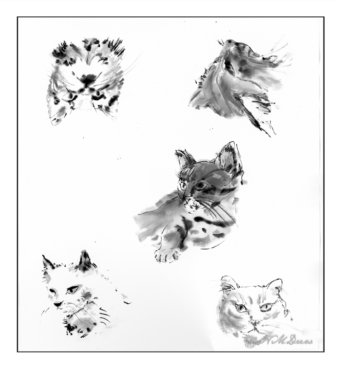
Of course you are looking at this and going, “Huh?!” I do, too. But, the fact is, I had a sheet of paper and made sketches of cats, starting in the center, and rotating the paper to create the next cat. Below, I present them to you in the order I did them.
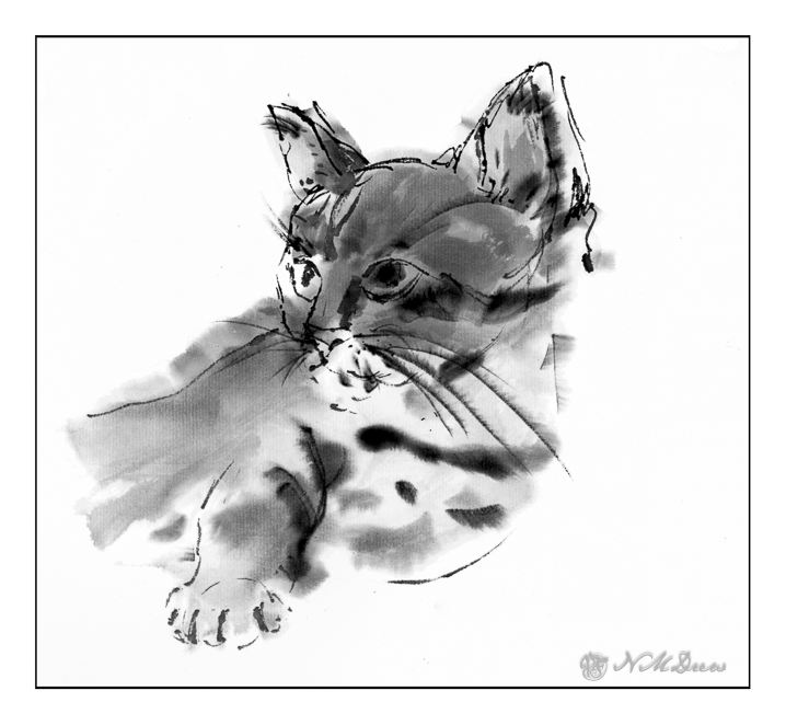
This is the first one I did, centered on the paper. Not having used this paper before, I needed to use washes and ink of varying degrees of value to get a better sense of the paper. My brush was fairly dry as I blotted it on paper toweling a lot, usually in between adding ink.
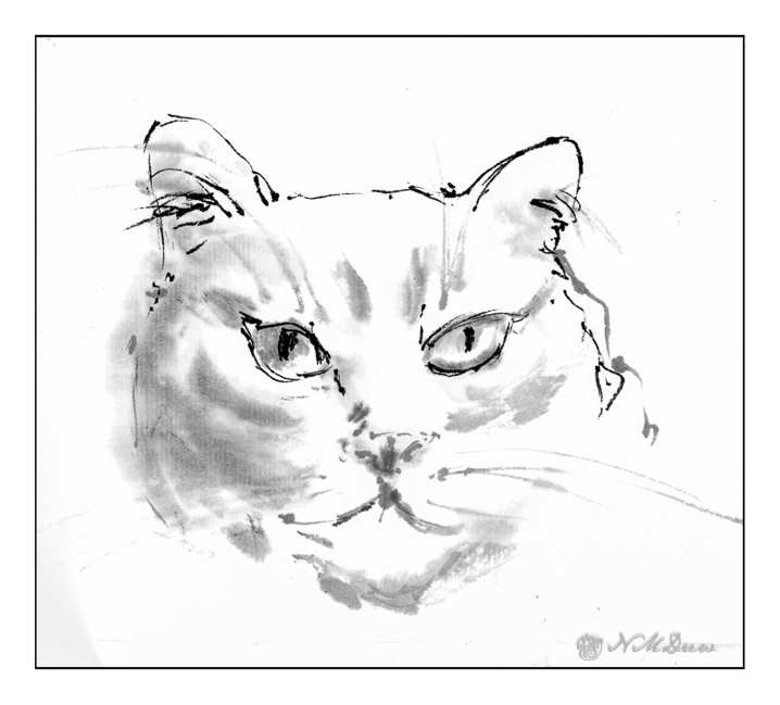
And then the one above. The second one. Here, more focused on sketching with a dryish brush using very light ink mixed with water. After letting the wash dry, the darker ink was applied using a very dry brush.
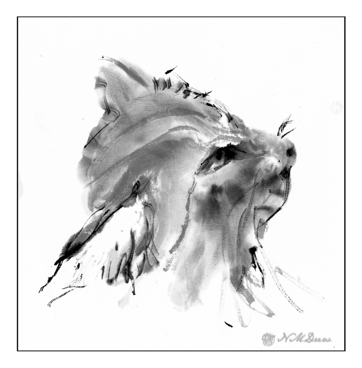
This third painting, as with the second, had a light outline in pale ink, but from there I moved into stronger ink and bolder brush strokes. I focused maintaining the white of the inside of the nearest ear while working to express the dark fur of the cat.
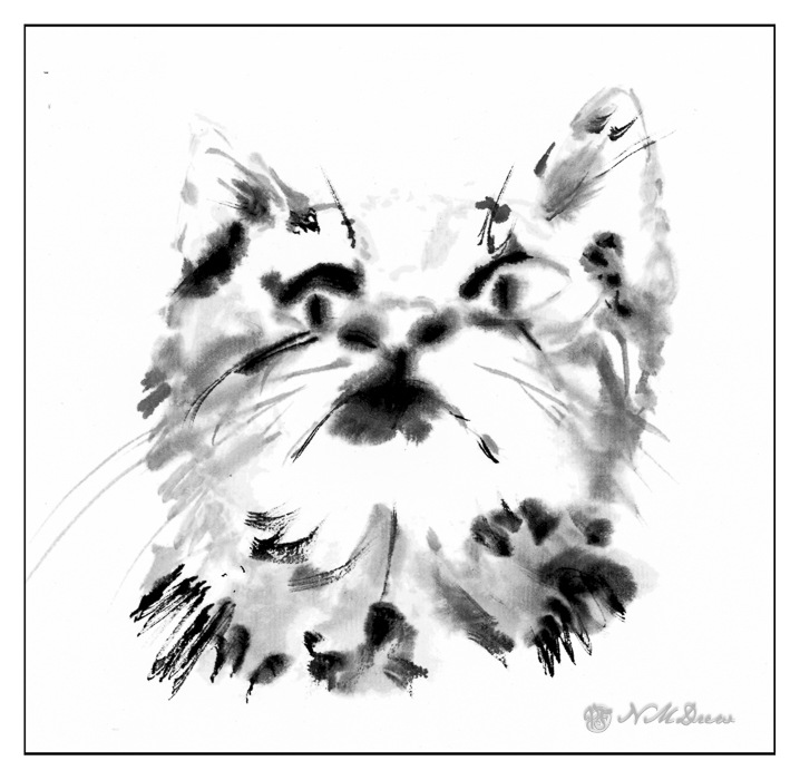
Kitty #4 is a kitten, looking up. Here, I wanted to work on that perspective – the upward movement and the shape of the cat’s head and ears. I was getting lazy, perhaps, as I did not focus as closely on monitoring my brush dampness when applying my ink. You can see it in the way the ink blooms outward a bit and there are not sharp lines.
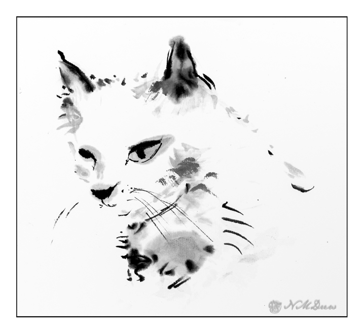
And the last, a totally white cat on a white background on white paper. The ways to do this is to suggest by a few discreet brush strokes and pale ink.
I forgot how much I enjoy ink by itself. Working free hand with a brush or pen is a challenge, but it feels so comfortable and natural. The double xuan paper adds to the experience as the tactile elements just extend into the hand and brush and back. I used only one brush, too, for all these paintings. Asian brushes, when I first began to use them, annoyed and frustrated me. They are very different from most traditional Western ones because they are very flexible. They feel soft and floppy but come to a fine point when shaped on the edge of the water container or ink stone. Learning how to control them is like herding cats – it seems impossible, but it can be done.
More to come – cats and ink and who knows what!


