Deep in the Canyon

Utah is home to many amazing national parks. These include Zion, Bryce, Canyonlands, Arches, and Capitol Reef. All of these are located in southern Utah and feature many different geological formation. In addition to the deep red canyons, there are ginormous hoodoos and sandstone arches. Rivers and streams run through the canyons, sometimes dry, sometimes filled with raging torrents, other times calm and serene. Flash floods are something to beware as they can come out of nowhere – storms elsewhere can cause floods miles away.

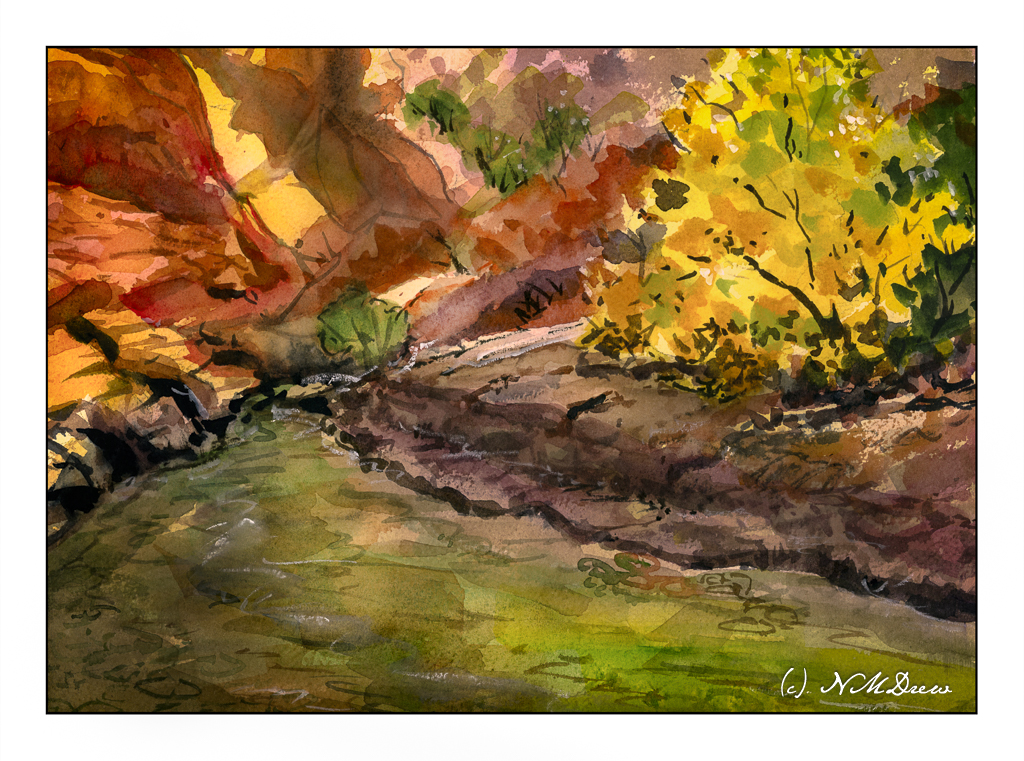
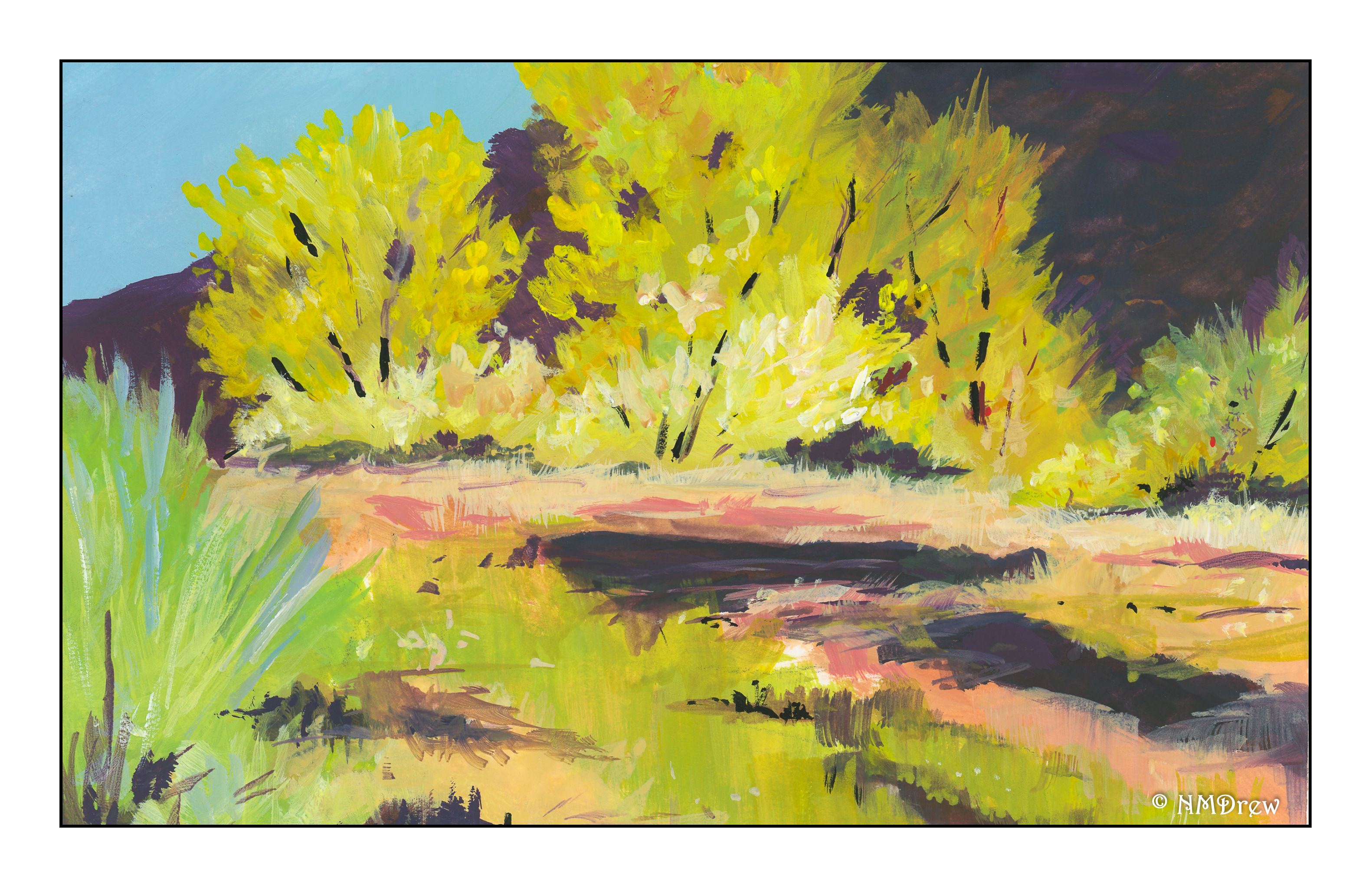
Here, an imaginary canyon in the autumn, complete with red sandstone and cottonwoods and evergreens. Colors are strongly contrasted when the sun slants into the canyon, bright and dark.

Getting the colors and the contrast “just so” is really challenging. I am playing around here with applying thin washes to tint large areas of the paper and then moving to more highly pigmented paint for deeper and brighter colors. I don’t normally paint like this, and it really makes me think a bit. More practice with this technique is necessary to find that fine balance.

Anyway, Arches 10×14 rough 140# paper; watercolor.

Storm on the Prairie

Strange weather afoot – rain, wind, tornado.

If you have never lived on the prairies or traveled through the vast middle section of the U.S., you have missed some majestic land and sky. The weather can change in an instant, you might see it coming, you might not. Flat, lonely, filled with a terrible beauty.

Gouache, of course!

Cottonwood Creek

We are pushing 100F today, with east winds adding to the heat and potential fires. Thus, an autumnal desert scene seemed appropriate for today’s painting.  As I haven’t worked in gouache for quite some time, I thought it time to dig them out.  Variety is the spice of life, for sure.

Before painting, I did a value study before I even sat down to paint.

I used pencil, as you can see below. I like pencil a bit more as I have a good range of pencils of varying hardness and softness, and that helped out in the light and dark department.

I won’t say that the value study did not help. It really did. What it aided in was setting up light and dark areas, of course, but also helped me see shapes, such as the trees against the dark mountain, as well as shapes in the creek in the mid to foreground areas.

I left the sandy bank of the creek and the reflections deliberately vague – hard for me when I want to put in a lot of detail! The focus of the painting is the cottonwoods, so too much detail in the foreground would compete with the more detailed painting of the trees.

Altogether, this was a pleasant diversion, and the value study was worthwhile (not that they take a lot of time – I am just lazy). The creaminess of gouache is fun and a completely different experience than watercolor or pastels. I used Holbein gouache for the most part, CP 140# paper. The painting is about 6×8 inches – the nature of gouache often means smaller paintings than watercolor or pastels.

Here’s to autumn!