A Rusty Brush

It feels as if ages have passed since I picked up a watercolor brush to paint. Out of all the media, watercolor is by far the hardest and to do it well it needs to be done often. I tend to be a bit “precious” – and by this I mean it is far too easy to look at too many details and fail to simplify and pay attention. When I haven’t painted in a while – in watercolor – I tend to just dive in and see what sort of mess I can make, or not make. This first painting exemplifies this.
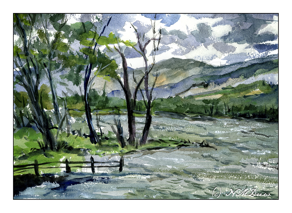
One good thing, I didn’t create mud, but my sense of depth and contrast was not well done. The sky was dramatic, but I made it too dramatic. The mountains and far edge of the water is poorly defined and overly defined at the same time. They all could be a bit more pale so that the trees on the left could look better. And then the leaves on the trees themselves are not well projected against the sky. But, as a bit of a save, the choppy water has a rather nice energy.

So, a bit too much altogether in the above painting. When I find myself doing too much (IMO), I always like to look to Edward Wesson or Edward Seago for simplicity. I found a painting by Wesson which is just simplicity itself, and did a bit of a quick study of it. Unfortunately, I cannot give the name or year he did this particular watercolor.
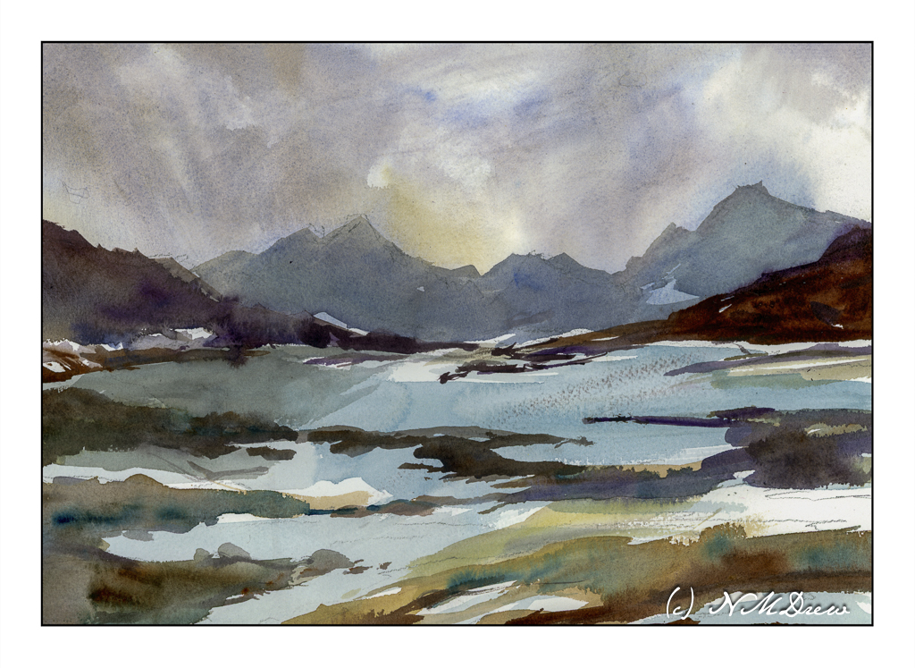
The first painting was done mostly with rounds and a small flat. For this one, I used a 1 inch wide flat brush with stiff bristles. I wet the paper a lot and then just painted. This how I try to get that gracefulness and simplicity so characteristic of so many of Wesson’s landscapes. I feel this is far more successful than the first one, and it makes me feel a bit happier with the painting process – like meeting up with a comfortable friend.

Watercolor, Arches Rough, 10×14 paper.
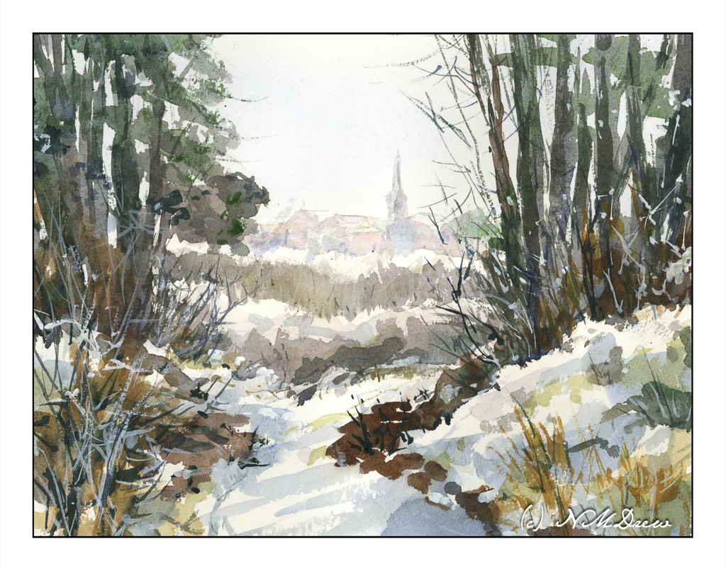
Later in the Day

A few days before Christmas and, while I don’t live in it, I do enjoy a snowy holiday! I’ve always thought that a walk in the woods, in the snow, on a misty but sunny day is the best way to enjoy the cold. Colors are soft in the distance. The contrast of bright white against dark branches and trunks is fascinating, creating twisty patterns on the intertwined branches of bushes and young trees devoid of leaves. There are lines and blobs, shades of blue and grey snow, bright white and deep shadow.

I used a limited palette here – mostly umbers, sienna, some yellow, blues. A touch of alizarin, too, to make some warmth. One of the goals of this painting was to create a soft view of buildings in the distance, suggestive of a misty sunniness. The pale blue of the sky is barely there. I used a lot of water for this effect! Coming closer to the viewer, colors are a bit brighter and shapes more evident. In the woods, sharp trees, shadows, snow, plants.

To date, I think this is one of my better watercolors.

Watercolor, Arches rough 140# paper, 10×14.

Old Trees in Winter

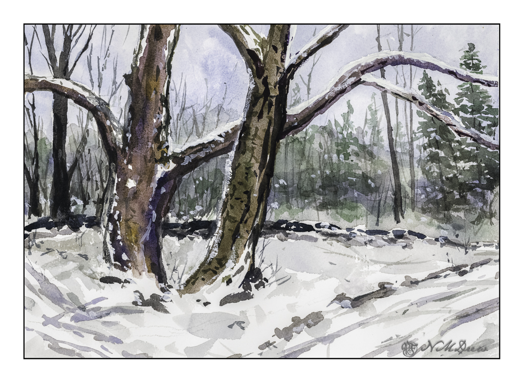
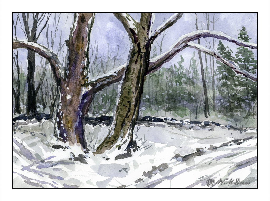
If you have been reading this blog awhile, you know I live where there is fire and not snow. Still, winter does come to my warm (ish) part of the world, and with it memories of tromping through the snow under spreading trees along a lake shore.

I use two software programs these days to scan my paintings – and I rather like the way they end up, similar but different. Above is the one using VueScan. Below is the one using Epson V600 and its software.

Epson software is more inclined to push colors, but in this case it does a decent job and pulls out more of the colors I put into the tree. Both scans are pretty much straight out of the scanner. Your choice as to preference!

Watercolor, Arches Rough 140#. Colors primarily burnt umber, ultramarine blue, Hooker’s green. 10×14.

Garage in Winter

I feel I somehow turned a bit of a corner when it comes to painting. Shari Blaukopf’s online classes are helping a lot. She applies color directly and doesn’t follow “the rules” – by this I mean applying all the light colors first and ending with darks. Instead, she applies color to areas and moves on, making sure in many cases to let the paint dry. (Gotta love those hair dryers!) The corner also started to turn when I decided it was time to add some of the rest of the world to my painting, meaning buildings and so on. Thus far, buildings, but I am gaining confidence with them, so why not with people and urban scenes?

The fact is, I was getting pretty tired of my limited subjects, so this is a good thing. Now, even my boring suburban neighborhood is taking on a totally different perspective – there are a lot of things to paint, even here.

10×14 Arches rough, 140# paper.