
A Rusty Brush

It feels as if ages have passed since I picked up a watercolor brush to paint. Out of all the media, watercolor is by far the hardest and to do it well it needs to be done often. I tend to be a bit “precious” – and by this I mean it is far too easy to look at too many details and fail to simplify and pay attention. When I haven’t painted in a while – in watercolor – I tend to just dive in and see what sort of mess I can make, or not make. This first painting exemplifies this.
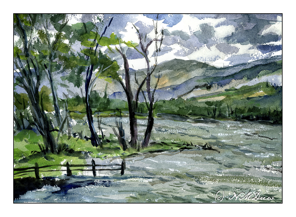
One good thing, I didn’t create mud, but my sense of depth and contrast was not well done. The sky was dramatic, but I made it too dramatic. The mountains and far edge of the water is poorly defined and overly defined at the same time. They all could be a bit more pale so that the trees on the left could look better. And then the leaves on the trees themselves are not well projected against the sky. But, as a bit of a save, the choppy water has a rather nice energy.

So, a bit too much altogether in the above painting. When I find myself doing too much (IMO), I always like to look to Edward Wesson or Edward Seago for simplicity. I found a painting by Wesson which is just simplicity itself, and did a bit of a quick study of it. Unfortunately, I cannot give the name or year he did this particular watercolor.
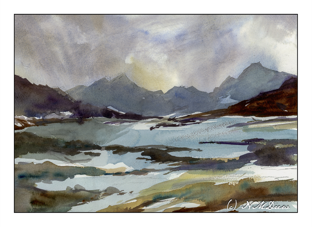
The first painting was done mostly with rounds and a small flat. For this one, I used a 1 inch wide flat brush with stiff bristles. I wet the paper a lot and then just painted. This how I try to get that gracefulness and simplicity so characteristic of so many of Wesson’s landscapes. I feel this is far more successful than the first one, and it makes me feel a bit happier with the painting process – like meeting up with a comfortable friend.

Watercolor, Arches Rough, 10×14 paper.
On the Northern Sea

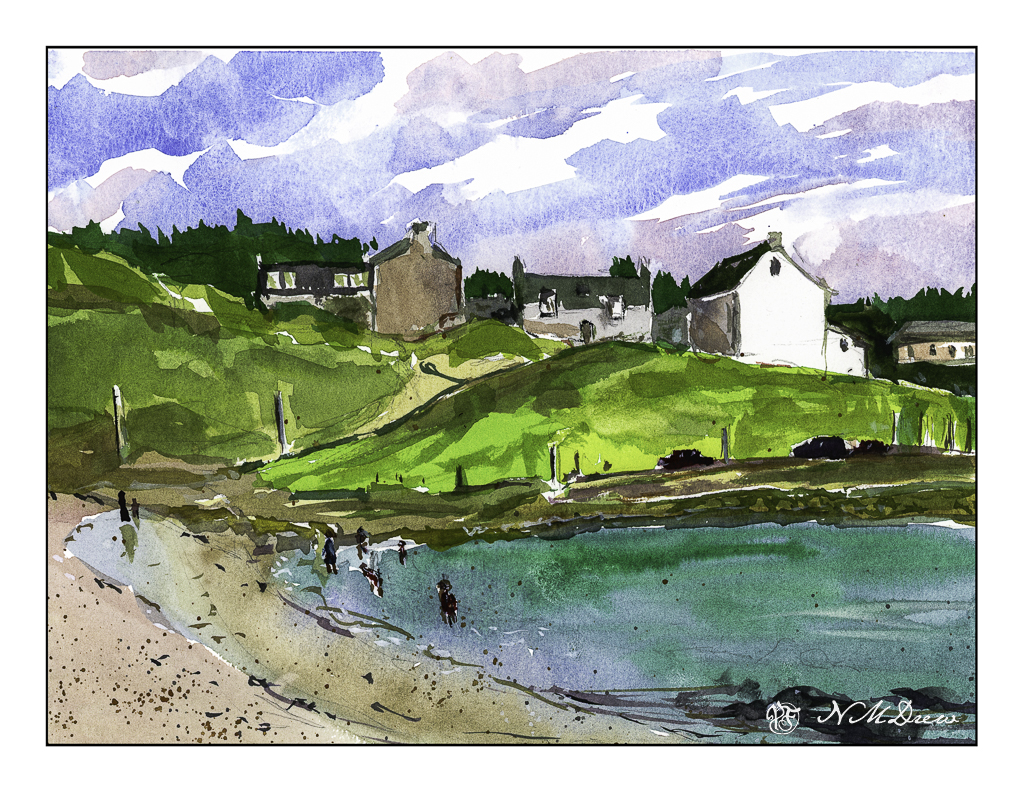
Lately I have been looking at pictures of Scotland. Bright white houses with few windows seem to be a norm here, and in watercolor they provide a brilliant spot that lets the watercolorist leave the paper untouched. This skill is actually important in watercolors as bright white paper needs to be worked around. There are tricks to retaining white paper, such as using a resist of some kind, but to master the skill of retaining white paper without anything but practice is both frustrating and rewarding.

I would say it is pretty obvious which house is white paper, but if you look carefully, you will see the building on the right has some white paper remaining untouched as do some of the windows to the left of the white building. The sky, too, has untouched areas of white for clouds. The large masses of colors also have bits of white here and there. This breaks up things and makes it more interesting to look at. I left white around the bathers, too, but some of them ended up getting soaked – not by the sea but by me and my watercolor brush!

After I did this painting I started thinking about English watercolors. In the 20th century, two famous painters, Edward Wesson and Edward Seago, are well known for their broad areas of color that create detail by shape and form more than a painstaking approach. This works especially well, I think, for landscape, but for urban scenes, it is more difficult. Nonetheless, the lone bright house in the landscape makes for a lovely study. I plan more of these in the not-too-distant future.

Hahnemuhle CP 140# / 300 gsm paper; 9×12.

A Study After Edward Wesson

Edward Wesson was a master English watercolorist.  He is renown for the simplicity of his work – clear color masses, defined work.  It is his economy of color and shape that are attractive to many painters as he says a lot with very little.

I, on the other hand, am prone to overdo and use rather bright colors.  My perspective is often wonky.  To counter this, I look for painters, such as Wesson or Seago or Hannema or Kautzky whose work I admire for its elegant use of colors or lines or both.  Copying another artist is good intellectually, as it requires thinking about what the artist did, and how.  Great practice!  Today, I chose Wesson.  Below is my interpretation.

My mountain in the distance is more detailed than Wesson’s.  I chose to make the trees on the shore in the midground lighter than in his painting as I think he meant to do it, but had laid in the dark of the hill on the left already.  My beach comes nowhere as beautiful as his – too much detail.

My husband remarked that this is definitely something he would define as NOT “my” style.  I agree.  I was looking to create something a bit spare, and to a degree I did, but I had to blot the sky (too dark) and re-wet the mountain.  I like the middle ground green hills, and the reflections on the water.  My beach sucks!  All in an afternoon’s work.