A Rusty Brush

It feels as if ages have passed since I picked up a watercolor brush to paint. Out of all the media, watercolor is by far the hardest and to do it well it needs to be done often. I tend to be a bit “precious” – and by this I mean it is far too easy to look at too many details and fail to simplify and pay attention. When I haven’t painted in a while – in watercolor – I tend to just dive in and see what sort of mess I can make, or not make. This first painting exemplifies this.
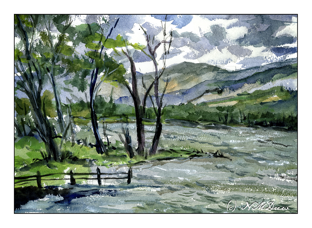
One good thing, I didn’t create mud, but my sense of depth and contrast was not well done. The sky was dramatic, but I made it too dramatic. The mountains and far edge of the water is poorly defined and overly defined at the same time. They all could be a bit more pale so that the trees on the left could look better. And then the leaves on the trees themselves are not well projected against the sky. But, as a bit of a save, the choppy water has a rather nice energy.

So, a bit too much altogether in the above painting. When I find myself doing too much (IMO), I always like to look to Edward Wesson or Edward Seago for simplicity. I found a painting by Wesson which is just simplicity itself, and did a bit of a quick study of it. Unfortunately, I cannot give the name or year he did this particular watercolor.
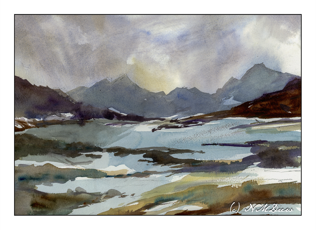
The first painting was done mostly with rounds and a small flat. For this one, I used a 1 inch wide flat brush with stiff bristles. I wet the paper a lot and then just painted. This how I try to get that gracefulness and simplicity so characteristic of so many of Wesson’s landscapes. I feel this is far more successful than the first one, and it makes me feel a bit happier with the painting process – like meeting up with a comfortable friend.

Watercolor, Arches Rough, 10×14 paper.

Somewhere in the Mountains

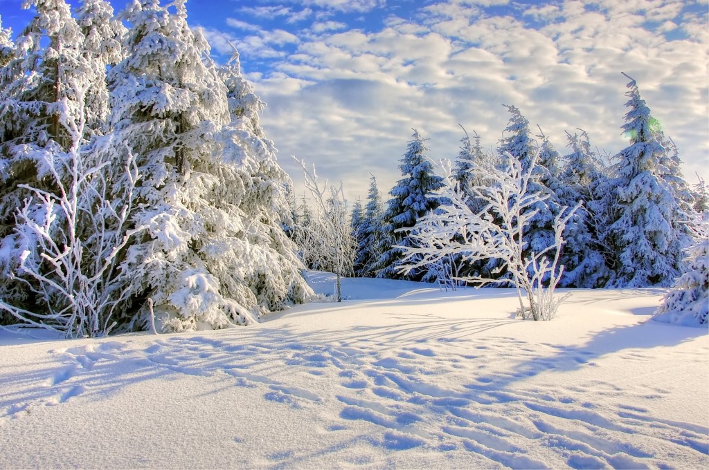
I went to Pixabay looking for snow and shadows and cold weather. The painting is of the photo below, done in gouache, 7×10.

The challenge here is depth of field – details – not too many details – simplification – and most fun of all, the shadows on the snow. I really enjoyed looking at the photo, imagining myself in it, and wondering where it is I am. In the photo, the white snow on the bare tree branches is really easy to see, but with gouache I always find my whites are never bright enough. Always interesting to compare a photo to a painting!

Birch Trees

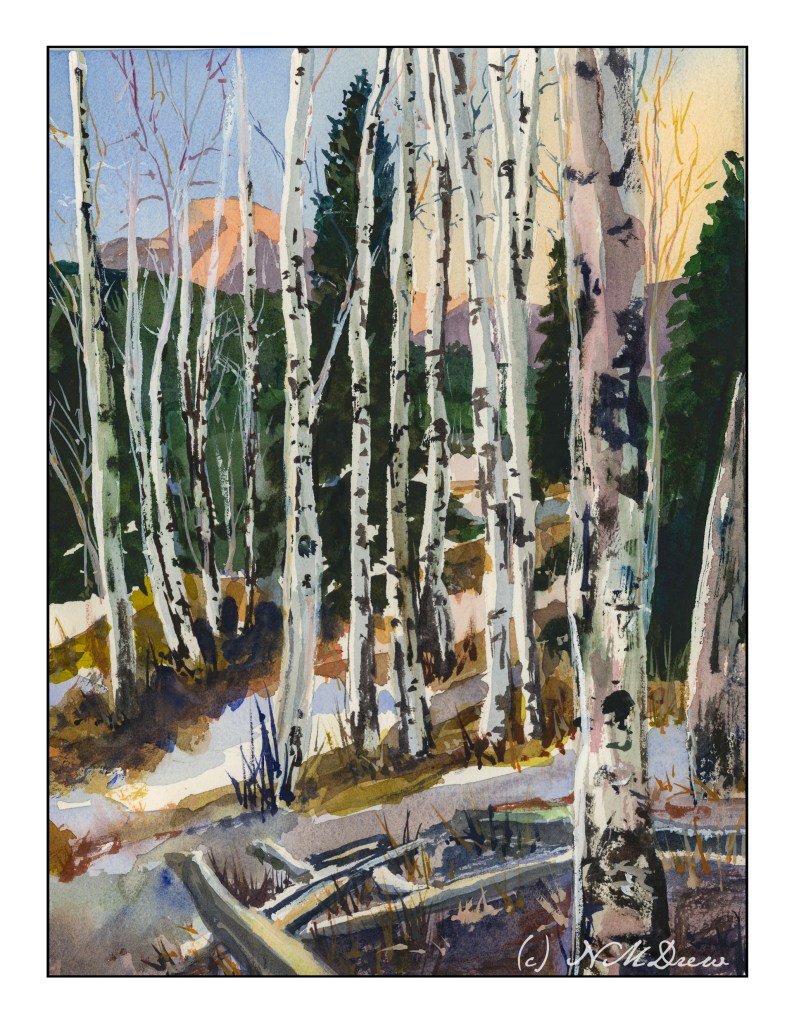
Birch Trees – from a photo in Module 2 of Andy Evansen’s Class

If you have been following me for a bit, you know that I have enrolled in a lot of painting classes. This is a study from my watercolor class, online with Andy Evansen. His work covers a lot of subjects, but I like his ones of the natural world the best. So, lazy me, I stick with his photos of the wilds, but will, at some point, take the dive and do something with buildings and people, and maybe even cars.

I used frisket to create the hard edges of the birch trees and the snowy areas of the logs in the foreground. The other white areas, the snow, is plain paper, no frisket. After the frisket dried, I did the sky, sunlit mountain, and dark background. Then, a bit of the foreground. Finally, the frisket was removed.

When the frisket was gone, I worked left to right, creating the shadows of the birch trees. Upon those shapes I added heavier paint to create the blacks characteristic of birch trunks. Various other details got worked in. White gouache came in handy to clean up some of the birch tree trunks as well as to create the fine branches of the trees toward the top of the painting.

The only thing I have some issues with is the very large birch tree on the right, the one which stretches top to bottom. It is not quite right, but that is something for correcting later on. Despite that, I am pleased with what I am learning, and creating, with all these classes. Painting and drawing and artwork is in the forefront of my mind these days, and it is beginning to show in more “successful” paintings from my viewpoint.

9×12 CP 140# Arches paper; primarily watercolor with a touch or two of gouache. (Maybe 3 or 4 or more….)

14-16 / 30

Day 14

I am beginning to lose track of the days since I began this project since some days I do nothing, and other days I do a few.

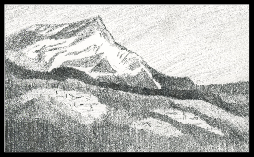
Above is Day 14. Continuing to simplify shapes and masses into values, the above should represent a mountain in the distance. From there, mid-ground is a dark ridge before the mountain, and another to the right of the mountain, behind the mountain itself. The white blobs in the foreground area with sticks is supposed to represent structures. To me, they look like felled timber. Ideally, I think the mountain itself should be lighter to represent atmospheric perspective.

Day 15

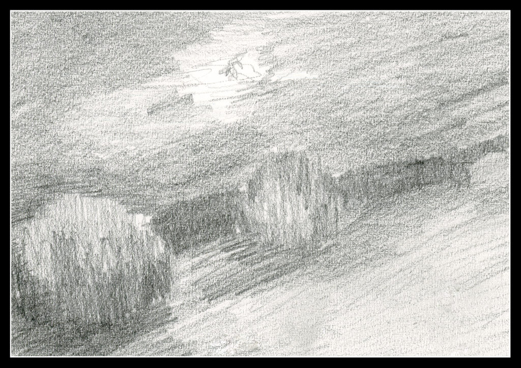
This is an attempt at a nocturne – a night time value study to see if I could catch the light of the full moon. The bush-like thing in the middle needs some lightening at the top. Overall, I like this as a start to something even though it is so vague – but that is how night is!

Day 16

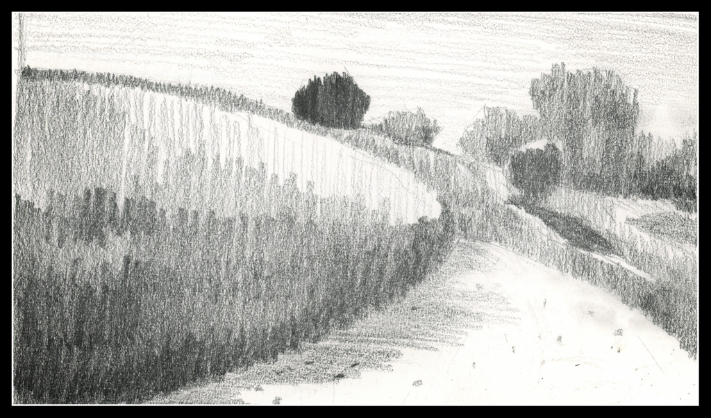
This is a view upward to the hill at the center of the local botanical garden. The white swath in the right foreground is the sand trail which winds around downward (behind the viewer) into the riparian woodland below.

I am not quite sure if I like the values as I have them set up here – nor am I really sure about the focal point of the drawing. It seems the dark tree at the top is too dark, but it could be a leading line down the hill to the tree with the cast shadow. The trail leads the eye. In a painting, this could work out with warm and cool tones in addition to values. Maybe I’ll give it a shot!

Commentary

With Day 13 I tried to make my masses more simple and graphic. I am continuing this, and will for the rest of the 30 day challenge.

Some studies lend themselves to it more readily than others. Despite that, I tried to simplify in all three. Doing this makes Roberts’ admonition to “draw shapes, not things” easier to do. Distilling the more important – most important – into value masses seems to be happening (at long last!).

Again, it will be interesting to see where it works with painting.

The Mountain

Yesterday was a watercolor day!  I warmed up with a copy of Wesson’s painting, and then moved on to more water.  I am not intimidated by water in the form of lakes or streams, but do need to learn how to do oceans and waves and white caps.  I am trying to get a grip on reflections and how water and reflections interact.  I think reflections appear longer when the sun is behind you rather than in front of you, like shadows.

Here, a mountain and a lake, with some very deep shadows.  The distant mountain is quite bland to my eyes and would like to liven it up with deeper greens and richer browns.  I didn’t.  I tried to keep it more simple than the actual photo.  I did to a point.

I think most painters will always find faults as they know, as they paint, what challenged them while they painted and what their vision was, versus what they put down.  My life.