New Pen, New Ink

These past several days just seem to have been filled with stuff that needed doing, not necessarily things needed and wanted. Getting taxes done, going to the dentist, etc., are not my ideas of a Fun Life, but things Needing to be Done.

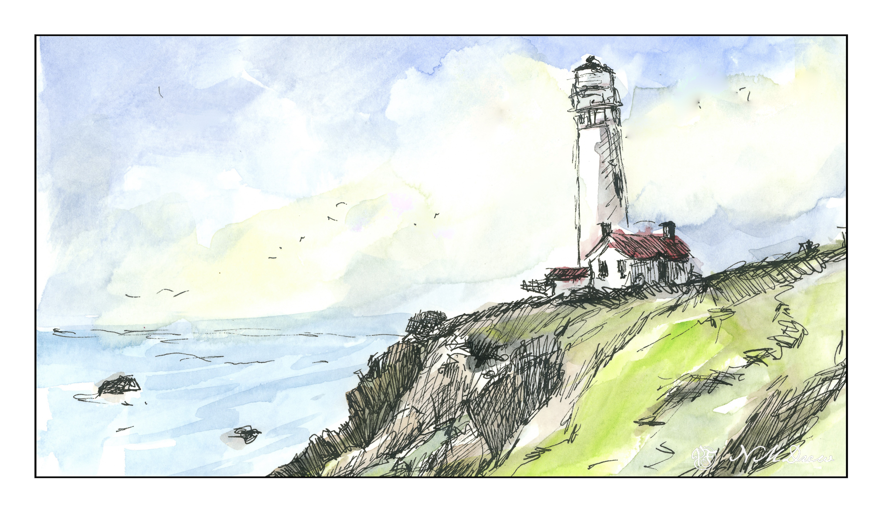
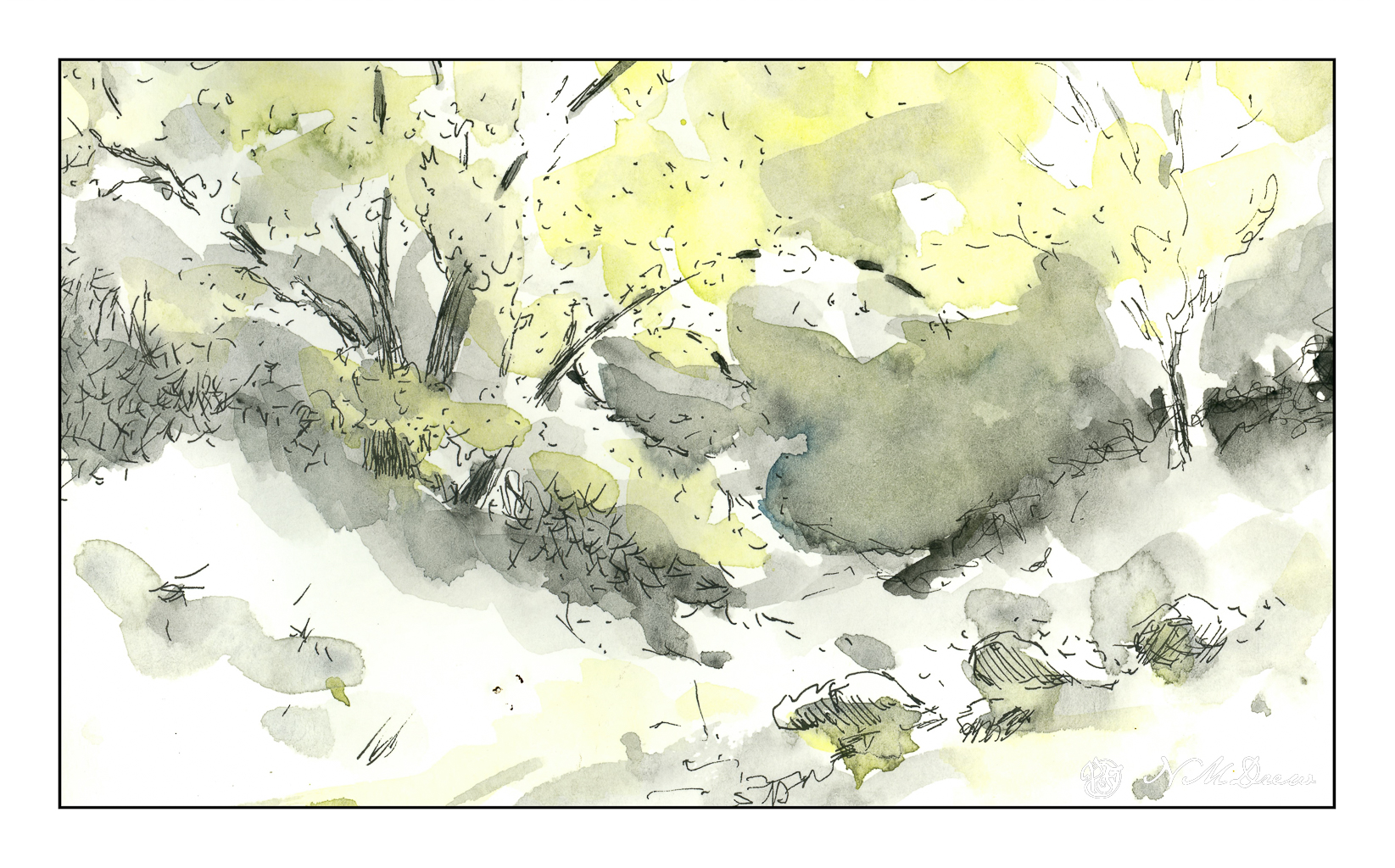
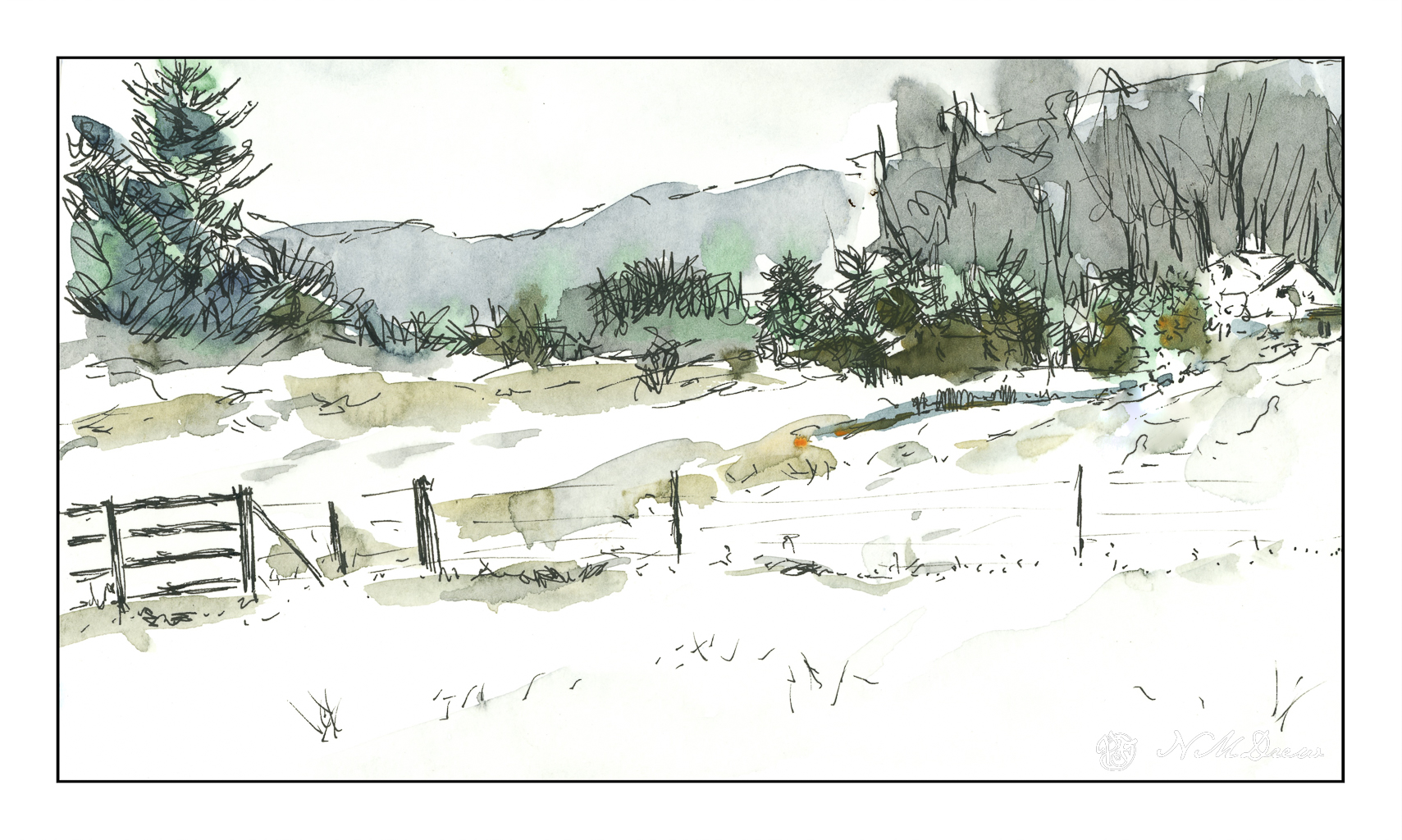
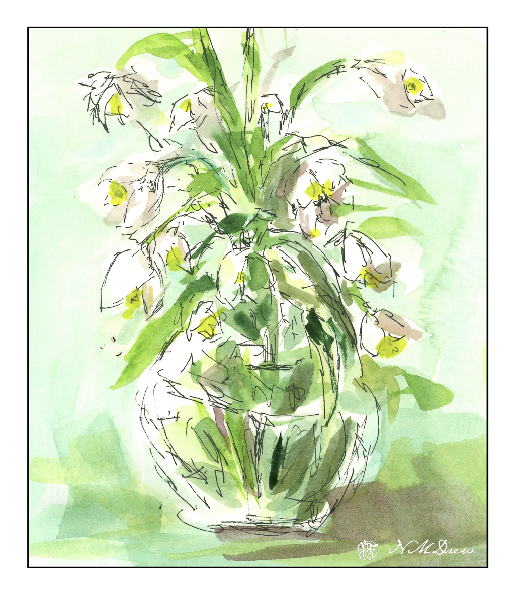
Despite duty, I have been putzing around. I realized that I don’t have a fountain pen and permanent ink for drawing any more as I lost a pen somewhere – which, no doubt, will soon be found as lost objects always are once replaced – and used up all my waterproof fountain pen ink. I now have a new drawing pen, a $17.00 job from Amazon with an extra fine point, and some of Platinum’s Carbon Ink, which is a long time favorite of mine for drawing. My Not Taken Vacation sketchbook was easily accessible, so off I went to the sunny patio to do some drawing. I used a few reference photos for ideas, and then began with ink and pen.

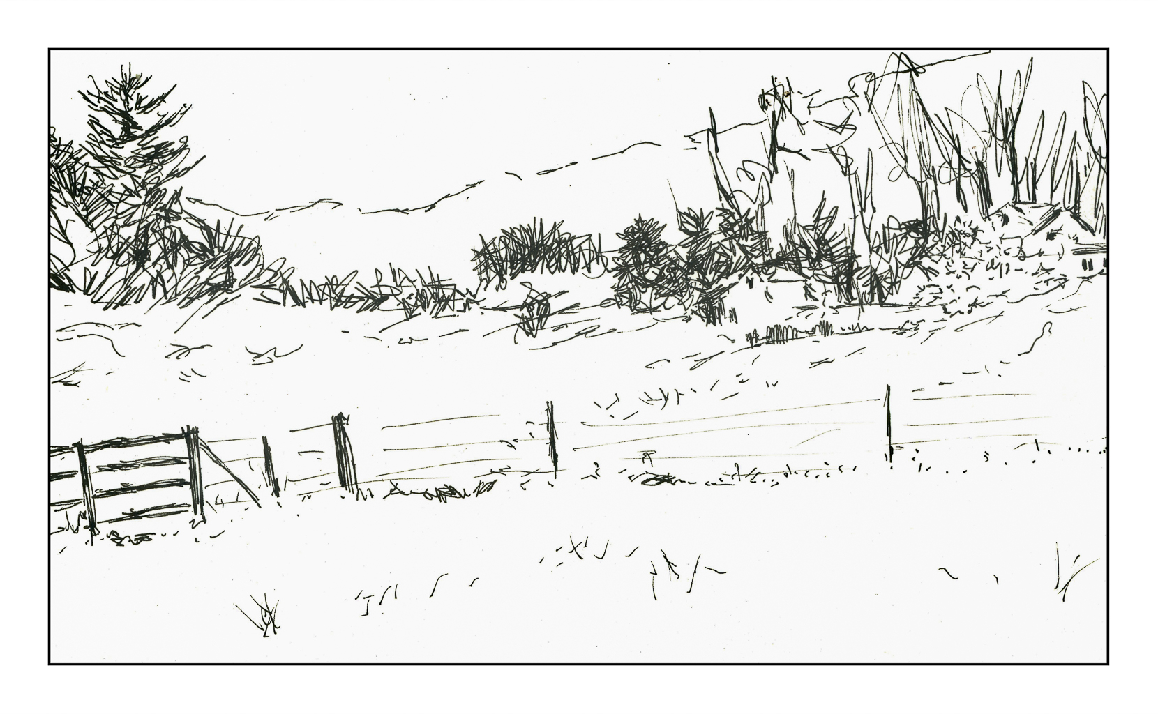
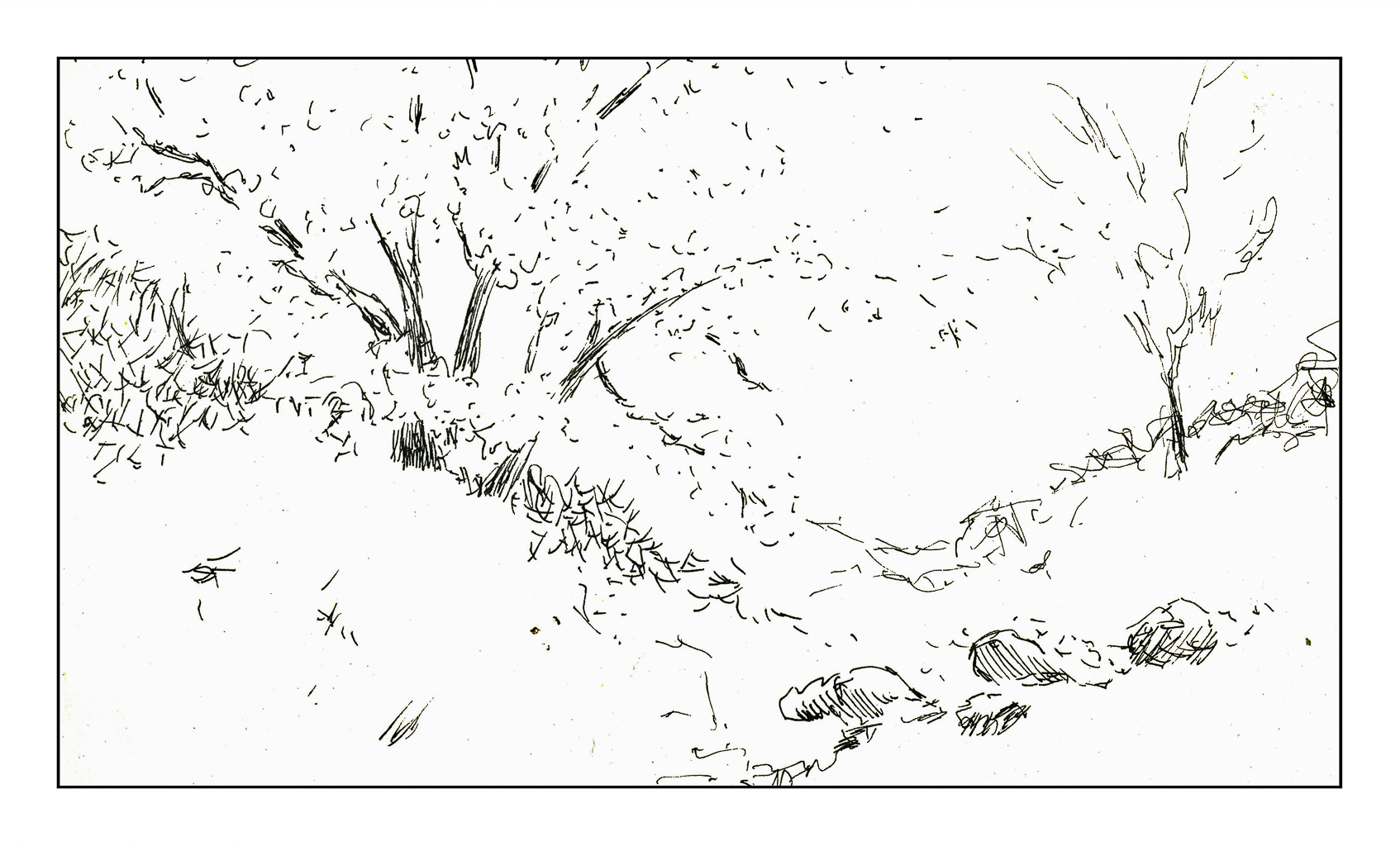
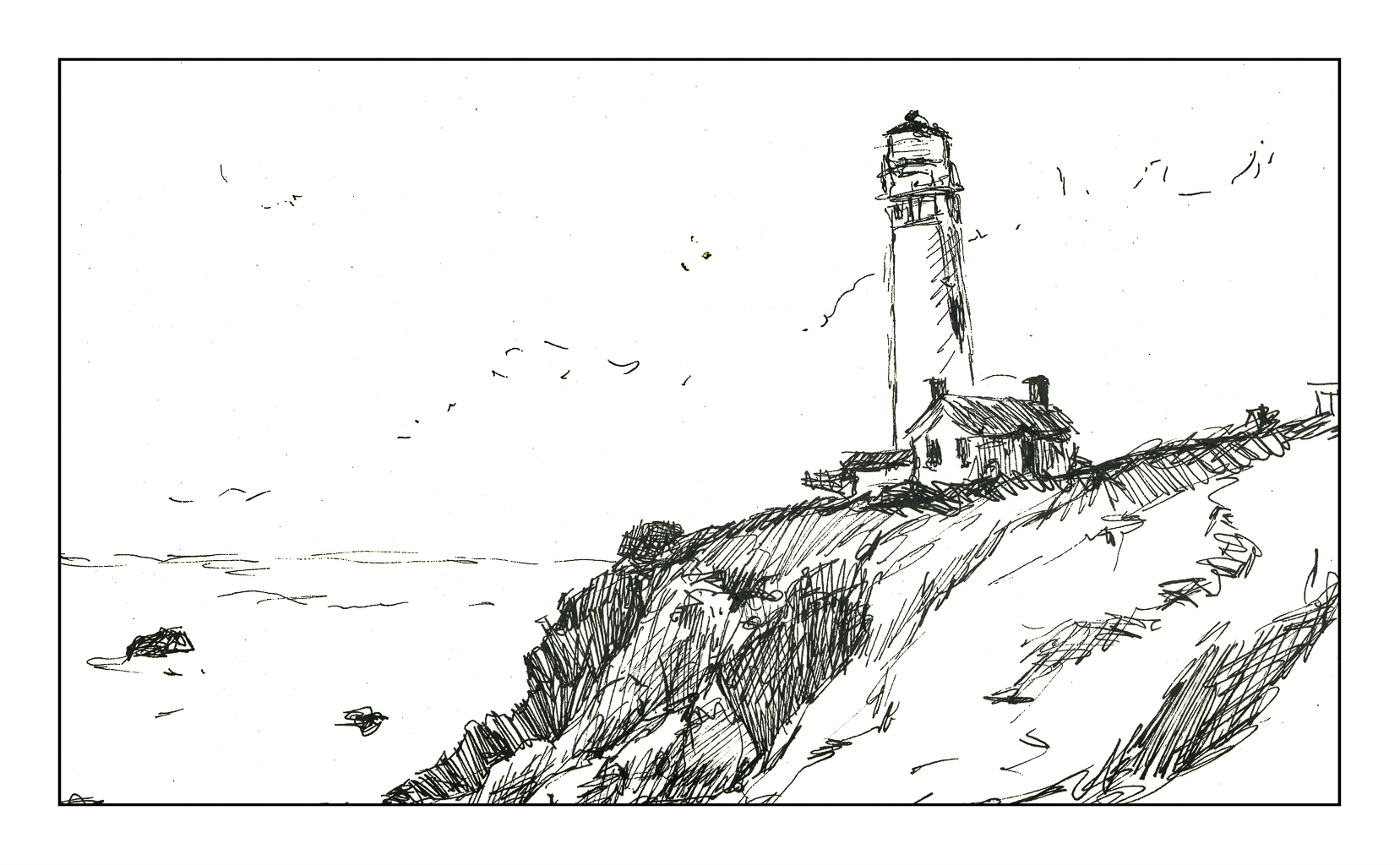
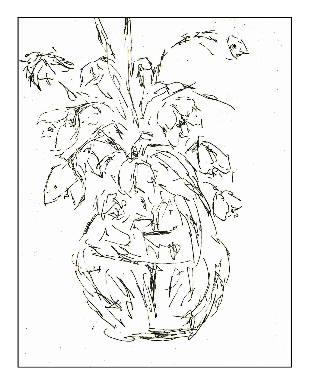
I chose to draw some snow drops in a vase, Pigeon Point Lighthouse here in California, a little cleft in the landscape, and a wintry farm somewhere. From there, my box of Schmincke pan watercolors, some water, and a brush. All this was sort of awkward as I have not done ink and wash for a bit, but it always feels so good to just sketch and paint, more so when it is out on a sunny patio on a beautiful spring day between last week’s rains and this weekend’s expected downpour.

I am quite pleased with my inexpensive fountain pen which came with the fillable screw adapter I prefer to cartridges, and coupled with the Carbon Ink, I think I have landed a rather happy combination for my drawing pleasure. Hopefully you like them, too!

After the Snow

There is a lot more “ink” these days than beer or yarn, but as far as those go, there is a lot going on in the background. I guess I will need to post some of my knitting projects or sewing projects (“yarn”). Cooking, too (the “beer” part). Paint (“ink”) takes up most of my time, though.

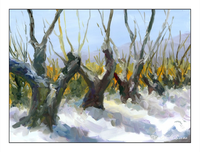
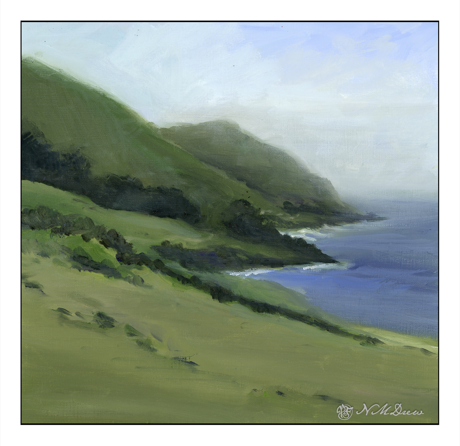
I am continuing with the oil paints and just love the sensuality of mooshing it around on a canvas! I also like being able to work on my sense of contrast – lights and darks – as I have done with a few pears.

When I am finished with a painting, even though I use low odor solvents, the smell lingers, more so when the house is closed up to keep it warm. Because of this smell, I have some drying shelves set up in the garage, which is pretty cold. It takes a long time for the paintings to dry unless I use Gamblin’s Galkyd Gel, and then they dry almost overnight.

Now that you know this, I painted this painting about 2 weeks ago using linseed oil as the vehicle as well as Gamblin’s solvent-free gel, but not the Galkyd. Drying time is very slow. I just got some walnut oil mixed with alkyd by M. Graham, which should speed up drying time and, I hope, give that lovely ooziness that makes oil paints a lot of fun. Maybe I will check that out later today.

I chose this subject to work on a few things: values, color, distance, depth, contrast. Overall, I am pleased with this painting. I like the brighter yellow between the tree branches on the right as I think it leads the eye in. Someone on a forum said it was too bright and might need to be dulled down a bit. That is something to think about, but my magpie self likes that but does see what the person means. But how much should that yellow-orange be dulled, and so on. Maybe I will play with it in PS.

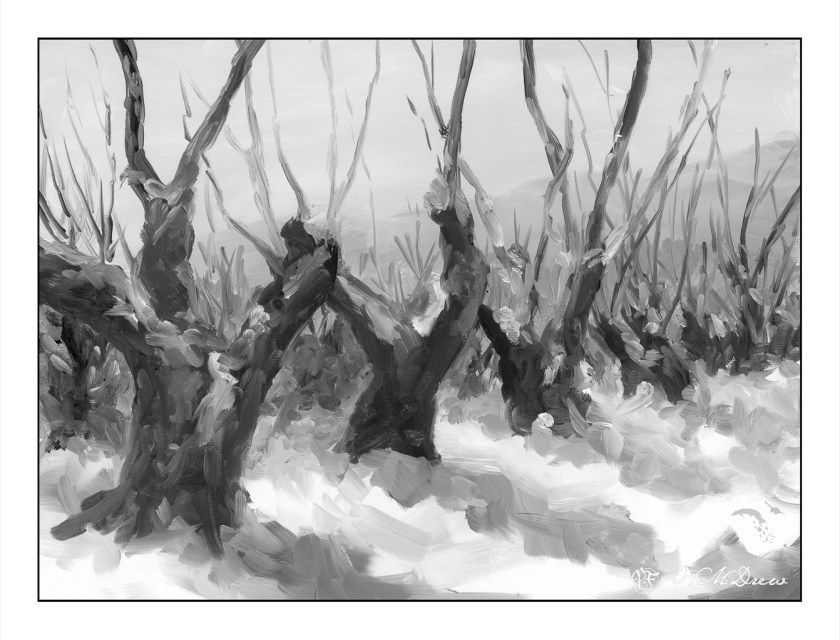
Above is the desaturated image. I do this to look at my values. Success! Isn’t it interesting to note that the bright yellow-orange becomes a middle grey when in black and white?

I have a couple of other paintings out in the garage drying. I’ll get those out in a few days. Scanning a painting is far nicer in result than photographing as there is minimal glare. The only problem with the scanner is that sometimes the software does not like to merge the sections – luckily I have a few different ones as back up and seem to work quite well.

11×14 oil painting on cotton canvas panel; scanned on Epson V600 at 600 dpi and 48 color bit depth.

Storm Break

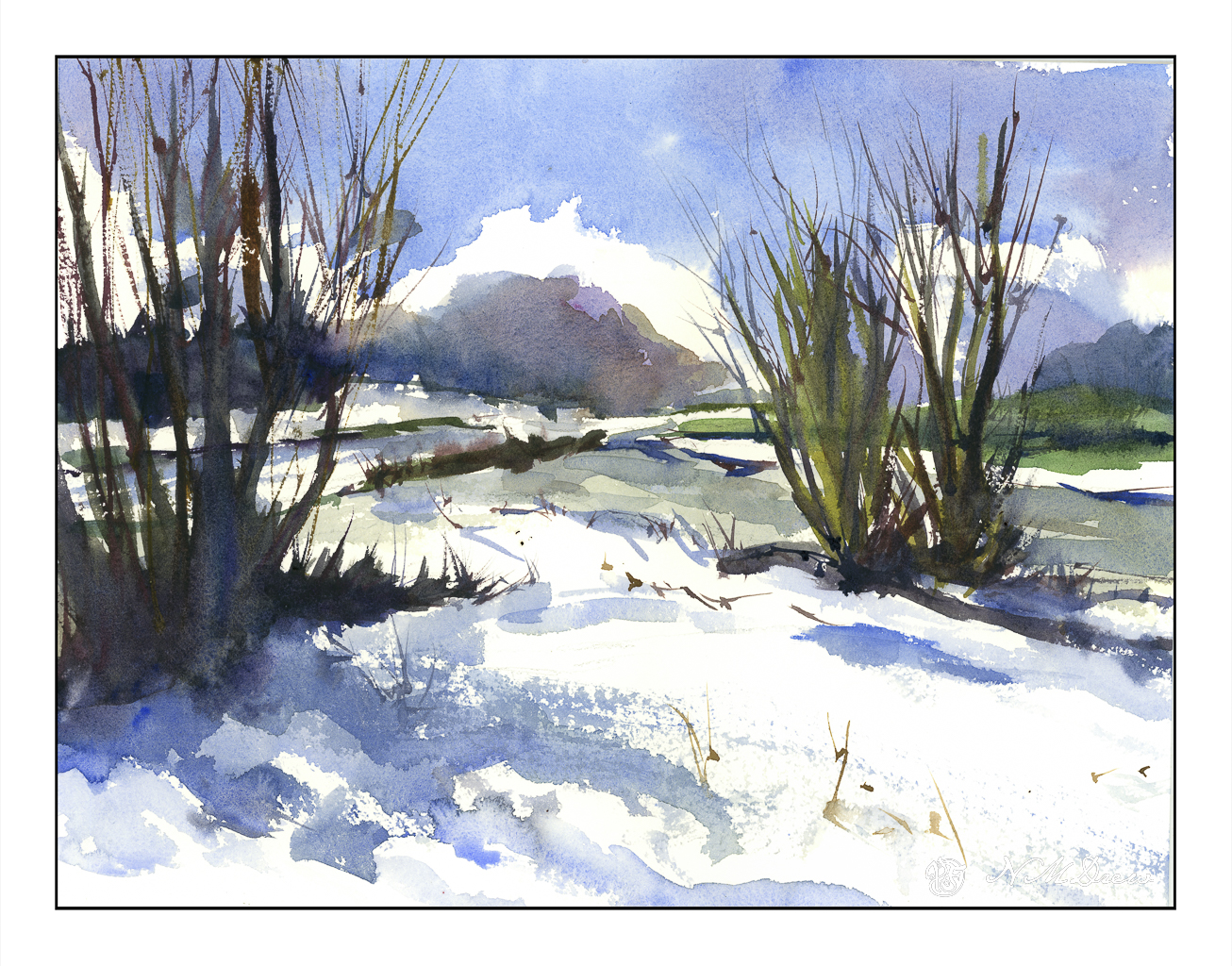
Heavy rains and foreboding skies give way to ragged clouds and brilliant blues as the storms recede. No snow here, but memories will do! I tried to express this sky in the distance, beneath the blue and white with the dark clouds moving away. Not so sure how it reads, but you can decide that. Could be trees, could be clouds, could be space ships. And there is a river behind the trees and the snow across the way.

Kilimanjaro Natural White Rough, 300#, Rough, 12×16.

Soggy & Boggy

Today the rains are pouring down. The backyard is flooded and the pump is working to keep the water levels acceptable by shunting it out to the the street and into the storm drains. This is the second of the two Pineapple Express atmospheric rivers causing concern and evacuations throughout the county and elsewhere in California. There is charm to living up a canyon until the rains erode it all – I live on a small hill in a tract with a creek in a park a ways down the hill. I’ll settle for that! Our clay soil and poor landscaping creates a boggy lake in the backyard, held in place with our clay soil, but we are lucky overall.

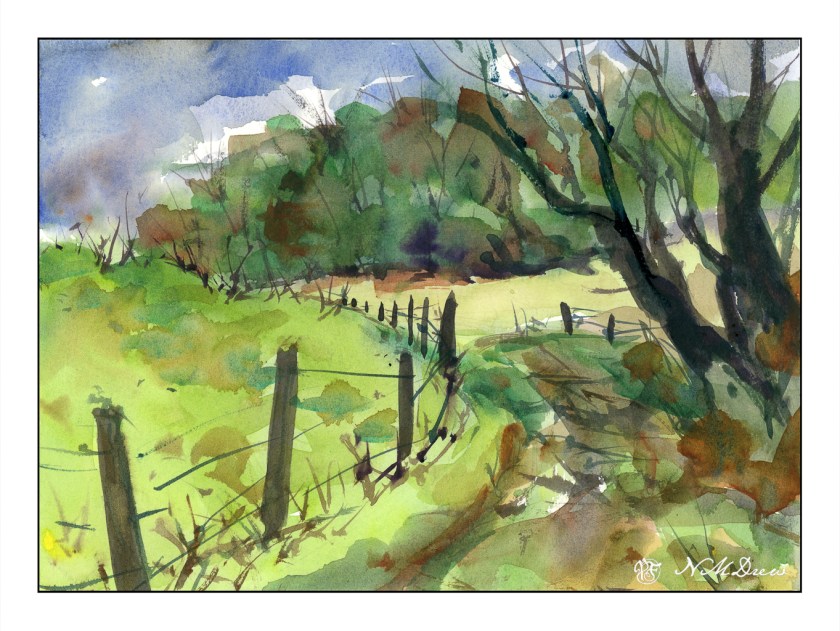
And on a rainy day, oil painting is not something I want to smell throughout the house even though I did think about it. Watercolors called – because of all the water around me? Who knows – but rain brings green growth and soggy ground, and that is a delight in our dry, dry land.

Hahnemuhle CP 140#, 9×12, watercolor. 

Wood & Wetland

I have been spending the better part of the day watching the videos in a class in which I have enrolled before starting any of the projects. There are a lot of short videos in it pointing out this and that, but sitting still to watch the longer ones makes me restless. I need something to do with my hands rather than just sit on my butt! Knitting is out as I have a few projects at a point which need some focus, but oil pastels did the trick. I can draw / paint and watch at the same time. I may not get all of the video, but I do get a lot of it – just as I am now as I write this post.

I picked up a few brands of oil pastels and a 6-pack each of soft white and greys. These include Sennelier, Mungyo, and Caran d’Ache. The white and grey pack are labeled “Anders” I think. I also have been playing on various papers, but decided to check out the Sennelier oil pastel paper. It seems to do a pretty good job despite all the rubbing in of layers of pastels.

Oil pastels, at this point, are more like playing with crayons for me. I blur the colors using my fingers and tortillons. Harder oil pastels make up the underlayers with the softer, oilier ones going on top. This adheres to the adage of “fat over lean” in oil painting, so it makes sense that it would apply to the oil pastels as well.

Oil pastel on Sennelier paper; about 5×7 finished. Scanned on Epson V600.