Playtime

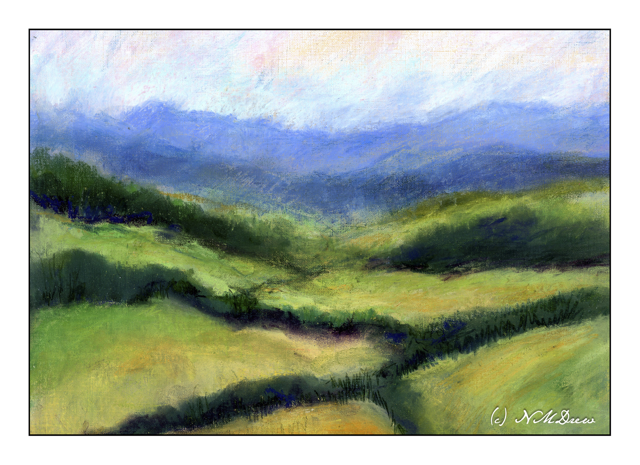
For some reason I remembered the fun I have had with pastels – soft, hard, pencil. I dug them out yesterday afternoon to play with, not to do anything great. I have not used them in a year or two, and with that comes the need to re-learn what to do with them. I figured an imaginary landscape somewhere would be good territory for exploration, so in the Land of Something, I began.

The first thing I did was to used Golden Pastel Ground which I mixed with some fluid yellow ochre acrylic paint and water, thinning it to the consistency of cream. I applied 3 thin layers onto Canson XL oil / acrylic painting paper, letting it dry in between each layer. This give a sanded surface with a bit of grit, and it held up really well.

After the paper and ground were dried, I pulled out all my pastels. I have soft pastels by Rembrandt and Terry Ludwig; harder pastels called Nupastel, and some reputable pastel pencils by Derwent and Faber-Castell. The first layers were done with soft pastels to lay in the values. I used rubbing alcohol and a paint brush to establish values. The alcohol seals the pastel pigment and once dried the colors do not flake off.

I applied layer after layer after layer of soft pastels, blending as needed, and using a very fine mist spray bottle with alcohol in it to settle each layer. In the end, I used the Nupastels and the pastel pencils to see what they can and cannot do. When finished, I sealed the painting with more alcohol and used a hair dryer to hasten the drying.

Last time I did pastels I got frustrated, and it seemed everything I did got worse and worse! My own thoughts are I am more accomplished or skilled with colors and such now than I was a few years ago, so this may be why I feel this is a successful foray into a forgotten medium. I expect I will be carrying on with pastels as they are a lot like drawing and painting, messy and bright. I think I may attempt a building with the next painting.

Working with pastels produces a lot of dust. I wore a face mask and damp wiped my work area after I finished. If I continue to paint in pastels, I plan to get a good air purifier with a HEPA filter to keep the potential dust hazard to a minimum.

9 x 12 Canson XL oil / acrylic paper; Golden pastel ground with yellow ochre and water; Terry Ludwig and Rembrandt soft pastels with pastel pencils and Nupastel. Rubbing alcohol used to seal dust. (Now let’s see how it works as a final fixative!)

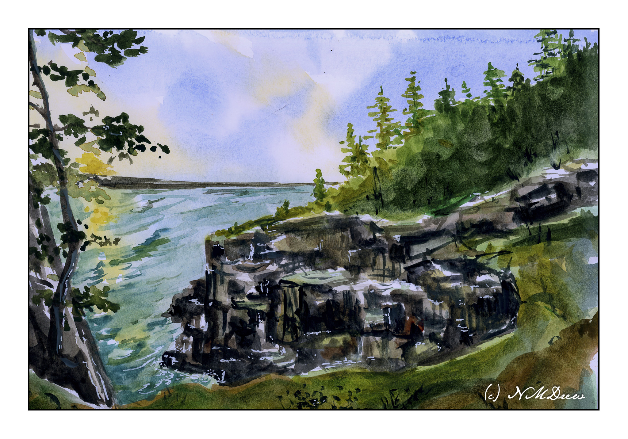
In Acadia

Acadia National Park is one of the most incredible parks – wild, rugged, beautiful.

Another painting with watercolor on Vision paper; again more direct approach. Not sure how good this looks online as the scan was not especially good.

This was a challenge altogether. Goal was simply to simplify. The rocks were not so easy to do as they are complicated in a lot of ways, at least here. They are very rectangular and sharp. I used broad strokes – and then some more – and then some more, each getting smaller. The trees, foreground, lighting were difficult as it was sunset or sunrise and catching the colors felt elusive. It feels overworked to me, but this is practice with both the paper and subject.

Vision watercolor paper, 140# CP, watercolor, 9 x 12.

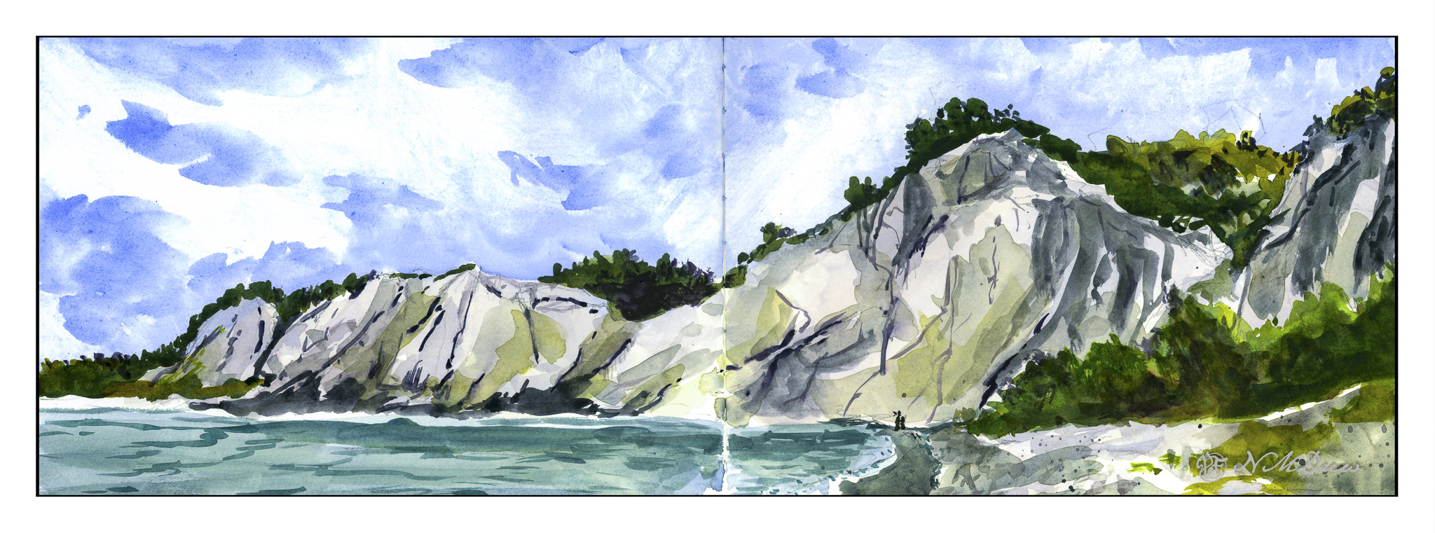
Scarborough Bluffs

More work on painting more directly in watercolor. It is becoming easier but it still presents a mental challenge. By nature – though experience shows otherwise – I think of watercolor as splashy and fast. Well, it is not! Patience is paying off as I am rather enjoying my latest forays into watercolors.

To enlarge, click on the image.

Once more, a panorama in my current sketchbook. This one is simpler, I think, than my previous one, so it did not take as long – about 90 minutes, including using the hair dryer to dry things off.

First, sketch in with pencil the entire drawing. From there, wet the sky, leaving edges for the cliffs and trees, though I really didn’t worry about the trees too much. I knew the trees would be using dark, thick paint. The bluffs, though, needed to be fairly free of color and water, though if you look at the far left, you can see a bit of sky color ended up in the bluffs.

Colors for the sky were essentially ultramarine and cobalt mixed together. I mixed a large area of wash and applied the color after wetting the paper. To create the clouds I blotted out a lot of color. This is always a fun and scary part of any painting!!

While waiting for the sky to dry a bit, I worked on the water, the shore, and the land mass on the right. The lowest tree mass, too, was done with a mixture of colors. I am not really satisfied with it, but it is okay and not too messy or overdone. Once these areas – sea and shore and shrubbery – dried I moved onto the bluffs themselves.

The bluffs will vary in color, depending on sky and time of day. I decided these should be bright as is the sky. Mixing up a light grey is a challenge, so I did a bit of cobalt, yellow ochre, and bit of what I think may be quinacridone rose. (Alizarin crimson would work, too.). I mixed together very small amounts of each and diluted it heavily. I used this to lay int he lighter areas of the bluffs, leaving some areas plain white paper. From there, darker shades, yellower shades, lines and fissures.

The final stages were details. Trees on the bluffs, some green along the right side shore, varying color in the water, shadowed areas in the bluffs, and splattered color on the lower right. Finally, a couple of figures to give scale – these bluffs are really tall!

Watercolor in sketchbook on 140# CP paper, about 8 x 18 inches.

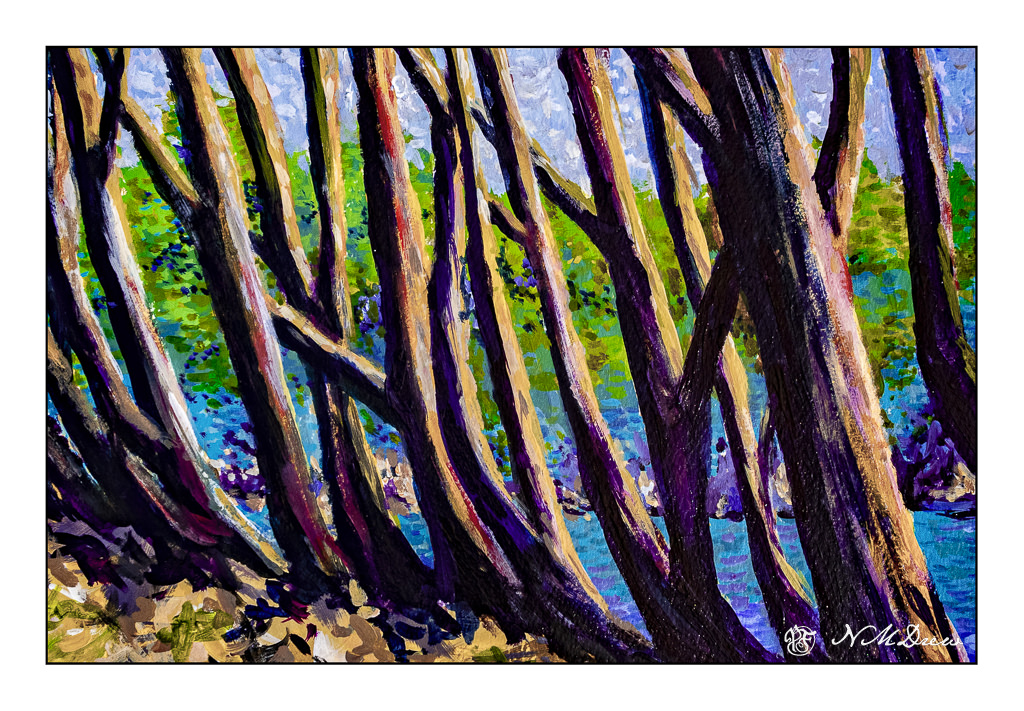
Through the Trees

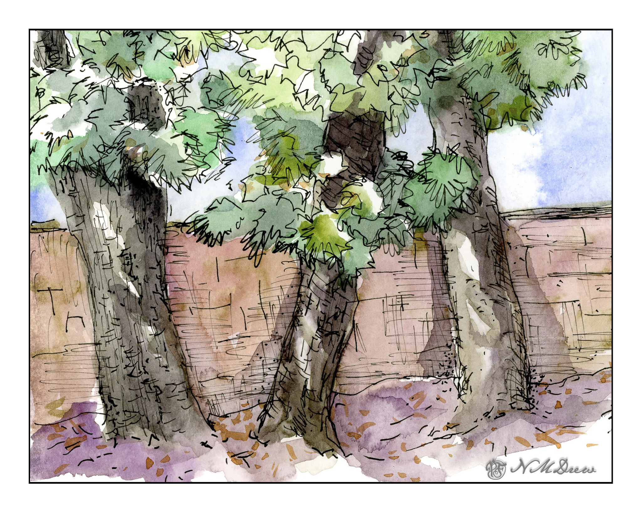
Another view of Lands End in the SF area – this time through the trunks of the cypress trees along the ridge line.

This was a day’s project using liquid acrylic paints on Strathmore 300 watercolor paper. Neither photographs or scans really did this painting justice as far as the colors go. That sometimes happens when there is purple in a painting it seems. I like the composition but not sure about the final colors. In real life it looks better. And, it may be, too, the acrylics just never quite sit well with me. Both acrylics and gouache tend to be a bit too bright for me. Maybe I’ll try it in oils.

Acrylic on Strathmore 300 watercolor paper; about 11×14.

Big Sur, Looking South

Big Sur along the California coast is an incredibly beautiful bit of the state – at once wildly beautiful, in many ways easily accessible along Hwy 1, but delicate, too, as it is easily destroyed by heavy rains creating mudslides. Parts of it are rugged with mountains rising up and coming down into the Pacific Ocean. Hwy 1 skirts along, and it is always best to be the passenger so you can enjoy the wonderful views.

From where I live, you drive north, past Santa Barbara and then veer off on the 101 in an area marked on the map as Las Cruces. You could continue up the 101 up to San Luis Obispo, cutting west toward Morro Bay and then along the coast. Before you get deep into Big Sur, the mountains are toward the east, and there is a coastal plain. Slowly the landscape changes as the flatter areas disappear and the mountains move ever closer.

The entire drive is a delight. Coastal fog may drift in and out, and no matter where you look, the beauty is breathtaking. I have tried to catch this in the distance and along the horizon. The Canson XL paper is nice to paint on, and I used Gamblin Galkyd gel to speed up the drying time, but it sat in the garage this past week so I could ignore it and look at life away from the studio. Getting some time away from a painting is always a good thing as eyes are fresh upon the return. I was pleased with what I saw, and so scanned it, and present it to you for your viewing.

Painted on 11×14 Canson XL Acrylic / Oil Paper, about 10×10.