Quick Capture

Yesterday I went to my portrait class with a rather meh attitude. I don’t really like doing portraits or painting people. The fact is, portraits are intimidating and scare me! I get frustrated if I cannot make my picture look like my subject matter. As far as other subjects, buildings and ocean waves get me, too, but they don’t have to be as precise as a person. I think the stylized art of different cultures as humans are depicted is often quite adequate for the job. Still, as I have progressed through doing pictures of people on paper, I am getting a bit out of the perfectionist rut. To me, the spirit of something is more important than accuracy.

I went to Pixabay to find something to draw that had people in it. I found an especially nice one and used two of the people in the picture as my subject matter. I spent about 90 minutes doing this sketch seen below.

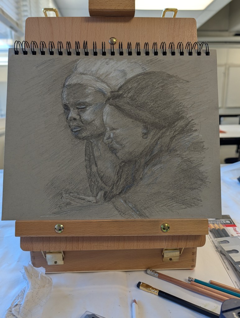
I used toned paper, a Blackwing pencil, a 6B, and whatever white pencils I had on hand – wax colored pencil, white charcoal (probably conte) and something else. Drawing freehand was what I did for the most part, but used my calipers for rough verification of proportions. It worked out fairly well.

Once the rough shapes were down and directional lines for the heads, the details of light and dark were added. Looking at the shapes of the light and dark are what give dimension to a picture of any subject as these give shape. Working through a drawing like this, I go from large areas of light / dark to smaller areas. This is when the subtleties work themselves into a picture.

In some ways I really limited myself – using a waxy white pencil and graphite is not a great combination as the white pencil could not be erased. So, a bit of pressure and a prayer – some areas worked out better than others.

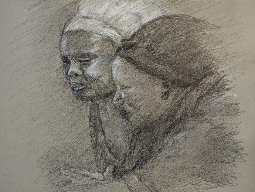
Above is the final result. I am fairly pleased with it. It worked out because I wasn’t stressed out about perfection and was feeling rather smug that my eyeballing things was verified by the proportional calipers no matter how sloppily used.

Toned paper, Blackwing pencil, 6B pencil, white colored pencil and white charcoal pencil, about 9×12 paper.

Foxglove & Milkweed

After all the stress of fire and fears of fire, no electricity, setting up a generator, yesterday was just a nice, normal, and pleasantly dull day. The usual daily chores got done, things were cleaned and straightened, the yard cleared of debris. My fig tree is also pruned and ready for its next crop – the first new tips are already pushing their way into the world and bulbs are sending up new growth. Little things like this make for a much better day.

I got to see all this, and then settle onto a patio chair just to look around. With wind and cold, being outside was not much fun, and certainly not a place to sit with pen and ink. With it gone, I could settle and sit, enjoying the warmth of the day. And draw . . . above is a sketch of my dead foxgloves – the leaves are dried and flopping over the edge of the pot, under and over each other, and into the milkweed plants.

A friend gave me a wonderful pen, a cheapie from Amazon. The ink is waterproof, and the tip is fine. The paper I am drawing upon has a bit of tooth, and the result, for me, is wonderful. When lines are drawn more quickly, the ink breaks up and gives texture. The pen point is sharp enough to deliver beautiful dots. In between, the lines are steady and solid. All together, a great drawing experience.

A few years ago, Josh and I spent a number of days in Decorah, Iowa, and there I found a lovely little stationary – art supply store. An inexpensive set of pan paints was available, and I have found it to be perfect for adding color to an ink drawing. The colors are intense but not overly so, and seem to be of a transparency many fine watercolors possess. I have been using it a lot for such pictures. The colors mix together well, and with a light touch with water and brush, these paints (with a bit of help from yours truly) work very well with delicate drawings.

Ink, pen, watercolor on multimedia paper. About 5 x 10 inches.

How Busy Can It Get?

No, I don’t mean life. I mean trees and piles of leaves and undergrowth – all the stuff that makes up a good fall scene! Some trees have dropped a bazillion tons of leaves and others are hanging on to them. Years of detritus build up on the ground, creating a fertile place for new growth, plant, fungal, insect, which in turn supports other life in the wilder world outside the super market.

Anyone who has taken a walk in the woods or tried to photograph or paint this jumble knows exactly what I mean – it is really a busy-ness of color and texture and shape.

This is my sketch, done with a fountain pen and some Carbon Ink by Platinum. The paper is a bit rough so it could be what caused some difficulties with the pen nib – or the pen itself is not the best – or both. I tried to convey light and dark and texture with different pen marks. Straight lines to show trees and texture and the shadows of the trees across the pathway. Contrast is suggested rather than emphasized as I wanted to use paint to give the sense of shadows and so on. With that in mind, I pulled a palette of my out-of-the-tube paints rather than pan paints, cleaned them up and went to work.

As you can see, light and dark are more emphasized with the use of color, as are the colors of the leaves and the complex shapes of trees on the left and undergrowth on the right. The leaves that have fallen have some variegation, depending on when they fell and how long they have been there. Green grasses and weeds peek through. There are a few rocks, too, and leaves on the pathway. Tree shadows fall across the trail and up onto the tree on the right. There is a brightness to the day despite the murk of the undergrowth.

After adding color, I waited for the picture to dry. I made some color adjustments. And then, back to the waterproof ink pens. This time I used Micron pens and my Uniball waterproof pens. Micron pens come in different nib widths (here 0.1, 0.2 and 0.5) and the Uniball is labelled as “fine” but in reality makes a darker, thicker mark than the Micron pens.

Overall, I am more pleased with today’s ink and wash sketch than the one I did yesterday of the plumeria. As usual, I did not do a preliminary pencil drawing but just worked from the end of the path and then moved back and forth to establish areas. I really like my tangled tree in the lower left and the shadows on the big tree on the right. The brightness of an autumn day is expressed. Now all I have to do is get to scuffling through those leaves and it will make my day.

Pen, ink, watercolor wash, on Strathmore Vision 140# CP paper, 9 x 12.

Trees in the Back Yard

For the past few weeks it is as if I fell down the rabbit hole – nothing made too much sense! The main thing was getting the walking boot off and getting used to being a bipedal organism after weeks of sitting around, walking here and there in the house or at the market, only taking minimal steps. It may sound weird, but for me, actually walking became an almost surreal experience. I am doing fine, too, but my mind and body had to coordinate it all once again. Jumping away from a moving car to save my skin was great, but spending 2 months recovering, and then some, from a badly bruised and messed up ankle is something else.

Doing nothing much sort of leads to a torpor and little desire to do much. I admit, I watched a ton of TV and movies, and played bits and pieces of music, but the motivation to do much of anything was very much missing. But now autumn is in the air, cooler days and cooler nights, light shifts and just that wonderful sense of change that comes with seasons – and being able to gad about – have me emerging.

Classes also help! A couple of painting classes, a ukulele class, and digging out my pen and watercolors have got me moving. Today, my ukulele class is at 5, so I decided to just sit out in the back of the house with pen and ink and pan paints and a waterbrush and sketchbook. As the season changes, leaves change color and drop.

This is my first sketch. We have a beautiful crepe myrtle tree with a rather vase-like base. Large branches spread out from the trunk like a V. It’s the prettiest of the local crepe myrtles, I think, because of this shape. Its flowers, too, are not the usual bright pink but a deep red violet. I decided to sketch with its flowers even though they are mostly gone. The leaves turn an orangish green with the end of summer. I made them greener. At the base of the tree is a small bush that has pink flowers in the spring.

These are podocarpus trees which line the back fence. They are ridiculously fat and poorly spaced – I am innocent! I didn’t do this! – and way too tall. I need to get them removed. They are really rather messy trees, and drop leaves year round as they are not deciduous. Despite these drawbacks, I really rather like drawing them as their trunks have an abundance of texture and the leaves seem to appear in clumps so that colors vary in shades of green depending on the light.

And there we are! I think I am beginning to feel like my life is returning to normal, and for the past year it really has been odd. Breaking and injuring my bones seems to be this year’s theme, so let’s hope it is not going to become a tradition. I would rather spend my time rambling around outdoors, enjoying what there is!

Later . . .