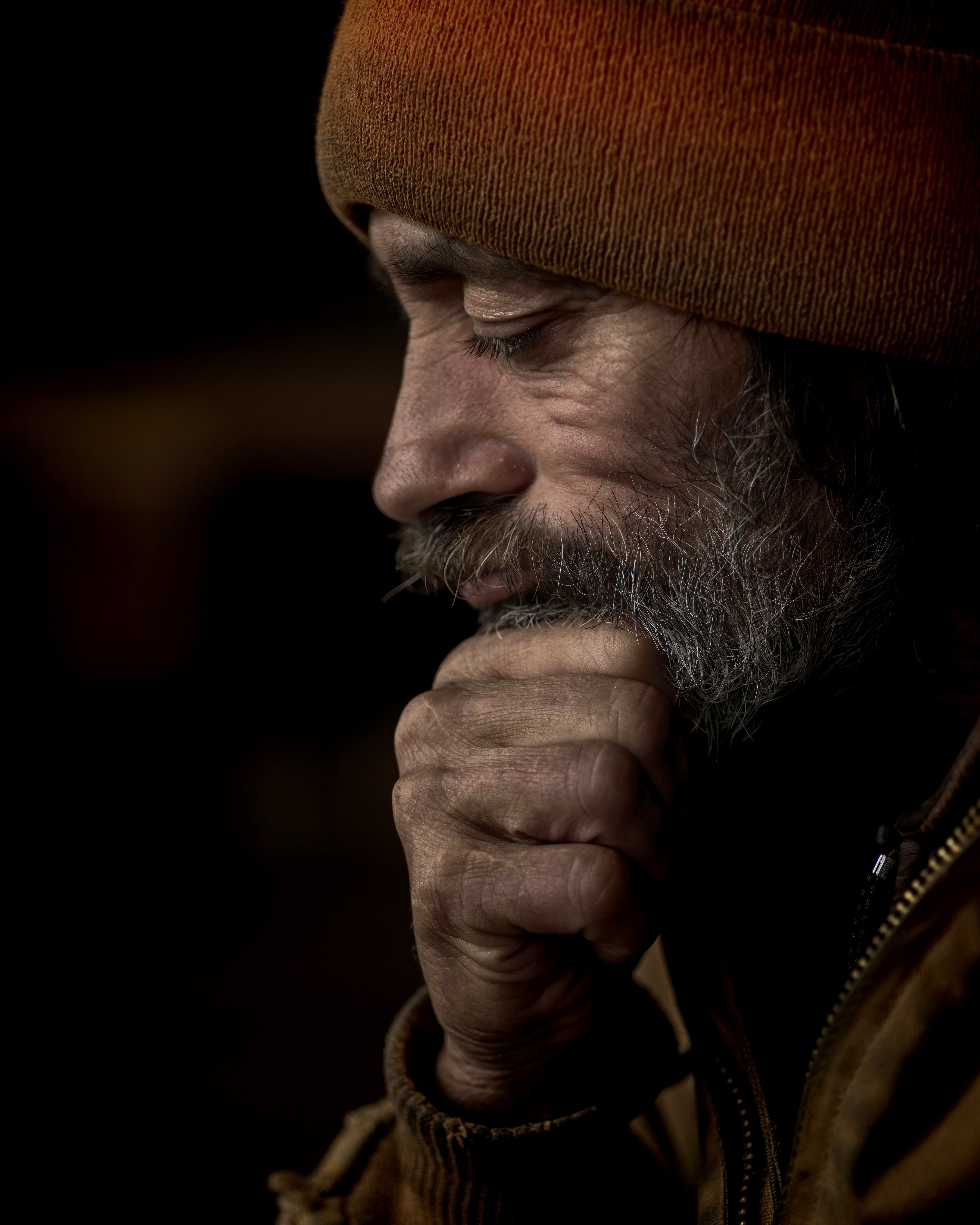
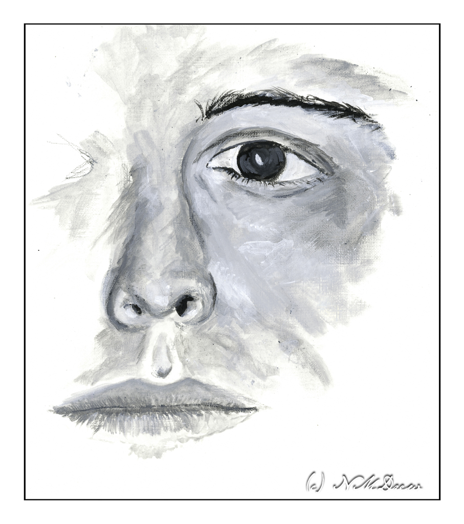
For the past 5 weeks I have been attending a gouache class. It has been one of the most fun and creative classes I have taken. Painting all of a sudden took on the element of play. My tight-ass self was so happy to untight-ass! I totally believe in play and we all, old and young and in between, benefit from that wildly creative and unrestrictive garden of no rules (well, within reason!)
As I mentioned before, my teacher worked for Disney and Warner in animation. 40+ years of experience brings knowledge of techniques and tricks. 5 weeks was short but in the fall there will be an 8 week class, and I will be there. Because of her background in animation, her knowledge of technique is very different than many online teachers and it is based on practical experience. She takes this knowledge and applies it in a clear and creative way. Though we got “samples” to copy from, there was never a “do it this way” but rather a “use your skills to figure out how to do this” as well as applying new skills.
First off, some of the samples we got to work with were clearly identified, and others I have forgotten. If you are an artist whose work we used, let me know if you see your work here.
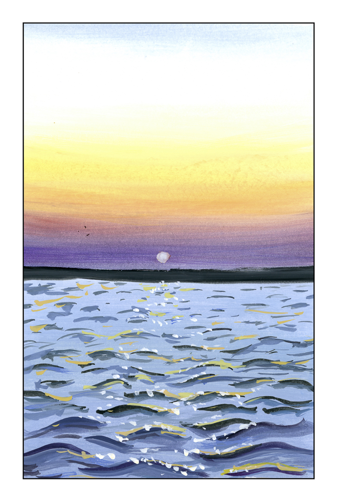
This exercise was assigned to the class to learn how to do color gradations. Jess Chung, on You Tube, had a study to which we linked and followed along as homework. It was easy and not easy – gradations can be difficult in gouache. What really worked for me was doing the waves. That was an eye-opener. Her video is below.
From this tutorial we moved on to Mary Blair, a famous Disney animation artist who rose to a prominent position because of her creative prowess in a time when most (if not all) animators were men. If you are familiar with “It’s a Small World” at Disneyland in Anaheim, CA, or from the 1964 World’s Fair in NYC, you will be familiar with her work.
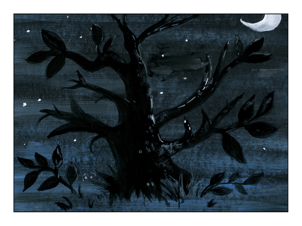
The above tree is done on black paper and is derived, I think, from some of Blair’s sketches for the animated film “Alice in Wonderland” by Disney. We did the tree, but the Cheshire Cat was in the picture as well as Alice.
To get the blue-white streak, we mixed blue and white together, very dry, and brushed it all across the black paper upon which we painted. From there, the tree was painted in, over the blue-white streaks (yep, black on black!). Gouache’s opacity worked very well here, as you can see. Then the moon and highlights were added. It makes for a wonderfully mysterious scene.
When I first saw the picture I was thinking “how am I going to paint the blue and white around the tree shape?” This is negative painting and it would be hard. The solution of painting over the colored paint was an eye-opening bit of information and technique.
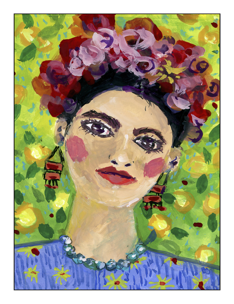
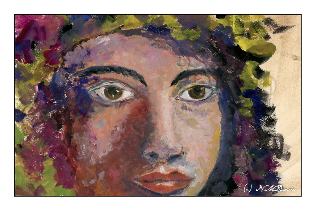
From Blair we moved on to Frida Kahlo, the Mexican artist who always surprises with her intense colors, rather primitive and surrealistic paintings. Our samples were, I think, derived from people who did Kahlo’s portrait in gouache. Kahlo did not work much – if at all – in gouache, but instead preferred oils. The simple and colorful style of the samples involved utilizing different techniques we learned as well as letting our inner child out to play with colors and non-realistic portraiture. The patterns and colors were fun to do.
And our final artist for inspiration were the paper cutouts by Henri Matisse. Most of us are familiar with his work, so I will not go into details here.
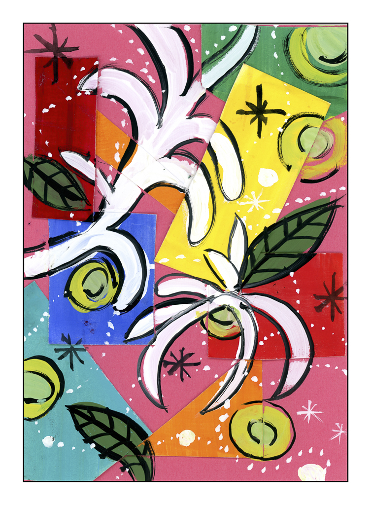
For this project, we painted shapes, such as rectangles and squares, in gouache and then cut them out. From there, we mounted them on a colored piece of paper using glue. I am not sure if we were supposed to do it all on paper painted in gouache – such as leaf shapes – and then cut and paste to the paper and underlying bits already glued on. I just used thick gouache and painted on the white shapes, leaves, circles, dots, and stars in various gouache colors and black and white gouache.
Playtime and different perspective – it was by far a fun, fun class! I wonder what I will do with what that class gave me.