Quick Capture

Yesterday I went to my portrait class with a rather meh attitude. I don’t really like doing portraits or painting people. The fact is, portraits are intimidating and scare me! I get frustrated if I cannot make my picture look like my subject matter. As far as other subjects, buildings and ocean waves get me, too, but they don’t have to be as precise as a person. I think the stylized art of different cultures as humans are depicted is often quite adequate for the job. Still, as I have progressed through doing pictures of people on paper, I am getting a bit out of the perfectionist rut. To me, the spirit of something is more important than accuracy.

I went to Pixabay to find something to draw that had people in it. I found an especially nice one and used two of the people in the picture as my subject matter. I spent about 90 minutes doing this sketch seen below.
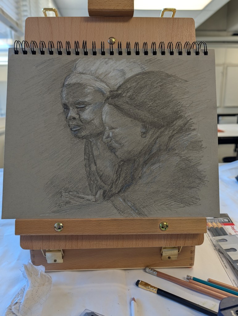
I used toned paper, a Blackwing pencil, a 6B, and whatever white pencils I had on hand – wax colored pencil, white charcoal (probably conte) and something else. Drawing freehand was what I did for the most part, but used my calipers for rough verification of proportions. It worked out fairly well.

Once the rough shapes were down and directional lines for the heads, the details of light and dark were added. Looking at the shapes of the light and dark are what give dimension to a picture of any subject as these give shape. Working through a drawing like this, I go from large areas of light / dark to smaller areas. This is when the subtleties work themselves into a picture.

In some ways I really limited myself – using a waxy white pencil and graphite is not a great combination as the white pencil could not be erased. So, a bit of pressure and a prayer – some areas worked out better than others.
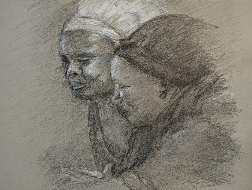
Above is the final result. I am fairly pleased with it. It worked out because I wasn’t stressed out about perfection and was feeling rather smug that my eyeballing things was verified by the proportional calipers no matter how sloppily used.

Toned paper, Blackwing pencil, 6B pencil, white colored pencil and white charcoal pencil, about 9×12 paper.
The Happiness of Trees

Trees always make me happy, and it makes me sad if I have to remove them for any reason. In particular, I like oak trees, and where I live, it is against the law to cut any oak tree down without permission. California is dotted with beautiful oak trees across the hills; from a distance, I always think that this is what a herd of buffaloes must have looked like in the 1800s as they grazed across the prairies. (Technically, the American buffalo is a bison.)

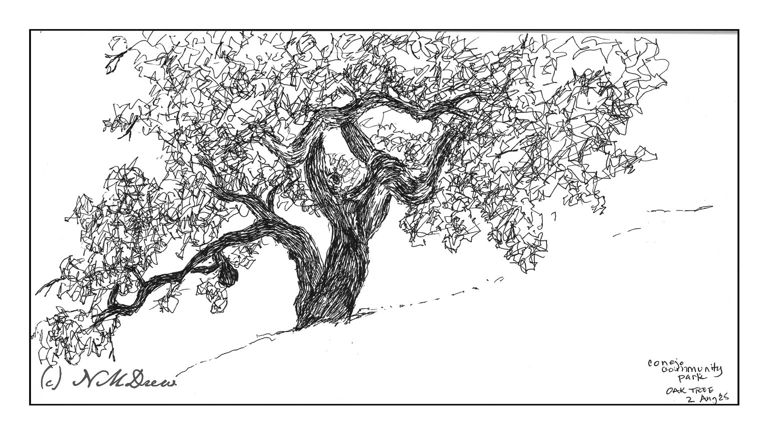
Mid-morning I headed out to a local park next to the botanical garden. The park is on a gentle slope upon which are several grand oaks. Many are supported by metal tubing as their branches can sprawl far from the trunk, often breaking and falling from the stress.

My goal this morning was to simply get out and sketch plein air. Rummaging through my stash of sketchbooks and paper, I found a 6×12 spiral-bound Pentalic watercolor journal, unused. Perfect for landscapes! And for the broad sprawl of the oak tree.

I think I did a decent job here!

Pen, waterproof ink, 6×12.

How Busy Can It Get?

No, I don’t mean life. I mean trees and piles of leaves and undergrowth – all the stuff that makes up a good fall scene! Some trees have dropped a bazillion tons of leaves and others are hanging on to them. Years of detritus build up on the ground, creating a fertile place for new growth, plant, fungal, insect, which in turn supports other life in the wilder world outside the super market.

Anyone who has taken a walk in the woods or tried to photograph or paint this jumble knows exactly what I mean – it is really a busy-ness of color and texture and shape.

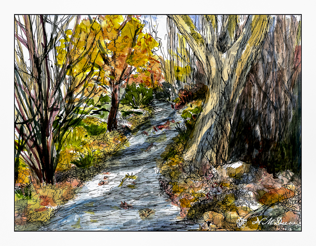
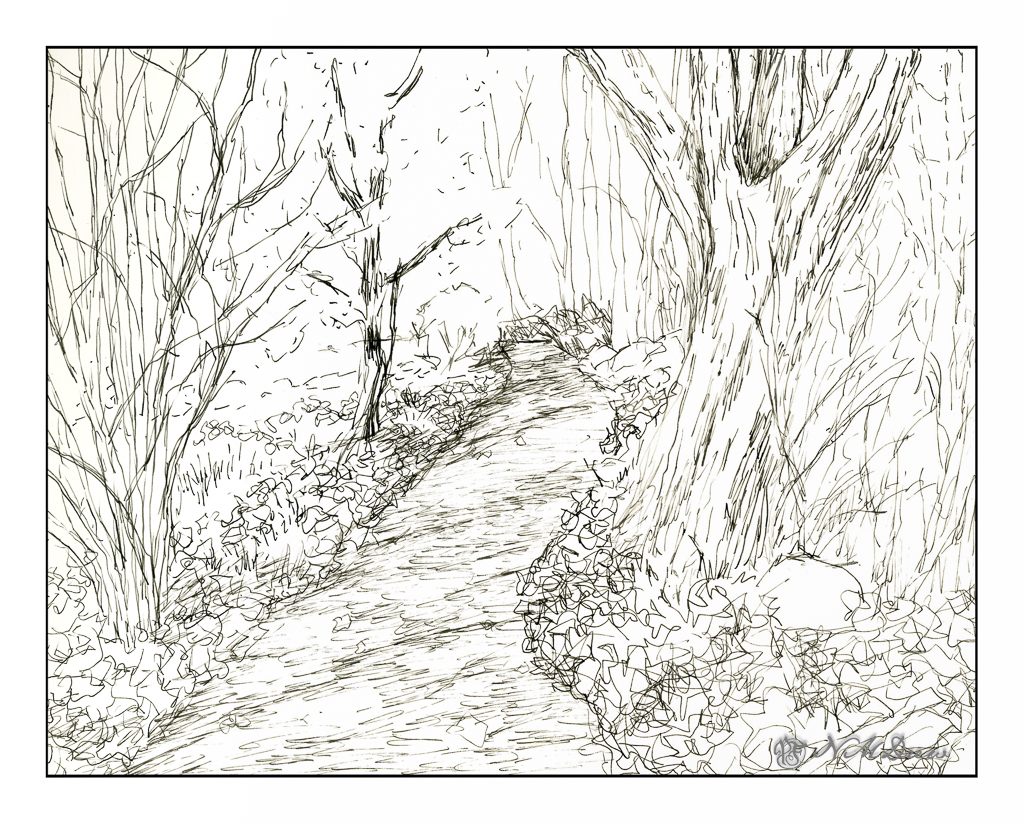
This is my sketch, done with a fountain pen and some Carbon Ink by Platinum. The paper is a bit rough so it could be what caused some difficulties with the pen nib – or the pen itself is not the best – or both. I tried to convey light and dark and texture with different pen marks. Straight lines to show trees and texture and the shadows of the trees across the pathway. Contrast is suggested rather than emphasized as I wanted to use paint to give the sense of shadows and so on. With that in mind, I pulled a palette of my out-of-the-tube paints rather than pan paints, cleaned them up and went to work.

As you can see, light and dark are more emphasized with the use of color, as are the colors of the leaves and the complex shapes of trees on the left and undergrowth on the right. The leaves that have fallen have some variegation, depending on when they fell and how long they have been there. Green grasses and weeds peek through. There are a few rocks, too, and leaves on the pathway. Tree shadows fall across the trail and up onto the tree on the right. There is a brightness to the day despite the murk of the undergrowth.

After adding color, I waited for the picture to dry. I made some color adjustments. And then, back to the waterproof ink pens. This time I used Micron pens and my Uniball waterproof pens. Micron pens come in different nib widths (here 0.1, 0.2 and 0.5) and the Uniball is labelled as “fine” but in reality makes a darker, thicker mark than the Micron pens.

Overall, I am more pleased with today’s ink and wash sketch than the one I did yesterday of the plumeria. As usual, I did not do a preliminary pencil drawing but just worked from the end of the path and then moved back and forth to establish areas. I really like my tangled tree in the lower left and the shadows on the big tree on the right. The brightness of an autumn day is expressed. Now all I have to do is get to scuffling through those leaves and it will make my day.

Pen, ink, watercolor wash, on Strathmore Vision 140# CP paper, 9 x 12.

Play with Oil Pastels

Ages ago when people thought the world was flat, I tried out oil pastels. I hated them. Messy, unresponsive, and just unpleasant to work with. I threw them away. 

Ignorance, though, and a lack of the internet, can make art materials mysterious and frustrating. Today, now that the world is round, YouTube and other media outlets show me what can potentially be done with oil pastels. Choices of paper, solvents, blending methods, brands and qualities of the oil pastels themselves has changed considerably. I bought some – Caran D’Ache, Sennelier, and Mungyo. I also bought some PastelMat paper and board, and I also have different papers here at home to try. And YouTube and oil pastel artists on Instagram.

‘Tis tangerine and mandarin season, so here we go with some locally grown. I used the Caran d’Ache as underpainting after outlining with a graphite pencil. The pencil blurred and created a bit of a fuss. To get the colors blended, I used tortillons and mineral oil, gentle touches and pressure. All play. I was rather pleased with them.

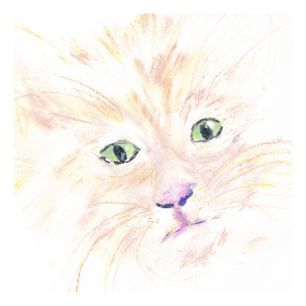
Then I decided to see how it would be to work with a very pale subject, namely a pale white and beige tiger cat. The green eyes are a combination of white, green, and blue, blurred together with a tortillon. The sharp edge of a black pastel crayon made the dark eye and nose lines, and even some colored pencil at the end to provide further sharpness in detail. Eye highlights were sort of a gamble with the white pastel – which one to use, softer, harder? And placement, too. The cat’s white whiskers wouldn’t show up no matter what I did, so I opted for a beige-y color and then some white over the lines.

Neither of these is spectacular – the poor cat is suffering a lopsided face – but the point was to play with the colors and work with blending. I did use some mineral oil on the tangerines, but everything dissolved into a gooey mess, so after the first scan, I scanned no more.

Now, on to my knitting! The acrylic painting is still vegging and that is fine for now.

Art with a Broken Arm

I signed up for two art classes at the local adult school, one in acrylic painting and one in Chinese calligraphy. The acrylic painting class I have to drop simply because I cannot carry an easel, paints, paper, and all the other supplies with me, but I can do the Chinese calligraphy class because the teacher supplies all the stuff and there’s very little that I need to bring to class! That’s great.

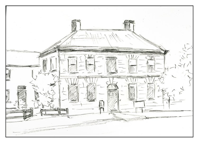
Consequently I thought, well, what can I do? I decided to try an online course in drawing buildings and learning from an architect of many years experience. I think this is going to be a really good lesson or group of lessons as I have never been good at drawing buildings and only through a lot of effort and learning about proportions and relationships have I been able to draw this one which is the preliminary drawing prior to any classes at all.

If I say so myself, I did a pretty good job on it and I am looking forward to seeing my progress in the future. There are a lot of tricks that I’m going to learn in this and I will be posting them perhaps as I go along.

And the class begins in 20 minutes!