Wood & Wetland

I have been spending the better part of the day watching the videos in a class in which I have enrolled before starting any of the projects. There are a lot of short videos in it pointing out this and that, but sitting still to watch the longer ones makes me restless. I need something to do with my hands rather than just sit on my butt! Knitting is out as I have a few projects at a point which need some focus, but oil pastels did the trick. I can draw / paint and watch at the same time. I may not get all of the video, but I do get a lot of it – just as I am now as I write this post.

I picked up a few brands of oil pastels and a 6-pack each of soft white and greys. These include Sennelier, Mungyo, and Caran d’Ache. The white and grey pack are labeled “Anders” I think. I also have been playing on various papers, but decided to check out the Sennelier oil pastel paper. It seems to do a pretty good job despite all the rubbing in of layers of pastels.

Oil pastels, at this point, are more like playing with crayons for me. I blur the colors using my fingers and tortillons. Harder oil pastels make up the underlayers with the softer, oilier ones going on top. This adheres to the adage of “fat over lean” in oil painting, so it makes sense that it would apply to the oil pastels as well.

Oil pastel on Sennelier paper; about 5×7 finished. Scanned on Epson V600.
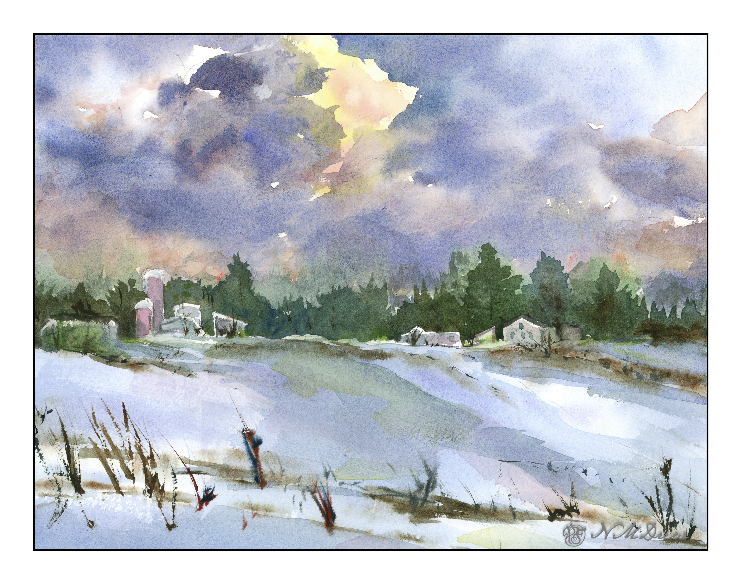
Winter Farm on Christmas Eve

Now to the northern part of the continent . . . somewhere in North America for winter on the a prairie farm, snow covering field stubble, early evening or morning. Cold, desolate, and heartbreakingly beautiful.

I spent the morning painting this on rough 300# natural white Kilimanjaro. I did it in stages. The sketch was light, with suggestions of shapes. Then the sky was wet and yellow, quin gold, and permanent alizarin crimson used to create the rosy golds. Once down, cobalt blue and ultramarine were placed to simulate sky being careful not to merge into the rose gold of the central cloud. As the sky dried, purple and alizarin were mixed with ultramarine to create the darker clouds. 

After the clouds were laid in, I did the dark trees, blurring some green into the still damp sky, as well as waiting for the sky and soft trees to dry. This was done to create the hard edges needed for the buildings against the tree line. The buildings themselves were left white as the trees dried.

From there, the snowy field was laid in with cobalt and ultramarine in a very light wash and using a 2″ soft brush. Again, drying. At one point, the 2″ brush was dried and dipped into lightly damp burnt umber and applied to make the streaks of brown for field stubble near and far. Then the buildings were done, and once the snow dried, more thin washes as glazes applied to the foreground snow, culminating in a streak of quin gold and then permanent alizarin to the middle of the painting, hoping to show a sense of light reflected in the still dark snow from the breaking clouds above.

After that, details such as dried grasses, windows, tree trunks and whatever were added as deemed necessary.

I am pleased with this painting quite a bit! It achieves what I set out to do – a winter scene, snow, clouds, and patience to wait and think about a painting before just diving in with brush and color. The 300# rough Kilimanjaro is 11×14 and a wonderful paper to paint on. More is needed in the future for sure.

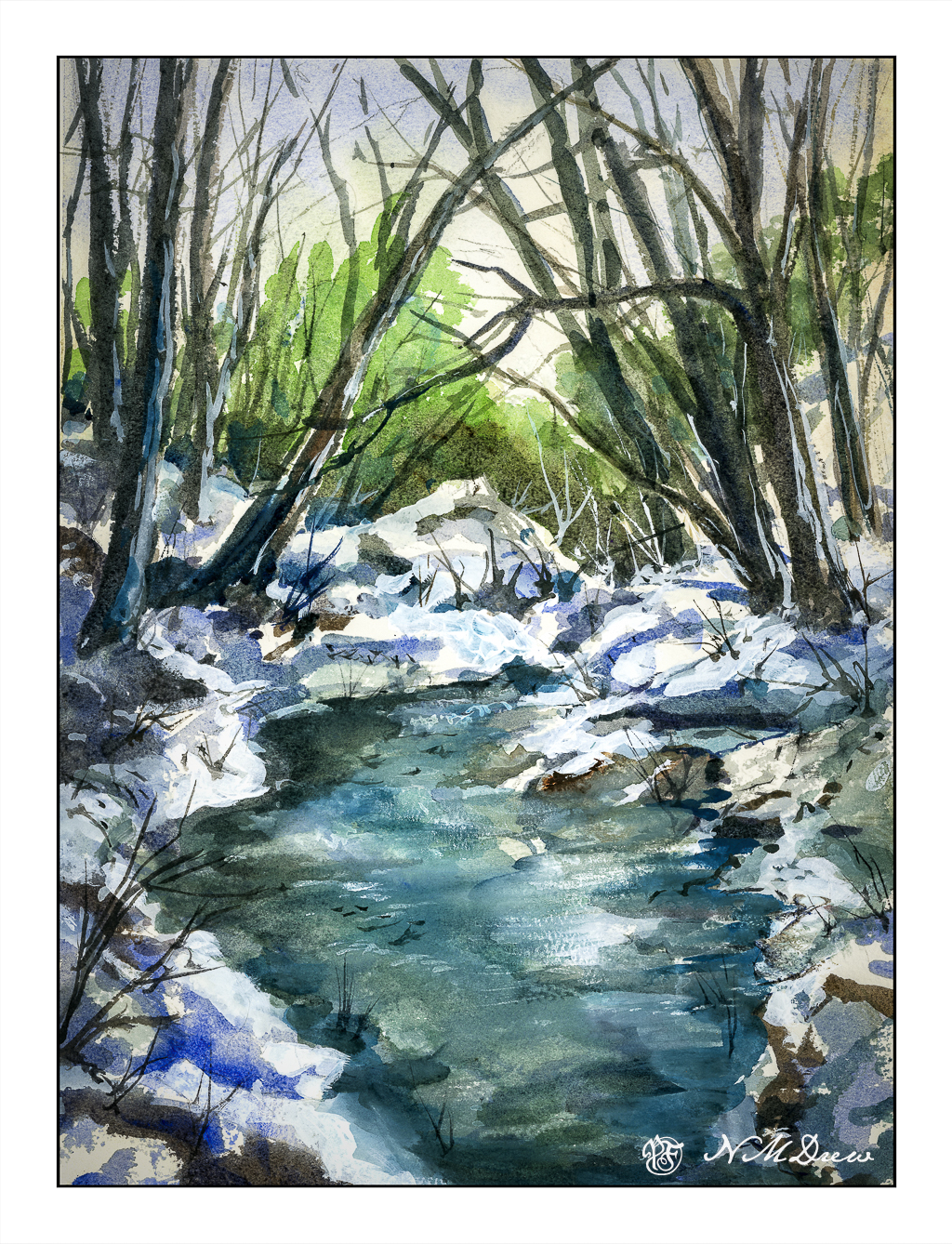
A Winter’s Creek

We have had rain – yay! – and thunderstorms, and threats of tornadoes (which never came) – and puddles of water, and a back yard lake. More to come, perhaps, but gentle and warmer, with a promise of a relatively sunny Christmas. I love the briskness this weather brings, but am also very happy not to have to shovel snow or drive in it. In fact, I was flying through water at intersections the other day, but luckily I am in an area without low lying ground which floods, unlike other areas of the county where people woke up to flooded bedrooms.

So, winter! Winter solstice is come and gone, and in many ways I wish we marked it more with bonfires and merriment, as in the olden days. I paint winter, partly from photos, partly from memory and imagination. 

Probably most of my memories come from upstate New York. No place that I have visited does winter quite like the mixed hardwood and pine forests. Bright green, dark green, barren branches, tall trees. Skies can be sunny and fierce, dull and overcast, and everything in between. Water, whether lake or stream, takes on its own life when frozen, thawed or in between. It still amazes me that fish swim under the ice and amphibians bury themselves in the mud until spring comes.

Happy Solstice!

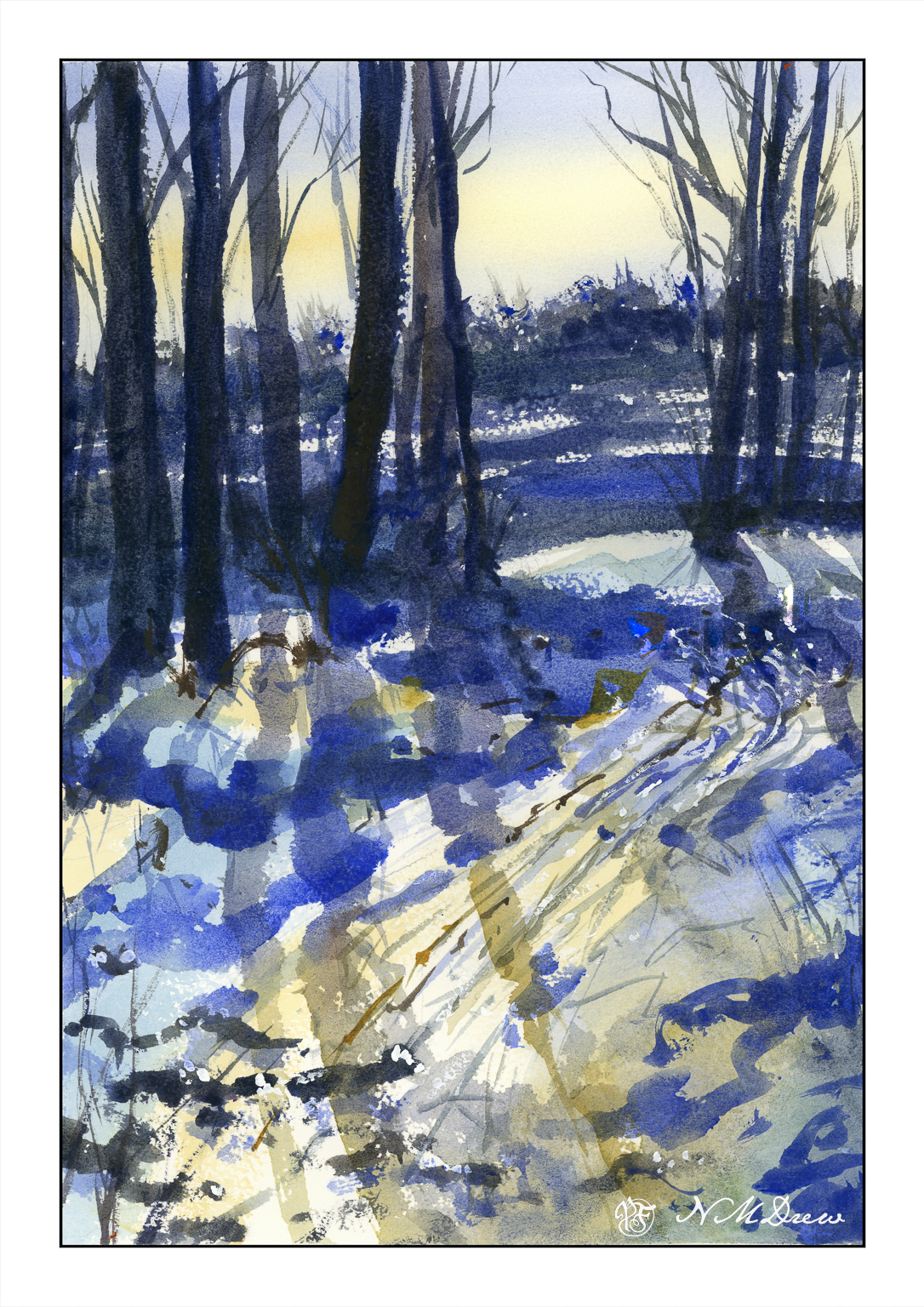
A Late Winter Afternoon

When I lived in upstate New York, the winters were marvelous! Hardwood forests and pine trees all worked together to create a magical land of light and shadow, rolling snow banks, and winter streams frozen and thawed and frozen again. The skies, too, were amazing in their coldness of light that could reflect so brilliantly on the snowy landscape.

As an adult, snow as a place to live, work, and travel in no longer holds much allure – great to visit, but don’t ask me to wade through it, chisel ice off my windshield, or shovel it just to get out of my house. Still, the memories of those magical winter days in deep winter always hold a spot in my heart for their crisp and intense beauty.

10×14″ Arches Rough, watercolor limited palette of umbers, quin gold, ultramarine blue, and a touch of titanium white gouache.

Sunflower Field

Yesterday I posted some of my paintings and a master copy of Khan’s Ground Fog to practice using large, simplified swaths of color to create abstractions of landscapes.

I like abstraction and simplification of things in paintings, but pure abstraction seldom attracts me. Recognition of whatever a painting is trying to depict seems to be essential for me to want to look at a painting, but as I study colorism / colorfield / abstract expressionism more, I find that sometimes pure color by itself can be enticing. I used to detest Rothko’s work, but now I am finding it quite entrancing as I appreciate the subtle qualities of color, and colors adjacent to one another, a lot more.

With this in mind, along with observing the work of Wolf Kahn, Richard Mayhew, Hashim Akib, and Andrew Faulkner, I painted this field of sunflowers.

I started out with big color fields for the sky, trees, and sunflower field using the basic colors of blue (sky), dark green (trees), and yellow and green (sunflower field). From there, I really worked to keep the foreground simple enough as the treeline, mountains, and sky do not beg for detail.

Initially I wanted to paint dots to represent the center of the sunflowers, but in the mindset of color planes, I didn’t. It paid off, but I was still not happy with how the sunflowers and foreground areas looked. Thus, some dabs – but bigger ones, brush strokes instead of dabs to be more accurate. Negative painting, too, and straight lines to represent the sunflower stalks. The buildings and poles were added at the end to add interest to a very horizontally oriented painting.

I am quite pleased with this painting. Goals were accomplished and my own style emerged here. I also did a lot of thinking about colors, how to paint a straight telephone pole (put a card down and run the paint brush along the edge), atmospheric perspective. Simplifying was difficult, but the broad swaths of color with variations within worked. In short, I have a bit of an abstract landscape in which the subject matter is recognizable, but not realistic. If I want a photographic rendition of something, I’ll just take a picture with my camera!