Lavender #3 – Final (For Now?)

For the last 2 or so weeks it has been appointments and appointments and ordering this or that and consolidating little things and I am so sick of it I could scream!! My lavender painting has been sitting on my easel, I see it every day, and at last I have found time to work on the painting. Finally. Oh, finally! Something fun to do.

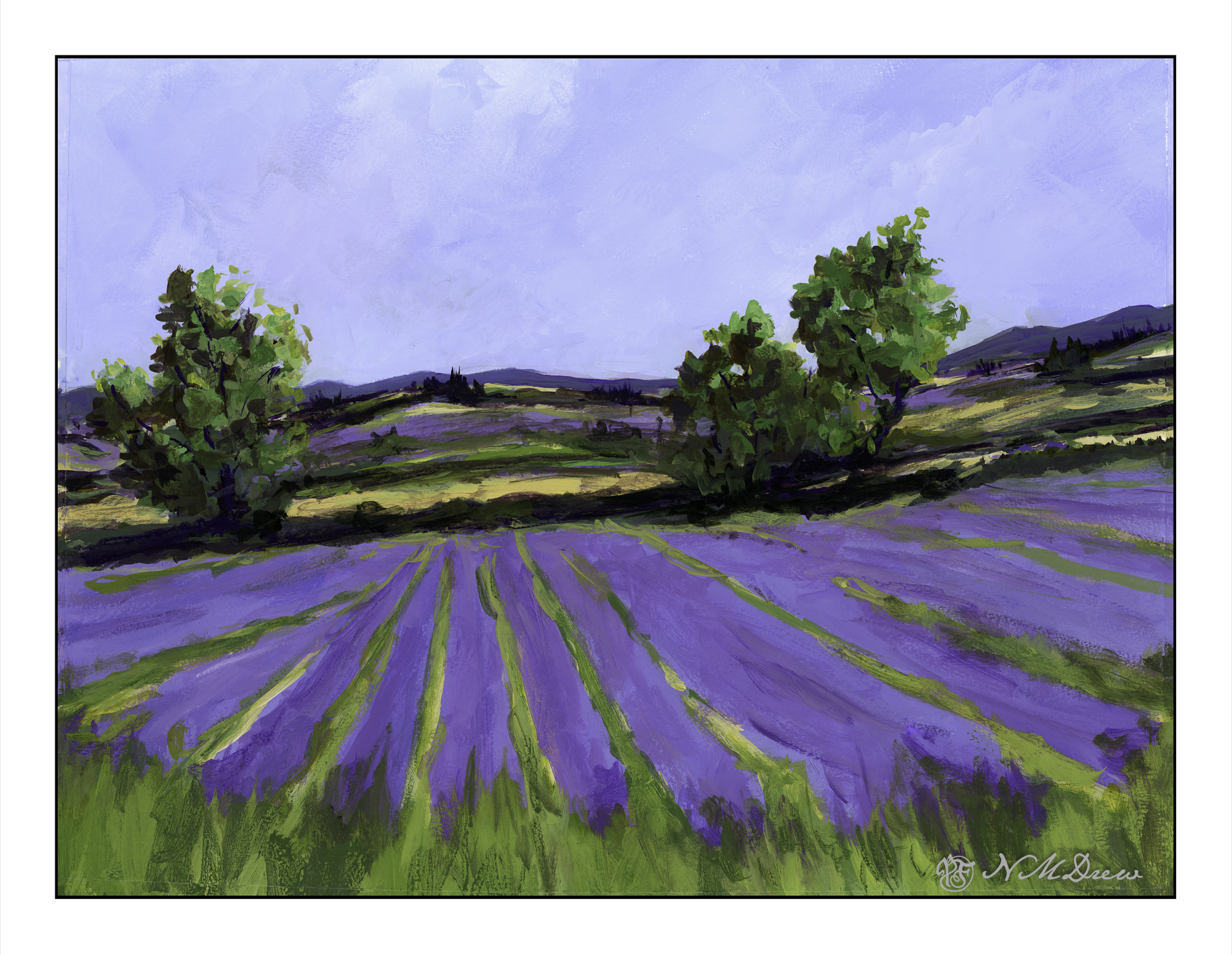
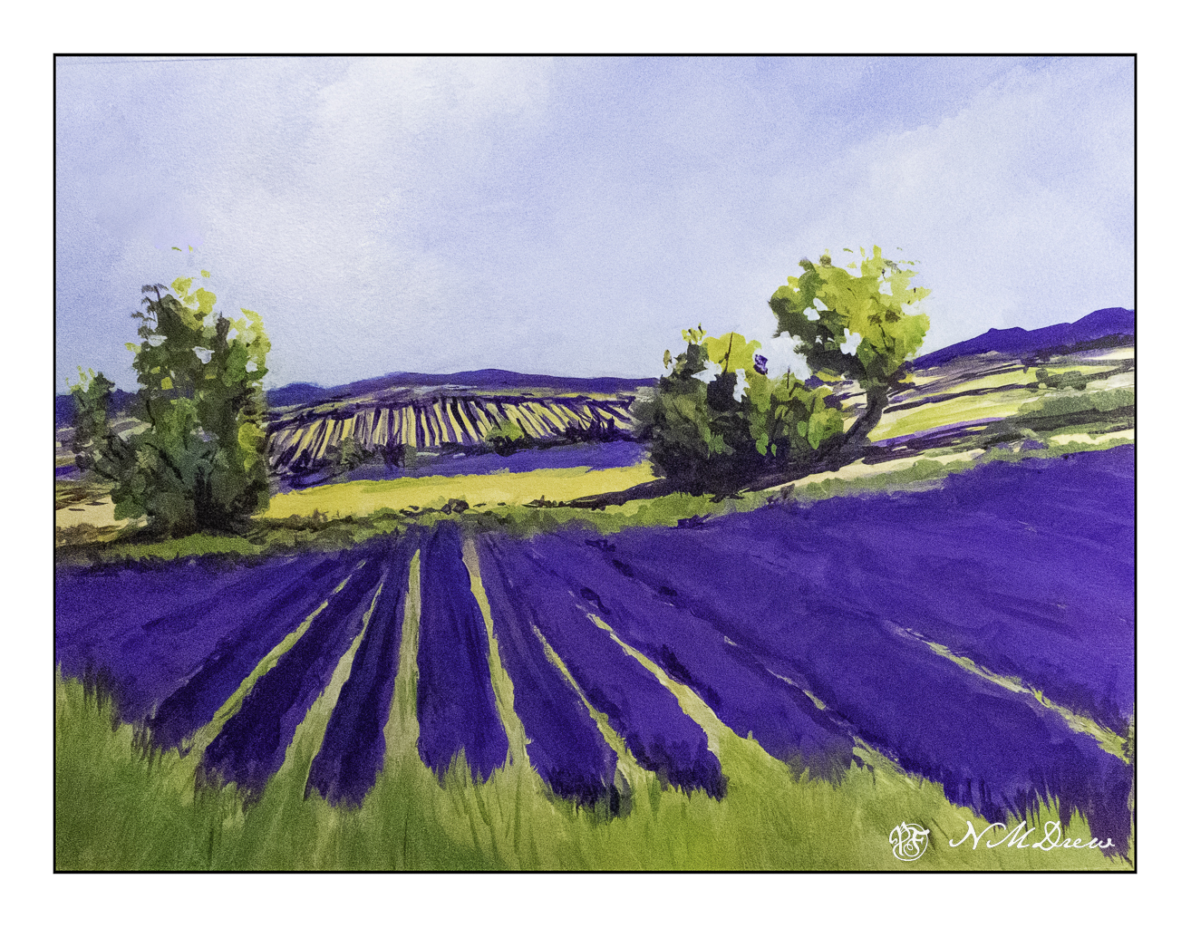
I wanted to accomplish a few things with this painting. One was simpler, more blended brushwork throughout. I wanted to grey out the distant colors a bit for a sense of atmospheric perspective. The trees, too, need to be cleaned up a bit. I think the pale field before the second level of lavender could indent a bit more on both sides of the left hand tree. I won’t say this is a masterpiece, but it has a bit more a painterly quality in it, has a decent sense of depth, colors aren’t too overwhelming.

This is painted in Golden Fluid Acrylics. A Sta-Wet palette doesn’t keep the paints wet as they are so fluid – the heavy body acrylics work well with the Sta-Wet because they are thicker. This means working a bit differently and I have found I like them best when they are a bit dryer – great for dry brush. Too much water in the paint – or in the brush – and they can drip down on completed paintwork, or form a rather interesting craquelure.

I have been putzing on this painting for quite some time, so here is a series showing its evolution – earliest paint

15×20, Langston watercolor paper, Golden Fluid Acrylics.

More Rocks – A Rocky Shore

It is always good to break up your routine. I have been sewing a lot over the last few days, and I am now ready for a change. I am also contemplating modifications to what I was making, namely pockets for a kit car. While I contemplate that, other things prevail! Today, I did all those fun things you have to do – specifically, clean house. A friend is coming in from overseas tomorrow, and I have no idea if he will be coming to visit, so I figured I better get it done. Who wants to welcome a guest to a dusty, dirty mess?

But messes are not really interesting to me. Color is.

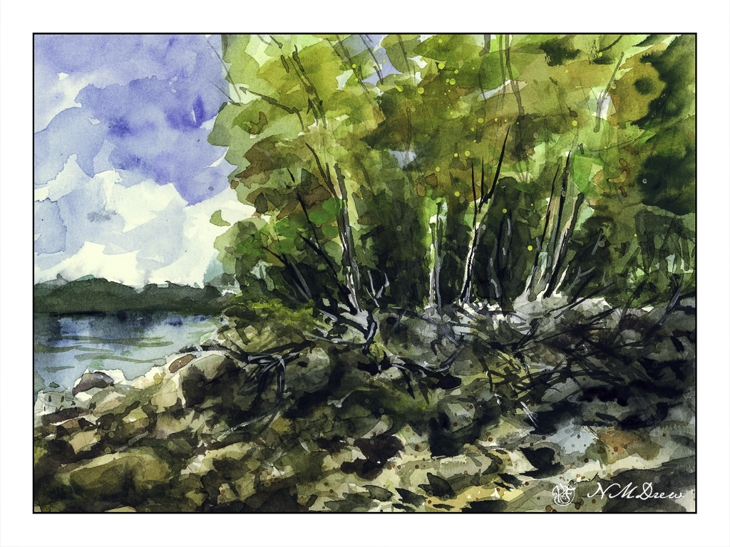
So, back to the rocks in a quick sketchbook painting. In the US and elsewhere, some lake shores are not covered with soft sand, but are home to boulders and rocks at the edge of a forest. Trees fall and die, water freezes and thaws, snow and ice and heat and sun all wreak havoc as storms of all sorts come and go. I love the wildness of these places and their lack of order and tidiness imposed by civilization.

Today I wanted to express rocks in a more abstract manner – suggesting boulders and rocks. Fallen trees, too, and the edge of the summer as it moves into autumn. I splashed on some light washes in the trees and on the shoreline after doing the sky, and from there worked with negative painting to create the rocks and boulders.

I rather like the rocks, but in general, the painting is nothing much – I just like to paint some sort of picture when I am practicing things.

Cliffs

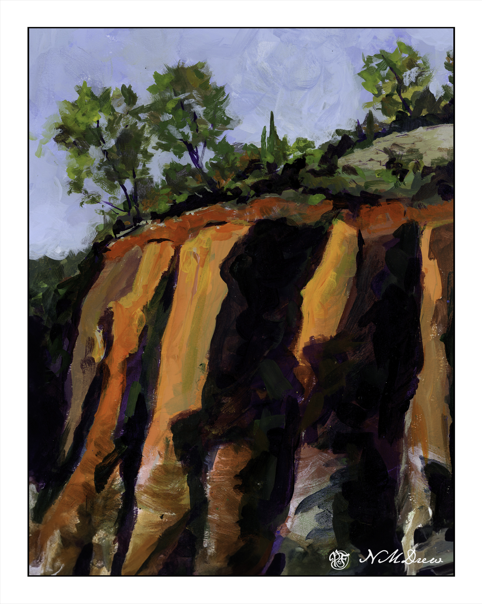
There is nothing so dramatic as a sea and cliffs, sometimes a sandy shore – but rugged rocks and trees clinging on for dear life always catch my eye. Northern California has its share, as do Oregon and Washington. All over the world such drama is there for our pleasure and to keep us humble.

My approach, thanks to having a sketchbook – my lovely sketchbook! – is becoming more deliberate and more patient. I am working with larger planes of color, going for the grand before homing in on the detail. I also wanted strong contrast of sun and shadow. Simplicity. Clarity. Less is more, etc. As well, warm and cool.

I am honestly very pleased with how this painting turned out. I think I will leave it at that!

More Podocarpus Trees

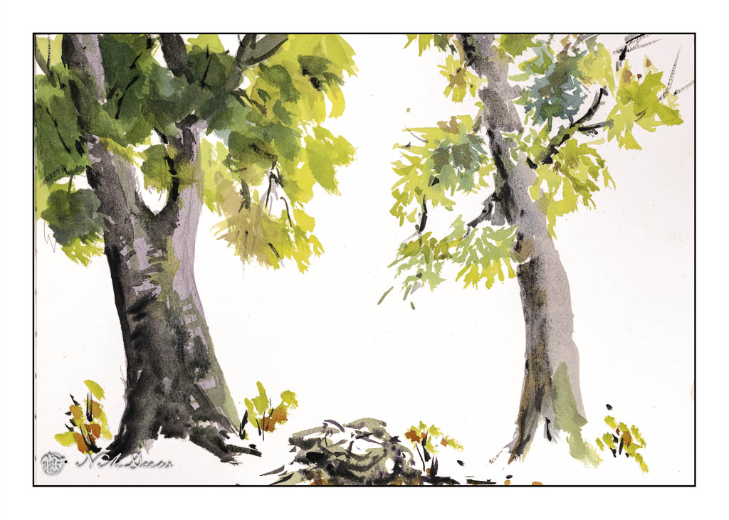
I am trying out different ways to paint plein air in my back yard, which is nothing of any beauty being just dirt and podocarpus trees (also called plum pines). It is going to cost an arm and a leg and a first born child to get it done the way I want, but such is life. In the meantime, use it to my advantage – like lots of container plants!

Anyway, I set up a plein air easel on a tripod I just bought for $20.00 and it did a good job. I clipped my large sketch book to the easel and put a lightweight travel watercolor palette on it. I sat on my travel stool. These details are for a future post.

I painted one podocarpus tree with outlines and more traditional ways of applying color in layers; that is the one on the left. The one on the right is direct watercolor. In the middle is a stump in direct watercolor and a few sketchy little camphor tree shoots from the root system still in the dirt.

I painted both trees to practice both ways of painting as well as to check out the plein air set up. With the tripod low to the ground, I could put water and such on the ground next to me. The plein air palette and sketchbook were propped up on the easel attached to the camera tripod. I sat on my stool. Everything was fairly comfortable, within reach and easy to get. The height was good. I think I might not want to sit down for a long time while painting, but it is something I want to experience.

So, though the painting subject is podocarpus trees, the real focus for painting was the plein air set up. It worked pretty good. I have another easel to use, and I think I am beginning to get a nice set up for my future career as an old lady painter in the countryside or patio, depending . . . .

Boring Waterproof Ink

I had hoped to have a nice dark ink on this paper, using a fountain pen filled with waterproof ink. The ink is waterproof, but it is so pale I fell asleep. If you are going to do a line drawing and then color it in, you need to have a dark ink. The ink was definitely waterproof, but so what if I don’t like the result?

I also used my cellulose paper sketchbook for this, and once more I am not happy. All these blobs of unabsorbed color and a few more than many times using the hair dryer.

Maybe I am not being realistic about the paper, but I am realistic about the point of this study – is the ink waterproof? And that answer is yes. Goal met.