Sparkly Day

The way the light shimmers through leaves on a bright day is something so difficult to capture in a photograph or a painting. The contrasts between light and dark shift and change to be almost blinding.
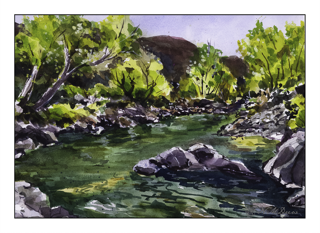
This is a creek running through the Coconino National Forest in Arizona. It is near Flagstaff and Sedona, and the terrain varies from alpine to the red rocks of Sedona and creeks and forests of Ponderosa pines. The above scan is a VueScan image with some corrections. Below is one using Epson Scan.
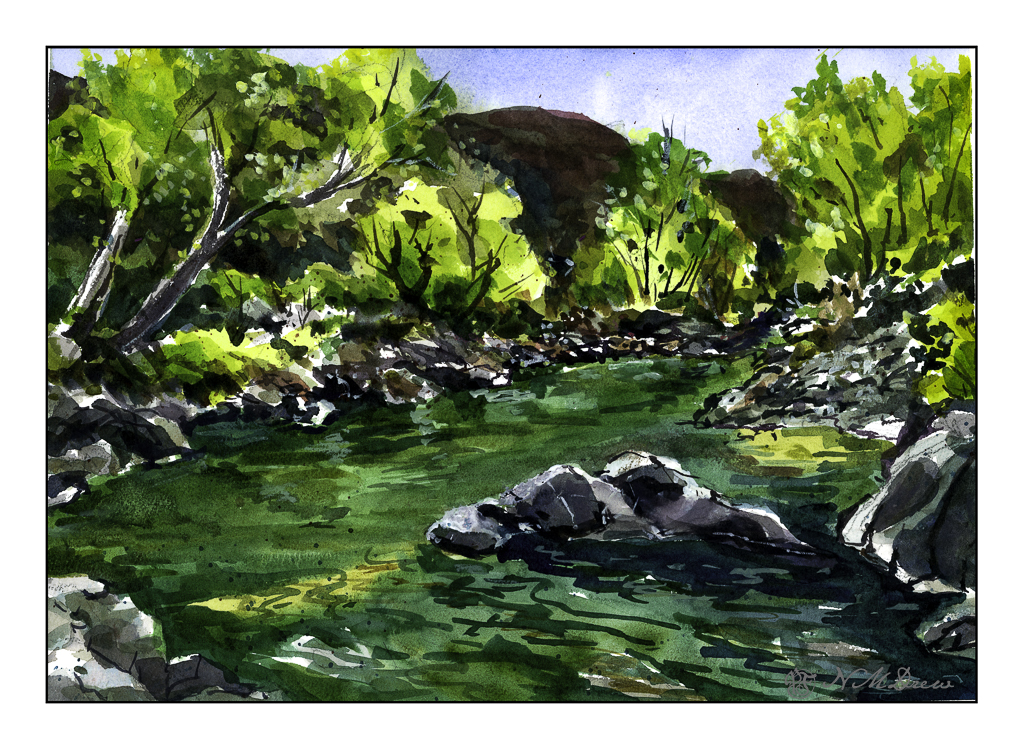
Neither scan really does justice to the colors, but the sparkle is caught. I think like a camera a scanner and software has difficulty with subtle variations from light to dark.

Sigh.

So, what did I try to do today? First, a bit of a limited palette. I didn’t do a triad, as with yesterday’s painting. I used (off the top of my head) mostly ultramarine blue, cadmium yellow, and burnt sienna, but into that mix I added Hooker’s green, cobalt teal, phthalo blue. The greys of the rocks came mostly from ultramarine and burnt sienna. Hooker’s provided a basis for some of the more obvious greens, but the cobalt teal mixed with yellow were used for the lighter, brighter greens you seen in springtime. Some titanium white gouache was applied here and there.

Additionally, besides limiting my colors, I tried some of the techniques for the water. Here, there were swaths of shallow water with an ochre coloring, reflections of rocks and trees in the water, and shadows beneath the rocks in the foreground and lower right. I didn’t use enough color and water to create a bead to allow blending – I have been told I would make a stingy bartender! – but still managed to get some of the colors to blend with one another. I also did glazes to show direction of water and movement. It turned out better than I thought it would – if nothing else, I need to be more generous and allow more paint and water than I think I will need. This something we all need to learn – how much is too little, how much is too much. Of course, the Goldilocks effect is best!

Watercolor, Arches 140# CP paper, 10×14.

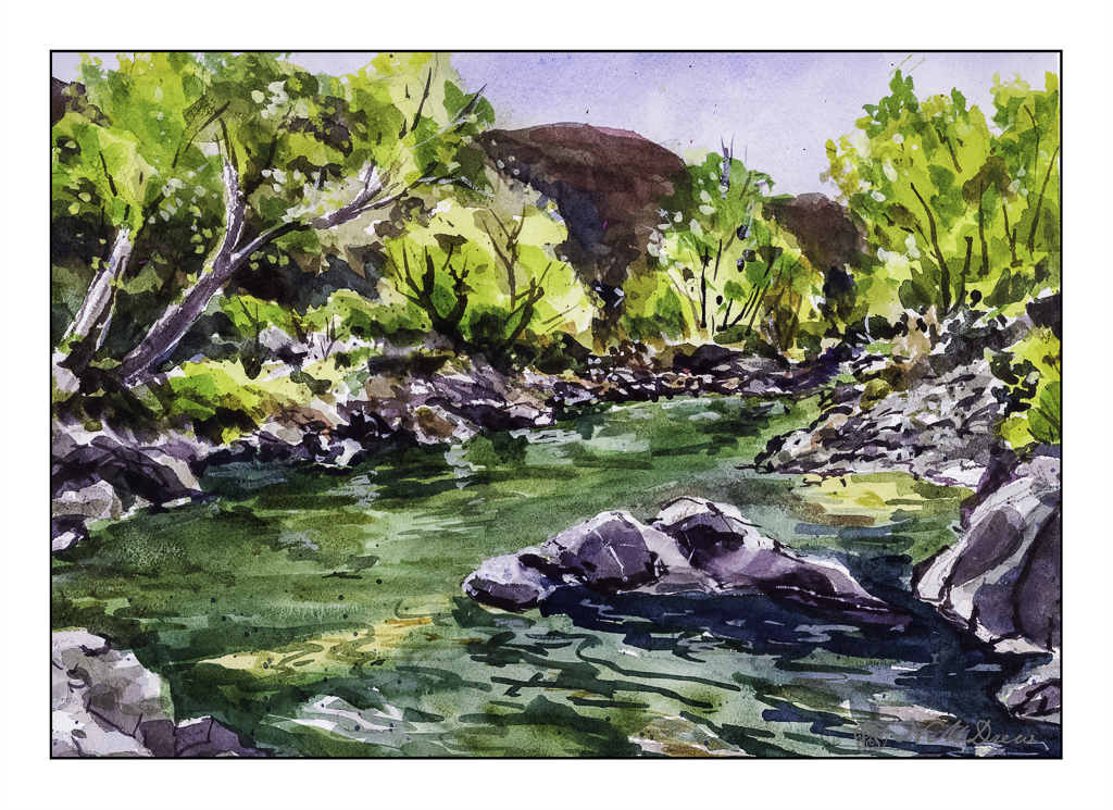
Oh, hell – here’s another scan!!
Let’s Just Say It’s Colorful!

Autumn along the Virgin River is filled with trees turning orange and yellow from the greens of summer. The sky is bright, bright blue. The red-orange mountains all around are dynamic and rugged. The river is aqua and blue and green.

The light is full of contrast – bright, dark, shadow, reflections. The leaves add texture, as do grasses and trees and rocks. Wind plays through the canyons and trees. The whole world shimmers and vibrates with energy and color. Simplifying it seems impossible.

Watercolor, 10×14, Arches 140# Rough.

Land’s End, SF

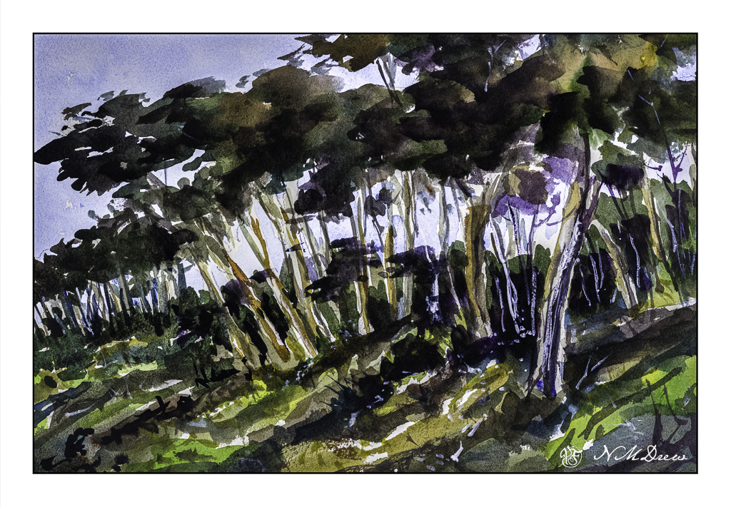
I love San Francisco, like so many people. And, like so many people, I am sad to see how challenging it has become as a city in a lot of ways – homelessness, cost of living, among other things. Still, it has a lot to offer, and Land’s End is one of them. Part of the Golden Gate National Recreational Area, it is a beautiful bit of nature on the edge of the Pacific Ocean.

There are paths within Land’s End, and this row of trees on a bluff is a signature landmark of the area itself. Golden Gate National Recreation Area is wonderful, and I have spent time here, and in the city and around the Bay Area often, more so when I was younger. I had friends who lived in the city itself and have great memories of all it has to offer.

This painting was a bit of a challenge. The tree trunks are bright and clear in the foreground and sharply contrast the foliage of the trees and undergrowth. In the distance, the shapes of the trees and their leaves merge into fascinating shapes. What I find so interesting about these trees – I believe they are Monterrey Cypress – is the trunks and branches seem to vanish within the leafy canopy. The hillside is variegated in vegetation, and while I caught some of the bright green and dark browns, the lights and darks were evident.

I tried to paint as directly as possible, putting paint down and then, while it was wet, varying colors within the shapes. The foliage was a good example of this, as was the hillside below the trees. The sky was painted first and brought down between the trunks near, leaving the trunks to be painted later. Bushes were also painted this way. Finally, trunks and foliage, near and far, and final touches such as a bit of titanium white gouache and a few dots and lines here and there.

Watercolor, unlimited palette, Arches 140# CP, 10×14.

Under a Rain of Acorns

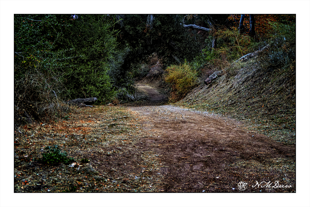
Yesterday I decided to finally go on a bit of a hike by myself. With a bit of trepidation, I told people where I was going, had my phone, and watched where I put my tootsies. The result was a slow meander, camera in hand, down the Chumash Trail. Housed within the area of this park is the Chumash History Museum, closed weekdays, but worth a visit.

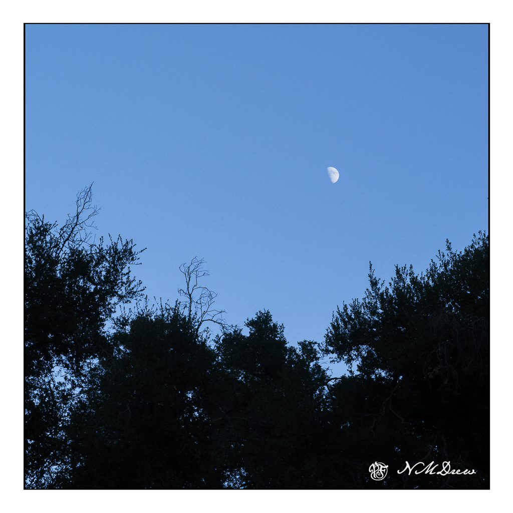
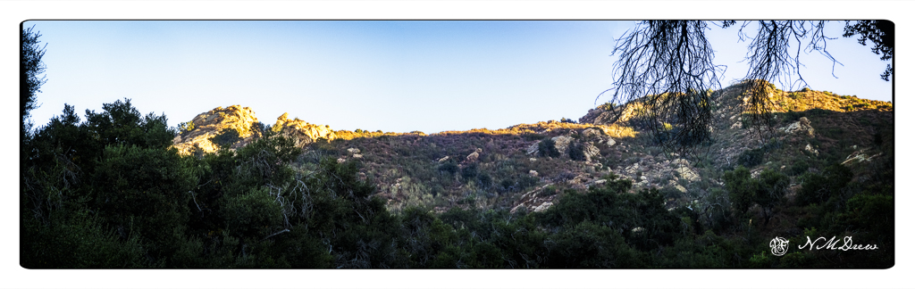
Overhead, the half moon could be seen above the trees and glimpses of the mountainous ridges above. The pathway beneath the trees was dark and shadowy.

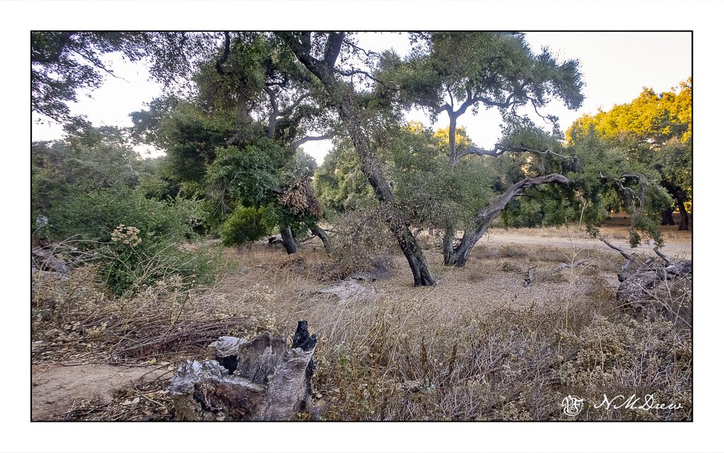
Though it is just weeks away from winter, here in SoCal we are experiencing dry weather, sometimes warm, sometimes cold. This morning I woke to the news that Malibu is, once again, in flames. An ironic bit as I thought I should walk down the Chumash before it burns again as I knew the east winds were on their way.

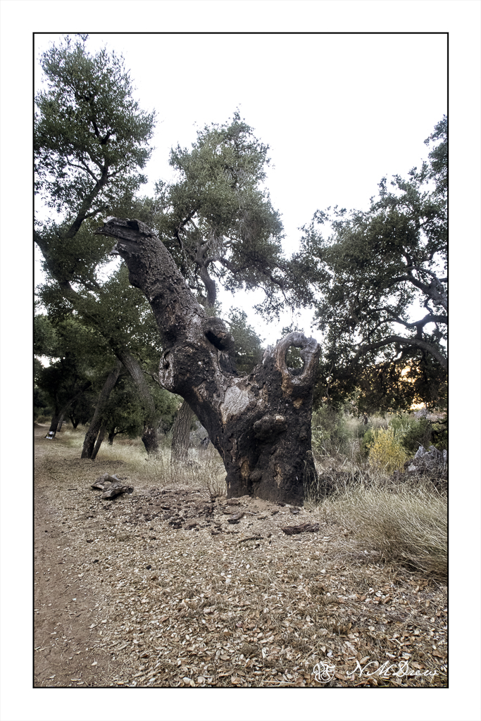
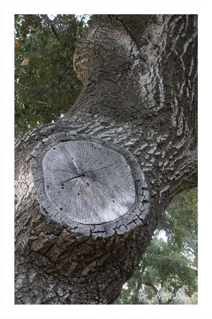
My favorite old, old tree is gone, with only a reminder of its former grandeur and an empty sky overhead.

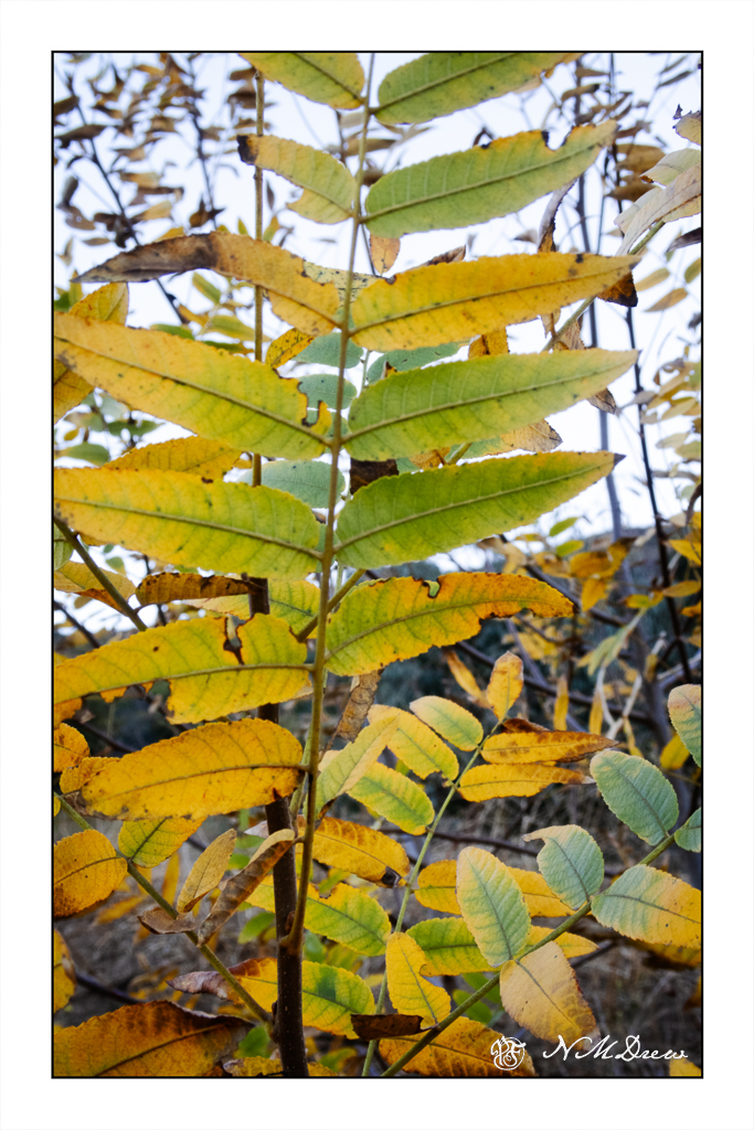
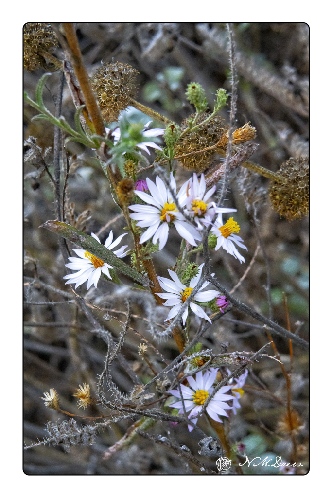
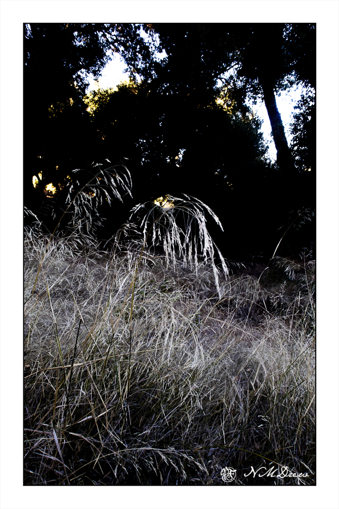
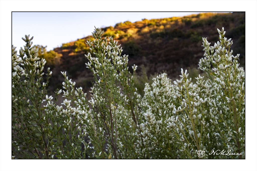
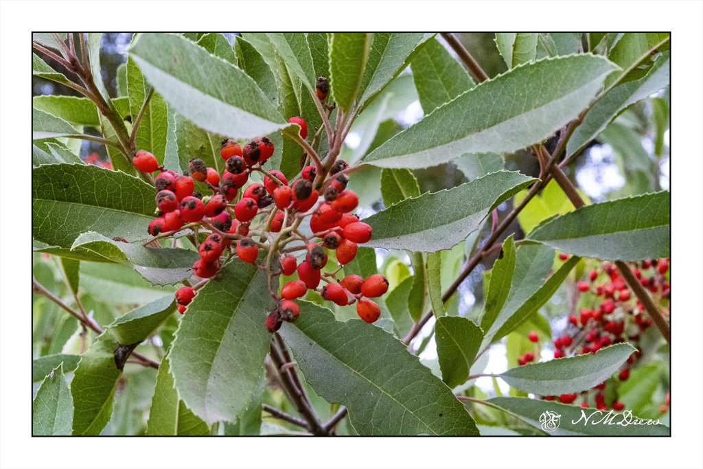
Grasses, flowers, poison oak, toyon were present, too – some plants I could name, others I could not, but it was just a pleasure to be out, looking for deer and squirrels – listening to the birds – canyon wrens mostly, an occasional crow – and to the patter, patter of the acorns.

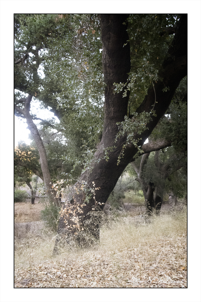
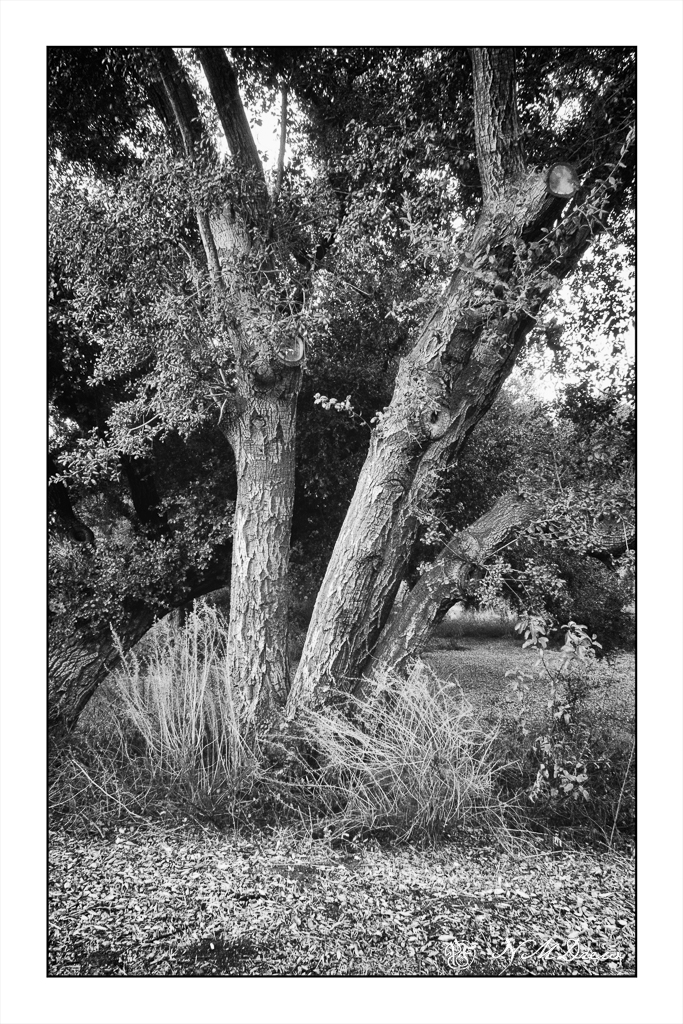
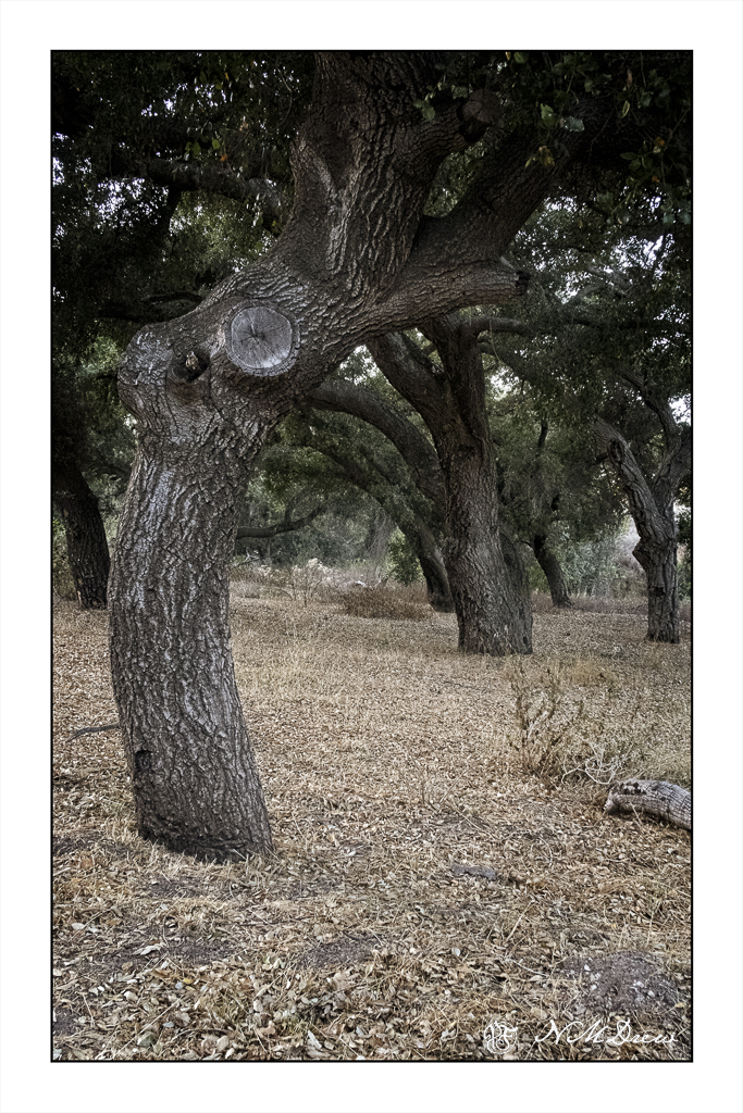
And, of course, everywhere are oak trees! Some scorched, some fallen, some cut down and left to return to the earth after the fire. Each tree has its own lovely and crazy shape and form, like dancers bending and arching. The Chumash Trail is a magical place and one which soothes the soul as only a walk under the trees can . . .

How Busy Can It Get?

No, I don’t mean life. I mean trees and piles of leaves and undergrowth – all the stuff that makes up a good fall scene! Some trees have dropped a bazillion tons of leaves and others are hanging on to them. Years of detritus build up on the ground, creating a fertile place for new growth, plant, fungal, insect, which in turn supports other life in the wilder world outside the super market.

Anyone who has taken a walk in the woods or tried to photograph or paint this jumble knows exactly what I mean – it is really a busy-ness of color and texture and shape.

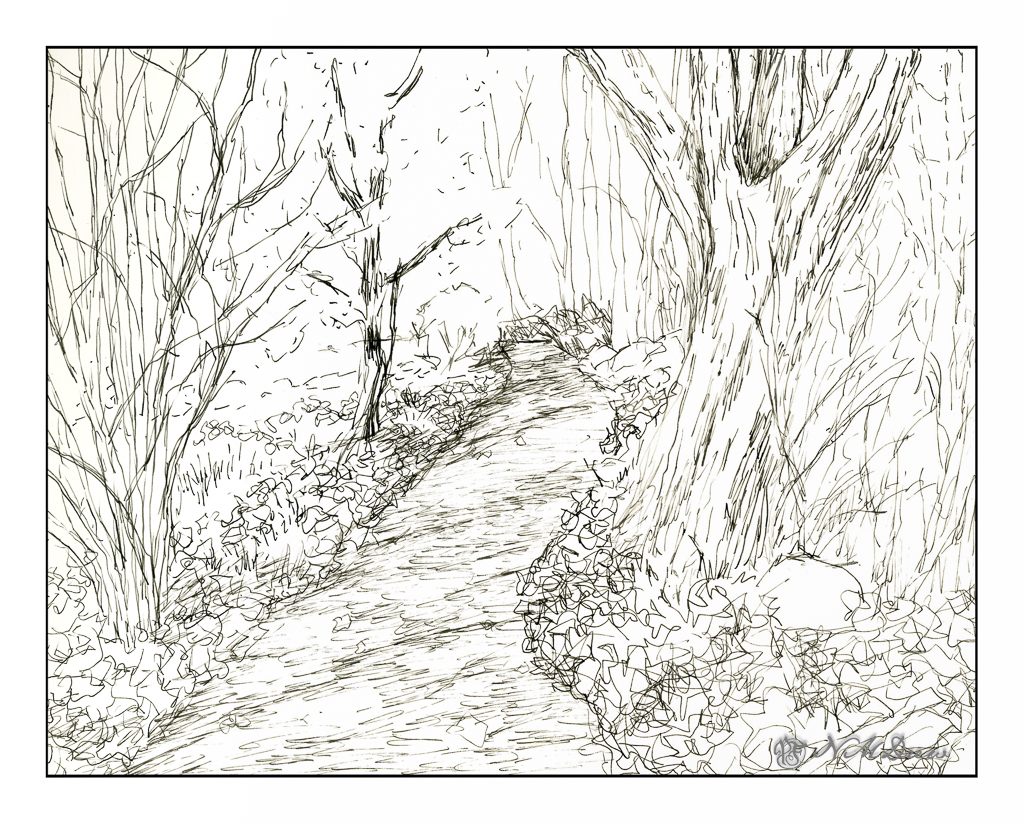
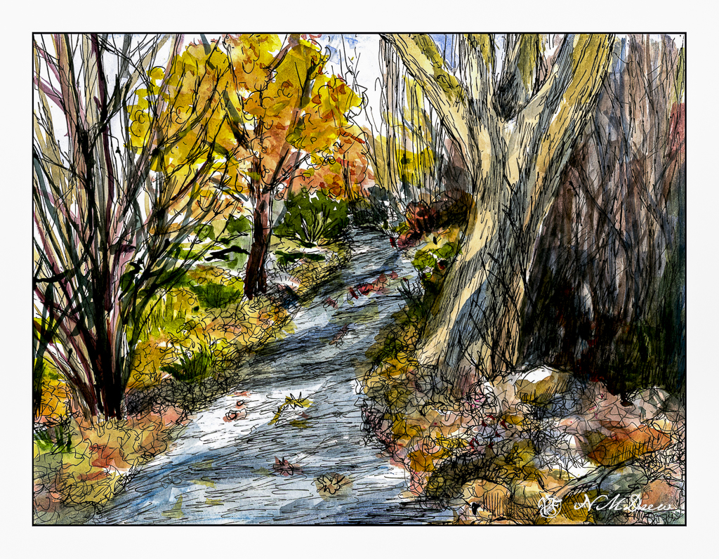
This is my sketch, done with a fountain pen and some Carbon Ink by Platinum. The paper is a bit rough so it could be what caused some difficulties with the pen nib – or the pen itself is not the best – or both. I tried to convey light and dark and texture with different pen marks. Straight lines to show trees and texture and the shadows of the trees across the pathway. Contrast is suggested rather than emphasized as I wanted to use paint to give the sense of shadows and so on. With that in mind, I pulled a palette of my out-of-the-tube paints rather than pan paints, cleaned them up and went to work.

As you can see, light and dark are more emphasized with the use of color, as are the colors of the leaves and the complex shapes of trees on the left and undergrowth on the right. The leaves that have fallen have some variegation, depending on when they fell and how long they have been there. Green grasses and weeds peek through. There are a few rocks, too, and leaves on the pathway. Tree shadows fall across the trail and up onto the tree on the right. There is a brightness to the day despite the murk of the undergrowth.

After adding color, I waited for the picture to dry. I made some color adjustments. And then, back to the waterproof ink pens. This time I used Micron pens and my Uniball waterproof pens. Micron pens come in different nib widths (here 0.1, 0.2 and 0.5) and the Uniball is labelled as “fine” but in reality makes a darker, thicker mark than the Micron pens.

Overall, I am more pleased with today’s ink and wash sketch than the one I did yesterday of the plumeria. As usual, I did not do a preliminary pencil drawing but just worked from the end of the path and then moved back and forth to establish areas. I really like my tangled tree in the lower left and the shadows on the big tree on the right. The brightness of an autumn day is expressed. Now all I have to do is get to scuffling through those leaves and it will make my day.

Pen, ink, watercolor wash, on Strathmore Vision 140# CP paper, 9 x 12.