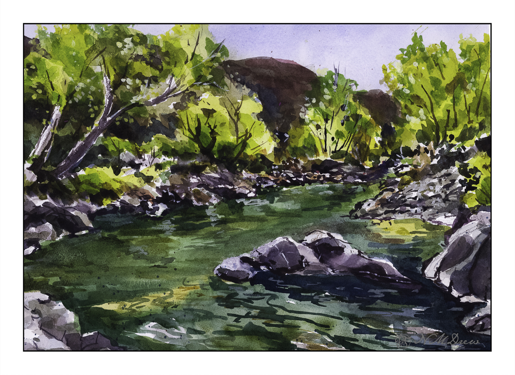
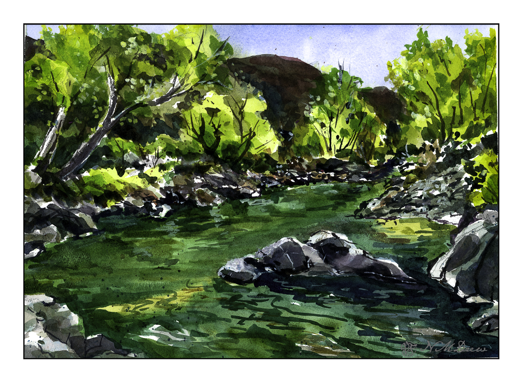
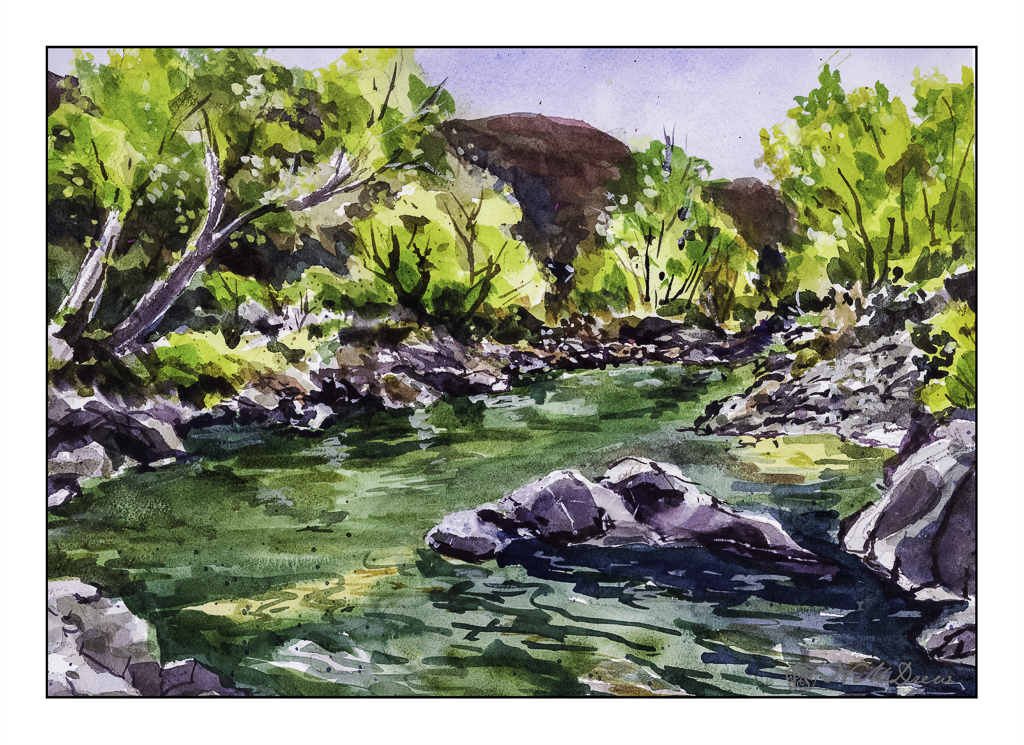
I just realized that if I want to do good – in my eyes, of course – or better ink and watercolor drawings, I need to work a bit more on my colors. For many years my colors were anemic and paintings ended up pale and wan. To compensate, I made my colors more intense – more pigment, less water. However, I think if I really want to do ink and wash, I need to learn to moderate the color intensity a lot. Next painting I do will have color swatches on another piece of paper before applying them to the paper.
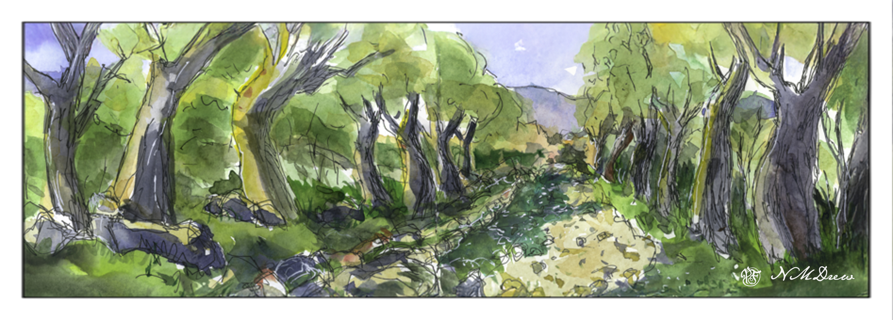
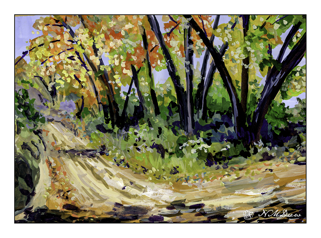
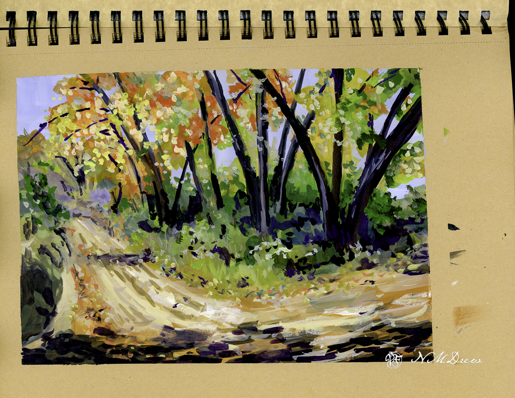
This is a very contrasty painting – and it doesn’t really play well with the eye. The shadow along the dirt road, on the left, is too green. The darks between the trees, from shadow and overgrowth, are not well done. I liked the ink drawing but think I could have made better color choices. Unfortunately, when you use a limited palette of only 10 basic colors, color mixing becomes a bit of a challenge. That is not to say these were not good quality paints – they are Schminke pan paints which are very intense – but I need to work more with moderating the colors.
Well, I didn’t paint anything yesterday, but I am beginning to work on cleaning up and getting rid of stuff. Yesterday I worked in the garden, straightening things up, getting rid of debris, and taking apart the drip system. With fewer plants it is unnecessary. This morning, sorting through clothes and mish mash in the in the garage.
However, painting continues!
Sketchbook across 2 pages, about 6×16 inches; ink and watercolor.