
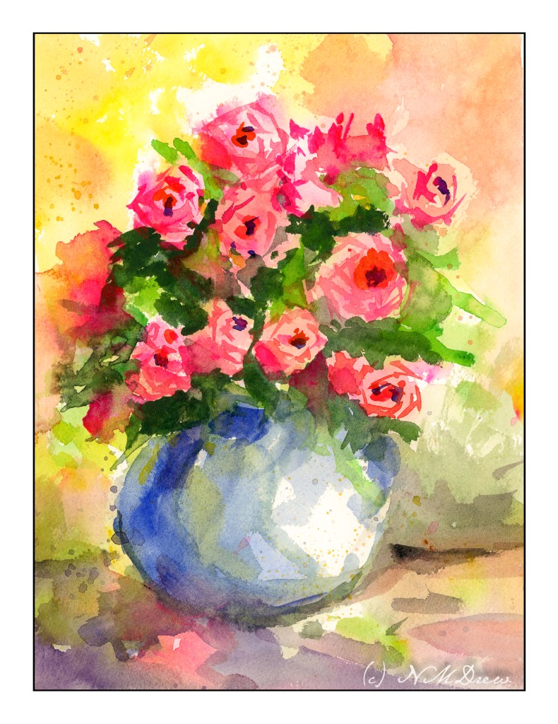
A Bowl of Roses

The above study was fun to do, but I had a lot of help in the form of (what else?) a YouTube video. Videos are such good ways to see what a person does, and how they paint. To me, watching the methods an artist goes about accomplishing something is one of the biggest ways to learn.

The video I used was one by a YouTuber called “Draw with Shiba.” There are a lot of good videos on his channel, and none of them are so difficult you cannot learn something. As my goal is flowers I found this video of his quite helpful.

Our images sort of match, sort of don’t. His paper seems to hold on to water more than mine does (Arches) so he can lift color from the sides of the roses. He also begins with a lot of wet-in-wet. In this video, he wets the paper entirely with a brush before he paints, and then drops in color so it blurs into all the major areas of the paintings. In other videos he simply drops water droplets onto his paper, thus controlling areas as he disperses the water with his brush. He paints, flat, too, from what I can see.

Overall, I enjoyed this video. The flowers are roses (thumbs up there!), the vase is simple, and the entire painting covers a lot of techniques. I liked the way in which he lifted the paint and painted the roses. I learned a bit and produced a painting that doesn’t make me cringe. I tried to apply a lot of the techniques here to my flower flop of yesterday, and some worked, some did not, but that is life. Live to paint another day!

On to “Brushwork”!

A few months ago I joined Ian Roberts’ online class “Mastering Composition.” First several weeks were simply drawing exercises, learning about values and shapes to create a 3D effect on the flat surface of paper. Two weeks ago we began the “Brushwork” component. I decided to use oils for this section simply because I have not painted with oils since high school – back in the last century.

What I like about Roberts’ class is he makes sense. He discusses things on very pragmatic terms as well as on a bit of a more esoteric plane. Both are satisfying. Exercises are clear and with stated purpose. The key components thus far are values and edges. He says, “If you can’t see it, you can’t paint it.” And that is true. If you don’t look and observe and get picky, well, it’s just not there.

Week One

Simple value studies of a landscape. I did 4, in 4 different mediums in order to decide which I wanted to default to – I chose oils (see above).

Watercolor
Gouache
Acrylic
Oils

I won’t say any of them are great, but by posting them, fellow students give feedback. It’s useful as others see what you do not. As well, it is also useful to give feedback as it sharpens your eyes.

Week Two

Now, onto still life, demonstrated by Roberts and then practiced by students. This was followed by a landscape. The still life focused on edges and values – and so does the landscape. The landscape is ours alone to do – no demo! I tried to make my landscape simple masses. Parts work, parts are illogical, and taking a photograph of both was a pain as they are both still wet. Oh, well.

Still Life in Oils

This was a fun study, and it was a challenge to really take the time to look, and to see, edges, shadows, shapes, etc. Overall, I am pleased with it. My sphere is a bit on the floating side, but I can fix that later. As well, it is fairly bright but monitors make it look darker or lighter, depending on which one I am using.

Landscape in Oils

This one is a challenge. It is wet and hell to photograph! One thing I have learned is that I will need to come back with a fine brush after it has dried to clean up some of the whites on the guardrails and perhaps elsewhere.

Thoughts

By far, this is the best online course I have ever taken! If you want to paint and learn a few things, you might check out Ian Roberts. He is on YouTube, so how he is there is how he is in the Zoom class meetings.

Stay tuned for Week Three and Week Four!

WWM #27: Fruits

Summer is the time of year when we live on fruit salads. If we get ambitious, maybe a pie, tart, galette . . . you get the picture. The prompt of “fruits” is perfect for the middle of July, the month of #WorldWatercolorMonth2019.

This year looks like it will be a really good year for our fig tree, a Brown Turkey. We used to have a Kadota, which is a lovely green fruit, and a perfect foil for the Brown Turkey, which are a deep purply-brown color. Figs are something I look forward to every year, to just walk out to the tree and enjoy a sweet treat . . .

Besides anticipating figs, we have also enjoyed grapes and apricots this season.  Cherries, nectarines, melons, raspberries, strawberries, blackberries, blueberries.  Abundance!

The first painting is not quite where I want it to be.  I was focusing on contrast and shadows to separate one piece of fruit from another.  The same for the grapes and apricots, which is a bit more successful although I am not quite pleased with it because I think it is a bit overworked.  It’s interesting how I feel pretty good about some things – more confident – and less so with others.  I guess we all do.