Bosc Pears on a Table Cloth

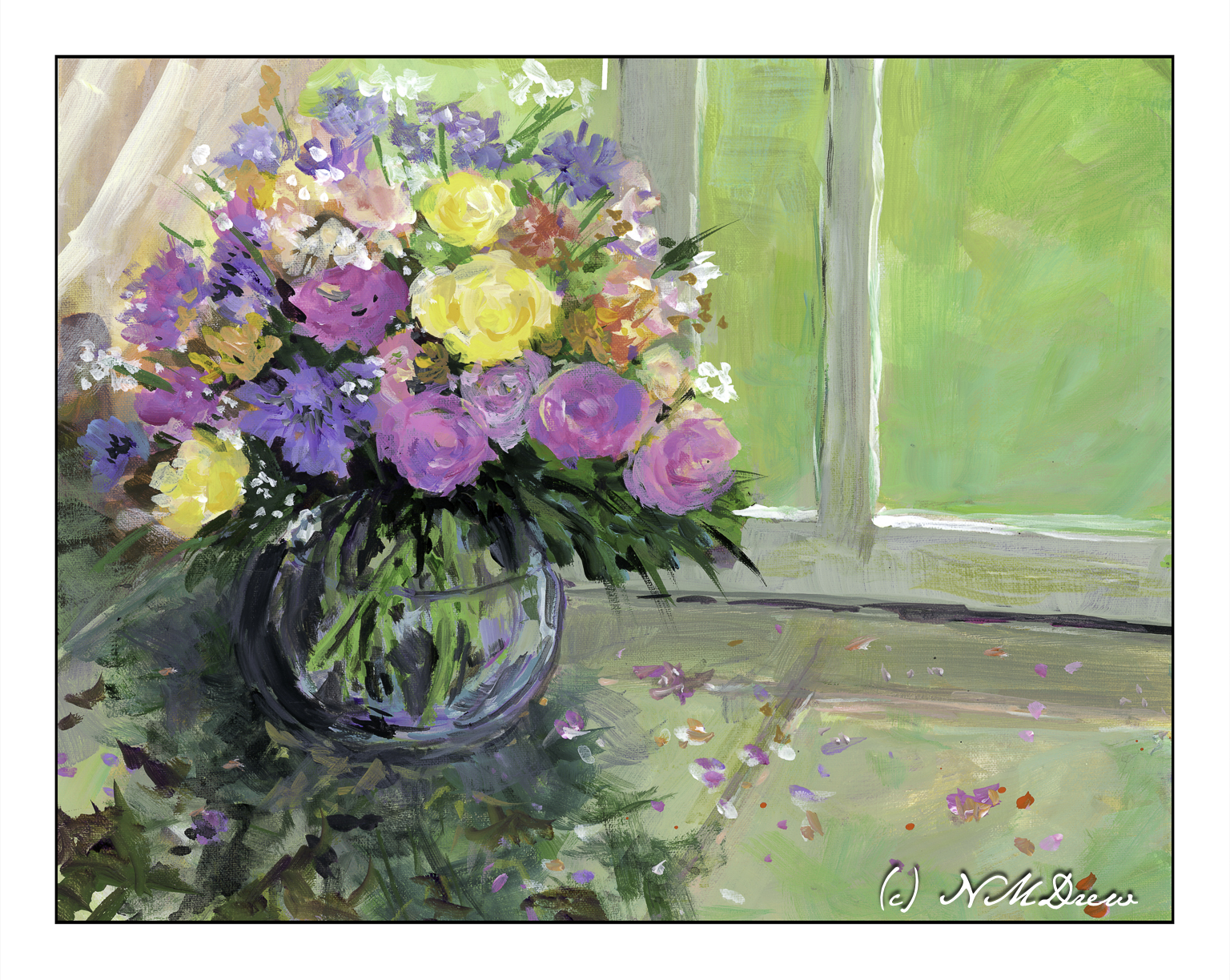
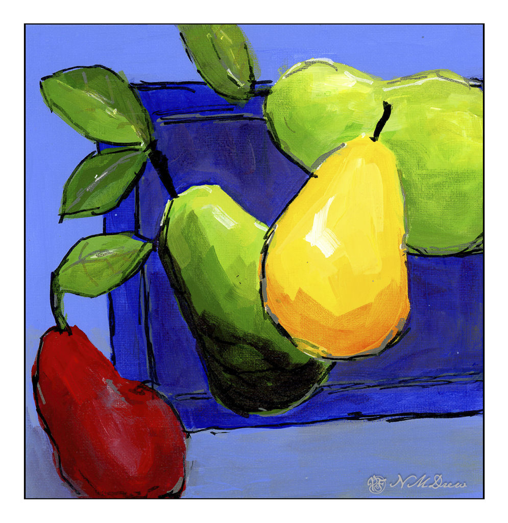
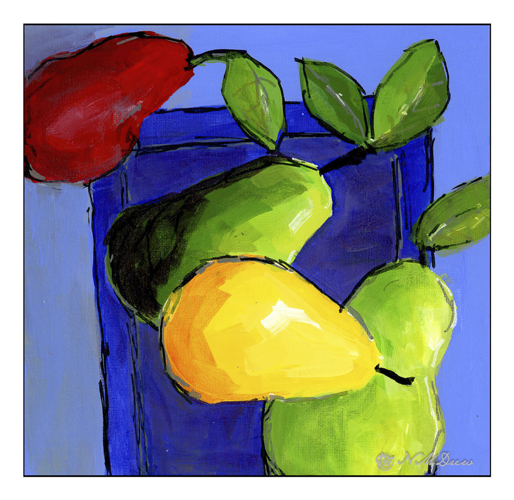
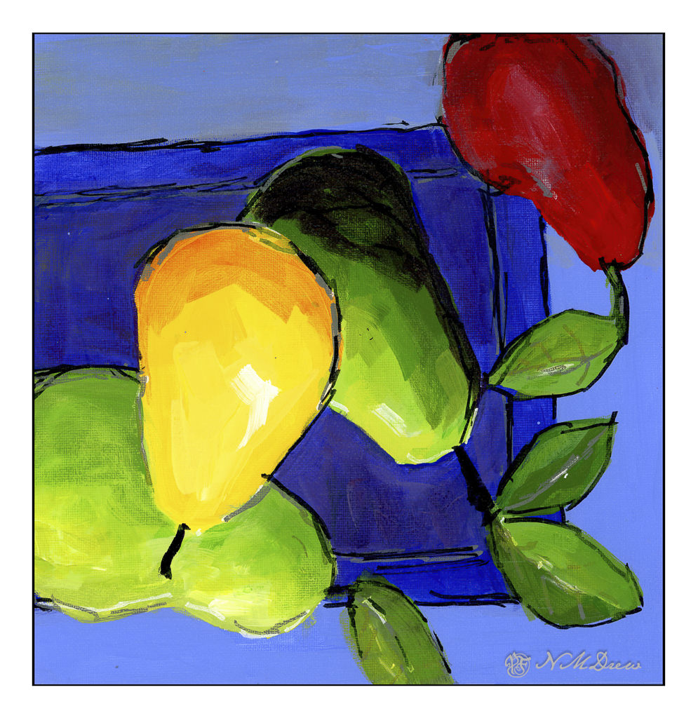
Cats are still on my mind, but in my painting class a few weeks ago I decided to do something fun and less intense than critters. Pears are always a favorite, to paint and to eat. These were photographed several years ago and were the source for the painting.

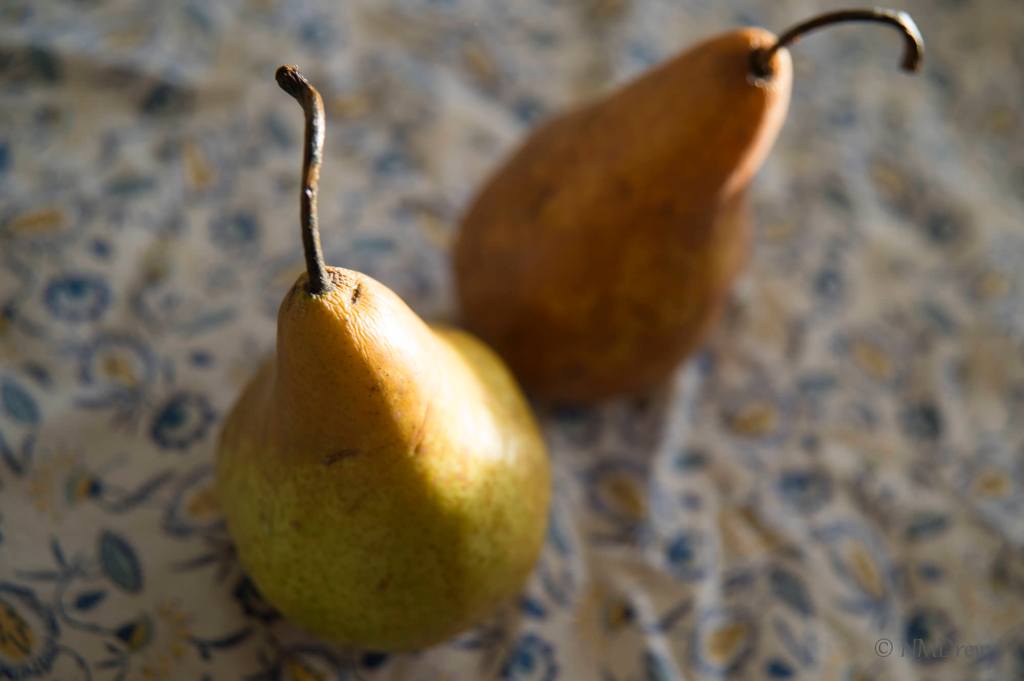
I have always liked this photo, partly because of the pears themselves, but also I love the table cloth upon which they rest. It was a present from my MIL, Judy, and it’s always been my favorite one I own. I thought the pears looked especially lovely on it.

The painting itself was pretty much finished in the 2.5 hours of class time I had. I did a few touch ups last week after it had dried. Too often I fail to see things and then wish I had fixed them when I could. So, this sat on my dining table for a week and was completed in class and critiqued.

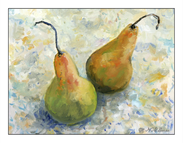
Photo realism in paintings does not interest me, and generally the same with still lives. This one, though, does please me a lot. I like the way my colors work together, the composition, and the way I handled the paints. It felt really good to paint this!

Oils on canvas board, 11×14.

Bouquet

I am not a fan of what are called “heavy body” acrylic paints. They are thick when they come out of the tube and need to be thinned with water or medium. Even with a Masterson palette to help keep them moist, acrylic paints dry too fast for my liking. It always feels like a race against time when I use them.

Enter fluid acrylics. They are not “heavy body” but come in pourable containers. The paint is the consistency of thick cream. A drop or two may be all I need or want, and while they do dry quickly, they are very easy to mix together into the colors I want. Smooth blending a brushwork is far more easily accomplished with fluid acrylics.

I spent about 3 days painting this because I had to correct mistakes and change this and that. All this is done with the fluid acrylics (Golden makes them, and Liquitex has their own equivalent, as do other manufacturers), a bit of color at a time. While the time element before they dry is still there, I don’t feel the waste of using too much paint – I am pretty good at figuring out how much I need before they dry on the palette. An advantage of acrylic paint over oils is that they do dry quickly, and a painting can be worked on in multiple dry layers throughout the course of the day. Hair dryers help to speed up the drying, too!

Acrylic paints can dry within 5-10 minutes, or even sooner, which is what I find so frustrating about them when using the heavy body ones, and drove me to give up on them altogether. I switched to oils, which I really enjoy, but using these fluid acrylics is a lot of fun, and I can work more quickly.

So, a bouquet. I am not totally sure if this painting is a “success” or not. Parts of it seem a bit peculiar once I see the painting as a scan. I like the window and green that is beyond the glass, as well as the window frame itself. The flowers are decent, but perhaps need more contrast and drama. The glass bowl is also okay. However, the “shadow” area in the lower left seems to not quite belong.

Whatever! I will leave it as is, generally pleased with this attempt.

Fluid acrylic paint (Golden and Liquitex), 11×14 Fredrix canvas pad, unmounted.

Ikebana

Ikebana – the beautifully simple and elegant Japanese art of flower arranging.

I don’t know if this would qualify as an elegant flower arrangement, but it is an interesting arrangement of lines and shapes, disguised as an ikebana painted on canvas. Colors, too. And a reflection on a semi-shiny surface. I wanted to explore open space in a painting and how to fill it fairly simply. Maybe an austere environment?

As with the gladioli the other day, I used fluid acrylics on a cotton canvas mounted on board. Many of the same techniques were used, too – vertical and horizontal brushwork using a 1/2 flat brush. When I had reached a point of needing to “finish” the painting, it just didn’t work. I wanted to add some swirls of lines, vetoed it, and decided that some softer shapes with a bit of curve might work. The flowers and leaves were dotted and dabbed in to take away the vertical and horizontal lines of the original ones. I think this worked. But, as this is so different than what I seem to do – a new area of exploration – I am not really sure about it at all!!

Fluid acrylics on cotton canvas on board, 11×14.

Gladioli

In seems to me that a “style” is not something I have. You can recognize many painters by how their work looks, but I am all over the place. This is not really by design, but more by learning by trying to figure out how they might do something. I started out here by trying to do an abstraction of a vase of gladioli, inspired by varied modern painters, but in the end I ended up doing most if it by shaping the flowers, background, and vase with vertical and horizontal strokes.

Using fluid acrylics, I painted with wet paint, and as time went by, used the brush to blend the drying paint. Some glazes were used, too. When I finished the vase, background, and bouquet, the background was pretty empty. So, simple geometric shapes – a bowl, a glass, a pitcher. I wanted them pale to blend into the background but still distinctive. The results seem to work.

11×14, cotton canvas on board, fluid acrylics.

Composition & Direction

I have my acrylic pear painting sitting on my easel. It is tilted to the right. I rather like it!

This is how the painting was painted and presented here the other day. Now let’s look at different directions and see how a 90 degree shift impacts the painting for better or worse.

Rotating the painting and adding a signature in the lower right of each image lets you know where the bottom of the image is supposed to be.

The image on the top of these four is the way it is tilted on my easel and what started this idea. I think of the 4, it may be my favorite. The original is conventional, the 2nd is my next; the bottom two are a bit odd for my eye.

This is my preferred variant.

Art for thought! Or, artsy food for thought?