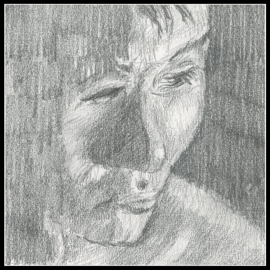
I really prefer landscapes to nearly anything when it comes to artwork. Part of it is pure laziness – no one will point out the inaccuracy of my rendering! I can make it anything I want. Portraits, of someone you know or is famous, are inherently more challenging. With this challenge in mind, I decided to enroll in an 8-week portrait class led by my painting instructor. Yesterday was the second class.
For a number of years now I have sporadically met up with a small group of artists in a nearby park. Originally the group was for a portrait class, in person, sans masks, during the Covid days. Eventually it evolved / devolved, but now it is once more on track as a portrait class. No problem – I think i will happily return. The reason is simple – I am beginning to enjoy portraiture – at least in pencil.
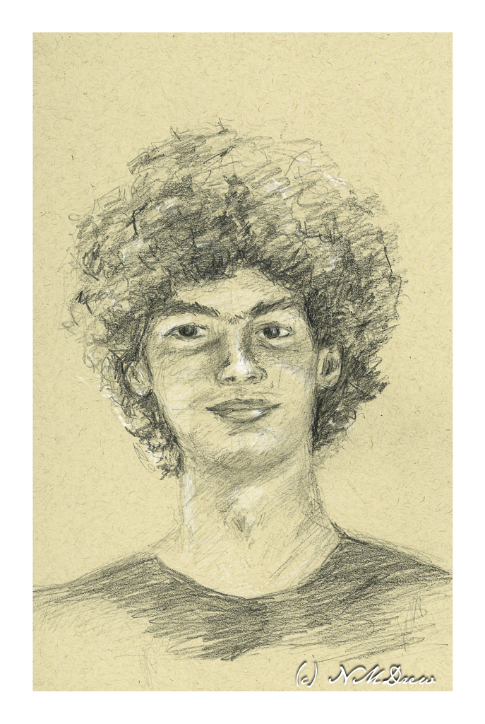
We did a graduation party for Dakota, new high school graduate and soon to be university student. I decided the photo Auntie Am took was perfect for subject matter in yesterday’s class. Tan paper, hard and soft pencil, white Prismacolor pencil for highlights.
I listened to my Portraits-in-the-Park teacher, Steve, whispering in my ear as I drew, recalling words of advice and hints. Barbara, too, refreshed the “rules” of portraiture last week. And so, a portrait of Dakota emerged with the help of my two wonderful instructors.
My own observations tell me my noses are improving but need work, my ears still suck, and the rest is not too bad. All done in about a 45 minute session once the class instructions were completed.
Now, let’s be honest here. Pencil is easy to use. Barbara’s class is to soon move into value studies on canvas and a painted portrait may emerge in the next several weeks. That is going to be pure experiential hell. I have never painted a person in my life. At least I am somewhat comfortable with oils and other media. I am considering oil paint or pastels. Oil is slow drying and can be modified. Pastels are like drawing with a pencil. Watercolor requires a bit more skill than I have and in a classroom I don’t think I would be comfortable, but may decide to do at home where I can wade through paper if need be. Colored pencils may or may not be on the agenda.
Onward!!