In keeping with yesterday’s theme, more three-color studies. Here, again, Quin Gold and Cobalt Teal, but this time I used Quin Rose for the red. 
Fruit is the best as it doesn’t wiggle around, and you can eat it later!

In keeping with yesterday’s theme, more three-color studies. Here, again, Quin Gold and Cobalt Teal, but this time I used Quin Rose for the red.
Fruit is the best as it doesn’t wiggle around, and you can eat it later!
When you get home at 7 p.m., have dinner, and paint some swatches on a wall to choose a color, there is not a lot of time left in the day to do much of anything. To slow down, I thought about what I had done the day before – watercolor and ink, not splashy and loose, but more controlled. A still life, and my favorite fruit – pears!
Last night I did the colors.

This morning, I did the ink.
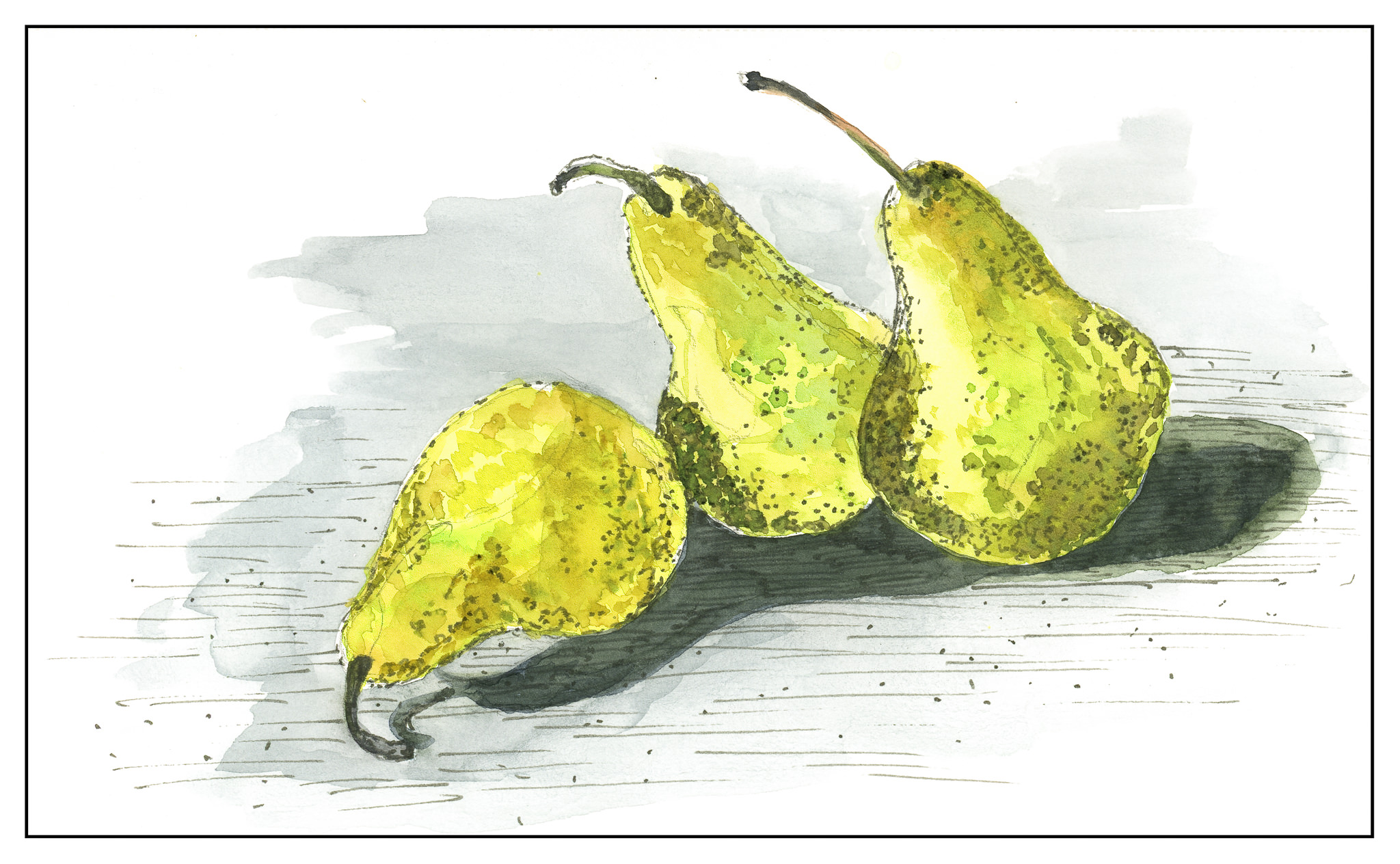
The ink I used is waterproof, but is a warm grey in tone. It actually works for a more delicate and less contrasting line or dot.
Another day just painting! What a pleasure to be able to do it!
Today we did two different things. Actually, three. For warm-up, we returned to the quick three minute sketches, which eventually morphed into a still life with three objects. Mine were a piece of dried corn, a plastic mushroom, and a plastic artichoke. I was not particularly nimble this morning, but here is one I produced.

From there, we moved on to landscapes, but I will hold off for a moment on those. We did an exercise which I found fascinating: take one object and paint it 6 different ways. I chose a really lovely fake pear – golden and red, reminiscent of autumn. Take a look . . . they are in a gallery format, so click on one image to be able to scroll through them larger than they are here.
")
")

This was a lot of fun to do – nothing I ever have considered as an exercise. And then . . . we moved on to landscapes from photographs Brenda took, laminated, and brought to class.
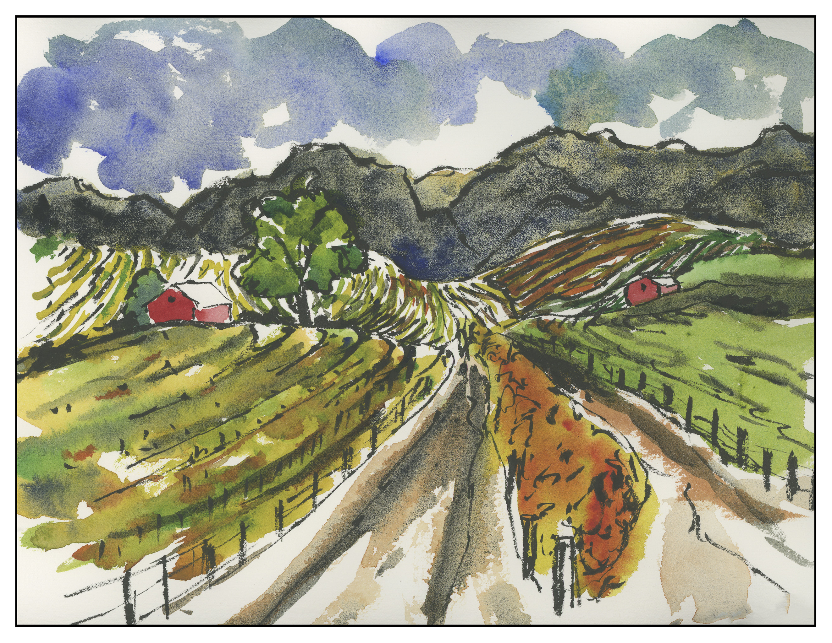
The idea was to take a photo and modify it. This one is in the wine country of Northern California.
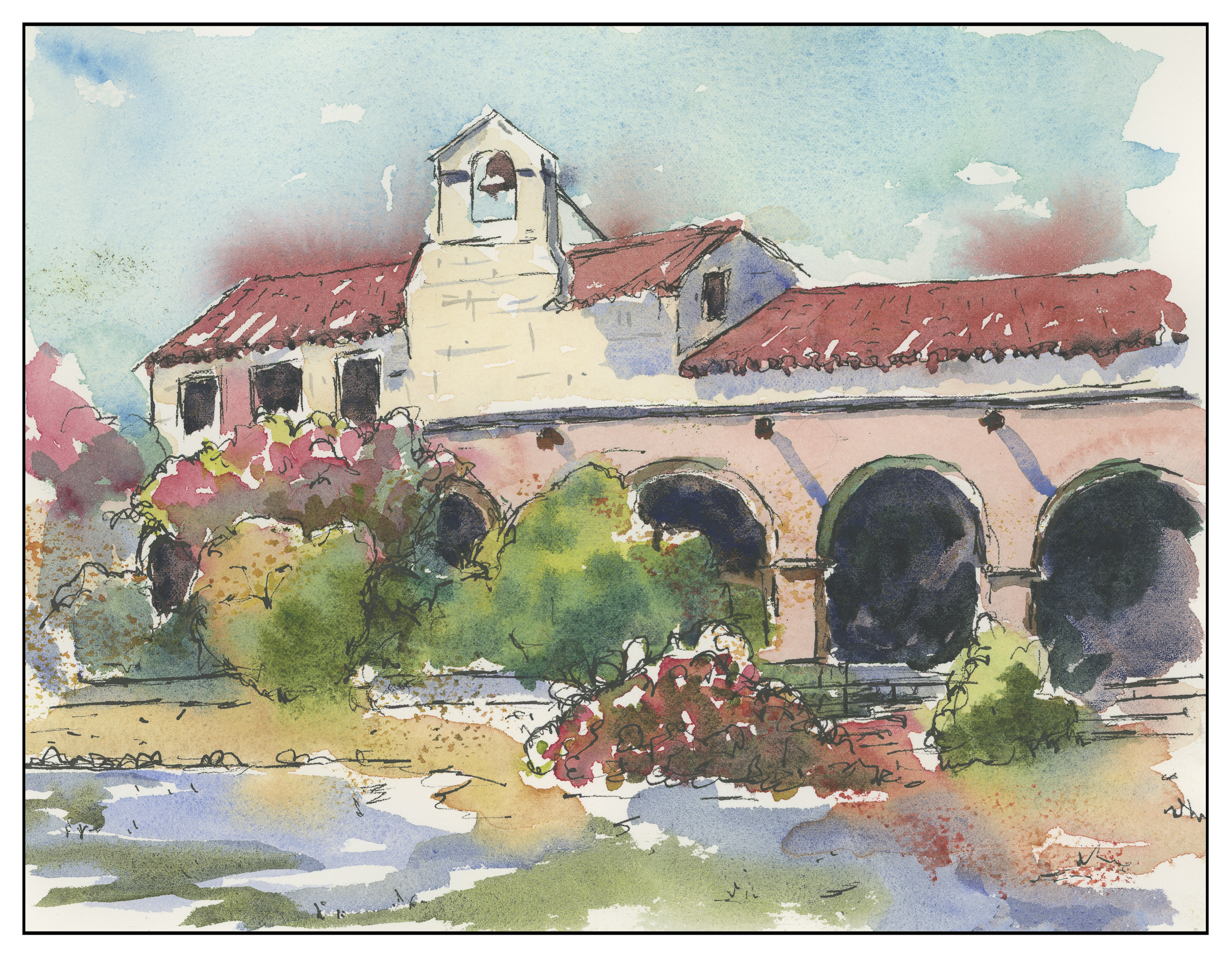
This one is, I think, in Carmel, but I don’t recall. All the speckles are from the fact that it is a ghost image from a wet painting. Truthfully, I was surprised it was a success at all. All day I felt restless and unfocused.

Finally, this one. I think it is the best of everything I did today. The mantra for the day was draw, frame, paint.
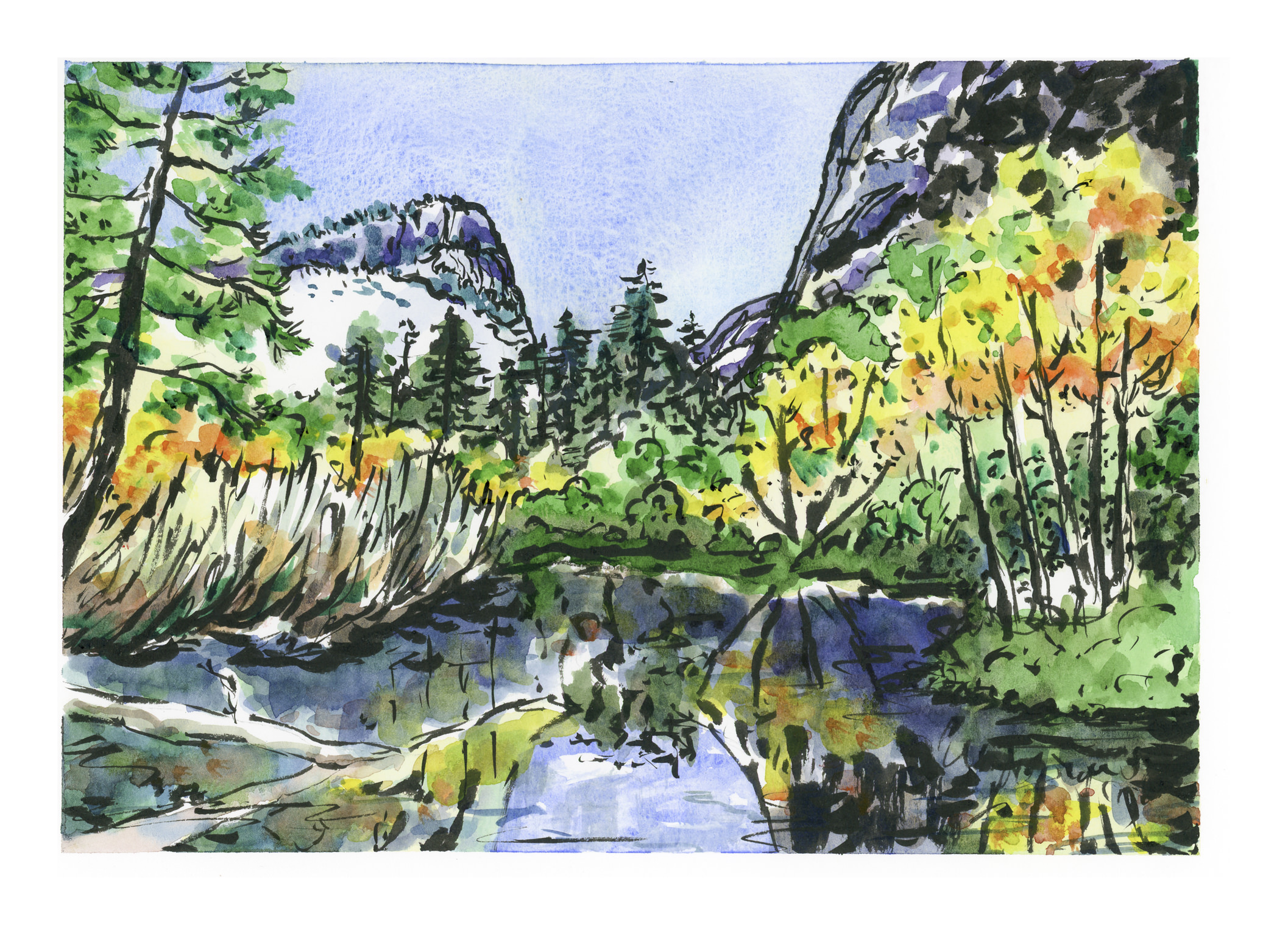
If you have been following this blog of late, you will know that I have been putzing around with watercolor on a more serious level than in a long time. (Really, more serious than ever before.) In the process, I have struggled with control of the medium, like all who begin with watercolors. Lines help when a painting fails, and sometimes lines add to a painting if that is part of its intended style.
Having done sumi-e for many years, I love lines and their expressiveness. I also like colors, and that is where self-control needs to show up the most. Think of Hawaiian shirts or 40s palm frond prints and you get the idea about my ideas of color – louder and more is the best!
This painting of Mirror Lake was very satisfying as I felt the use of sumi ink and colors worked well.
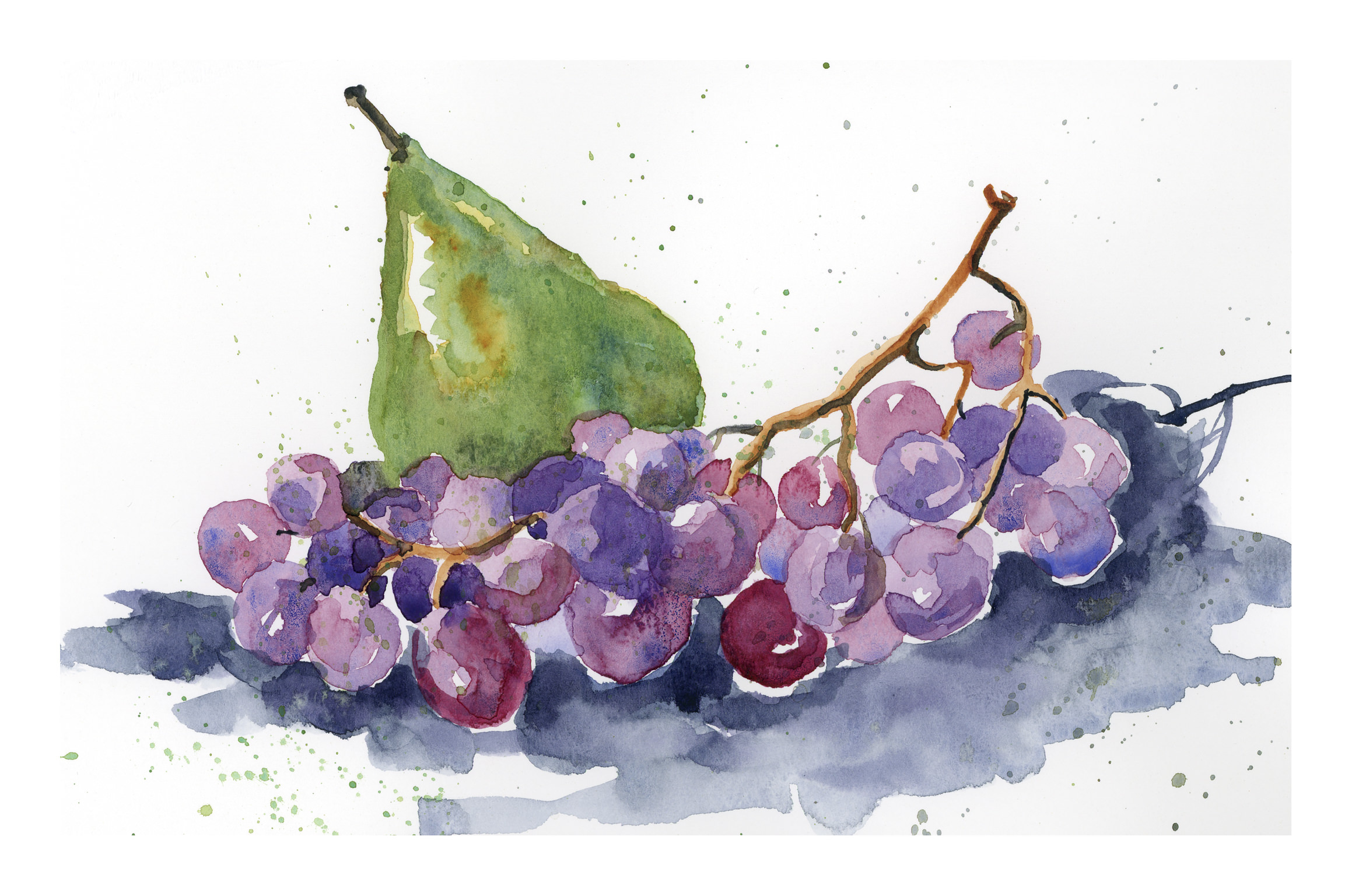
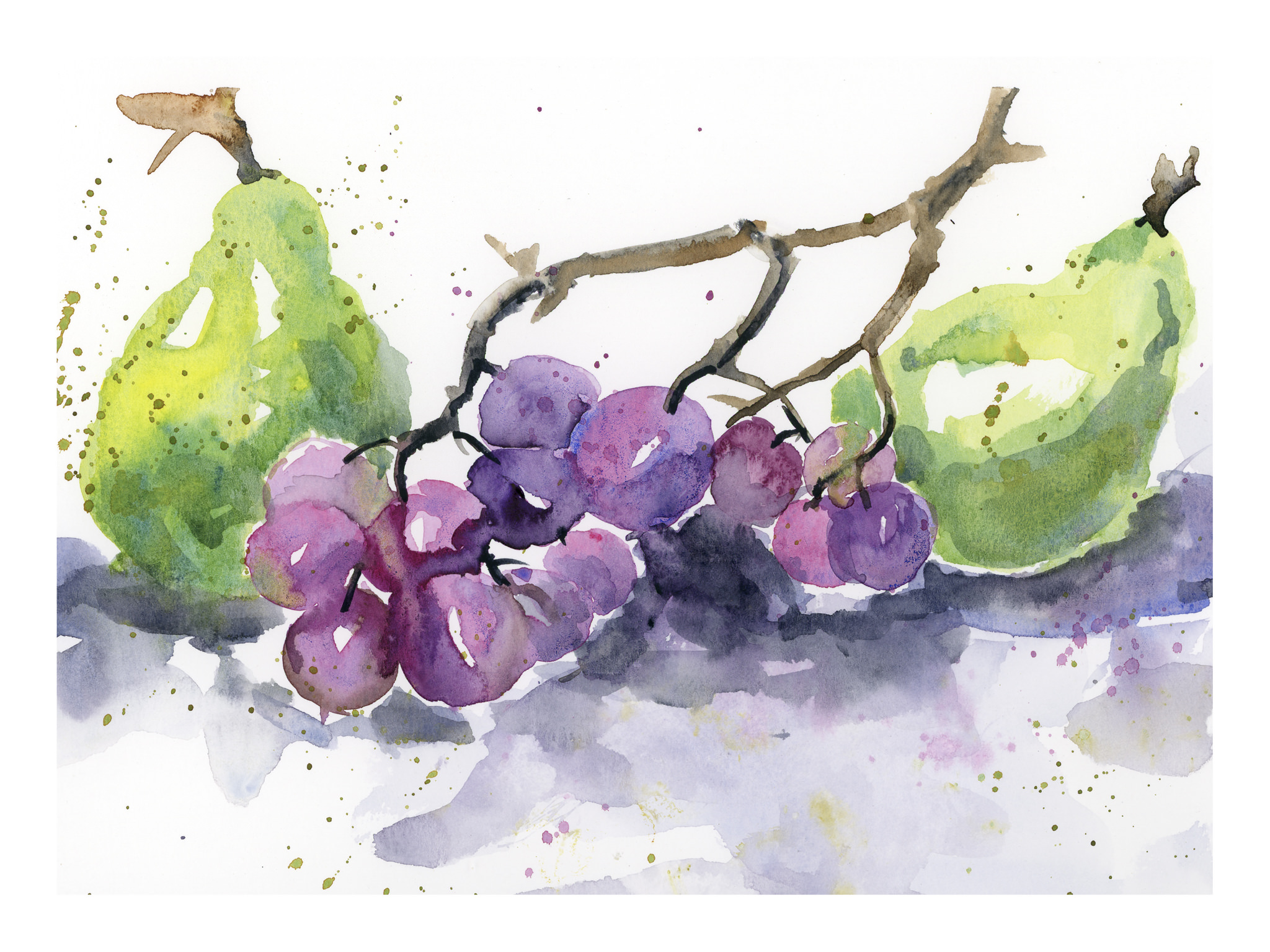
The painting is inspired by a number of paintings I found when I googled “pears grapes watercolor” and chose images. There were a lot out there, and so I painted a number of grapes-and-pear paintings yesterday.
This is the one that pleases me the most. I like its painterly elements and the colors of both the grapes and the pears. It is the most controlled and thought-through of the series. I did not draw any pencil lines prior to painting it, but painted it freehand, recalling brushwork in sumi-e. It’s easy to fall prey to haste in watercolor, to achieve a “painterly” look, but it really requires forethought, just as sumi-e does.
I did four paintings altogether in this series, which you can find under “My Other Lives” above.
Today was a day of wrath! I was soooo frustrated!
And a day of learning. I did four watercolors without lines. The first two were sketched in with pencil; the last two were done freehand, relying on imagination and the precepts of sumi-e, where lines are not drawn.
In each painting, something works, and in each painting there are places of failure. What I failed at was separating various areas from the neighboring shape or shadow. Some areas appear rather painterly. I still have a long way to go – but at least, at last, there are no lines.
Paper is Canson’s watercolor paper, and colors include quinacridone yellow, cobalt teal, carbazole violet, ultramarine blue, burnt sienna, Hooker’s green, alizarin crimson, Payne’s grey, and a few others.