Sunflower Field

Yesterday I posted some of my paintings and a master copy of Khan’s Ground Fog to practice using large, simplified swaths of color to create abstractions of landscapes.

I like abstraction and simplification of things in paintings, but pure abstraction seldom attracts me. Recognition of whatever a painting is trying to depict seems to be essential for me to want to look at a painting, but as I study colorism / colorfield / abstract expressionism more, I find that sometimes pure color by itself can be enticing. I used to detest Rothko’s work, but now I am finding it quite entrancing as I appreciate the subtle qualities of color, and colors adjacent to one another, a lot more.

With this in mind, along with observing the work of Wolf Kahn, Richard Mayhew, Hashim Akib, and Andrew Faulkner, I painted this field of sunflowers.

I started out with big color fields for the sky, trees, and sunflower field using the basic colors of blue (sky), dark green (trees), and yellow and green (sunflower field). From there, I really worked to keep the foreground simple enough as the treeline, mountains, and sky do not beg for detail.

Initially I wanted to paint dots to represent the center of the sunflowers, but in the mindset of color planes, I didn’t. It paid off, but I was still not happy with how the sunflowers and foreground areas looked. Thus, some dabs – but bigger ones, brush strokes instead of dabs to be more accurate. Negative painting, too, and straight lines to represent the sunflower stalks. The buildings and poles were added at the end to add interest to a very horizontally oriented painting.

I am quite pleased with this painting. Goals were accomplished and my own style emerged here. I also did a lot of thinking about colors, how to paint a straight telephone pole (put a card down and run the paint brush along the edge), atmospheric perspective. Simplifying was difficult, but the broad swaths of color with variations within worked. In short, I have a bit of an abstract landscape in which the subject matter is recognizable, but not realistic. If I want a photographic rendition of something, I’ll just take a picture with my camera!
Haystack Rock

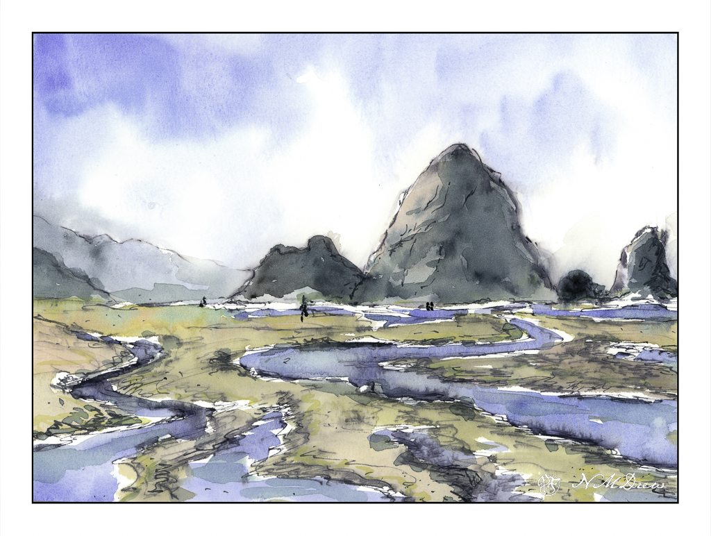
More of the northern coast along the Pacific Ocean. Here, Cannon Beach in Oregon, possibly one of the most dramatic beaches I have ever seen. Sea stacks, tide pools, sand, mist and fog. When the fog lifts and the sky brightens, there is a glare that cannot be explained. It’s not a summer day brightness as we have in SoCal, but a brightness that is cold but not like on a snowy day. There is a lot of moisture in the air, from sea and fog, and perhaps that is what magnifies the light to such a degree.

If you look closely, you will see some of my ink bled into the paint. I used my iron gall in, not my waterproof micron pens, and a stub nib to draw. From there, I wet the sky, dropped in colors, and then let things dry to dampness. I wanted to create soft edges for the mist in the distance which blurs and softens edges. The rocks themselves were painted wet-in-wet initially, and then other colors applied to either dry or damp paper. The sand and the rivulets were painted in the same manner. In the end, I drew again with my iron gall ink to add texture or detail.

Keeping this sketchbook is so much fun! I have room to paint as the sheets are big, the paper is strong so I can use both sides, and I can paint with a lot of water should I wish. It is proving to be one of the best decisions I have made of late!

High Desert Creek

More gouache, which I really get a lot of satisfaction in using. Here in the west, there are dry bed creeks which fill with water when it rains, creating a potentially dangerous situation with flash floods and scary fast waters. This is a bit of a calmer situation, but with the monsoon season, the potential threat is there.

Gouache, 8×10.

Winter at Great Dunes

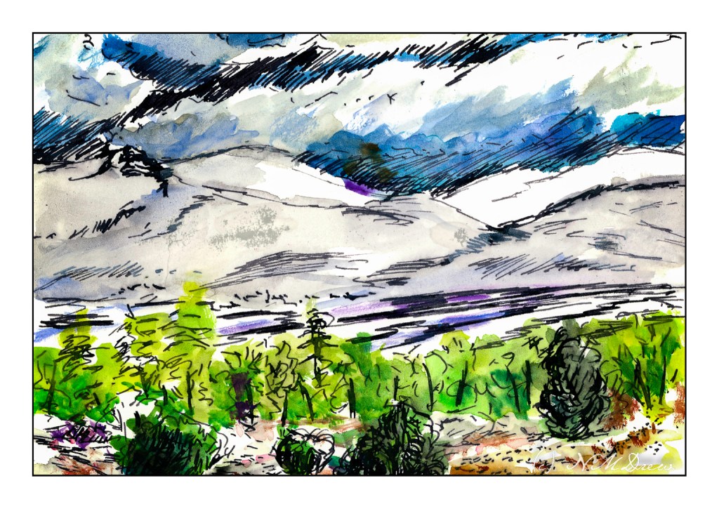
More iron gall ink and opaque watercolor. The watercolor is a small set of 24 “Angora” pan paints, probably meant for children as the colors are nontoxic and bright. Sets come in groups of 14 colors to 36. When I was a kid, I had a set of pan paints my mother bought for me – my sister had the same – and I just loved them. The set my mother bought was transparent watercolor, but diluted enough, these are equally transparent. There is something that I always love about paints in a pan – I think it is because it is more play than serious.

I have become enamored with the Great Sand Dunes National Park – so much to see, so many seasonal variations. Here, winter and snow on the dunes with clouds dropping down between the dunes and distant mountains. The river is cold, and there is a dusting of snow in the high desert plants. Winter is at hand.