Morning at My Desk

Today there is a bit of running around to do, so this morning I was in a blithery mood. Things to do – like the usual morning stuff – but I also know I won’t feel too focused on any one thing, so sketching with ink and watercolor seemed to be the best of all choices. (After all, life is not all about dishes and making the bed!)
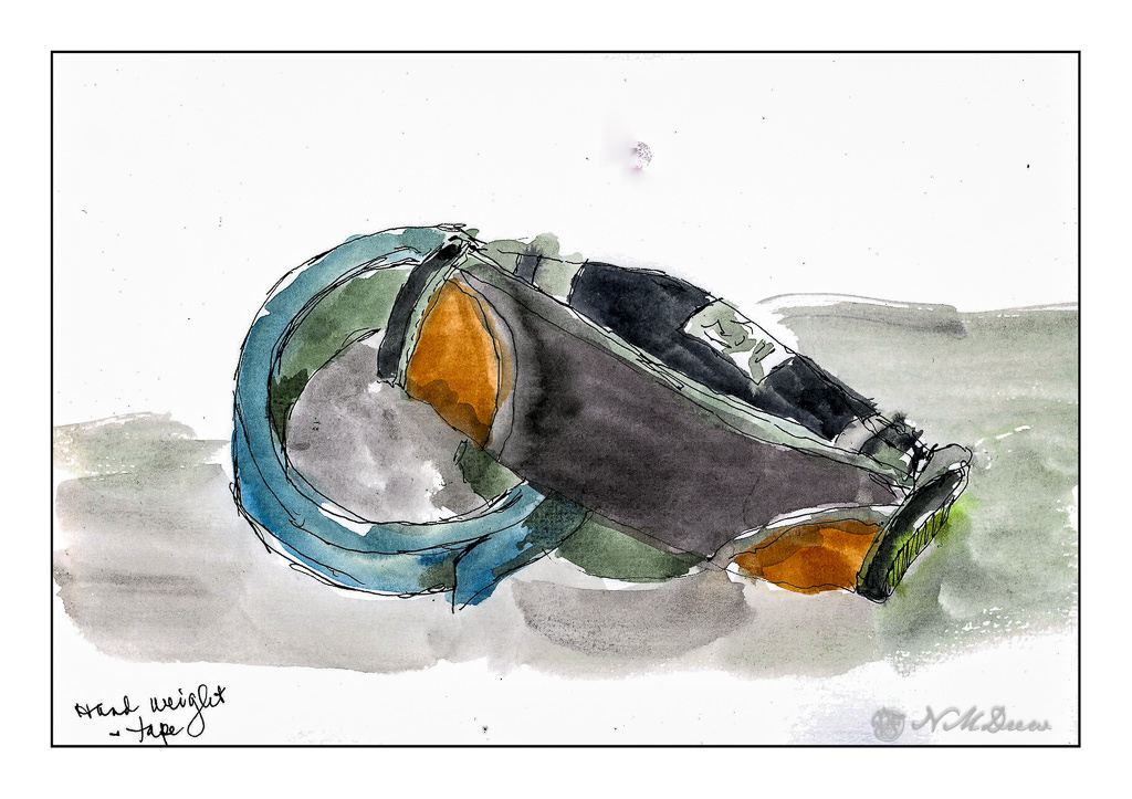
On my desk is a small hand weight and roll of painter’s tape. Warm-up. And now immortalized.
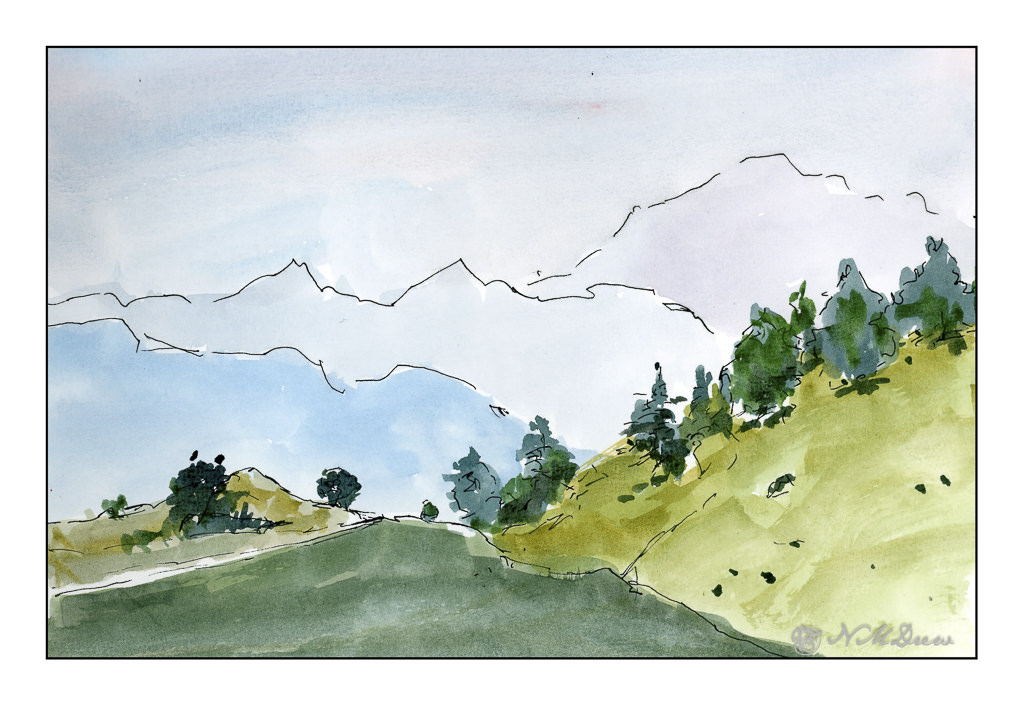
Next, the great outdoors. Mountains and trees. I would love to be walking around here, but sadly my ankle is keeping far more stationary that I want to be. I am getting better, but I have to just keep all to a minimum. I can go to the store and walk a bit, but I need my heel to get better more than anything.

So, the painting. Goal is to get a sense of distance with the gradations of the mountains as they recede into the distance. Accomplished!
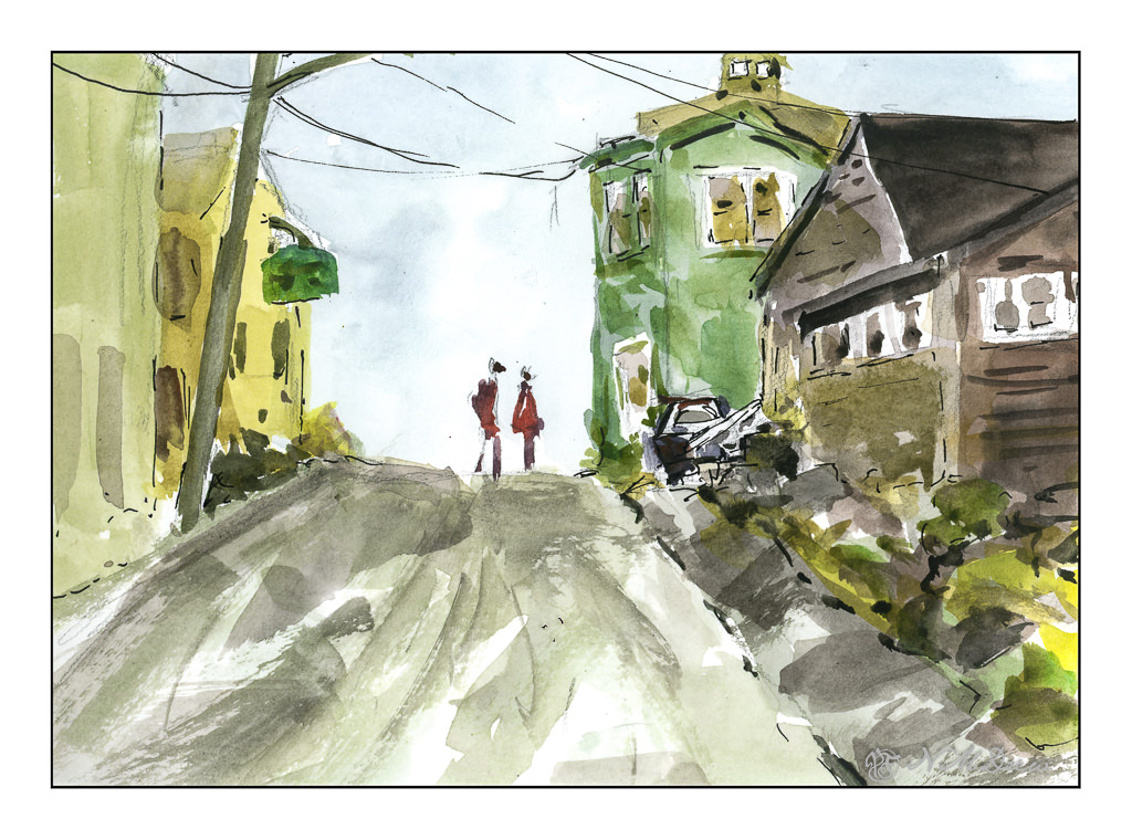
Finally, a scene with some complexity. I figured my warm up and splashing of paint were ready to meet my next challenge which is to paint buildings, people, perspective. Landscapes are comfy but I really want to push myself a bit more, as I did the other day, with direct painting and more patience and planning.

The first two sketches were done in very short order, but here I pulled out my pencil, limned in lines and worked on perspective and size. I think my people are a bit too tall, and I put them in before I did the painting of the buildings and the road. The buildings, too, are a bit wonky, but they work fairly well. I painted everything and then, once okay with the picture itself, I decided some black lines here and there would be good to help pull the painting together. Not perfect, but pleased with the results as I did meet my challenge.

Pentalic Aqua Journal, about 7×10, watercolor, Uniball micro pen.
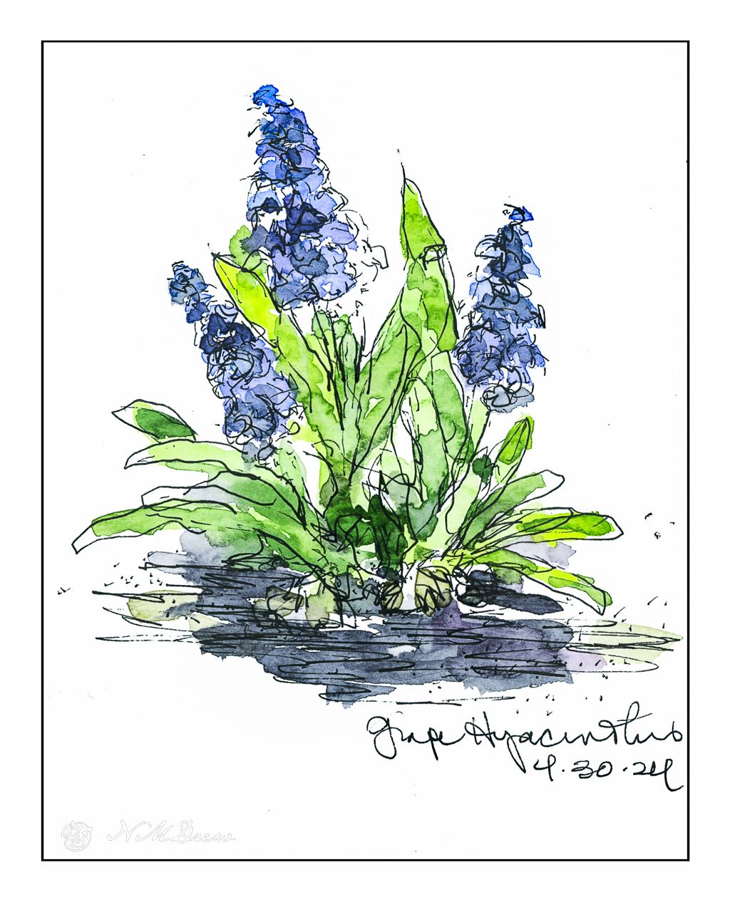
Last Day of April – Morning Sketches

The last few days have been the quintessential spring days in Southern California – and I have been outside, but never enough. I planted some tomatoes and cleaned up some plants in the patio garden, basked in the sun, and have done very little. Today, though, pen and watercolor beckoned with the morning coffee, and the colors of spring and the outdoors called.

Grape hyacinths are so odd to me! I am used to the big ones, in pinks and blues and flower petals which curl outward. Grape hyacinths make me think of little bells. This is the first year I have ever grown them, and short-lived as they were, they were so much fun to see. Bulbs always make me happy, and I have a variety of them, such as iris, ixia, daffodils. Bulbs need to be hybridized for our warm California winters, so they are not so rare as they used to be, but never seem as exciting as they do when they flower in a patch of snow.

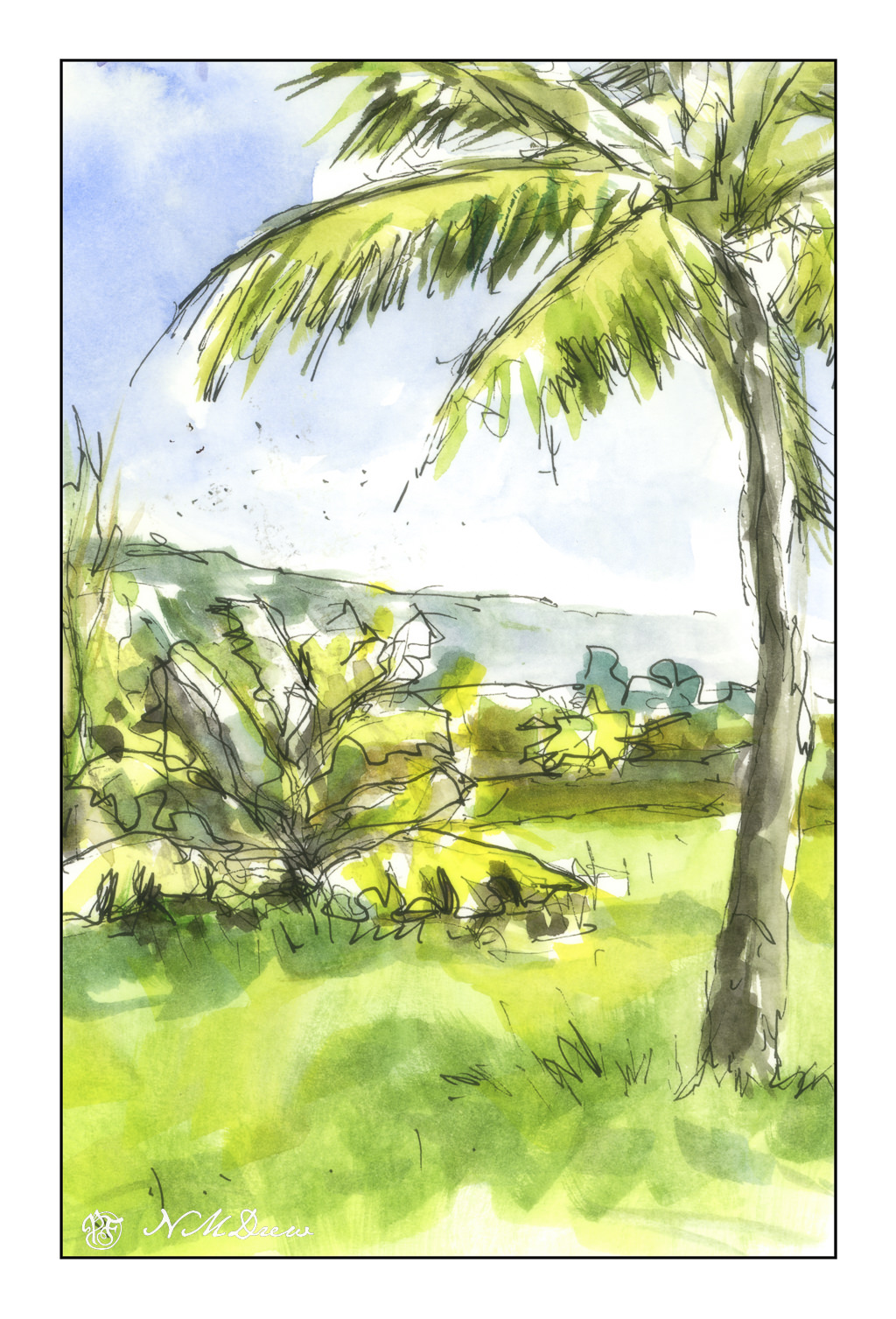
I was poring over some photos I have, taken by me or collected through Pixabay and other free online royalty sources. Palm trees and banana plants. I did this to practice dry brush on a wedge brush – nothing great but it accomplished what I wanted – a soft bit of blending, such as in the foreground.

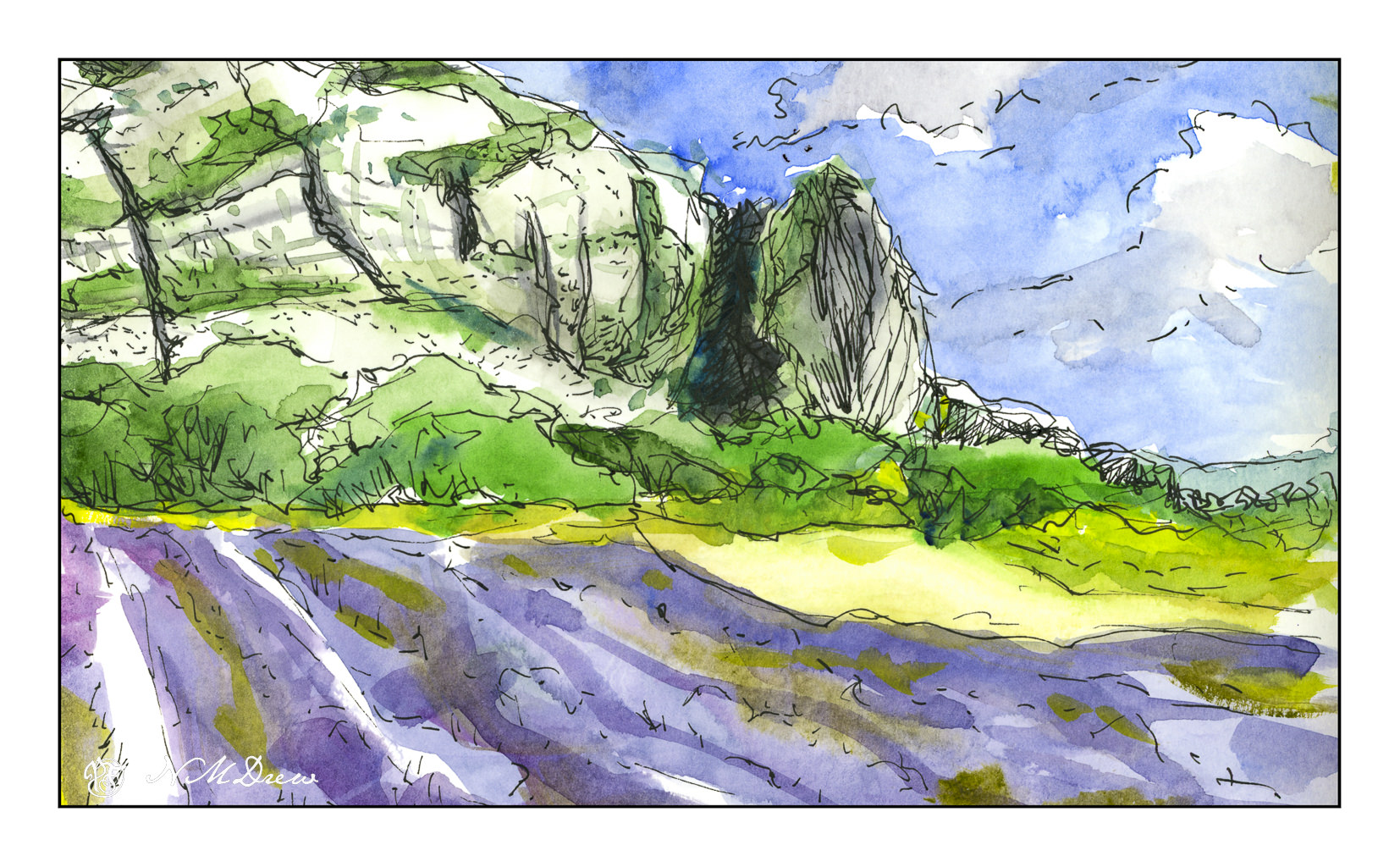
Once more lavender fields in Provence and other areas of southern France. In particular, mixing lavender that is bluish is a challenge; here, in watercolor, I diluted my purples with some blue and rose, as well as some greenish colors to suggest the lavender’s foliage. The scan didn’t do a great job. Additionally, I wanted to capture the texture in the rocky faces of the mountain, cracks vertically and horizontally in the bare stone.

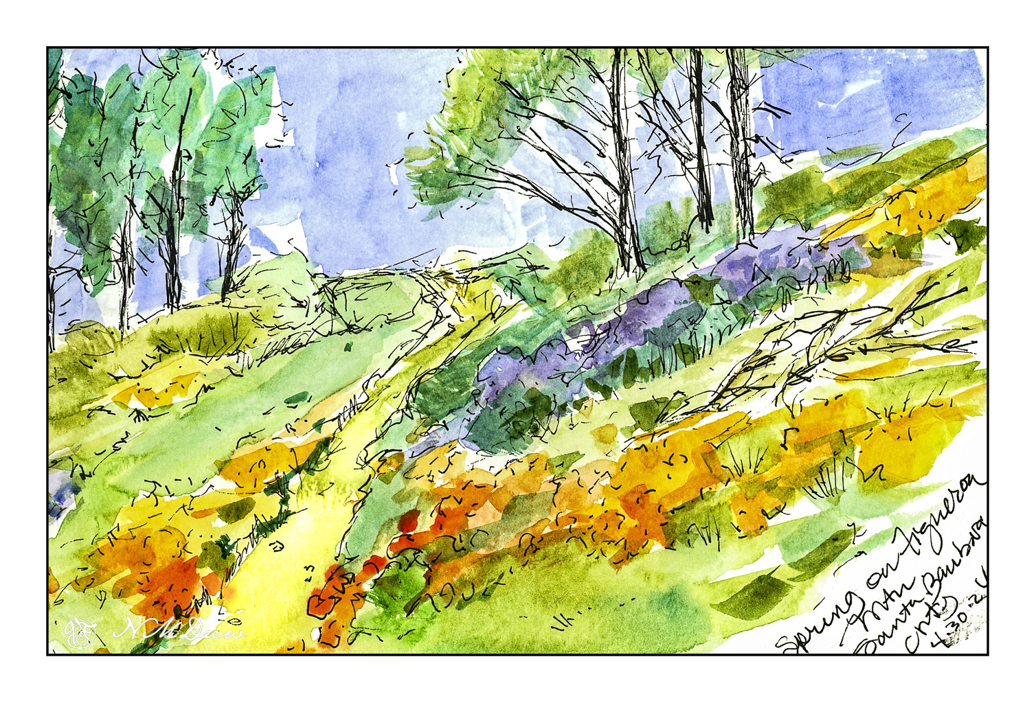
Finally, a favorite place of mine – Figueroa Mountain in Santa Barbara County. In the spring, lupines and poppies bloom, and the view across the Santa Ynez Valley extends for miles. To me, this is the epitome of a wonderful time of year in California. It is when the rains turn the hills from brown and dull to an intense display of yellow, gold, and purple.

Drawing with ink and watercolor is pleasant and relaxing, and doing it in a sketchbook takes away the desire to create a masterpiece. Here, exploration, play, practice.

Carbon ink on watercolor paper; Rosa pan watercolors.

Somewhere in Ventura County

I have been taking classes from a local teacher and artist, Harvey Cusworth, through a seminar and adult ed classes in oil painting. He is an experienced teacher and one who pays attention to each student, gives good suggestions and advice. Additionally, he is an experienced teacher which, in my opinion, adds a lot of value to a class as he is very aware of how a classroom of unruly kids or adults can act!

In the seminar we started landscapes, but because of getting sick, I missed two of the classes along with a number of adult ed classes. I decided to continue into the adult ed class the landscape I had started in the seminar just because I thought it challenging but also something I wanted to paint – a landscape from the back country here in Ventura County.

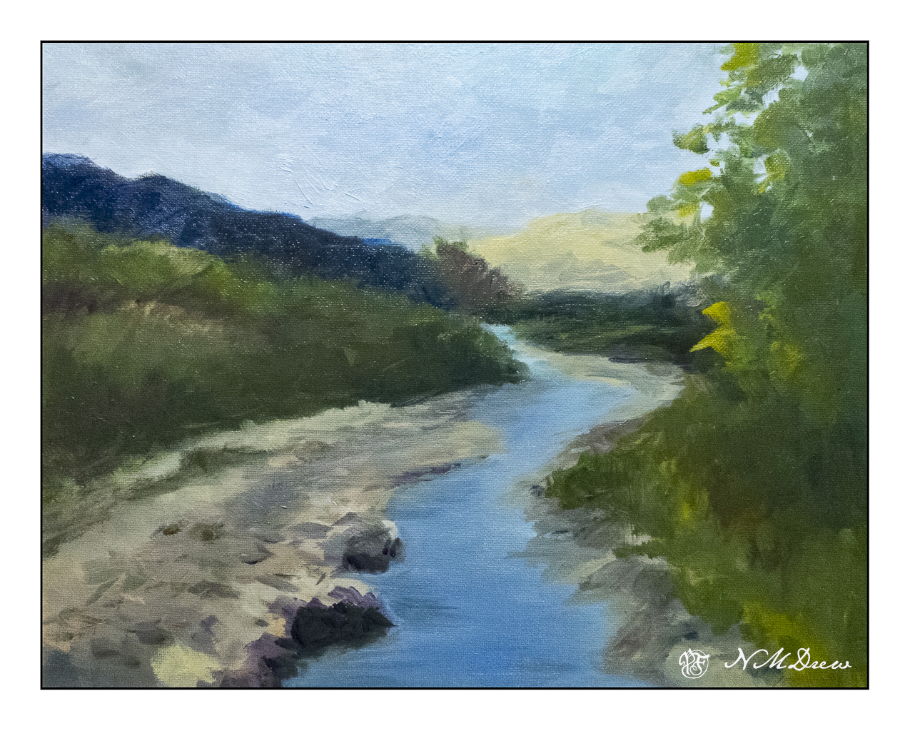
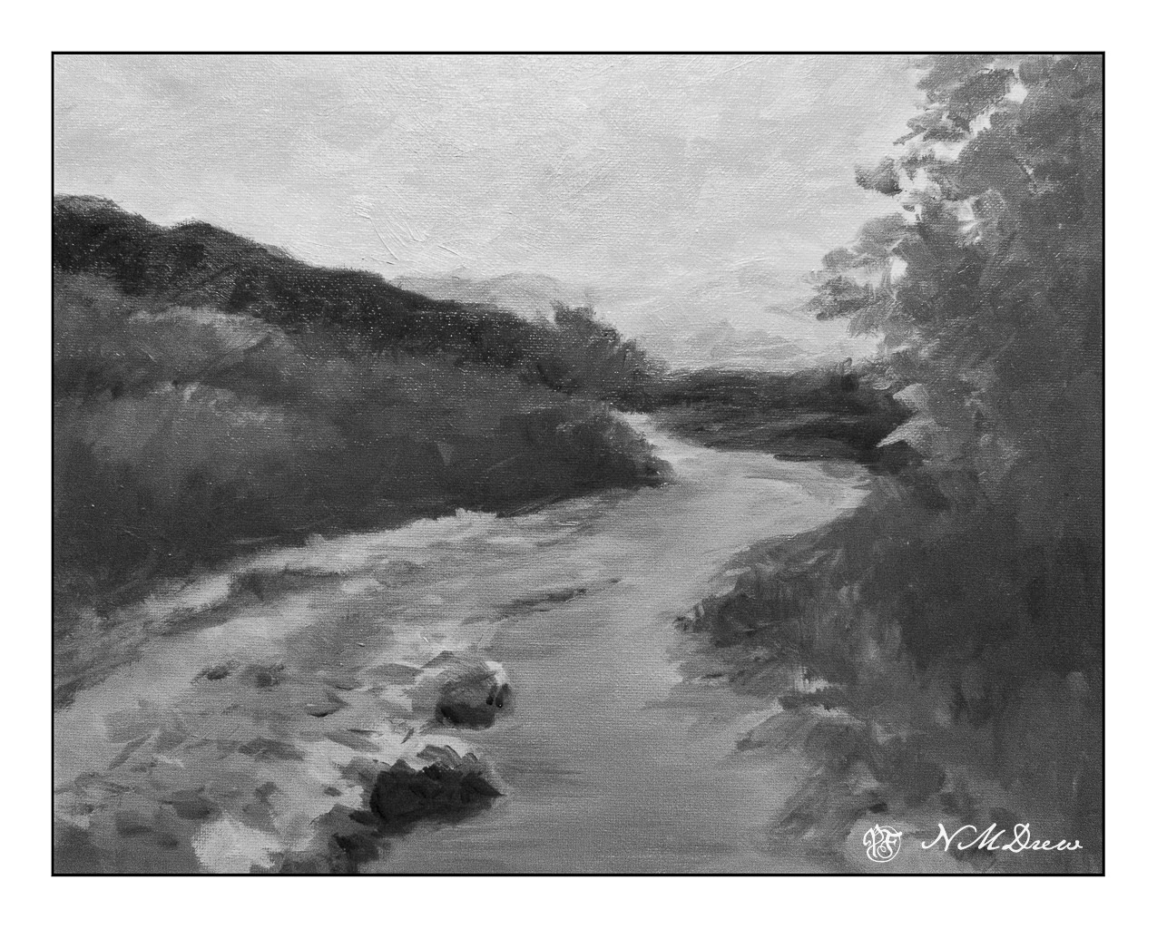
First: my final (as of this writing) version of the painting.

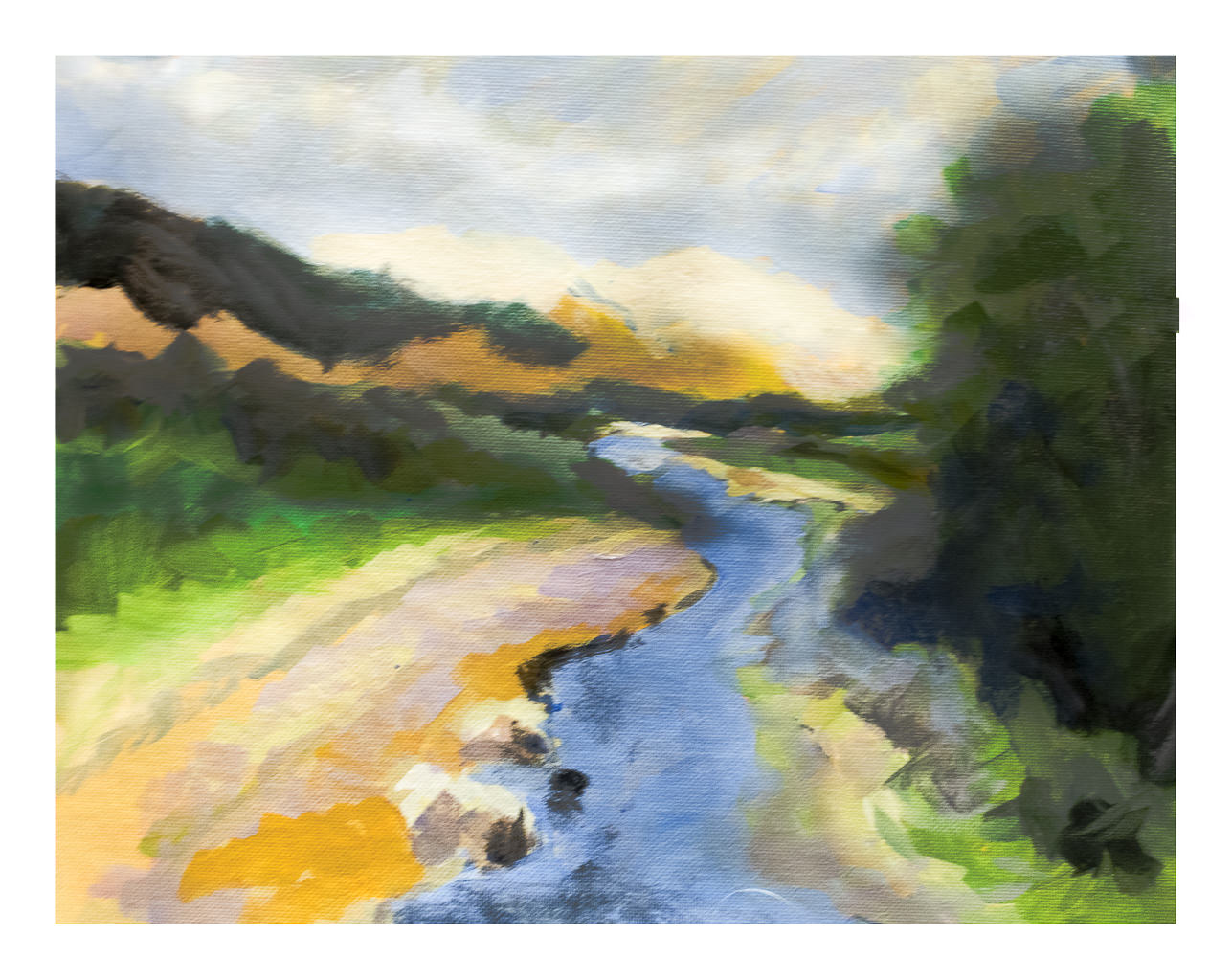
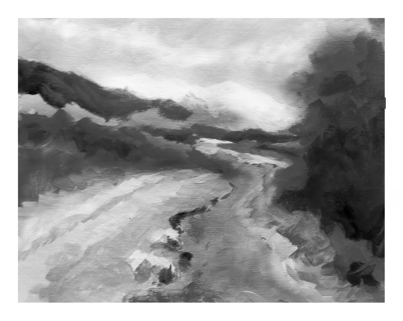
And now, it’s evolution. First, Harvey’s photo which was the subject matter – in color and then reduced to black and white to get a sense of values.

Photograph by Harvey Cusworth

Next, my own rather goofy value study, painted in color and then reduced into black and white.

Underpainting

This painting is done in oils, and has taken me several hours over several days to complete it. Even now, I have to let it sit and dry and regard it a bit more carefully to see what I think of it. As it is still wet I took a photo of it, and in places there is some glare, seen more clearly when enlarged. 11×14 on a cotton canvas panel.

As above, I like to see what my work looks like when turned to black and white – for values. Also, it is just fun to do! I just use the sliders in LR to reduce vibrancy and saturation reduced to -100. Doing this is really a good way fro me to evaluate contrast and such.

Final painting in color and black and white

So, there we are. In general, I am pretty pleased with this painting. The goal is to lead the eye along the creek to the small stand of tree at the top of the creek. I wanted to show the brightness of the barren mountains in the distance, but did not want them to become overwhelming. The BW image of the final painting shows that the mountains are very similar in value as the sky. Is this an issue? Not sure. Things like this are to be considered in a few days when it is no longer in front of me.

Now, on to other things, like cleaning my brushes . . .

Big Sur, Looking South

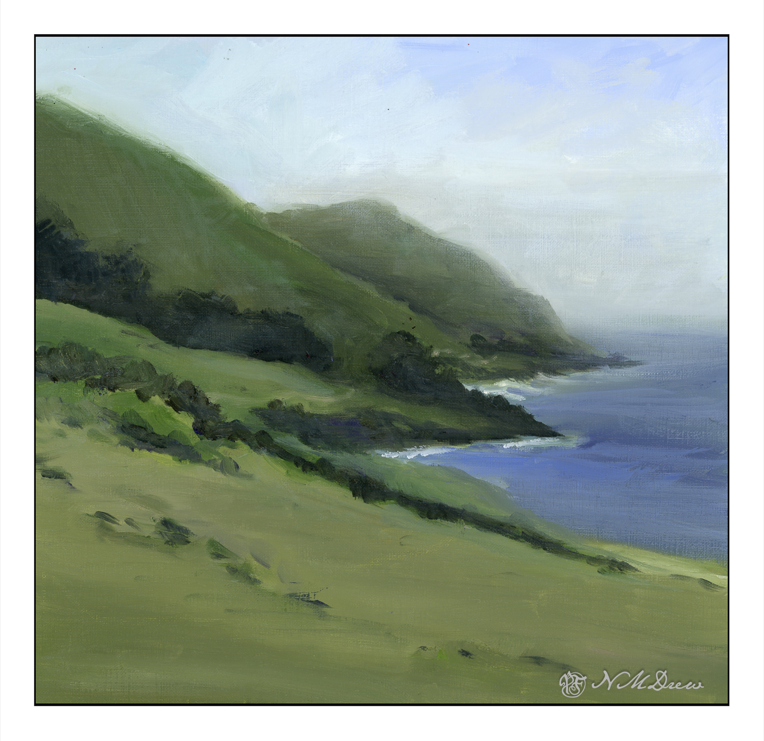
Big Sur along the California coast is an incredibly beautiful bit of the state – at once wildly beautiful, in many ways easily accessible along Hwy 1, but delicate, too, as it is easily destroyed by heavy rains creating mudslides. Parts of it are rugged with mountains rising up and coming down into the Pacific Ocean. Hwy 1 skirts along, and it is always best to be the passenger so you can enjoy the wonderful views.

From where I live, you drive north, past Santa Barbara and then veer off on the 101 in an area marked on the map as Las Cruces. You could continue up the 101 up to San Luis Obispo, cutting west toward Morro Bay and then along the coast. Before you get deep into Big Sur, the mountains are toward the east, and there is a coastal plain. Slowly the landscape changes as the flatter areas disappear and the mountains move ever closer.

The entire drive is a delight. Coastal fog may drift in and out, and no matter where you look, the beauty is breathtaking. I have tried to catch this in the distance and along the horizon. The Canson XL paper is nice to paint on, and I used Gamblin Galkyd gel to speed up the drying time, but it sat in the garage this past week so I could ignore it and look at life away from the studio. Getting some time away from a painting is always a good thing as eyes are fresh upon the return. I was pleased with what I saw, and so scanned it, and present it to you for your viewing.

Painted on 11×14 Canson XL Acrylic / Oil Paper, about 10×10.

Snowy Pines Road – Rectangular or Square?

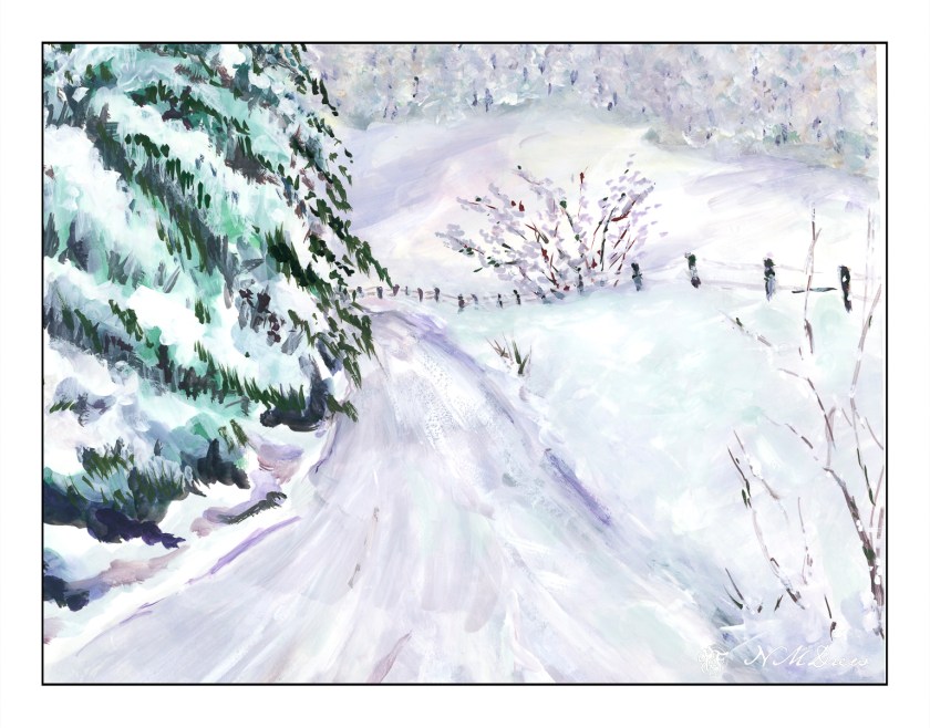
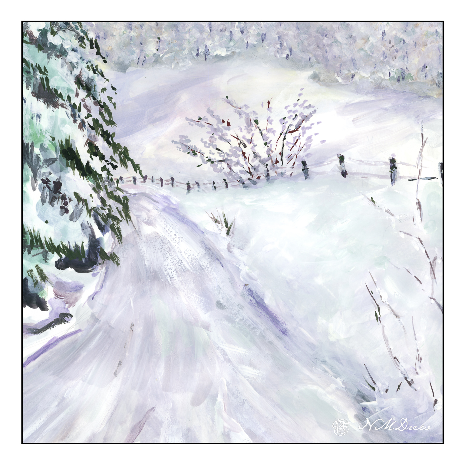
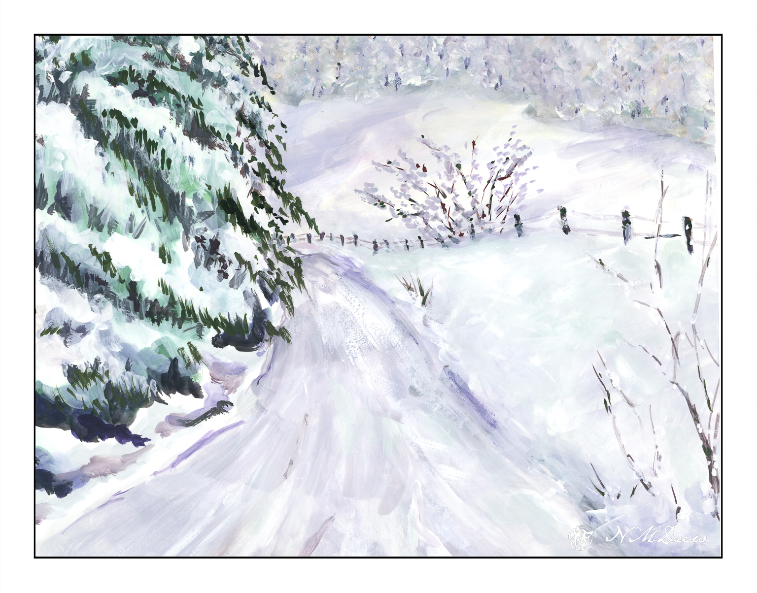
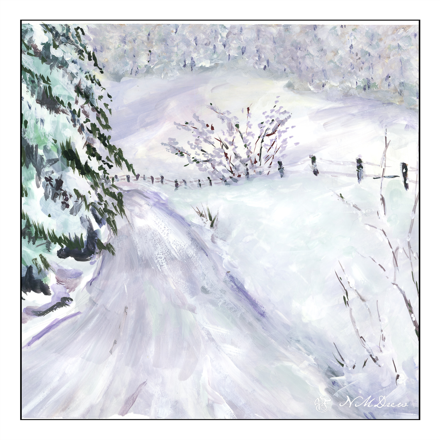
Another afternoon, another bit of time, another gouache. Today, since we are in December, it is time to visit mythological scenes of snow and cold as today we had 70+ F, and tomorrow more of the same with the possibility of fires because of the winds.

I am also in a bit of a dilemma – are the trees too heavy on the left hand side of the painting, or should they be reduced a bit in volume? The only way to do this is to crop the picture, so I did it in Lightroom.

Or is the square one a better painting?

I am rather torn. So, a slide show to compare them side by side. Drag the <> as far as you can left to right if you want to see them . . .

Your thoughts??