Round Things: Highlights & Shadows

Painting light and dark – contrast – values – is a hard one for me in watercolor.  I want to do it wet-in-wet, but maybe layering will work better.  I just don’t know.  So, when in doubt, look to YouTube!

Here is one video I found that I think does a very good job on both highlights and shadow, discussing reflected light and so on.

Another video which is also good, with a look at only the shadows on a spherical object, discusses the use of analogous colors to create the shadow on the surface opposite the light source.  This video can be seen below.

Because I was having problems with making grapes believable (see here), I decided to research highlights, shadows, and round things.  These two videos proved very helpful.  Rather than describing them in detail, they are definitely worthwhile watching.  The top one addresses shape and shadows on the object, as well as the cast shadow.  The lower one uses analogous colors to deepen the shadow on the sphere itself, which keeps the color of the sphere rich, rather than neutralized by a complementary color or an added grey, such as Payne’s or Davy’s.

That said, I spent a bit of time on these old spheres today and yesterday.  Here are some of the results of my practice.

The image above is based on the exercises in the first video.  The ones with the red and blue spheres are the most believable, I think.  The spheres and shadows are essentially wet-in-wet, with the final thin lines of darkest shadow done with a finely pointed brush on a dried image.

Here is another round of studies, trying slightly different techniques, such as wetting the paper first, then applying color.  The techniques followed were the same as in the first video, with greater success.
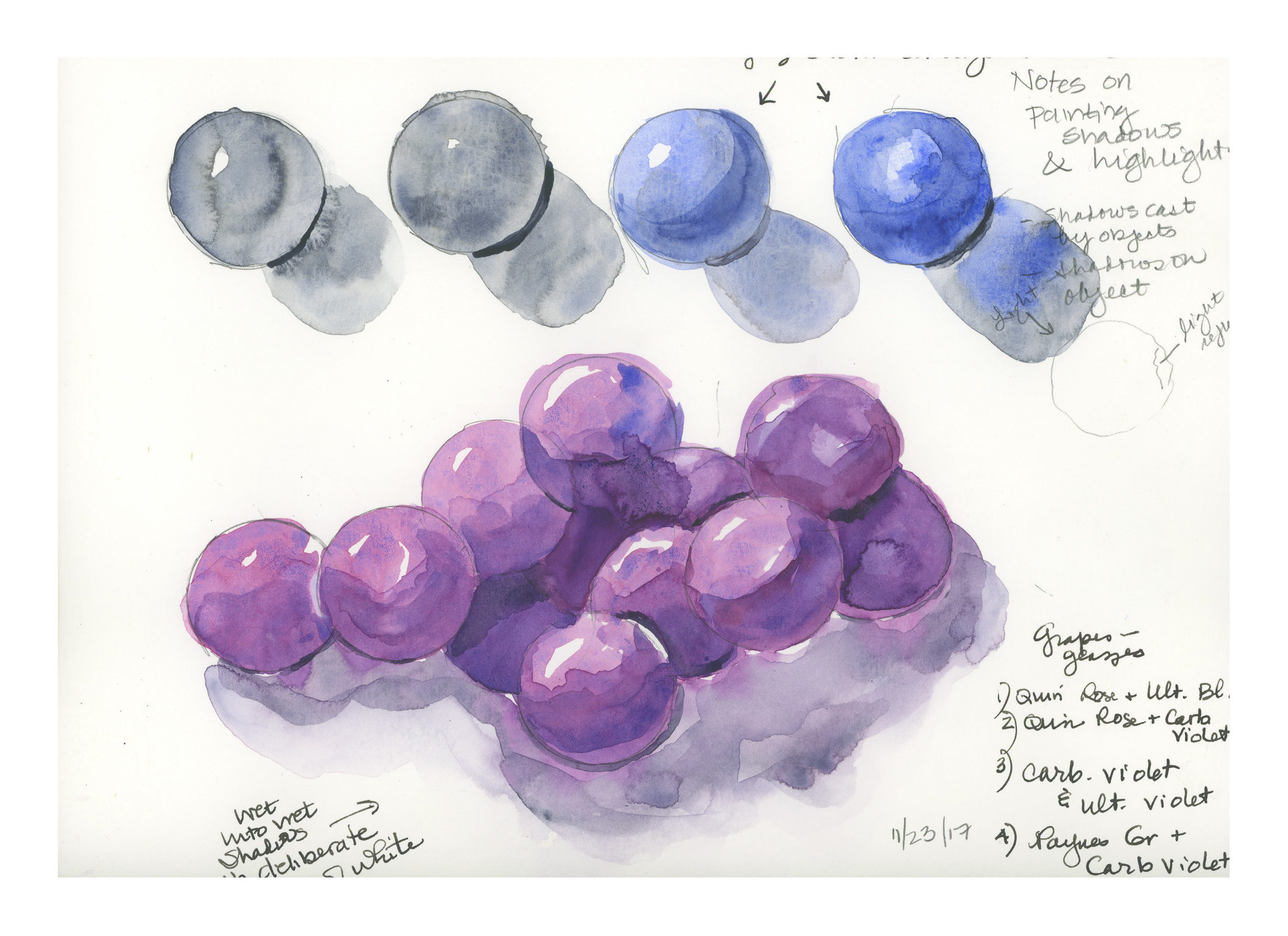
Here, the spheres were made as in the first video, but then I went in to darken the shadows using analogous colors.  The blue spheres were done in ultramarine blue, and the deeper shadows were a glaze of indanthrene blue.  Below the 4 spheres is a bunch of spheres, sort of like grapes.  The spheres were done with quinacridone rose and ultramarine blue, with analogous layers in the shadows to include carbazole violet and then Payne’s grey (see note on lower right of image).  The shadows were done wet, and linked to the grapes to bleed color in.  I deliberately left areas of white, even if they didn’t make sense, just to create areas of white between grape and grape, and grape and shadow.

Finally, the above image.  I have a bunch of oranges I want to paint, so I thought it was now time to incorporate all my lessons into one little orange.  The one on the left is the example, with, I think, the best orange colors.  These were hansa yellow, pyrrol orange, and organic vermillion – all three are colors new to my palette.  The ink is carbon ink from Sailor on the left, and just a fountain pen with regular black ink on the right, just if you are curious.

My orange is my favorite of all the exercises as it pleases me the most.  The grapes are OK, but they are glazed, which I am not too excited about.  It could be that I am just not adept at glazing.  Anyway, there we have it:  Thanksgiving morning exercises.


Working with Contrast, or, A Day Without Mud

Today, my little Meetup group was really little.  Initially there were to be 4 of us, but one cancelled, and then the third unfortunately got very lost using her GPS.  She wrote she was 3/4 of an hour late . . . and we waited 10 minutes, too.  Next time I post a Meetup meeting, I’ll spell out directions, so hopefully that won’t happen again.

So, contrast.  I am dreadful with it.  And with painting things so that they look like things rather than blobs of color.  However, that is probably something that time and experience will cure.  Today, though, I did manage to not turn everything into mud – a major accomplishment, let me tell you!

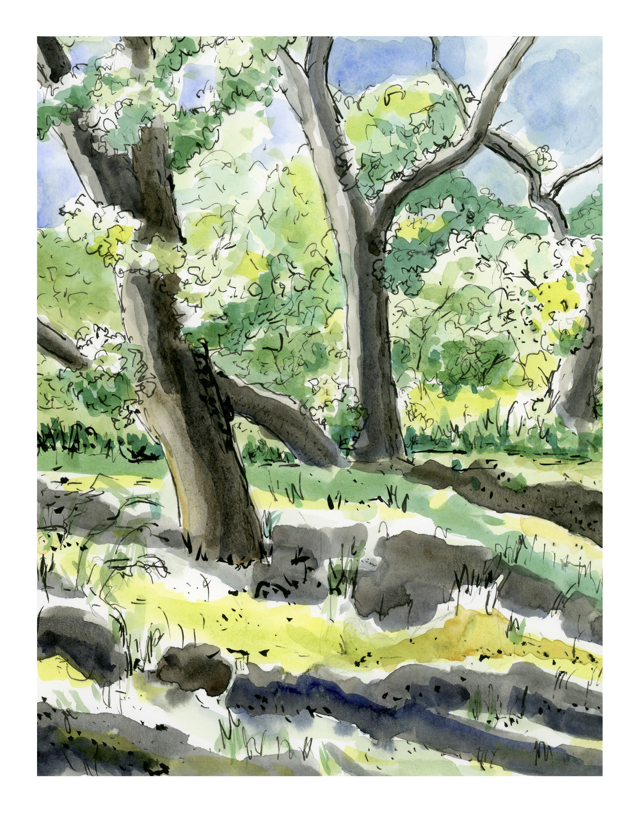
We went to a local place, the trail by the Chumash Museum nearby my house.  (The Chumash are a California tribe.)  We were there for about an hour.  I began with a pencil sketch, and then, color.  We were settled in a small oak grove, with dark and light contrast about as contrasty as you can get.  At the end of the hour, this is what I had painted, knowing full well I would look at it and work it a bit once home.

As you can see, I did leave areas of white!  Another first . . . As I was painting I made a monumental decision, too:  paint long horizontal stripes to represent the grasses under the trees, and the shadows crossing the foreground.  I sat there and painted stripes.  It was nerve wracking.  The blobby white areas were deliberately left for consideration later.

And once home, I looked at the painting.  Still a need for contrast, and a bit more detail.  More pen, more ink brush, more colors, and some warmth.

Overall, the one above came out okay, but if you look on the mid-right, to the left of the furthest trunk, there is a bit of an odd space, so I went in and worked it a bit with ink to try to mitigate it.  I found it very distracting.  Here is the final image below.

The area has a few more lines in it, a bit busier, but somehow more in keeping with similar areas of the painting.

My palette was somewhat unknown!  That is, I was not really sure the names of the colors as I was using them, but I do have a list of how they are laid out on the palette, which is why I can tell you now!  I used Koi watercolor brushes and the following paints:  Quinacridone Gold, Naples Yellow, Hansa Yellow Medium, Cerulean Blue, Cobalt Teal, Ultramarine Blue, Indanthrene Blue, Phthalo Green, and Burnt Sienna.  I used a Stillman & Birn Beta Series 8×10 inch softcover notebook, and scanned the images using my trusty, not rusty, Epson V600.

Remembrance of Things Past

If I want to be honest – which sometimes I don’t want to be! – I never realized that in watercolor, as in sumi-e painting (which I haven’t done for a few years), the brush is important.  In sumi-e, brushwork is important as it expresses what color cannot – color is not found in sumi-e, only shades of blacks and greys and white, with the subject hinted at, not indicated in boldface!  Playing with leaves made me remember this . . .

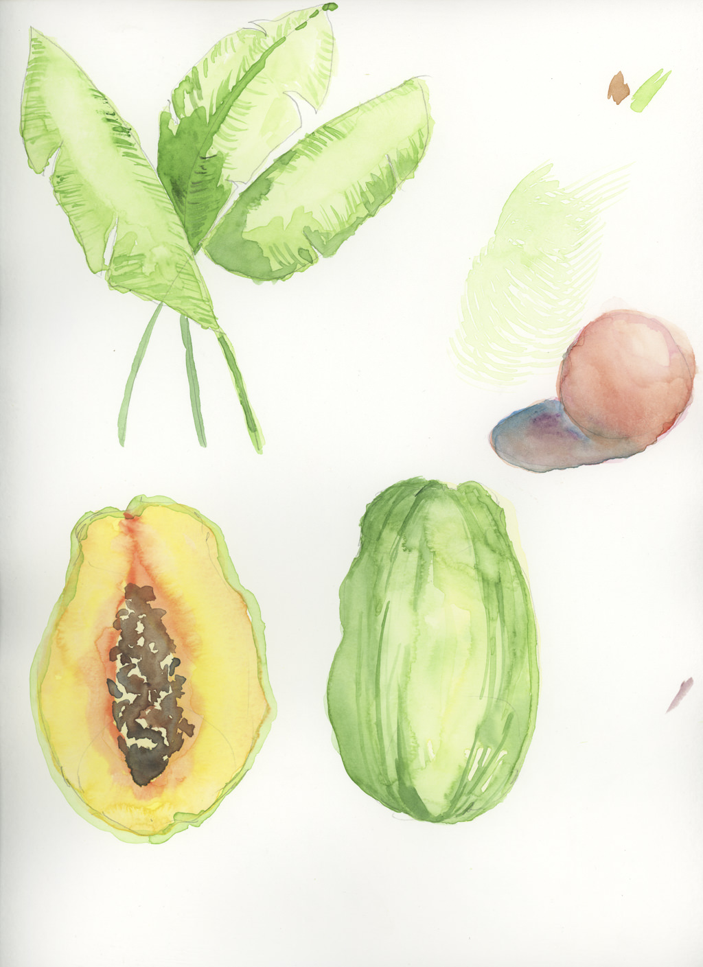
Because my chronic struggle in watercolor always seems to be overworking and mixing too many colors together, I decided to pick up a book called Everyday Watercolor:  Learn to Paint Watercolor in 30 Days, by Jenna Rainey.  I figured some kind of disciplined plan could work.  Her style of painting is not necessarily my style of painting, but that was not important as far as I am concerned.  My concern was to stop making mud and to relearn what I have forgotten over the years.  The examples in Rainey’s book are pretty basic, pretty straightforward, and actually, a lot of fun to do.  It has helped me drop that little, nagging, nasty perfectionist who always criticizes.  Rather, it is far better to just do, and quit the role of critic.   She does studies such as shapes, allowing colors to bleed into one another; she discusses design in the abstract exercises with squares and circles.  There are simple exercises in drawing and painting trees with foliage in shadow, and depth, with lighter pine trees in the distance, and darker ones in front.

What do I find the most valuable in this book?  Crazily simple lessons.  Step 1.  Step 2.  Step 3.  Limited palettes of color.  Most how-to-watercolor books are wonderfully full of tantalizing pictures, but few that I have seen really drill down to making it simple.  I enjoy the work of watercolorists such as Winslow Homer – people with a loose, free style which I would love to emulate.  I am not a contained person in the sense of wanting to fill in the lines, like in a coloring book, but I also appreciate the disciplined approach of people like Birgit O’Connor, who paints huge flowers, beach debris, and so on.  I am still struggling with watercolors enough to have no style of my own – I am still attempting to master the brushwork, water, and colors.

Currently, I have just finished Day 11, which is wet-into-wet and some dry brush.  Like in dry-into-wet.  Something like that.  It’s a papaya.

I’m looking forward to 19 more days … sort of a diet!  And to date, no mud!


Penstalgia

So many people these days cannot write cursive, much less read it, thanks to the insistence on “new technology” in classrooms.  Keyboarding takes place of learning how to write using a pencil or pen.  Printing seems to be the only thing taught, and mastering it is not even encouraged.  It’s funny to think that the hours I spent in the classroom learning to print, to write cursive, and to touch type are now returning to being recognized as skills more valuable than just being able to communicate.  Eye-hand coordination, fine motor control, neurological benefits.  I probably could do some research and list a thousand things.  All this automation and such makes life easier – no doubt!  I love my dishwasher! – but the satisfaction of working with your hands is completely lacking.

Cursive has become a foreign language to students born in the last 30 years.  They cannot read it.  It’s not just U.S. students who should learn cursive, but students coming in from other countries could also benefit from it.  Other languages have other alphabets, and their beauty is certainly something to be appreciated.  Good handwriting is really an unfancy form of calligraphy.  The practicality of good cursive is just as it was advertised years ago – it is clear and readable.

I’m revisiting what I learned ages ago, and it is a lot of fun.  I’m using a fountain pen, and I am using a dip pen.  A dip pen is not so hard to master, once you learn how to hold it and adapt to holding it at the right angle and tilt.  Once there, it is smooth sailing.  Repeating letters and practicing strokes, curves, and circles is very soothing.  Like coloring, there is something that simply refreshes, like a deep meditation.

Anyway, because I was blundering around on YouTube, I came upon the above video, which I totally enjoyed.  It’s informative, classic, and if you like fountain pens, wait until the end – you will learn a few things you may not have known!

New Year, New Focus

paint-boxes-1189945_1280

I’ve done watercolor off and on since I was a teenager, back before the dinosaurs disappeared, but I have never made it a resolution to spend time – a lot of time – mastering it.  Rather, the approach I have had has been sporadic and amateurish.  Now, I want to be the “serious student” I never was . . . and while I think I am off to a good start, the real question which lies ahead is how well will I integrate painting into my work life?  I’ve managed to integrate both sumi-e and photography into my life, but I began both of those long before I ended up working 10-hour days.

There are a lot of good books about “how to” watercolor, and I have looked through and purchased a number of them.  As well, there are a number of good YouTube channels with talented artists, with whom you get to cruise along with as they produce a painting.  For me, this visual is what gets me all the time.  While books show you step-by-step photos, some in color, some in black and white, there is absolutely nothing like the video of beginning-to-end, with commentary as the painting develops.

I still plan on pursuing photography – in fact, I have a 365 project planned, with different subjects on a monthly basis.  While I am shifting my focus away from photography as my primary creative outlet, I really want to master watercolor and drawing, and to do so, I need to spend more time doing it rather than thinking about doing it.

So, Happy New Year to everyone!  I hope you have new intentions to keep you happy and creative in your life!