Winter is leaving and the bulbs are emerging. In my own yard, freesias are in bloom, their sweet scent greeting me as I come and go from the house. Other bulbs are found in the stores, as cut flowers or in pots. Daffodils and tulips are the most common. Hyacinths are rare. Where I live, there is never snow on the ground, and if we are lucky, we get rain and a cold wind. Having grown up in the middle of blizzard country, I miss the bulbs – but I don’t miss the weather! So, here are some paintings of daffo-down-dillies and one of some tulips. None are great, but all were fun to do!
Category: Painting
Retrospective
I was rummaging through the files on my desk, and came across a collection of sumi-e ink, ink and color, and watercolor or acrylic paintings I did a long time ago. Some of these are “aceo” size, which measure 2×3.5 inches, and others are other papers. I used to sell these on Ebay, too. Maybe I need to go through and scan some more – it’s like tea and madeleines – memories and reminders.
Sky, Interrupted
This morning I sat down to practice skies. If I were to do the ones in my neighborhood, they would be blue. That’s all. Just blue. Clouds are not a common sight where I live!
Anyway, so I scooted around YouTube and found some videos that had some good ideas. One showed how to do lifting with tissue, advising not to scrub too hard on lightweight paper. Important to know – I scrubbed a bit of the paper off. Others used some rather wild color combinations, or certainly ones I haven’t thought about using. Add to that, I wasn’t trying to accomplish anything more than playing, so it was altogether a fun way to start the morning.
This first one is a combination of Sodalite Genuine, by Daniel Smith, Ultramarine Blue, and Quinacridone Gold. The Sodalite is a color I picked up on a whim, put in my palette, but had never used until this morning. It granulates wonderfully, and is a good charcoal grey. I think I will be using it again.
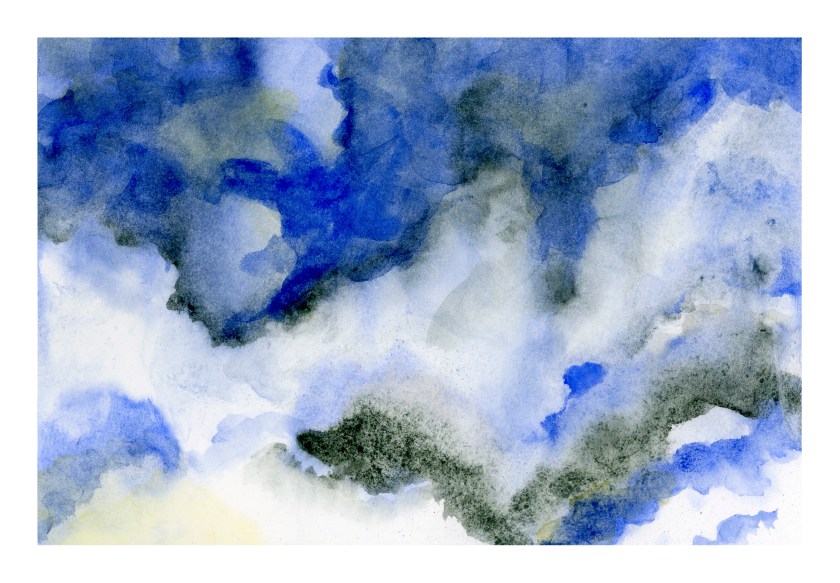
Then I started another one, wetting the paper once, letting it soak in a second time, and then wetting it again. I am using Canson XL watercolor paper, which has a nice texture, is about 90#, and is a student grade paper. I like it because it is working out really well for my needs.
After wetting the paper, I decided to start with a gradated wash, using the reverse side of another painting (to save paper, eh?). The brush I used was a flat with rather stiff bristles, and the result was lines throughout the wash. Oh, well. Then I simply lifted the color off. Then I began adding Carbazole Violet and Quinacridone Gold.
And then the phone rang! My brother and his wife in Wisconsin calling, to wish us well for the holidays . . . . the painting was forgotten for the next several minutes, and this is the result.
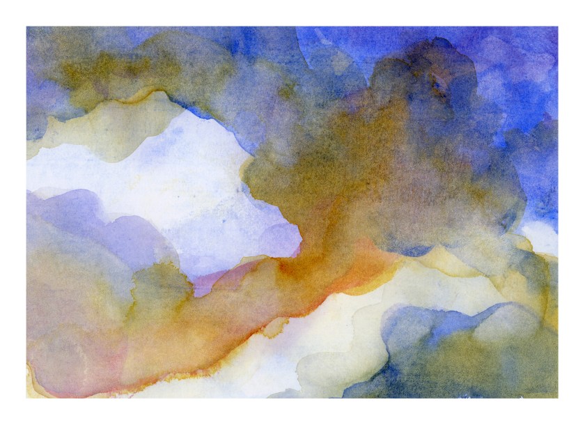
Regardless as to whether or not this last looks like clouds, the colors have a lot of potential for a dramatic sky some day. I really like the colors! I like both, actually.
White space. No mud. I must be doing something right!
Practice Present Presented
My sister-in-law requested hand-painted cards for a Christmas present. She’s getting them! Out of all of these, 6 were from exercises I did following Peter Sheeler’s YouTube painting tutorials. What made them particularly useful, to me, was that many of them had a lot of white space in them, such as white snow or flowers. The other thing was the simplicity of composition – a few trees, a stream, some flowers. While they look easy, I did need to focus on the videos to follow the sequence of painting, as well as to focus on what I was seeing. Of all of them, I think the stream was the most challenging.
From using Peter’s videos to practice with, and to create cards, I went on to do two based upon photos I have taken. One is a prickly pear which really does sit on a heart-shaped paddle, and the California poppy fields at the State Preserve. The latter made me think of Monet’s painting of a woman in a poppy field – the brilliant colors against a sea of green. Our poppies in California are orange and yellow, so no reds, but mixed in with these colors are blues and whites and so many other colors it is hard to imagine that much of California once looked like that in the springtime!
Below are the different cards I did. Click on one of them to start the slide show.


