1st Colored Pencil Class

Nothing like learning a few things! I’ve drawn with colored pencils on a very causal basis, but what I learned today included: use of Saral, a waxy transfer paper; use of burnishing and blending pencils. Never heard of those before today, but used all three.

Where to begin? I got there 30 minutes late – I thought class began at 9:30 but, no, 9:00. Oh, well.

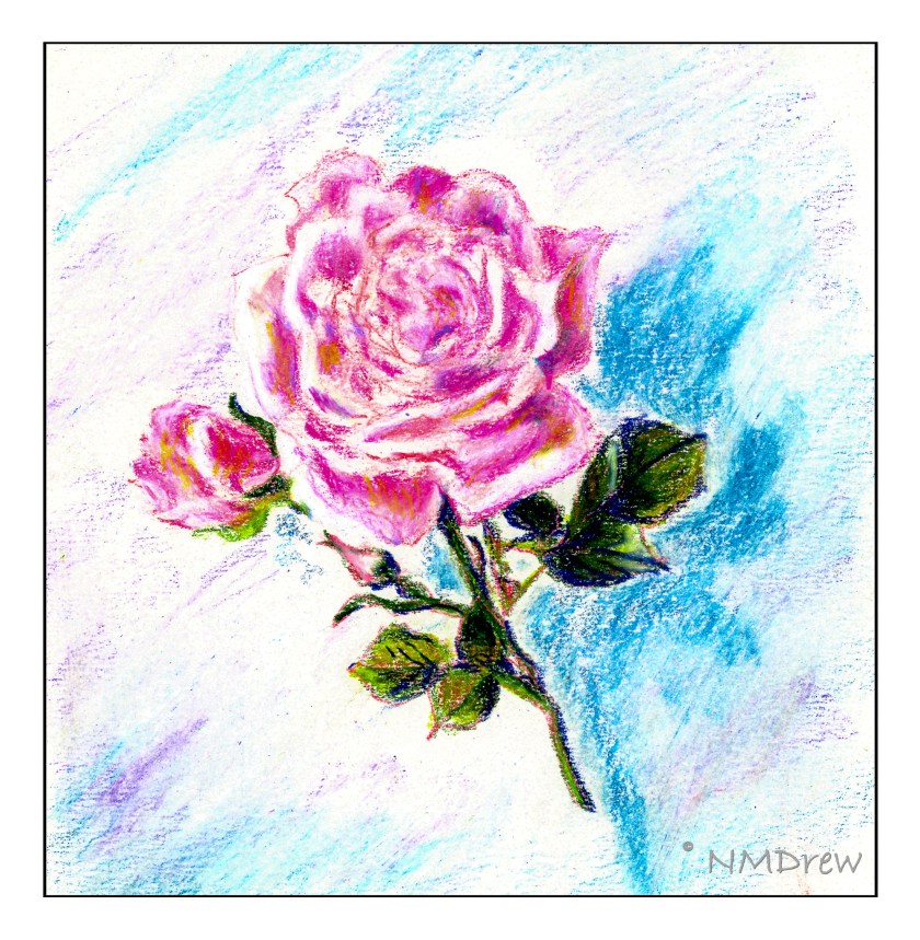
Subject was a rose. Place the Saral between the picture you are going to use as reference and the paper you are going to draw upon – like carbon paper. Press hard to be sure it is on the drawing surface. Then, remove the Saral, and use a rubber eraser to blot the lines. This lightens them so you can still see them, but not so dark they are obvious. The paper we used had a bit of tooth, to catch the colors, and we worked from light to dark, white to reds and pinks and into the greens of the leaves. The suggestion was to moosh up a background to keep the rose from floating in space, so I did.

When I got home, I was interested in trying my hand on different papers. I have some bristol paper, which is a very smooth and very white paper.

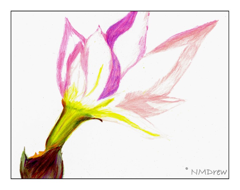
This paper is so, so smooth that it is actually slick. As a result, colors are blended into one another very easily. I think the Prismacolor Premier pencils may be too soft for this paper and a harder, oil-based pencils, such as Polychromos, may be better suited for bristol.

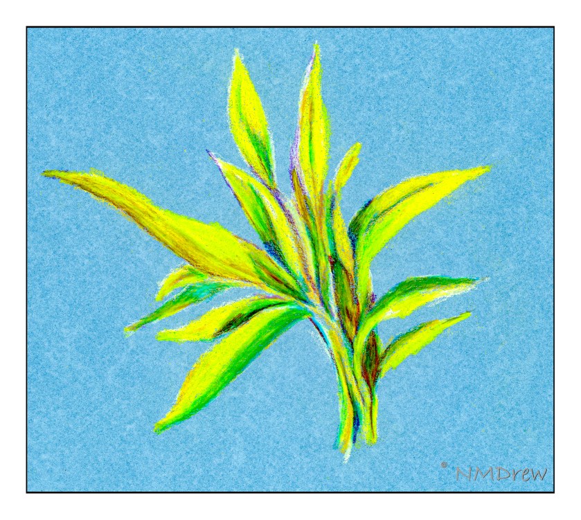
The next experiment was done on some of my MiTeintes pastel paper; here, a mid-blue. I sketched directly onto the paper, using a very pale yellow pencil to create the general shapes as well as limn in the lights and darks. I decided to look at values the best I could, as well as whether they values tended toward warm or cold. The sunlight was dappled on the leaves, with some bright yellow green, and other a deep, blue-green tending toward black.

Out of all of these, I like the galangal the best. I like it because I had gotten a better sense of how to use the colored pencils, learning some of their characteristics and qualities. The blue background adds to the picture. The light and dark colors worked pretty well, and remembering to use complementary colors to dull down shadow areas I think kept the vibrancy. So, for a yellow-green leaf, the shadow colors were a purplish red, or a layer or two of each.

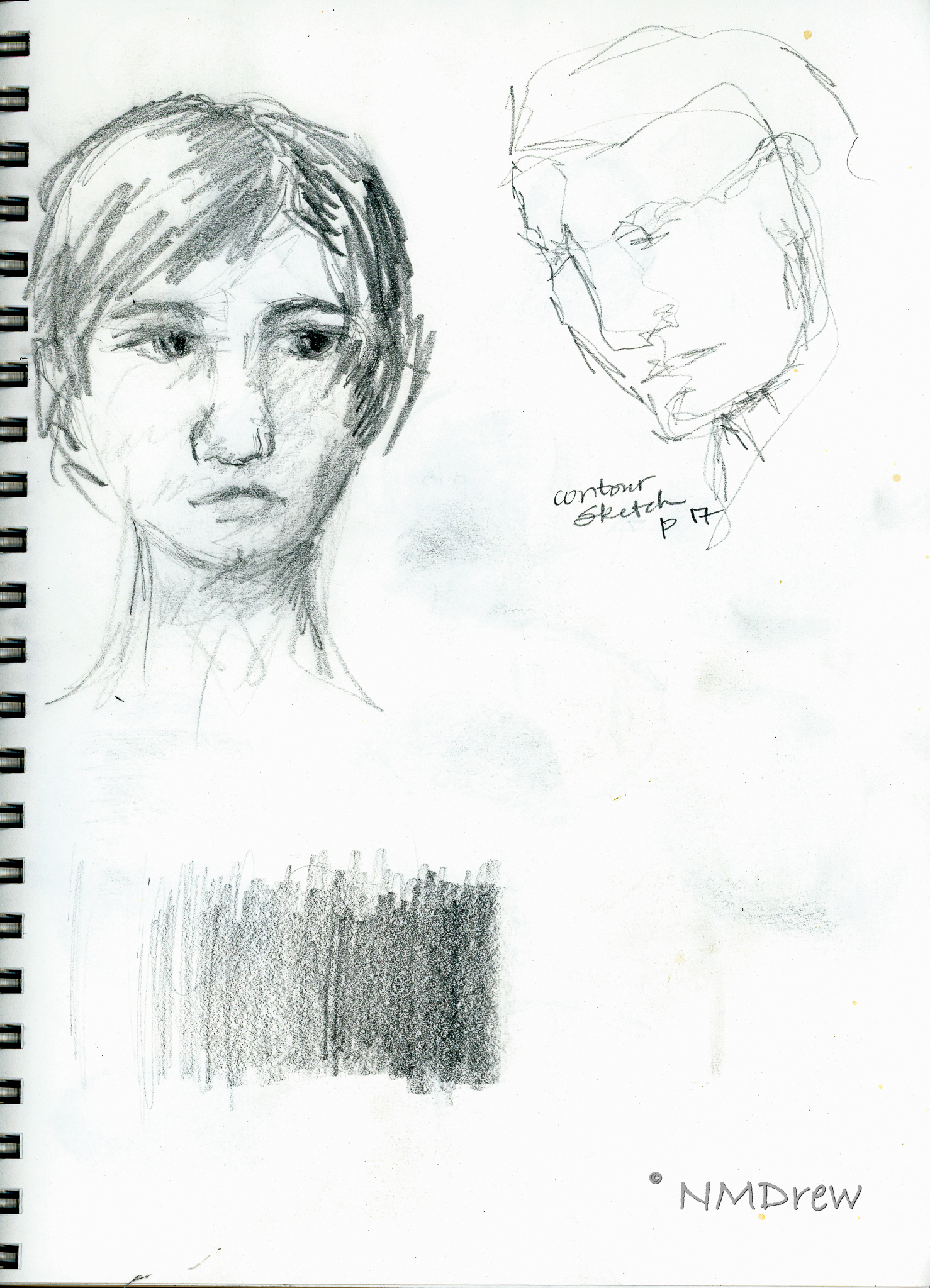
I don’t know if colored pencils will become a big love in my life, but I do enjoy drawing. My Pencil Portrait class was a real joy. I think I learned a lot in it, and moving to colored pencils is interesting. Shades of grey in graphite now are translated (or attempted to be translated) into values in color – something that is very, very challenging for me.

A Pencilly Afternoon

As you may recall, my Pencil Portraits class will begin again, on 2/17/21. It’s a lovely class with a great instructor, social distancing, real people! None of this virtual stuff, which has its place, but doesn’t cut it for me. However, that is another story.

For my previous two Pencil Portrait classes, I spent the entire time – 2 hours a day in class for 5 weeks to do one portrait in each session. I learned a lot and got some good results. This time around, though, I am actually “prepping” for the class. I want to be able to render a likeness that is recognizable, but I want to try to do a portrait in each session. That means a portrait in two hours, for a total of 4 portraits (we are meeting for 4 weeks this time, with a possible 5th depending on what the class wants).

Thus, I have decided to refer to various how-to books in my library, as well as work with other resources, such as YouTube. With as many resources at hand, I just need to sit down and work on things. Today’s focus is on proportions and positions of the eye, nose, ears, and mouth in a frontal view and in profile, as well as some practice with shading – as I’ve noted, my ability to render shadows and contrast gets lost when I work with color.

Above are studies from the book Drawing Portraits for the Absolute Beginner by Mark and Mary Willenbrink.

More from the Willenbrink’s book as well as a face I drew the other day. 

Shading studies with a look at where light hits a sphere from different directions.  Not too sure how realistic my results are, but in a way, just doing it and thinking about it is perhaps more important.  Being conscious of shadows is the whole point.  I learned a lot from a video by Xabio Arts, which is below:

Solving the problems of drawing means putting tools in your art supplies – mental ones for reference with a pencil (or pen, or brush!).

More shading, and a face.  Per the Willenbrinks, the face is about 5 eyes wide – which I know – and 7 eye-widths high – which I never learned.  Now that is a good trick.  From there – a couple of faces and shadows.

A face on a singe sheet of paper, using guides from the Willenbrink’s book as well as from a video on YouTube from Xabio Arts on drawing the face straight-on.

Now, profiles.  I really did not get the Willenbrink’s proportions very well.  Something eluded me.  The heads just don’t seem in proportion.  Thus, some YouTube videos on drawing the head in profile.  Not much hit me until . . .

. . . I came across a profile video done in 2015 by Liron Yanconsky on YouTube.  These are his proportions, and they work a lot better for me and how I want to set up proportions.  You can see his video below.

And the final drawing of the day is below.

Art is personal and we all have our own way of doing things.  It’s so interesting that, although we are taught the same thing, how our minds and bodies put it out on paper can be so different.

I’ve also realized that I never have had a drawing course, or read a book, that says “Do it this way!”  Technical mastery is not just in knowing how your medium works, but also how to render the real world around you.  This mastery becomes a jumping-off point to your own adventrues.

Pencil Time

After my attempts at a portrait of a person, the realization was that my shading skills are not really good.  Also, my Pencil Portraits class recommences on 2/17, so I thought it might be a worthwhile endeavor to work with a pencil, and work on value with the pencil.  This certainly will benefit any studies I do in the Pencil Portraits class, and perhaps get it into my thick skull to think a lot more about gradation and value than I do!  (Magpie Brain loves bright colors.)

I am very fond of the books by Alphonso Dunn on ink drawing.  His work is phenomenal, and I have learned a lot through his exercises.  Given this, I decided to apply some of his studies to pencil work rather than ink.  All of these exercises come from his Pen and Ink Drawing Workbook.

Above, is the first one I attempted.  If you look closely, you can see the page numbers in the sketches (enlarge the images by clicking on them).  These studies were outlines with a choice of light direction.  You have to use your imagination!

Shapes and shadows – reflected light, cast shadows, highlights.  Simple forms and then a rather pathetic toucan.

I particularly enjoyed employing the pen-into-pencil of these drawings in Mr. Dunn’s book.  His are obviously rendered in black and white, with shades of grey determined by pen strokes.  Here, I took his studies and applied pencil – graphite – to them.  They include a cabbage (I know, it looks like a brain), mushroom, hammer, and bow tie.  Each has a different set of textures.  I started to visualize where the light source was, and that really helped me start thinking more about what I was doing.

For all of these, I used a 2B pencil and a sketchbook, along with referring to Penn and Ink Drawing Workbook examples.

Eyes and Bottle

I took a few days off from painting and drawing because I needed to work on some sewing and knitting.  Made a couple of masks, and did a major step in a sweater, and those both took a lot more time than I expected.  But, breaking up patterns refreshes you – like a good vacation!

The next lesson in Keys to Drawing is to draw your own eyes!  I can’t see past my nose without my glasses, so it was a bit of a challenge.  Here I am, blindish and glasses-less.

I look pretty darned paranoid here!  My eyes are wide open and I am trying to see what I am looking at in the mirror.

The next one I did with my glasses on.

Hardly stylish, but at least I could see what I was doing!

Then, a tinted bottle.  As it is in the 90s, I have my water bottle everywhere I go.

Both assignments were to use a pencil, here an HB for both, and use lines.  The bottle neck is a bit small compared to the rest of the bottle – it’s really about 1/3 the bottle’s diameter – and a bit misshapen at the top.  I did have my glasses on when I did it.

As in painting, the idea is to go from the general (shape) to smaller details and to focus on line and shapes, not thinking, “I am drawing eyes” or “I am drawing a bottle.”  Overall, it worked.