A Pencilly Afternoon

As you may recall, my Pencil Portraits class will begin again, on 2/17/21. It’s a lovely class with a great instructor, social distancing, real people! None of this virtual stuff, which has its place, but doesn’t cut it for me. However, that is another story.

For my previous two Pencil Portrait classes, I spent the entire time – 2 hours a day in class for 5 weeks to do one portrait in each session. I learned a lot and got some good results. This time around, though, I am actually “prepping” for the class. I want to be able to render a likeness that is recognizable, but I want to try to do a portrait in each session. That means a portrait in two hours, for a total of 4 portraits (we are meeting for 4 weeks this time, with a possible 5th depending on what the class wants).

Thus, I have decided to refer to various how-to books in my library, as well as work with other resources, such as YouTube. With as many resources at hand, I just need to sit down and work on things. Today’s focus is on proportions and positions of the eye, nose, ears, and mouth in a frontal view and in profile, as well as some practice with shading – as I’ve noted, my ability to render shadows and contrast gets lost when I work with color.

Above are studies from the book Drawing Portraits for the Absolute Beginner by Mark and Mary Willenbrink.

More from the Willenbrink’s book as well as a face I drew the other day. 

Shading studies with a look at where light hits a sphere from different directions.  Not too sure how realistic my results are, but in a way, just doing it and thinking about it is perhaps more important.  Being conscious of shadows is the whole point.  I learned a lot from a video by Xabio Arts, which is below:

Solving the problems of drawing means putting tools in your art supplies – mental ones for reference with a pencil (or pen, or brush!).

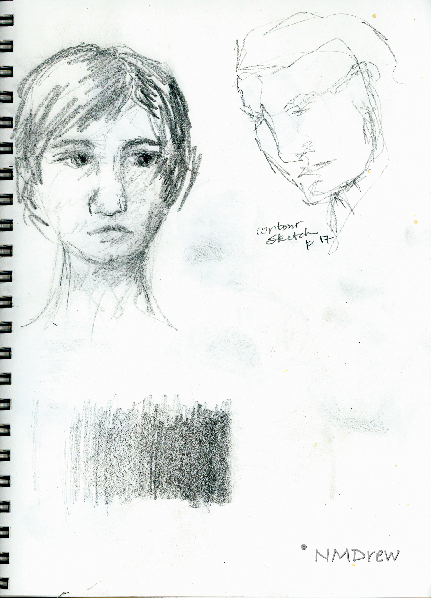
More shading, and a face.  Per the Willenbrinks, the face is about 5 eyes wide – which I know – and 7 eye-widths high – which I never learned.  Now that is a good trick.  From there – a couple of faces and shadows.

A face on a singe sheet of paper, using guides from the Willenbrink’s book as well as from a video on YouTube from Xabio Arts on drawing the face straight-on.

Now, profiles.  I really did not get the Willenbrink’s proportions very well.  Something eluded me.  The heads just don’t seem in proportion.  Thus, some YouTube videos on drawing the head in profile.  Not much hit me until . . .

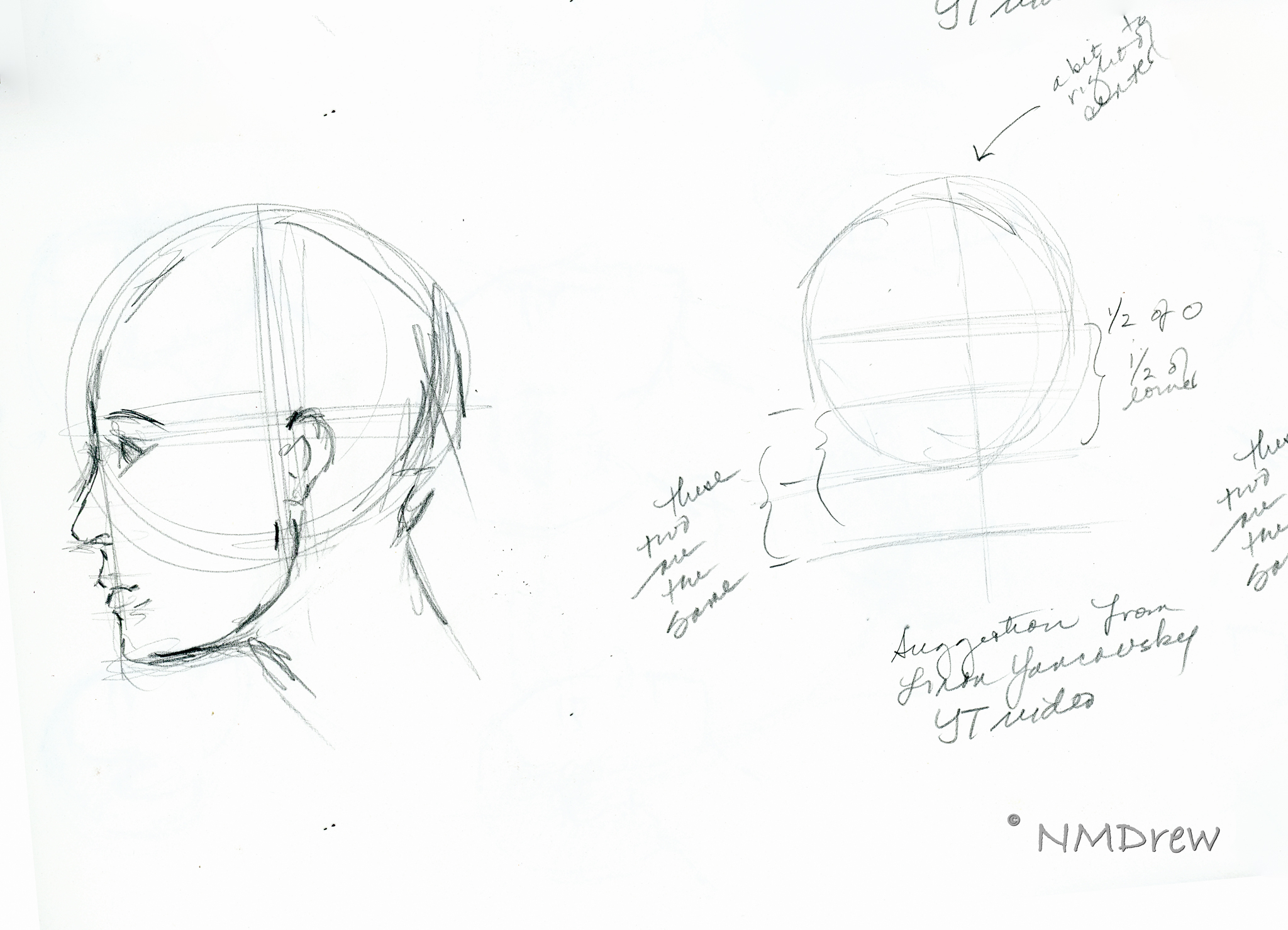
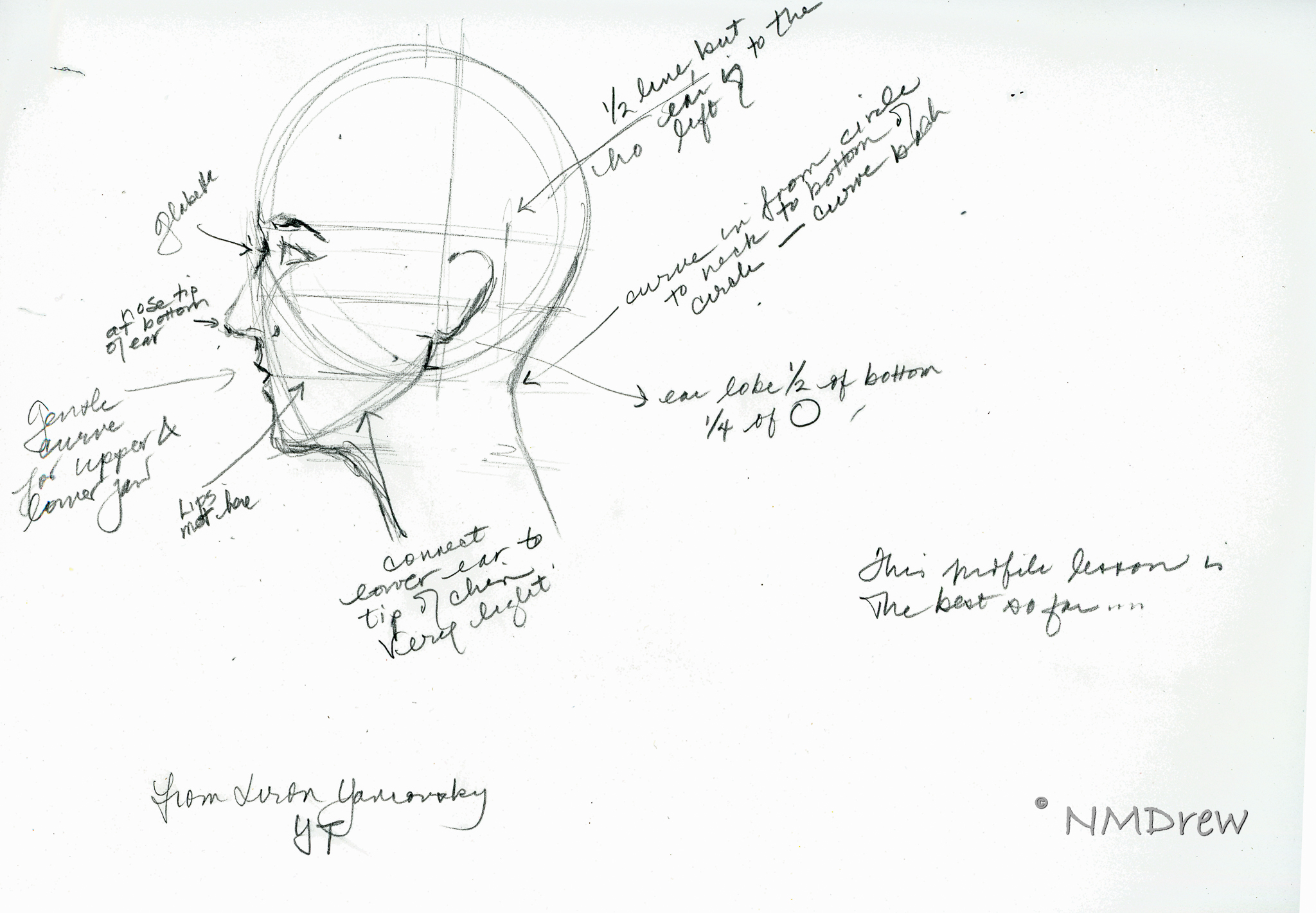
. . . I came across a profile video done in 2015 by Liron Yanconsky on YouTube.  These are his proportions, and they work a lot better for me and how I want to set up proportions.  You can see his video below.

And the final drawing of the day is below.

Art is personal and we all have our own way of doing things.  It’s so interesting that, although we are taught the same thing, how our minds and bodies put it out on paper can be so different.

I’ve also realized that I never have had a drawing course, or read a book, that says “Do it this way!”  Technical mastery is not just in knowing how your medium works, but also how to render the real world around you.  This mastery becomes a jumping-off point to your own adventrues.

Book and Video Lessons for the Student: A Retrospective

I have picked up watercolor on a serious level, along with drawing and sketching.  I have neglected that side of myself for a long time, but have attempted to reconnect with that part of myself off and on.  Truthfully, it has been more off than on, but when I do delve into painting, it is such a pleasure.  Over the years, I have purchased video classes or viewed videos from a variety of people.  Today, I sat down and went through some of my notebooks and watercolor pads, and decided to scan what I have done to see if there is anything of value.

One person I have admired and enjoyed for a long time is Charles Reid.  I love his loose, wet, messiness in watercolor.  It works.  I have watched his videos and read his books, attempting to catch what he does – learning from the teacher by doing.  I have had some success, but I still tend to overwork and create muddy colors.

Another artist I have learned from is Birgit O’Connor.  Her approach is very different than Reid’s – not splashy, but controlled, thought out, and very disciplined.  The results are completely different, but valuable in that self-discipline and forethought are necessary to achieve results.  Reid’s discipline is from years of knowledge, such as how to paint negative spaces and create contrast.  O’Connor uses masking in varying forms, such as with contact paper and frisket to help preserve white space and create texture.

From both Reid and O’Connor, I have learned a lot . . . but without daily practice, it all is forgotten.  Besides needing to remember how to paint, how to manage color, I have also forgotten how to sketch.  Craftsy classes have proven to be helpful, with ones from Shari Blaukopf, Mark Taro Holmes, David Brody, and Kateri Ewing.  These classes range from urban sketching to an extensive, classical drawing class.  Each of these has proved, and is proving, to be very valuable.  Videos are some of the best learning tools when it comes to finding time to do and to learn.  Books with encyclopedic samples on how to do things are also great, such as Claudia Nice’s books on ink, pen, and watercolor, as seen below.

On YouTube, I have subscribed to multiple channels.  These range from using dip pens to lessons from extremely talented watercolorists and sketchers.  Of late, I have been working on negative painting – painting around things, rather than directly painting things.  This is in the hopes of learning to manage white space better.

It’s easy to use lines to compensate for a lack of contrast to define light areas in negative space.  The flowers are rather disastrous, but a lesson on YouTube (sorry, I don’t recall the video the trees are from, but it was fantastic!) was very helpful.  The key to that video was to paint from the foreground back, unlike in traditional watercolor, you paint from the sky down for the most part.

In addition to videos, books are an excellent resource.  I have a lot of books.  The ugly truth is that art books are damned attractive, but how many of them have I actually sat down with and gone through, step by step?  Not many.  In fact, none at all . . . until I came across a book by Jenna Rainey:  Everyday Watercolor:  Learn to Paint Watercolor in 30 Days.  Rainey’s painting style is not what I see myself doing, but what I do like is the “daily” approach and the short, structured lessons.  Thus far, I am up to Day 11, and have been really enjoying myself.  I’ve let go that nasty inner critic that expects perfection out of the gate, and have been loosening up, and doing some things that I like.

More than anything, I am happy to see I am not lacking ability – only self-discipline to work on painting and drawing when I have time.  Looking at what I have done is inspiring me to continue, despite frustrations and time.  Nothing like a retrospective to see what and where I have been, what I am doing now, and looking forward to what I might yet do.


A Bit of Color, i

The Book and the Paints

I’ve been doing sumi-e for awhile, and now with my return to my Chinese painting class, the urge to paint is getting stronger, and the need for color is making itself known.  However, it never hurts to refresh one’s skills; given this, I dug out a book I’ve had for some time:  Watercolour by Patricia Monahan.  This is a good book for standard watercolor techniques.  So, I’m going through it, front to back, in my spare time.  It’s a good refresher.  As well, these techniques are important to remember as I know many will be used in any subject done in the Chinese style.

In watercolor, I’ve encountered different approaches to how to work – light to dark (Monahan’s approach) and dark-to-light.  Personally, I find that I work more logically light-to-dark, but the truth is that working dark-to-light just confuses me.  Maybe it is something I should deliberately try.  For now, though, I will hold that thought and practice a few simple techniques.

Monahan’s book is broken down into sections.   Currently I am on Washes (having read the introduction and chapter on equipment), which include techniques and then subject matter, such as rain clouds and the beach.  I’ve done a solid wash, into which I’ve done

  • wet-into-wet
  • wet-onto-dry
  • dark to light stripes (not a wash) by adding water to a dark color to lighten it
  • gradated dark-to-light wash

I’m using pan paints, made by Pelikan, and I think they are technically opaque, but I find that they work fine and have a nice degree of transparency when diluted. They are convenient and easy to use on my crowded desk. For paper, I have a 7 x 10 inch block of hot press, 140 pound, Arches. I’m using both sides of the sheet for the exercises.

Washes:  Solid, Wet-into-Wet, Dry-onto-Wet

The very first exercises in the book are reviews, or introductions, of the wash.  The solid wash is explained, and demonstrated.  From there, the author moves into wet-into-wet.  Below, you will see it in the upper left corner of the picture.  Wet-onto-dry is also done, with a wash laid down, allowed to dry, and then another color applied over it.  This is illustrated by the weird circles in the lower left corner.  Finally, layering of color is done, which you will find on the right.  I kept the same strength of color for the layers, and applied about eight.  The results are quite nice.

Diluting a Dark Wash

This next exercise was actually one I’ve never encountered before.  This consisted of creating a fairly dark wash, and continuing to dilute the wash with the same amount of water.  Each stripe in the picture below shows what occurs as the intensity of pigment is weakened.  I was not scientific because I did not measure out specific amounts of water, but I did add two brushes full of water to the pan as I moved along.  It seems to have worked out well.

Gradated Wash Using Flat Brush and Round Brush

Next was the ever-popular gradated wash.  Onto dry paper, color is placed at the top and diluted as the color is worked down.  I did this twice, using a flat brush on the left, and a large round on the right.  Both have their merits.

Two Gradated Wash Methods

This next exercise consisted of placing a gradated wash onto dry paper and moving it into damp.  This is on the left side of the picture below.  I used a small sponge to dampen the lower half of the paper, and then at the top began my wash on dry paper.  As I moved down the dry section, I added a bit of water, and then continued on down into the damp section, moving left to right and back.  When I got to the damp section, I did not add any more water, nor pigment, but just let it become weaker.  This was a brand new technique for me.  On the right I did the dampened paper with a gradated wash.  The paper was dampened with a sponge, allowed to dry a bit, and then a standard gradated wash done.

First Exercise:  Monochrome Rain Clouds

Finally, the first exercise:  monochrome rain clouds.  Using black, I laid down a gradated wash onto dry paper.  Before I let it dry, I used the sponge to lift up some of the color.  I squeezed the sponge out into my waste water jar and continued.  After I let this area dry, I laid down some medium and darker washes, doing some wet-into-wet, some lifting, and so on.

I was pretty nervous doing this as I was sure it would all be a disaster, but decided to trudge on rather than freak out! I always over do my watercolors – or nearly. I get sooooo frustrated! However, I am rather pleased with the results, and will do a few more monochromes before moving onto the next exercise which is the same thing – rain clouds – but with a limited palette.

Heads Up! Top Down! – Two Felted Hats

With Christmas looming in the not-to-distant future, I’ve been focused on getting all my presents done. I finished the Fish Hat, I’ve knitted up others to be sent and to be given. Yesterday I finished the second of two hats to be felted and given to Auntie Am (who is younger than me, BTW!).

Years ago I gave Am a knitted and felted hat – that hat has seen Africa, Europe, and Asia – and it is getting quite worn out. She asked for another hat. And so she is getting two. The fact is, I have forgotten a pattern I made up in my head when I was totally into felting knitted hats. This time, I decided it would not be a bad idea to record what I did in pattern form.

My personal preference for felting is handspun yarn that I know will felt – commercial yarns can be more difficult. Finn-Lincoln is a very nice combination. The Lincoln has a quality of luster, and the Finn gives a nice hand. When I make yarn for felting, I ply it rather loosely, as well as spin it loosely. The looseness gives the yarn a better opportunity to felt. The biggest problem with handspun yarn for felting is that it needs to be watched very, very carefully, or else it can become Lilliputian in size.

That said, Am wanted “something in blue.” I had two skeins of Lamb’s Pride Worsted, from Brown Sheep, in “Blue Boy” and “Tahiti Teal.”

Pre-Felted "Heads Up!" in Tahiti Teal
Pre-Felted "Top Down!" in Blue Boy

The recommended needle size for Lamb’s Pride is a US 8; I used 9s as I knit very loosely. I think I could have used 10s or 11s easily enough, but didn’t want to experiment with a present due in a few days!

Designing the Hats

My typical felted hat has a sloping crown which moves into the body, and then expands outward to a brim which will eventually curl up. Both of these hats work on that premise in design, but with different length brims. Heads Up! is started on the outside, working in from the brim. The brim is wider than Top Down! which is knit from the center out, moves into the body, which is knit straight, from a sloping crown, and then into a very narrow brim. Pre- and post- felted, each hat looks rather bell-shaped, and not particularly attractive. On the head, though, they work out quite nicely.

Felting the Hats

I just throw them into the washing machine, hot water, a towel or two, and laundry soap. I washed mine on the heavy cycle a couple of times. They don’t look like much other than soppy rags before I move them into the dryer. As my washer spins things out to the point of being nearly dry, I let that happen. This way, the drying time in the dryer is less, and I can control the felting a lot more. The wetter the hat, the more it will felt, and the more it might shrink. The ones here were in the dryer about 20 minutes with the towels. Again, in the dryer, I used the heavy duty setting to get a lot of heat. More friction, more felting, more shrinking. Mine was at a minimum, although for other projects I have been known to throw them into the washer and dryer more than 5 times!  I have also used my wash tub and wash board, and a plunger, but machines make hard work a lot easier.

Key things to remember are to watch the project as it felts, and to remove it from the dryer while it is still damp-to-very damp, but not soggy. Once you are happy with it, take it out, and shape it on some form.

Shaping and Drying the Hats

I have an old ball I use, one that the dogs outgrew. It’s pretty disgusting, so I put a plastic bag over it to cut down on the ick factor. You could do the same with any plastic ball, or a balloon. Shaping the hat and letting it dry is important because that gives it a memorized form.

Heads Up! Drying on the Ball. Notice the Plastic Bag???

Since I only have one plastic ball, I put both hats on it, with the teal one on the ball, and the blue one on top of it.  Both dried fairly quickly.

The Hats Sans Heads

Until I can see Am at our family gathering, I won’t have any pictures of what they look like on a head.  Nonetheless, here are some pictures of the hats individually on the ball.  The blue one – Top Down! – has a small crown.  The teal one – Heads Up! – looks like it has a small crown, but really, it will flair out when worn.

Top Down! on Ball
Heads Up! on Ball

And in comparison, here is an image of both hats, now dried, side by side so you can see what they look like flat as well as in size and shape.

Top Down! on Top of Heads Up!

I’ll get some pictures of Am in her hats to post later.  For now, you can get this pattern directly here, or by clicking on the “Patterns” or “Patterns for Free” page to the right.

Merry Christmas!

Yarn Stitch Markers for Lace Knitting

Whenever I knit lace, admittedly I look for pretty patterns that stay neatly between my stitch markers.  Even though the lace for Ishbel is simple, its set-up doesn’t allow for such structure.  Part of the pattern has a 3-stitch decrease, which gives the slant to the pattern.  However, this decrease also falls at the end of a pattern repeat, which means a pattern marker falls in the middle of the decrease. The marker needs to be removed to create the decrease, and then replaced.

To resolve this problem I did two things.  First, I moved the repeat over, so that the decrease began the pattern repeat.  Second, I decided to use strands of a contrasting yarn to weave in and out of the pattern.  This would allow me to not worry about markers falling off, or needing to be slid off needles with the potential for being dropped on the floor.  I chose to continue unraveling my poor Albatross Socks* and use its yarn.  The wine red of the yarn contrasts nicely with the turquoise of Ishbel, and its hard twist and fineness make it durable enough not to unravel while being used.  Also, it doesn’t stick to the turquoise yarn, or flake off little fluffs of color that will need to be picked out of Ishbel later on.

Yarn for Stitch Markers

It actually makes sense to use leftover yarn for stitch markers.  They probably did before the advent of modern knitting tools, such as plastic and metal rings to slide onto needles.  These markers could have been knotted into loops and strung individually between stitches, or as separate strands, woven back and forth as the knitting progressed.  I tried the former years ago, just because I didn’t have enough plastic ones.  They worked great – until I knitted them up into the pattern!  So, I came up with the idea of strands, which I pop back and forth as I work my pattern.  Not very easy to knit up a strand of yarn, and easy to move the strand from front to back, or back to front, using the hand not holding the yarn – for me, this is my left hand, as I am a right-handed knitter.

I have also found that a yarn has to be rather hard and un-fuzzy to work well.  Cotton yarn, if mercerized, is very nice because it is a firm thread.  Unmercerized cotton yarn is linty, and sheds onto the fabric being knit.  If you use cotton yarn for a stranded marker, be aware that it might want to unravel – cotton yarn doesn’t stick to itself like wool does.  Woolen sock yarn with a tight twist is one of my favorites to use for a pattern marker.

Making the Stranded Yarn Markers

To make yarn markers is very easy, and is just like making a pompom in the first steps. I use a book to wrap the yarn around. This book is about 5×8 inches. The yarn is wrapped around it, and then cut on one end only. Thus, the strand will be about 10 inches long.

Because the yarn was in a sock, it is all kinky, but this is actually a nice thing! As the yarn is used, it curls up, and stays out of the way of the turquoise. And, because it is wool, it actually lies close to the body Ishbel while I knit.

Setting Up Yarn Stitch Markers

Once the strands of yarn are cut, begin knitting the pattern as required. Wherever the stitch pattern begins and ends is where a strand is laid across the row below it, in between the last and first stitch of each lace pattern repeat. I usually drape the strand evenly, front and back, to lessen its chance of falling out, or being tugged out. As you progress in your knitting, the chances of the yarn being pulled out lessens.

Continue laying out the strands until the entire pattern area is marked.

Observe Your Knitting

As you can see from the above pictures, the strands are placed along the pattern repeats. This was done as the lace was established on the knit side. Returning along, purling, you can see what the strand will look like when you have knit passed its initial placement, turned your work, and are now purling.

This picture shows you what to do: simply bring one of the strand ends forward (or backward, your choice). You have now marked the next row.

This picture shows marking strands on either side of Ishbel’s fabric.

As your knitting progresses, you will begin to see the advantage of using stranded yarn to mark pattern repeats. I let the beginning of the strand dangle on the wrong side of the fabric; for Ishbel this is the purl side. The reason for doing this is that it does not leave a contrasting line dangling where it can distract me if I need to check my work. As the picture below shows, the strand weaves in and out as the knitting progresses.

On the front side, the yarn strands do not detract from observing if the lace pattern has any mistakes. If you look carefully, you can see the red yarn slants a bit here and there – that is because of the 3-stitch decreases creating diagonal stitches.

Finally, the strands will work their way through the entire pattern as Ishbel progresses. Even if there is not enough length for all the pattern repeats, a gentle tug will pull the stranding markers through the fabric. When Ishbel is finished, I will simply pull out all the yarn markers, and re-use them in another project.

Another Reason for Stranded Yarn Markers

In addition to using strands of yarn as markers for Ishbel, I have used them whenever a pattern calls for a regular marker movement.  Simply picking up a strand of yarn when the marker is ready to be moved is so easy compared to

  • slipping off a stitch,
  • manually removing the marker,
  • replacing the stitch on the left-hand needle,
  • putting the marker on the right-hand needle, and
  • continuing until all markers have been moved!

Anything to make lace knitting easier is worth doing, don’t your think?