Remembrance of Things Past

If I want to be honest – which sometimes I don’t want to be! – I never realized that in watercolor, as in sumi-e painting (which I haven’t done for a few years), the brush is important.  In sumi-e, brushwork is important as it expresses what color cannot – color is not found in sumi-e, only shades of blacks and greys and white, with the subject hinted at, not indicated in boldface!  Playing with leaves made me remember this . . .

Because my chronic struggle in watercolor always seems to be overworking and mixing too many colors together, I decided to pick up a book called Everyday Watercolor:  Learn to Paint Watercolor in 30 Days, by Jenna Rainey.  I figured some kind of disciplined plan could work.  Her style of painting is not necessarily my style of painting, but that was not important as far as I am concerned.  My concern was to stop making mud and to relearn what I have forgotten over the years.  The examples in Rainey’s book are pretty basic, pretty straightforward, and actually, a lot of fun to do.  It has helped me drop that little, nagging, nasty perfectionist who always criticizes.  Rather, it is far better to just do, and quit the role of critic.   She does studies such as shapes, allowing colors to bleed into one another; she discusses design in the abstract exercises with squares and circles.  There are simple exercises in drawing and painting trees with foliage in shadow, and depth, with lighter pine trees in the distance, and darker ones in front.

What do I find the most valuable in this book?  Crazily simple lessons.  Step 1.  Step 2.  Step 3.  Limited palettes of color.  Most how-to-watercolor books are wonderfully full of tantalizing pictures, but few that I have seen really drill down to making it simple.  I enjoy the work of watercolorists such as Winslow Homer – people with a loose, free style which I would love to emulate.  I am not a contained person in the sense of wanting to fill in the lines, like in a coloring book, but I also appreciate the disciplined approach of people like Birgit O’Connor, who paints huge flowers, beach debris, and so on.  I am still struggling with watercolors enough to have no style of my own – I am still attempting to master the brushwork, water, and colors.

Currently, I have just finished Day 11, which is wet-into-wet and some dry brush.  Like in dry-into-wet.  Something like that.  It’s a papaya.
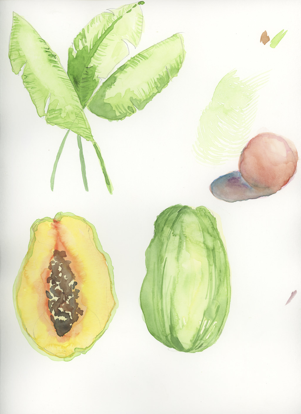
I’m looking forward to 19 more days … sort of a diet!  And to date, no mud!
 

Book Larnin’

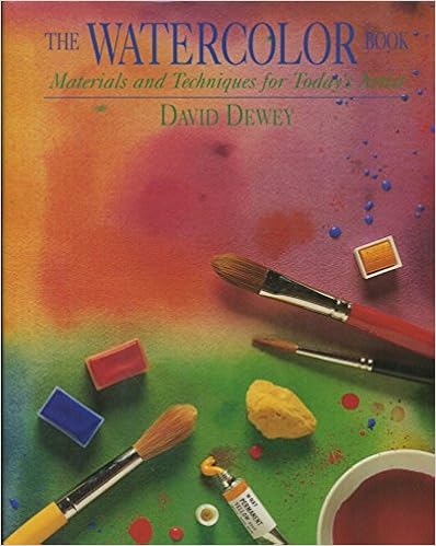
I did some watercolor studies, derived from David Dewey’s The Watercolor Book.  This is the edition my local library has – there is a newer edition, but I have no idea how much different it is from this one.

Dewey’s book came highly recommended from one of my favorite sites, www.handprint.com.  There are others, too, but this one is the one at the local library.  Packed full of text and pictures, demos and a plethora of information, at first it seems like a rather intimidating book.  It is.  There is a ton of information, and to me, it was hard to sit down to look and to read.  However, once I started, I decided my best approach is to begin with some exercises.  Other parts can be read for information – I wanted to get into actual painting!  What really draws my eye to Dewey’s work is the beauty of his washes – clean, simple, expressive.  You can see his more recent work on his website.  Given my usual propensity to messy, muddy stuff, his work is simply elegant – not splashy and spontaneous like Charles Reid, but serene and calm.

Okay, so here is what I did.  This is the first exercise I did.  I used glazes and mixed colors.  This was a drawing from one of Dewey’s exercises in warm and cool colors.

Not an especially inspiring image – and poor photography as well!  However, what I did learn was a bit about glazes and managed to leave some planned white, some bleeding, some patience, and how certain colors mixed.  I did an overall underglaze of Quin Gold.  The sky was laid in with a glaze of cerulean blue, while the ocean was a layer of ultramarine.  I mixed some alizarin and viridian (complementary colors to tone down the red of the alizarin), along with some burnt sienna to create the float of the shack.  The islands were my favorite part – carbazole violet and burnt sienna.  I’ve never used the violet, so it was a fun mish-mash.

Next, water studies, which I feel were more successful than the washes and glazes, but I was also warmed up.  These are also from demos in Dewey’s book.  Here, an underlying wash of ultramarine with a touch of cerulean.  Once dried, ripples in cerulean with a bit of permanent rose.  Finally, the greenish color is a combo of phthalo blue and burnt umber, a blend I’ve never done before.  I really like the colors!

This next image is done in essentially the same way with the same colors, only the ripples are circular.  The photo is crummy, but the results are rather clear.

Certainly no works of art, but successful exercises in a few areas.  First, getting reacquainted with watercolor is rather painful.  Glazing and washes take a bit of patience.  Finally, there is the real pleasure of learning new color blends, as well as having a sense of derived satisfaction with a study fairly well executed.

I am excited to be painting again.  During the week, it won’t likely happen because of work, but I hope that some drawing might occur.  Weekends are likely to be very much taken up with painting . . . yay!

Sketching Class

Deciding to take the bull by the proverbial horns, I enrolled in a few online classes.  I have used them for a number of other courses, such as sewing or photography, and really enjoy their format.  Demonstrations which are practical, well presented, and make sense are worthwhile.  Online streaming format, without limitation (once bought), is another advantage – you can watch, play, replay, go away, and revisit.

For my online sketching class, I sit out on the patio surrounded by pencils and paper, my chrome book, headphones, coffee, and dogs.  I listen and watch the demonstrations, and replay, and practice the exercises for sketching.  I’ve doodled with drawing throughout the years, but never really focused on drawing as presented by the online teacher.  She uses 3 pencils – 6H, 4B, and HB and also explains the differences between willow and vine charcoal, which I never thought about.  Contrast and value are considered, gestural drawing, shading and how to do it.  I’ve learned a lot.


My problem is a lack of time.  Work and life get in the way.  Still, it’s wonderful to feel the focus of drawing and think I could possibly get good at it.  I like some of my other drawings I’ve done while listening to an audiobook or just chillaxing.

The Southwest in Black & White

The last few days of July 2017 and the first few weeks of August 2017 were devoted to a family trip, leaving California and thence traveling through Arizona, Colorado, Wyoming, Utah, Nevada, and home.  In that time period we covered about 4000 miles, spending 2-3 days in each place.  There were four of us – my husband’s parents, my husband, and myself.  It was a family trip, to see places never before seen, as well as to see places where family ancestors lived and worked – specifically, Ft. Laramie, Wyoming.

On this trip, there were two photographers – my FIL and myself.  Tom has a Nikon D810 and D610; he brought the D610 along and shot numerous images, which I hope to see soon!  Myself, I brought along more toys than I should confess to, but enjoyed using all of them.  In particular, I brought along a new-to-me Olympus OM-1n, an OM 50mm f1.8 MC, and the OM 35-70mm f3.5-4.5.  Each has a 49mm diameter, so I also brought along UV, polarizing, orange and red filters, and used the latter two to see how JCH StreetPan 400 would work as landscape film.

It was gorgeous!  Combined with the Oly, I was incredibly pleased.  StreetPan comes in both 35mm and 120mm, so a lot of people will be really happy.

What I like about the StreetPan is that it is contrasty, yet has a good, long grey scale.  The orange and red filters helped to make the skies pop, and the landscape.  I didn’t have to do too much in post, perhaps modifying highlights and blacks to meet my own (artistic?) desires.  Detail was good, too.

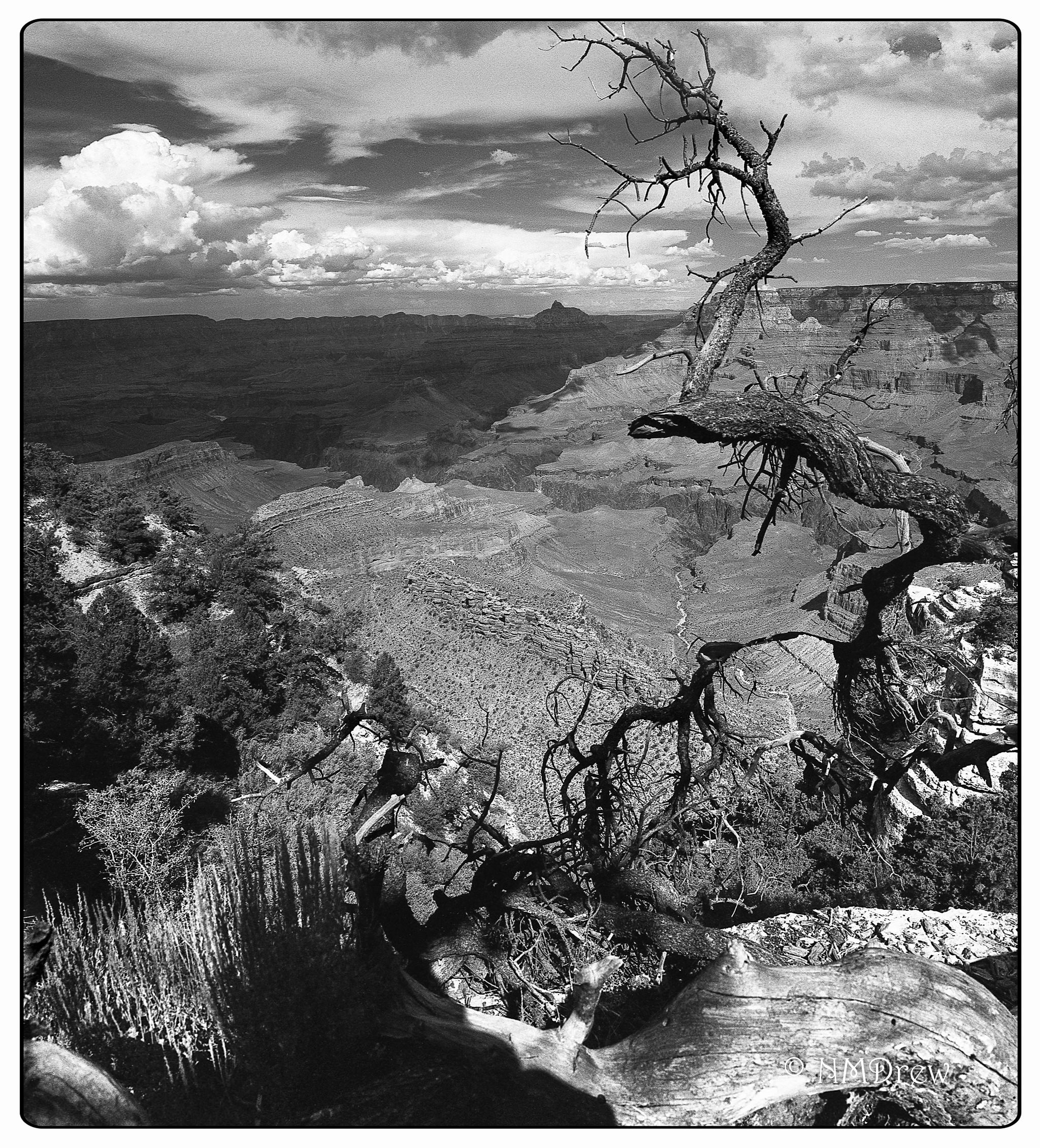
The image at the top is a panorama I stitched together in CS6; below are individual images which can give you a good idea about the beauty of this film for landscape.  These scenes were shot in the Mesa Verde National Park and the Grand Canyon National Park, both in Arizona.


Too often, black and white landscapes don’t interest me, and the reason is the difficulty in differentiating small details.  Dramatic landscapes don’t have to look dramatic, but they need something to make them dramatic.  This can mean contrast, composition, and a number of other elements.  In all honesty, I do not consider myself to be a good black-and-white photographer simply because I find it difficult to think in terms of value.  I see color before I see anything else, and certainly my gaudy photos show this tendency.  Therefore, using the filters and an already contrasty film produced a number of photos that pleased me no end.  This experience is whetting my appetite for more!


The Grand Grand Canyon

Needing to travel light, I took only my Chrome Book, my Nikon V3, the Olympus OM-1n, and the Olympus XA4.  I used up 3 out of 10 rolls of film, and probably blew one of those.  I thought I had used a 4th roll, and maybe I did, but cannot seem to find it.  I used a Chrome-OS based editor called Polarr, but found the Chrome Book a bit too small to do much editing.  I backed up all my images onto an external HD, a 1.5 TB “My Passport.”

The first stop on our trip was Flagstaff, Arizona, for two nights.  We stayed at the England House B&B to use as our jumping-off points for the Grand Canyon and Sedona.  Our hosts, Richard and Laurel, were full of great information, and sent us out to the Grand Canyon to a very specific spot from which we could peer into the depths of the Grand Canyon.  We made a few stops as we drove into the Grand Canyon National Park.

The first stop was the Desert View Watchtower designed by Mary Colter, who was quite an amazing woman.  If you have a chance to visit the Desert View Tower, take the time to do so.  Not only is the Tower a piece of fascinating architectural design and execution, the views are worthwhile.  Take the time to walk around it, find the little corners, and stop for a moment to appreciate the grandeur of the view and the vision of Ms. Colter.

From the Desert View Watchtower, we drove deeper into the park, following the specific directions from Richard and Laurel.  It is a pullout leading to a fire road, and about a 20 minute walk through a pine wood.  The air is aromatic, redolent with the spices of high desert plants – resinous and sweet.

Flowers and grasses grow between the pine trees, and old, dead trees have become architectural designs created by nature, with the details of their structure revealed in their craggy lines and intimate remains.

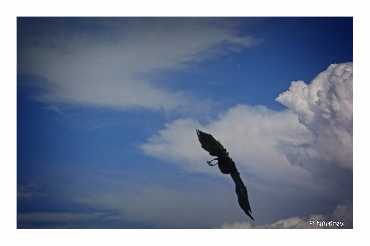
Finally, at the end of the road, a picnic area opens up at the very edge of the Grand Canyon, which drops below you a mile.  No fences protect you.  No one tells you not to jump.  You find a place to stop, and look, to hold on to.  Birds such as ravens and raptors fly above you, only to drop down into the Canyon.  The Colorado river, a deep muddy red, flows at the very bottom.  As the sun shifts and clouds move, the colors of the Canyon change.  It’s a mesmerizing, enchanting, and magical place – far too big and grand to be seen in one day.

I used the Nikon V3 with the 1 Nikon  10-100mm lens for most – if not all – of these images, with post in Lightroom and On1.