The August Project: Begun, Not Begun

I’ll use the excuse that I am warming up – so to speak – to my August project of copying the Heart Sutra.  After giving it some thought, I am still thinking about it.

I decided, as I thought, to simply dig out some ink and some brushes, and play a bit, loosen up.  Once I did so, I realized how stressed out about everything I’ve become.  Even this project, because perfection is what was on my mind, not enjoying a process.

I also was considering the reality that using the seal script might not work for me.  I did a bit of research on the seal script, and realized it would be possibly more frustrating than I wanted to handle.  The reason is that the lines are uniform, with none of the thick-and-thin and technical details, such as bone lines and dots, that kaisho would require.  So, for now, I have decided I will probably do it in the latter.

Playtime

In the process of playing, I started with lines.  Straight lines, horizontal, vertical, criss-crossed.  Circles and spirals.  Bone lines.  Dots.  I used bottled ink, and cheap, poorer quality ink sticks, and sheets of paper.  The results are like photography – lotsa photos, lotsa paintings – and only a few which are particularly pleasing.

Lines

In the line category, I wonder if it is just me, or if other people from the West experience the incredible difficulty I have with doing straight lines.  Both horizontal and vertical, parallel to the edge of the paper, are very difficult to produce.  My theory is that as someone who was taught the Palmer method of script, everything – but everything! – has a slant on it, except the t-bar.  Horizontal and vertical lines are very foreign.

In one book, one on the meditative approach to sumi, the author wrote about the importance of focusing on each line individually, not on the group of lines.  This proved to be the case.  As I began to paint grid after grid, the understanding of this concept became quite clear. Becoming the line as I was painting it is the simplest way I can explain the experience.

Circles / Enso

On the other hand, circles were a bit more easy, but doing them from the bottom of the` page and moving in a clockwise manner was a bit of a challenge.  My penmanship training was always start the number zero at the top, and create it by moving counterclockwise.  On a few pages, the paperweights did not hold, and so the paper got pulled along in the brush movement.

From circles and spirals, came a series of circles – some of which developed an incredible dynamic quality for me.

Bone Lines

Bone lines, used in kaisho, were especially difficult.  I watched videos from YouTube, simply to watch how the brush was manipulated.  Reading directions also created confusion.  Instructions in videos and in text books emphasize that the brush is held vertical to the paper.  To me, this means a 90 degree angle, perpendicular, not a tilt at all.  Then, watching, of course there is a tilt to the brush, but it is done through wrist manipulation.  Books say to keep the brush vertical, and then say “push the brush to the right” – well!  What does that mean??  I think I figured it out – some of my bone lines began to look like bone lines.

Dots

Finally, I could not just practice lines and circles.  I had to do something a bit different.  Yesterday I did dots – such as would be found with grapes – and various techniques with the brush.  Dots can be made by simply allowing the ink to be absorbed by the paper and spread, or by twirling the brush, to create a circle.

Brush Loading

Another technique is loading the brush in different ways.  In the picture below, you can see different methods.

In the picture above, there are three ways of loading the brush demonstrated.  The top one is the traditional light ink with the brush tipped in dark, and pulled at an angle across the paper.  The second one was an attempt to add dark ink to the top of the brush, near the handle, along with dipping it – this did not work out too well as I was stingy with the ink.  The third line, I was more generous, with both ink and water – the light middle line is visible to show the result.  Finally, the fourth line is the result of using a light wash for the brush, and then adding dark ink to the middle of the brush.  A rather nice effect.

Bouncing the Brush

I also practiced bouncing the brush, sort of tapping it and moving it along the paper.  The picture below demonstrates what can be done with this technique.

Copying the Master

Thoroughly warmed up now, I decided to see about copying a painting, using a video to copy and learn from techniques.  I admire the work of Kazu Shimura (see link to the right), who has over 70 videos on YouTube about sumi-e painting.  One I really enjoyed was his demonstration painting of hydrangeas.

Two totally different approaches to the same subject.  I went for the first one, and to do it with some rain.  These are my first attempts.  I did them from recall on what I saw, but I was not too pleased with my results.  Something was missing.

I did about 5 paintings altogether, but none of them worked.  So, I watched his first video again.  This time, my painting was far more pleasing than any of my other attempts.  Knowing full well I would fail at frogs, I did a snail.

And now?

It’s Friday, early evening.  I read a book today from the library – a rare treat – and then went out shopping for a computer desk.  I think tomorrow I am ready to begin the Heart Sutra.  It will be slow, maybe only one character, maybe a few more than that.  I think I will go page by page, as broken down on van Ghelue’s web page or from her book.  This past week I have spent about 20 hours painting in ink, and enjoying every minute!

Iris, iv

Irises – in Color – in Ink

The iris – the butterfly flower – is just too much fun to paint!  And quite a challenge as well.  The videos make it look easy, but I assure you, it is not!  The shape of the flower petals is far more difficult to do in a few squishy movements than it appears.  Loading the brush, with ink and / or pigment, is also a challenge.

Of all the videos, I looked at Virginia Lloyd-Davies’ the most.   The reason for this is that she has multiple irises in different positions.  She also uses similar approaches for each iris, but varies the iris enough so that brush variations also occur.  By watching her video repeatedly, it became possible to actually learn a great deal by imitating.

For these pictures, I used the same paper. The paper is double xuan, which is an absorbent paper which is heavier than student grade, and much nicer as a result.

Iris Scribbles

Unfortunately, I did not take very good pictures, but at least they are clear.  In the picture above, you can see some attempts are better than others.  This picture represents my first attempts at painting irises in color. The ones on the left side were done with the paper turned around – what you see are upside down.  The reddish-purple ones are my first ones, the blue ones later on.  You can see there is some improvement.  As always, my sense of value seems very off to me – not enough contrast between the light and the dark and middle tones. The yellow iris was just awful. The yellow paint has a decidedly greenish cast, and I could not find my white paint (I’m using Marie’s Chinese Paints) – or maybe I’m just out of it.  Anyway, it held no appeal once the color was on the paper.

Colored Irises, i
Colored Irises, ii

These two side-by-side paintings were my tries at creating the irises and attaching them to the stem. Not very good. The colors of the irises are not bad, but the shapes leave a lot to be desired. Leaves as well are unpleasant.

Colored Irises, iii

This painting with the reddish irises is better than the blue ones, as far as some of the shapes of the flowers. Those of you familiar with orchids in Asian painting will realize that these are orchid leaves, not iris leaves! Well, I guess I have some sort of hybrid here.

Sumi Iris, i

Once I got frustrated with color, I got out a Chinese ink stick and ground up some ink. I made three shades – light, medium, dark – and went to work. Again, contrast was an issue, but the flowers, stems, and leaves became a lot nicer. This one was the first attempt which pleased me.

Sumi Iris, ii

The second sumi iris also shows a problem with light / dark, but the composition is pleasing to me.

Sumi Iris, iii

And this one, the third one, pleases me the most. Still some problems with light / dark, but not so badly. The entire flower is looking a lot better, from top to bottom. Certainly some of the irises are rather blobby, and the buds don’t quite make it. Parts of the painting are too busy or crowded, but, over all, I think I am seeing some success. Certainly I plan to continue practicing, and I hope that I will be able to produce a creditable flower.

Leftover Ink

This is what I did to use up the rest of my sumi ink – I hate wasting it!

Corn Stalk
Tiger Lily, i
Tiger Lily, ii

All these paintings were done on Memorial Day. A few others were done as well. As far as the photography, well, let’s just say it sucks and I need to work on it. The paper is a warm cream, and perhaps I should have used a flash. Ah, well, always something new to learn.

Art of Ink, i

Yosa Buson

Now that I’ve pulled out my brush and sumi again, I start rummaging through the drawers of the internet.  I’m not quite sure how I found Yosa Buson, 1716-1784, but I did; I’d forgotten about him.  He was both a poet, and an artist, frequently combining the two.  As a painter in ink, his skills are more than evident in the work below.

Two Black Crows and a Hawk - in Snow and in Rain

Both Crows and Hawk show many techniques that allow expression of the elements in sumi-e.  Snow is painted by going around the flakes – dark ink makes the white flakes fly.  Rain is expressed by using a wide brush, such as a hake, that has been dipped in light / medium ink.  The ink is squeezed out by hand or blotted on towelling, and the bristles squished between the fingertips to create an uneven edge.  Rain is painted in one long sweep; two or three strokes may be all that is needed. These two paintings are very Japanese in approach to working with sumi.

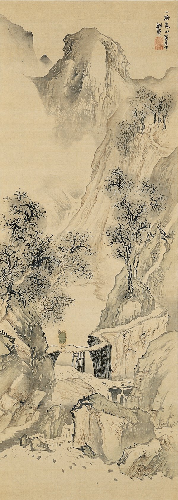
Landscape with Solitary Traveler - 1780

In Landscape with Solitary Traveler, we have a more Chinese approach to ink painting. The theme and constructs are familiar – mountains, water, a path, a bridge, a pedestrian. As in Western painting, Asian painting has its own history and symbolism. The beauty is that these familiar subjects become personal and unique in the hands of the artist. This painting is done in ink, with only a touch of color added to the traveler.

As I mentioned, Buson also wrote traditional Japanese poetry. Here are some translations of his haiku.

coming back—
so many pathways
through the spring grass

in seasonal rain
along a nameless river
fear too has no name

more than last year
I now feel solitude
this autumn twilight

Before the white chrysanthemum
the scissors hesitate

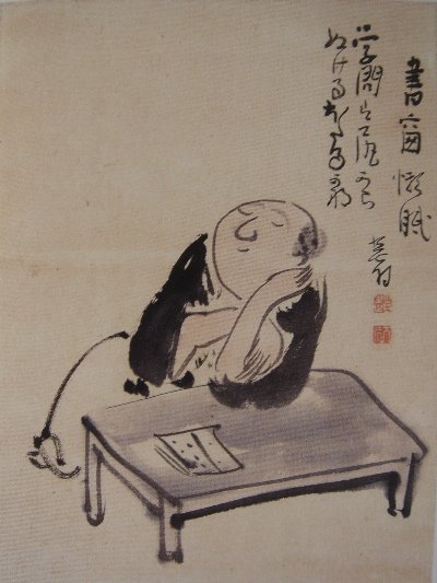
Besides being a master of wash and line (in word and ink), Buson was quite funny. I came across this painting and could not help but laugh. And here, both painting and poetry mingle, albeit not too politely.  Dave Bonta writes about this picture quite well.  Understanding the language – and the humor in the translation – may be read about here.

Bonta translates the writing,

gakumon wa ketsu kara nukeru hotaru kana

as

All this study—
it’s coming out your ass, oh firefly!

Perhaps I should stop while I’m ahead . . .

Iris, iii

I keep thinking about my cochineal dyeing – I still need to write up the rest of it, and post some pictures. Maybe tomorrow when I have more time.

Tonight, though, is painting night. Not a lot of time for it, but in the little time I had, I did some outline drawings of irises. The idea is to get a sense of shape. I drew from some of the photos, and copied some from the Mustard Seed Garden; in fact, I think the best ones were those as the contrast created by the lines was very nice.  My own drawings are quite lacking.  I am so out of practice!

This painting was the first, done early this morning on the same very absorbent paper I used for last night’s wash paintings. You can see just how it sucks up the ink – whoosh! The rest of these are done on tissue thin sulfite paper from Japan, which is much better for line drawings as it is not as quick to wick the ink out of the brush.

All of the above were done from photos. The bottom one was copied from the Mustard Seed Garden – and you can see the refinement compared to my own awkward drawings. Hopefully I’ll get better . . .

Iris, ii

I did my visual research.  I downloaded almost 100 different iris pictures, for color, shape, structure, position.  Too many to post here!  Also copies of famous prints and paintings – Japanese screens, Van Gogh’s fields.  Besides flowers, I also looked at leaves and descriptions.  I pulled out my “how to” books. And, I watched the videos from my last post.

Research

The iris is an impressionistic dream!  It is not a tightly structured flower, but more an explosion of color and shape.  Also, not all irises are bearded, even though there is a similarity of structure amongst the varieties, as far as I can tell.  The color variations are numerous, and vary from subtle to outrageously loud.  The most structured thing about the iris is the leaves, which are a perfect contrast in their simplicity against the frilliness of some of the blooms.

Each video provided some instruction, in shape, in how to move the brush, how to load the color.  Right now I am working in sumi ink alone, so that means grays, whites, blacks, and everything in between.  The paper I am using is a roll, and the paper itself is very absorbent.  This presents a bit of a challenge because the brush has to be very, very dry for control.  And then, waiting for the paper to dry enough to pick up darker lines, but not bleed them away into the already wet paper.

This is what I accomplished this evening.  The main focus of this painting venture was to think about, and to do, the brushwork.  Determining how to manipulate the brush to create given shapes and how to load the ink onto the brush is part of this practice session.  Because the throat of many of the lavender-blue-purple irises have a yellow throat, that pale color has to be represented by white or light grey ink.  Some irises are light on the tips, and darker toward the center.  How the stem attaches to the flower is also important, and deciding how to relay it visually also means deciding what kind of movements need be done with the brush, wrist, and so on.

I’ll stop with that.  Needless to say, the values need to be sorted out at some point!  These are all disasters in that area.

From Sadami Yamada's Book on Flower Painting
Following the Brushwork of Danny Chen's Video
Following Virginia Lloyd-Davies' Brushwork in Her Video

First Attempt Looking at a Photo

Painted from an Upside Down Photo - a la "Drawing from the Right Side of the Brain"

Upside Down Painting Right Side Up!