At the End of the World

Today and yesterday were really rather discombobulating. Does getting older mean you are more set in your ways and less able to adapt to changes in the daily routine? Either that or my allergies just make me a bit crazy – this morning I had one of my sneezing fits where I sneeze about 30 times in a row. That is exhausting to the point I need a nap.

And nap I did. But then I decided to do something creative, and back to watercolor (my real first love in painting) and work on something idyllic, wet and watery, full of rocks, and put it in my sketchbook so I won’t take myself too seriously.

Click on the image to enlarge!
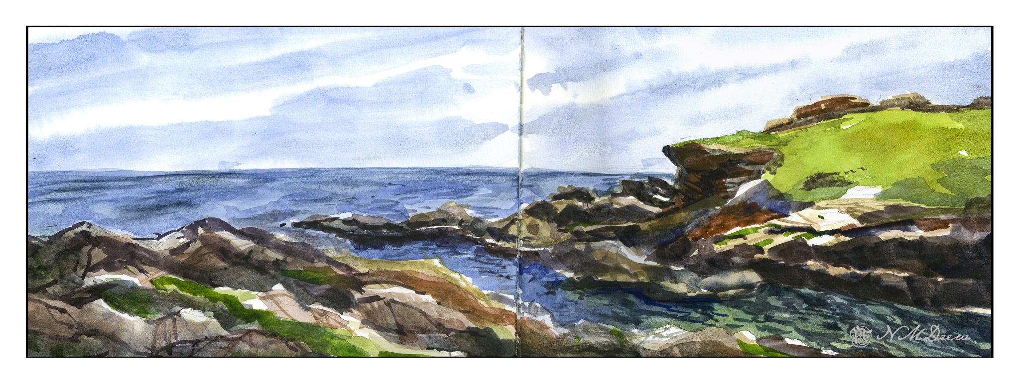
The Strathmore Vision paper works really well with little re-working of any part of the painting. I decided to see how the sketchbook would do with the same approach, as well as the more personal challenge of being more direct in color application.

With watercolor, many artists work with very wet paper, and while I like that, I prefer to have wet paper – as for the sky and the sea – but I also like to have layers. If you paint into wet color, your next incursion must be more pigment and less water than you are moving into, otherwise you get what are called blooms or cauliflowers. You can also paint onto dry paint and these won’t occur, and you can use thinner or thicker paint – less or more pigment combined with water. My sketchbook has good paper – far better than the Vision paper – so I could do all these things, and did.

First, wet the sky area, then drop in stripes of blues. Next, wet in the water, from horizon to the inlet area, all in about the same shades of blue, but darker than the sky. Let that dry. While that is going on, I painted in the greens on the right, blending colors into each other for gradations of green. The rocks, too, were painted with varying colors, working to leave bits of unpainted paper for a bit of pop and to indicate areas with more sun that shadow. Slowly I put in details, such as the waves or ripples in the lower right of the inlet, cracks in the rock, and so on. Large colors and masses first, finalized with contrast and detail.

I am pleased with this painting. I accomplished my task of direct painting with some modification – not a lot – later as I moved into detail. I drew in the general shapes with a pencil. The foreground rocks on the left and bottom were a challenge, but I think I have enough detail to make them interesting but not distracting. The same with the land mass on the right. Overall it took about 2 hours to do complete this watercolor.

Watercolor sketchbook, watercolor, about 7 x 18.
Storm Break

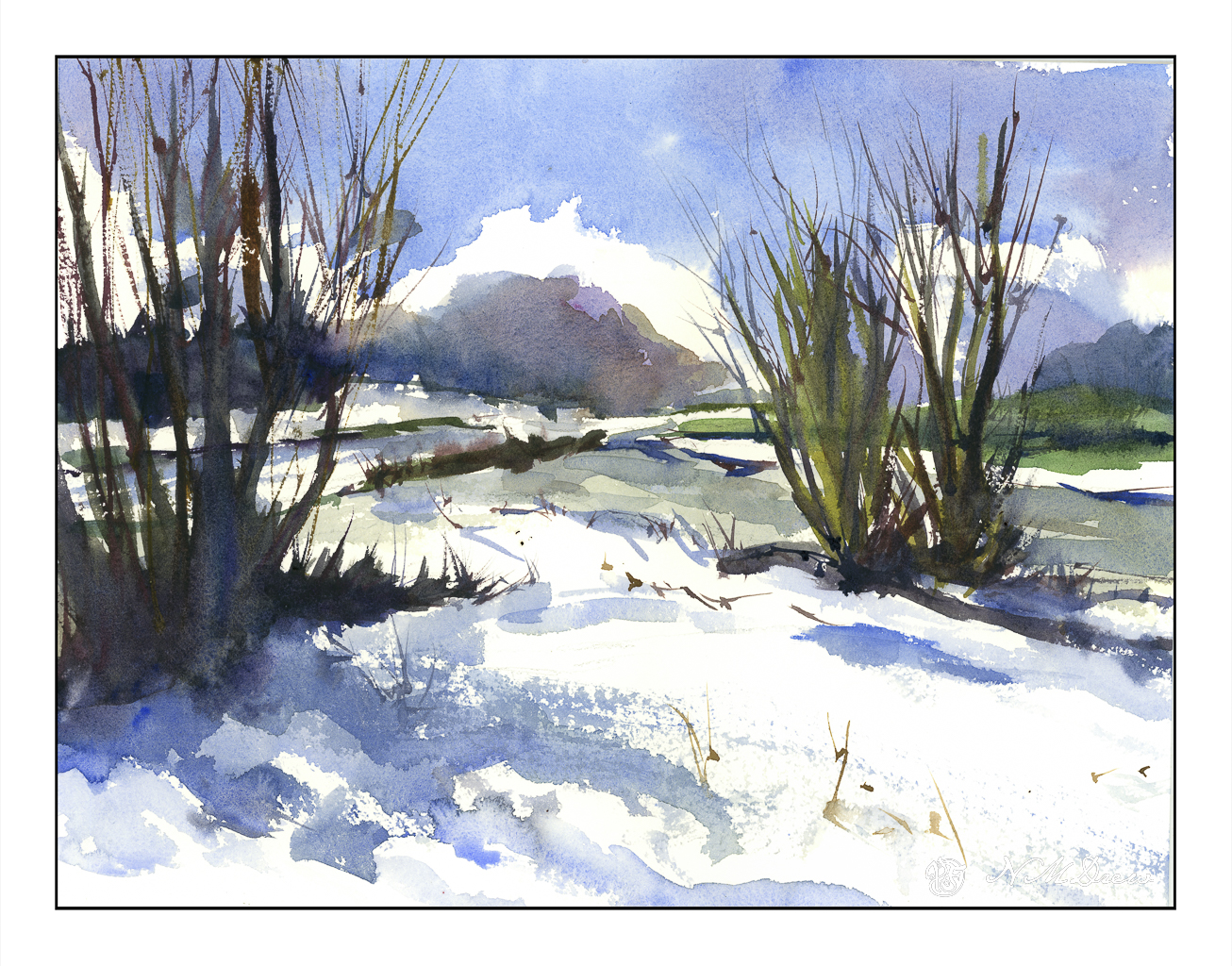
Heavy rains and foreboding skies give way to ragged clouds and brilliant blues as the storms recede. No snow here, but memories will do! I tried to express this sky in the distance, beneath the blue and white with the dark clouds moving away. Not so sure how it reads, but you can decide that. Could be trees, could be clouds, could be space ships. And there is a river behind the trees and the snow across the way.

Kilimanjaro Natural White Rough, 300#, Rough, 12×16.

Sunflower Field

Yesterday I posted some of my paintings and a master copy of Khan’s Ground Fog to practice using large, simplified swaths of color to create abstractions of landscapes.

I like abstraction and simplification of things in paintings, but pure abstraction seldom attracts me. Recognition of whatever a painting is trying to depict seems to be essential for me to want to look at a painting, but as I study colorism / colorfield / abstract expressionism more, I find that sometimes pure color by itself can be enticing. I used to detest Rothko’s work, but now I am finding it quite entrancing as I appreciate the subtle qualities of color, and colors adjacent to one another, a lot more.

With this in mind, along with observing the work of Wolf Kahn, Richard Mayhew, Hashim Akib, and Andrew Faulkner, I painted this field of sunflowers.

I started out with big color fields for the sky, trees, and sunflower field using the basic colors of blue (sky), dark green (trees), and yellow and green (sunflower field). From there, I really worked to keep the foreground simple enough as the treeline, mountains, and sky do not beg for detail.

Initially I wanted to paint dots to represent the center of the sunflowers, but in the mindset of color planes, I didn’t. It paid off, but I was still not happy with how the sunflowers and foreground areas looked. Thus, some dabs – but bigger ones, brush strokes instead of dabs to be more accurate. Negative painting, too, and straight lines to represent the sunflower stalks. The buildings and poles were added at the end to add interest to a very horizontally oriented painting.

I am quite pleased with this painting. Goals were accomplished and my own style emerged here. I also did a lot of thinking about colors, how to paint a straight telephone pole (put a card down and run the paint brush along the edge), atmospheric perspective. Simplifying was difficult, but the broad swaths of color with variations within worked. In short, I have a bit of an abstract landscape in which the subject matter is recognizable, but not realistic. If I want a photographic rendition of something, I’ll just take a picture with my camera!

A Touch of Morning Light

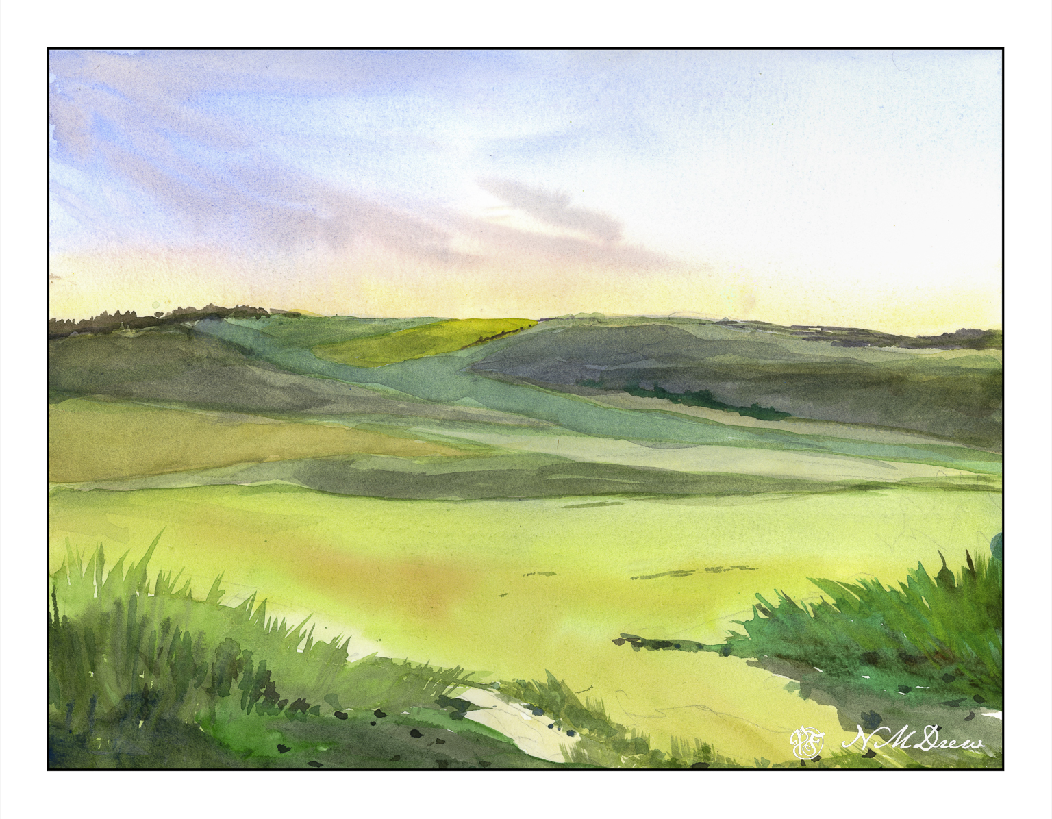
Most of my watercolors tend to have intense colors that are rather bright. With the underwater rocks and floating leaves of the other day, to get the effects I did, I used a lot of thin layers of colors – glazes – to create the desired effects. I was pretty happy with the results, so today I decided to work at creating a painting with good contrast but with many delicate ares of color.

My intention here is to create the effects of early morning with sun just beginning to brighten the landscape. This needs a delicate sky. I had drawn in my sketch first and from there began with thin washes of cobalt, quin rose, and Naples yellow. The wispy clouds were painted wet-in-wet using cobalt and umber. Pleased, I again used pale washes to create the fields in mid and foreground.

Looking at the picture, I realized that the lower 2/3 of the painting were essentially all the same value even though different in color. A scan of the painting and a desaturation of color showed my assumptions were correct.

Sooooo??

A bit of thought. In the end I applied thin glazes of quin gold along the hilltop horizon and a number of layered glazes on thew lower hills in cobalt and umber. This gave depth and distance.

Another painting done slowly and with more deliberation. And I am pleased with the results as well as even learned a few things!

Watercolor, 9×12, Fluid 100% cotton CP paper.

Practice

With any art or craft, familiarity with it makes it easy to do. With familiarity and understanding comes the ability to explore using the knowledge you have acquired. I am pretty comfortable with watercolors and oils, but acrylic has always been a point of frustration as it dries so quickly and, to me, doesn’t have the qualities of oil paints. Gouache can be opaque or transparent, depending on how used; acrylics can be used in the same way. The difference between artists gouache (vs acryl gouache) is that the colors underneath the other colors can be re-moistened, and used to dissolve and create other colors. Acrylics, while they can work similarly to artists gouache, once dried, are dried, and there is no going back.

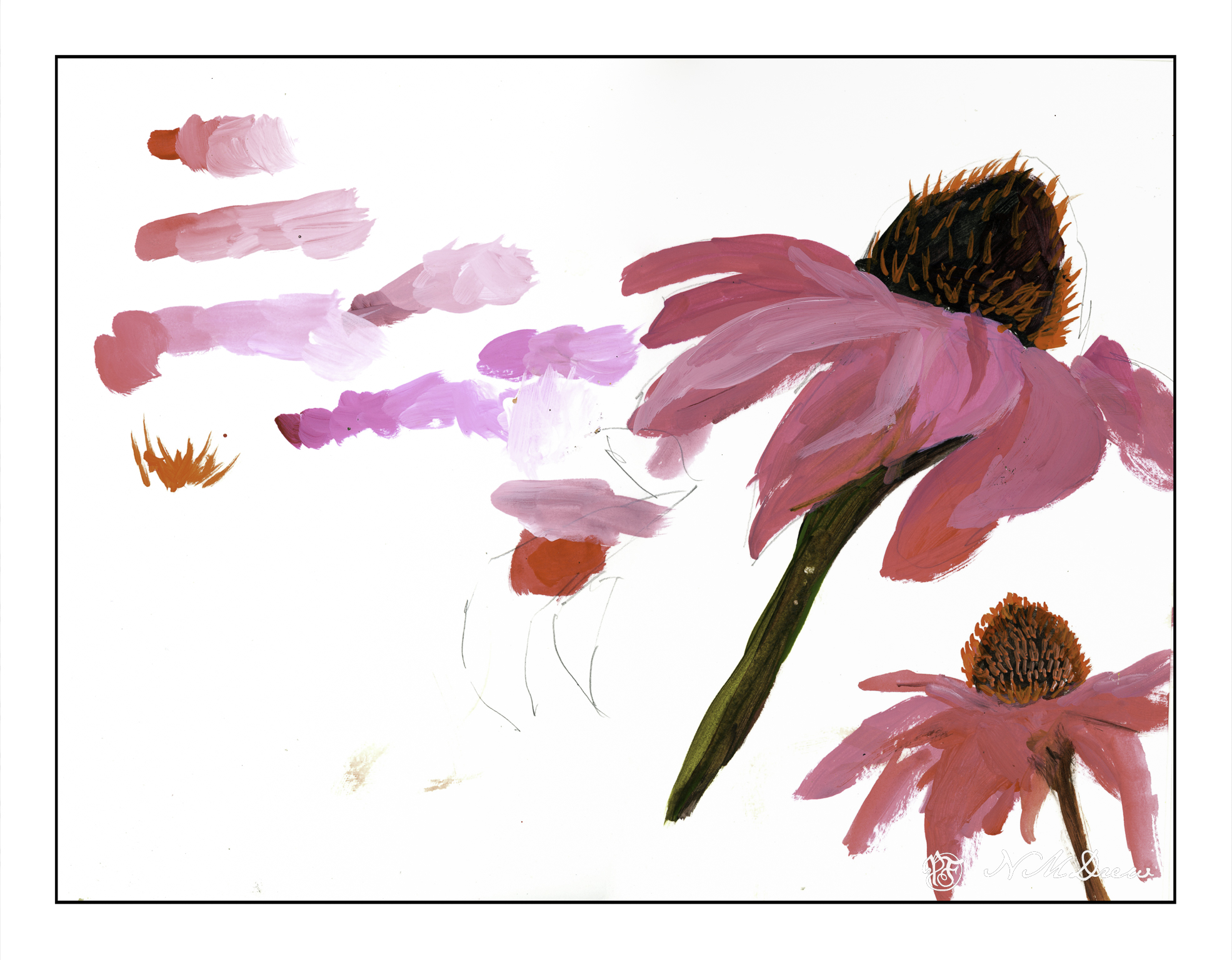
What I am trying to learn is how to use acrylics in ways that make sense to me. This is not coming easily. I like being able to sprawl my colors all over the place without drying, but this doesn’t work quite well with acrylics – unless using the heavy body paints on a sta-wet palette, the fluid acrylics I am using dry very quickly. To use them well I am trying out different ways of painting and mixing paints. Above, on the left, are colors straight out of the bottle and then mixed with white on the palette, increasing the amount of white with each brush dab. From there, I played a bit with painting cone flowers; the one on the lower right is more successful.

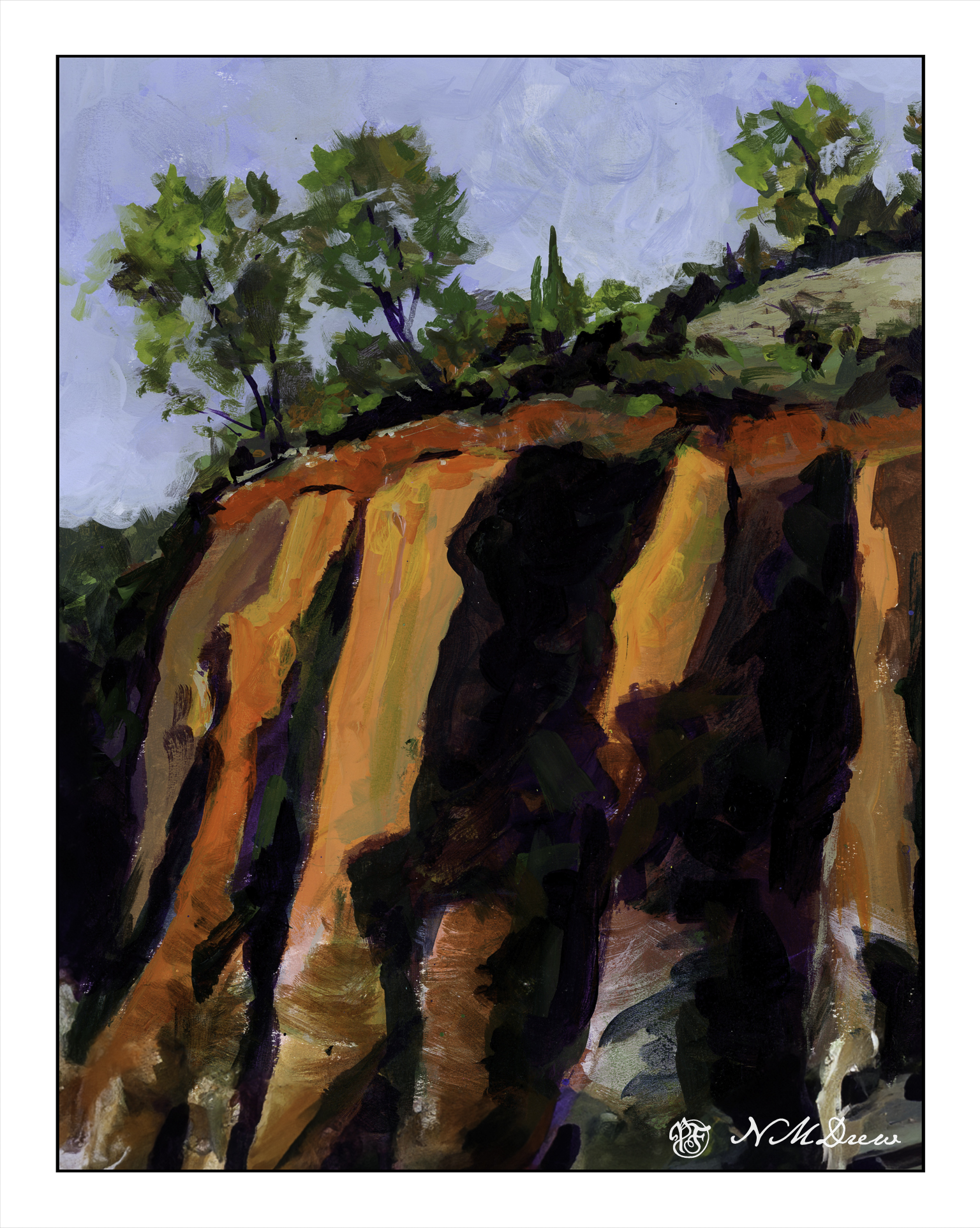
Playing is a way to explore. Above was play. Below is a “more serious” foray into painting with acrylics. I worked hard to make layers, and then return to add more color as I moved along. I just painted directly onto paper in a sketch book and practiced both painting and blending, painting directly on other areas, and bouncing around to work at making a bit of a harmonious or connected picture with similar / same colors used in various parts of the painting.

There used to be 4 trees in a row on the top of the cliffs – but then I looked at it and they were all the same shape and height. I decided to paint out the 3rd from the left. I had to paint the sky in a number of times, building up layers to hide the tree. It worked pretty well. I also played with my brush – I tend to dab, using the point of the brush – but here, especially for the tree foliage, I worked on using the sides of the brush. Additionally, I changed between very soft brushes and more firm brushes. These change how the paint moves and blends over the paper.

Practice can be fun – in any art – and by practicing and playing, new doors and experiences add to the skill set of the artist or craftsman.