
The Esposo Drinks Coffee

I just recently realized that I can use Photoshop to help me create shades of grey in a photograph. This is particularly useful when trying to render a portrait into a painting. Portraits are very difficult to produce with any reliability as a painting because the face is subtle in construction, and thence, subtle in gradation. My skills are lacking in this arena.
To begin, I found a portrait on Pixabay. From there, I imported it in PS and applied an “artistic” filter, using the “cutout”, keeping defaults. I then printed out the photo, sized to 5×7, and gridded it out to a correspondingly sized piece of paper.

Once done, I chose gouache as the medium to use – already out on the desk, and easy enough to use without making myself crazy. First done was all the darkest values on my drawing.

I just lay down the black in most of the areas that looked darkest to me. I missed a few areas, but since gouache is able to be applied over previous layers, I was not too worried. Also, as this is the first time I have ever done this, I was not too concerned about perfection – the experience was more important.
From there, some white was mixed in with the black to produce the second darkest shade. Truthfully, I did not mix in enough white as it was nearly the same shade as the black when it dried. That is the nature of gouache – it dries darker than it goes on. I had to lay on a second and third layer.

Next, the third shade of grey. This I tried to push into being lighter than I thought I needed. From there, the highlights as light as I thought I needed. Again. the white was really a light grey that dried rather darker than expected.
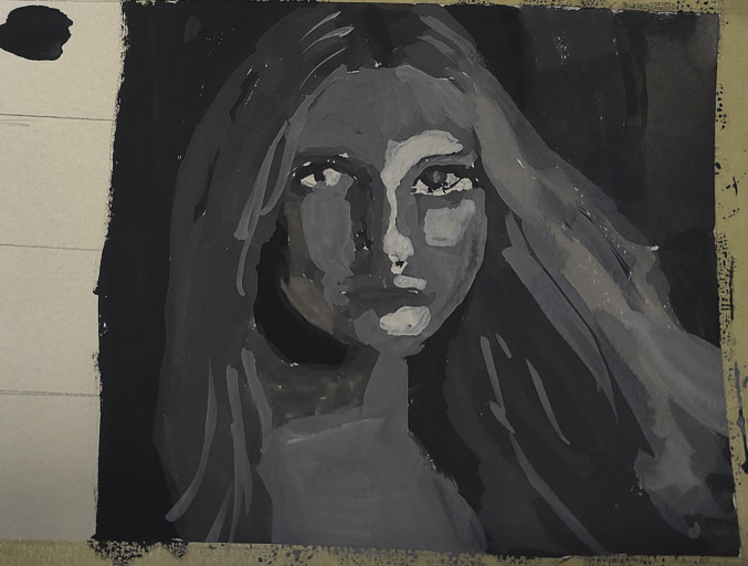
Finally, I increased the white, using titanium white instead of zinc white (the former being more opaque than the latter) and did some touching up and adding of detail.
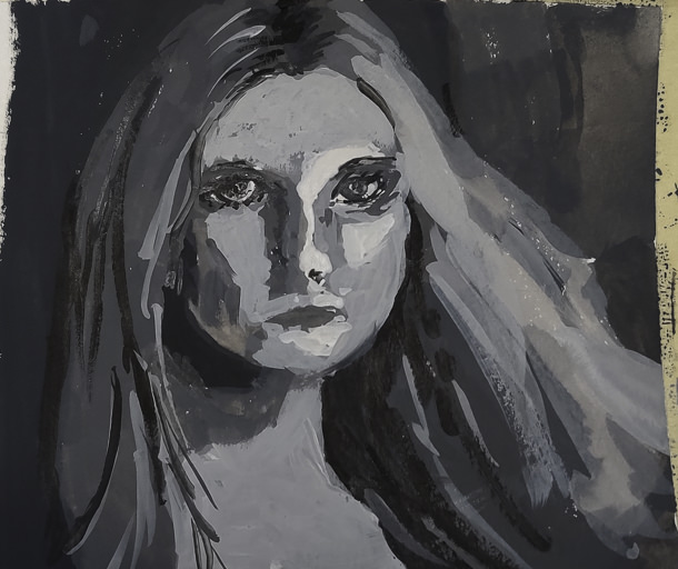
This is the final image. The paint is cracking a bit as it is really thick in some areas. Given this is 5×7 or less, the detail is not too bad, but I wouldn’t like to have this a portrait of myself! The goal of doing values is what is key here – light to dark, catching the face. Much room for improvement, but what I set out to do – a value study – worked out.
I plan to use this method with PS to do more portrait studies. Tools like this aren’t cheating – they help you see what is in front of you more clearly. Gridding the photo onto paper helps keep proportions relatively correct. I would like to do this on a bigger surface with acrylic, perhaps limning in only the white and black values, and from there adding the different shades of grey before moving into a final white.
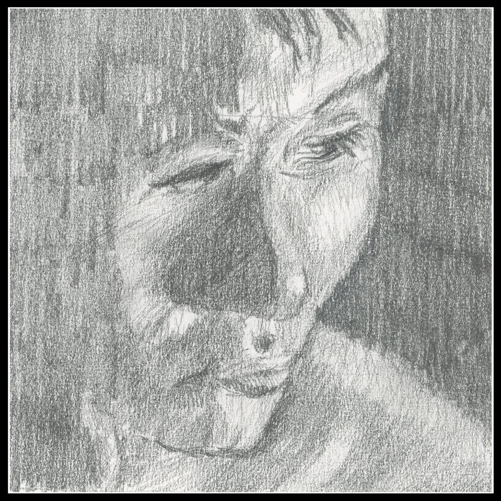
4 x 4 on drawing paper. Not a great sketch, but for values, it was a bit of work!
Last year I started a pencil portrait class, and since have continued with it when offered. It used to be through the local adult school, but with Pandemia, that was quickly shut down. Thus, the teacher offered it to us outdoors at a local park, and I jumped on it, as did others.
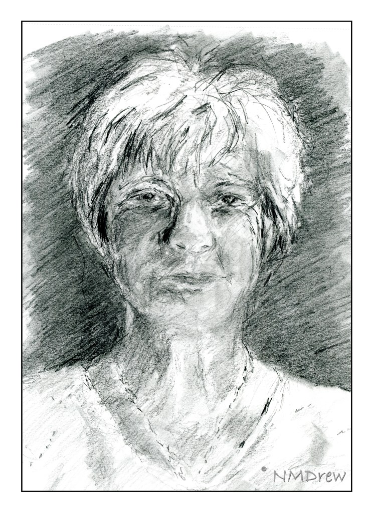
The above portrait is the first one I did this year. I was determined to do it within the two hours we have for the outdoor class, rather than the 10 hours I took for the little boy below last summer. The style is rough and quick, but important in the sense of working to get proportions and shadings correct.
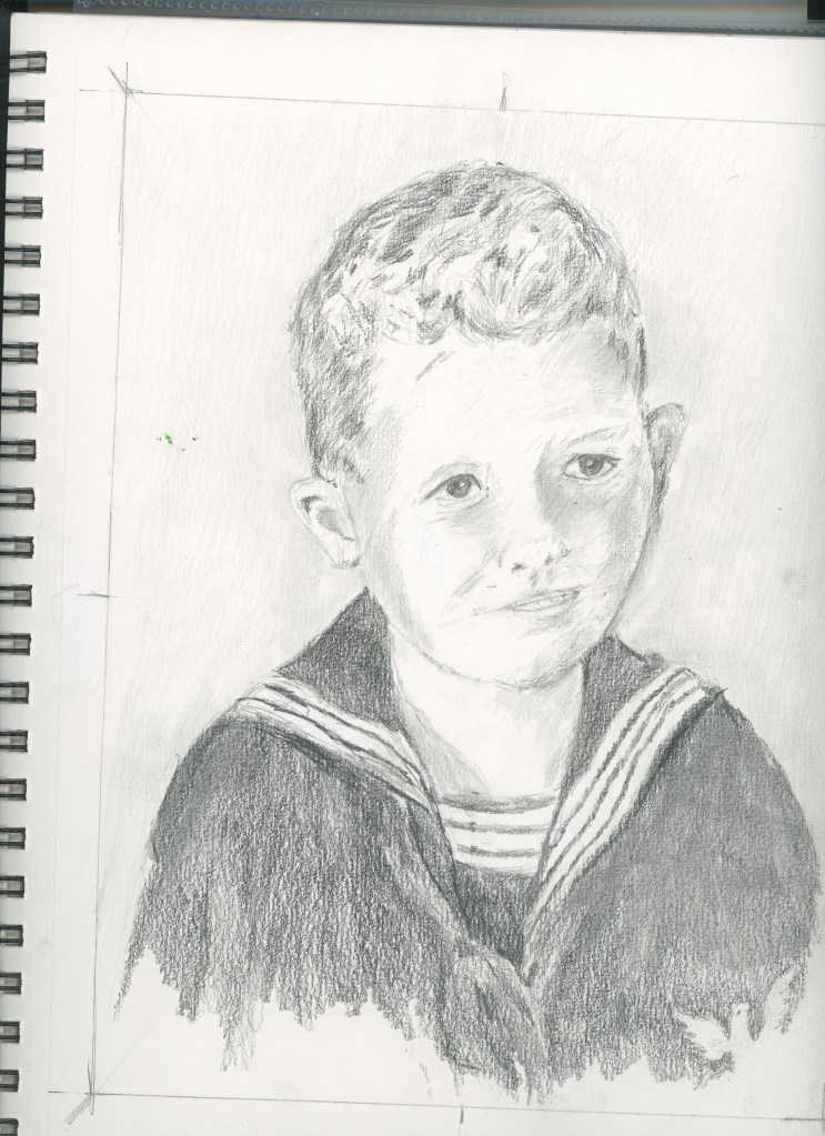
This little boy is from a photograph from the mid 1950s. He is really sweet and I think I managed to catch his character. He looks older in the drawing than he did in the photograph.

I think I may have posted this drawing here or on another blog, but this one I was determined to catch a different position of the head. Proportions change when the head position changes, and I was rather pleased with this one!
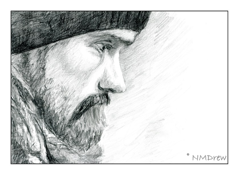
This profile I completed last week. The photo I used as reference came from Pixabay, a great resource for royalty-free photos. I decided to print out the photo on my laser, forcing black and white, and then using it taped upside down on my drawing board, as suggested by Betty Edwards in her book “Drawing on the Right Side of the Brain”. It worked! At the end, I turned it right side up to put in the eyelashes . . .

This is my current WIP. I started it last Wednesday. As with its predecessor, this one is also being done with the portrait upside down, and from a photo on Pixabay. It’s about 75% done I think. I need to work on the lights / darks and shadows a bit more, as well as make the hair more distinctive.
I got a few others in my class turning their reference photos upside down! The one thing they noticed, as did I, is that the shadows and shapes become dominant – you aren’t drawing a person any longer, but you are copying light and dark, shape and shadow. It’s amazing how well it works.
Well, time to wander off. The day has been spent reorganizing my life, meaning the garage, the closet, the studio, and the bedroom. Cocktail or whisky, anyone?
As you may recall, my Pencil Portraits class will begin again, on 2/17/21. It’s a lovely class with a great instructor, social distancing, real people! None of this virtual stuff, which has its place, but doesn’t cut it for me. However, that is another story.
For my previous two Pencil Portrait classes, I spent the entire time – 2 hours a day in class for 5 weeks to do one portrait in each session. I learned a lot and got some good results. This time around, though, I am actually “prepping” for the class. I want to be able to render a likeness that is recognizable, but I want to try to do a portrait in each session. That means a portrait in two hours, for a total of 4 portraits (we are meeting for 4 weeks this time, with a possible 5th depending on what the class wants).
Thus, I have decided to refer to various how-to books in my library, as well as work with other resources, such as YouTube. With as many resources at hand, I just need to sit down and work on things. Today’s focus is on proportions and positions of the eye, nose, ears, and mouth in a frontal view and in profile, as well as some practice with shading – as I’ve noted, my ability to render shadows and contrast gets lost when I work with color.

Above are studies from the book Drawing Portraits for the Absolute Beginner by Mark and Mary Willenbrink.
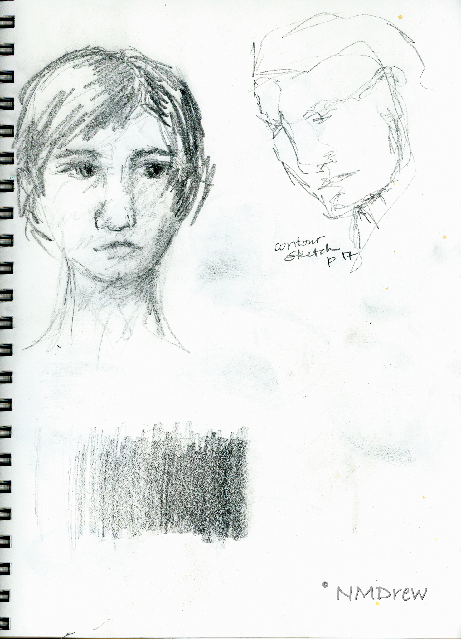
More from the Willenbrink’s book as well as a face I drew the other day. 
Shading studies with a look at where light hits a sphere from different directions. Not too sure how realistic my results are, but in a way, just doing it and thinking about it is perhaps more important. Being conscious of shadows is the whole point. I learned a lot from a video by Xabio Arts, which is below:
Solving the problems of drawing means putting tools in your art supplies – mental ones for reference with a pencil (or pen, or brush!).

More shading, and a face. Per the Willenbrinks, the face is about 5 eyes wide – which I know – and 7 eye-widths high – which I never learned. Now that is a good trick. From there – a couple of faces and shadows.

A face on a singe sheet of paper, using guides from the Willenbrink’s book as well as from a video on YouTube from Xabio Arts on drawing the face straight-on.

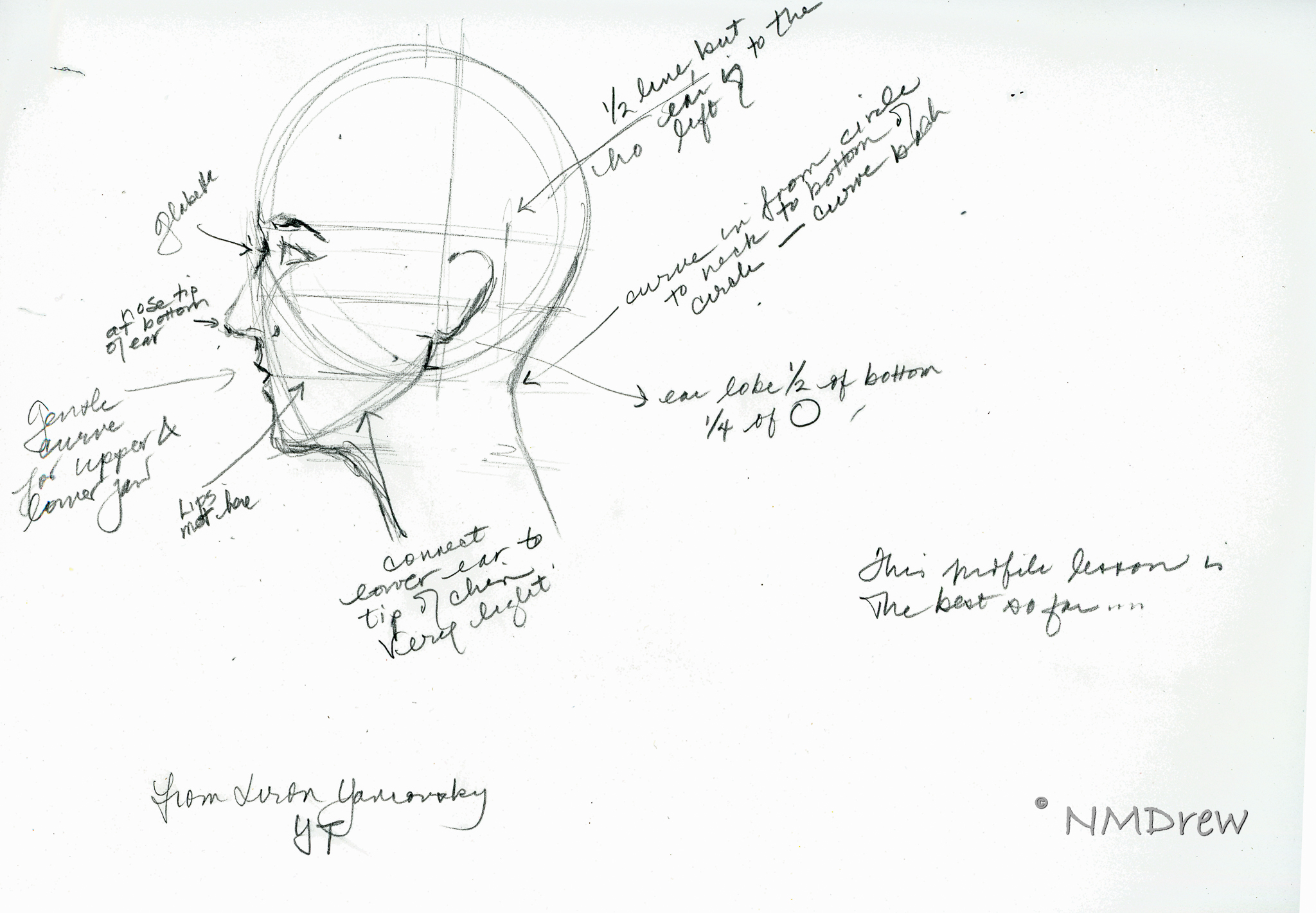
Now, profiles. I really did not get the Willenbrink’s proportions very well. Something eluded me. The heads just don’t seem in proportion. Thus, some YouTube videos on drawing the head in profile. Not much hit me until . . .
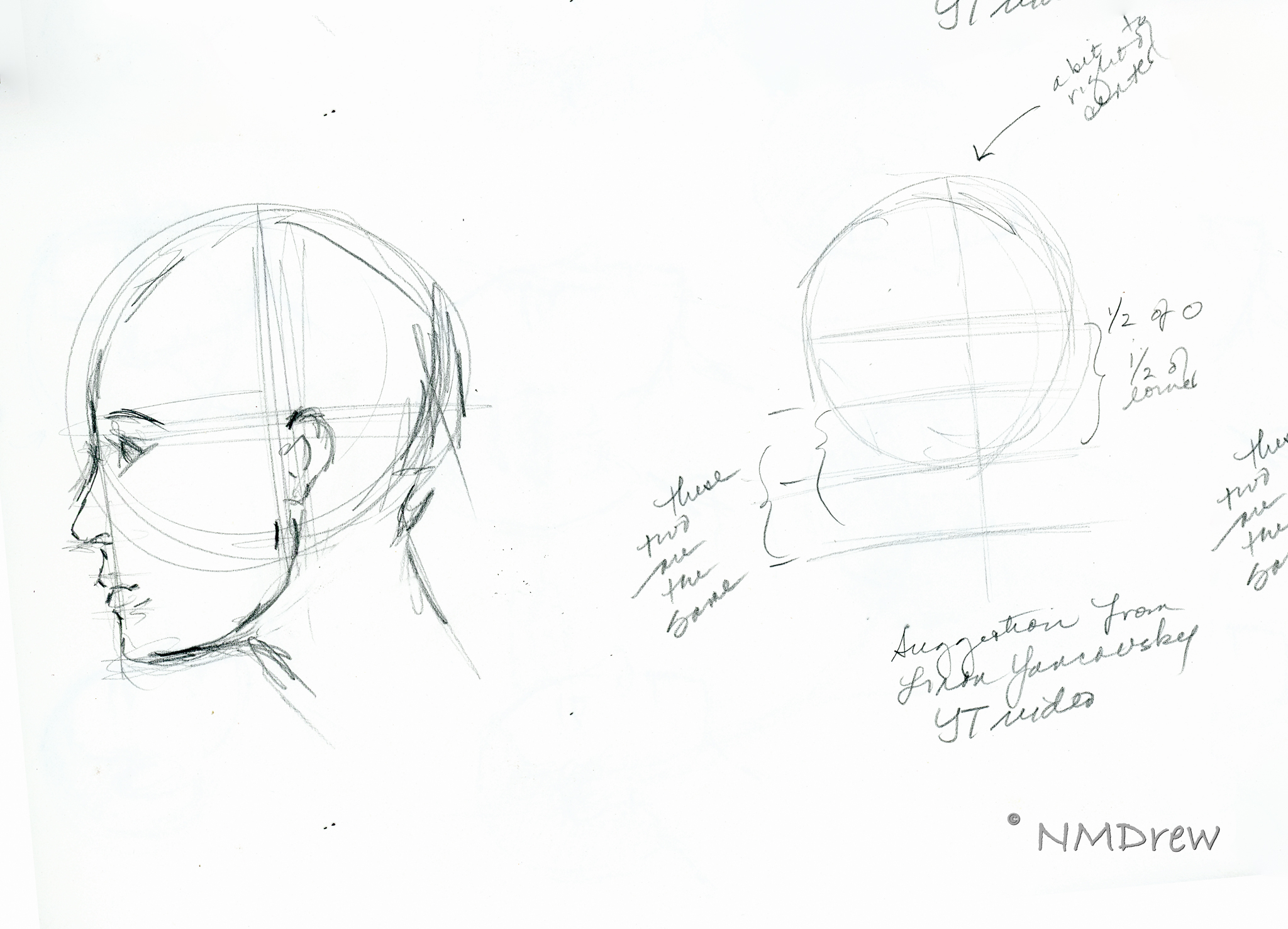
. . . I came across a profile video done in 2015 by Liron Yanconsky on YouTube. These are his proportions, and they work a lot better for me and how I want to set up proportions. You can see his video below.
And the final drawing of the day is below.
Art is personal and we all have our own way of doing things. It’s so interesting that, although we are taught the same thing, how our minds and bodies put it out on paper can be so different.
I’ve also realized that I never have had a drawing course, or read a book, that says “Do it this way!” Technical mastery is not just in knowing how your medium works, but also how to render the real world around you. This mastery becomes a jumping-off point to your own adventrues.

