Book Larnin’

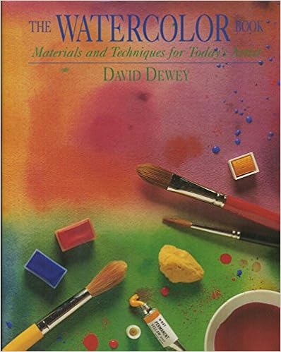
I did some watercolor studies, derived from David Dewey’s The Watercolor Book.  This is the edition my local library has – there is a newer edition, but I have no idea how much different it is from this one.

Dewey’s book came highly recommended from one of my favorite sites, www.handprint.com.  There are others, too, but this one is the one at the local library.  Packed full of text and pictures, demos and a plethora of information, at first it seems like a rather intimidating book.  It is.  There is a ton of information, and to me, it was hard to sit down to look and to read.  However, once I started, I decided my best approach is to begin with some exercises.  Other parts can be read for information – I wanted to get into actual painting!  What really draws my eye to Dewey’s work is the beauty of his washes – clean, simple, expressive.  You can see his more recent work on his website.  Given my usual propensity to messy, muddy stuff, his work is simply elegant – not splashy and spontaneous like Charles Reid, but serene and calm.

Okay, so here is what I did.  This is the first exercise I did.  I used glazes and mixed colors.  This was a drawing from one of Dewey’s exercises in warm and cool colors.

Not an especially inspiring image – and poor photography as well!  However, what I did learn was a bit about glazes and managed to leave some planned white, some bleeding, some patience, and how certain colors mixed.  I did an overall underglaze of Quin Gold.  The sky was laid in with a glaze of cerulean blue, while the ocean was a layer of ultramarine.  I mixed some alizarin and viridian (complementary colors to tone down the red of the alizarin), along with some burnt sienna to create the float of the shack.  The islands were my favorite part – carbazole violet and burnt sienna.  I’ve never used the violet, so it was a fun mish-mash.

Next, water studies, which I feel were more successful than the washes and glazes, but I was also warmed up.  These are also from demos in Dewey’s book.  Here, an underlying wash of ultramarine with a touch of cerulean.  Once dried, ripples in cerulean with a bit of permanent rose.  Finally, the greenish color is a combo of phthalo blue and burnt umber, a blend I’ve never done before.  I really like the colors!

This next image is done in essentially the same way with the same colors, only the ripples are circular.  The photo is crummy, but the results are rather clear.

Certainly no works of art, but successful exercises in a few areas.  First, getting reacquainted with watercolor is rather painful.  Glazing and washes take a bit of patience.  Finally, there is the real pleasure of learning new color blends, as well as having a sense of derived satisfaction with a study fairly well executed.

I am excited to be painting again.  During the week, it won’t likely happen because of work, but I hope that some drawing might occur.  Weekends are likely to be very much taken up with painting . . . yay!

An Afternoon’s Painting Practice

I am an unabashed Charles Reid fan when it comes to instruction books and videos and style in watercolor.  I love his loose style and the way his colors flow in and out of each other without getting muddy.  Honestly, I am really a novice when it comes to watercolor painting – and mud is my usual result.  Somewhere in the past 6 months a part of me just quit worrying about what I produce, and this gave me the freedom from self-criticism (and condemnation) about what results I get.  I don’t care anymore, and this freedom is opening up doors which have been slammed shut by my unrealistic and unrelenting worrying.  It’s a great feeling!

Having a bunch of watercolors and supplies on hand, I dug out some water brushes and my traveling palette.  Out on the patio, with earphones on to listen to a spy novel, a bunch of paper towels and some water, I pulled out Reid’s book.  My watercolor pads came along with me, as did my coffee, water bottle, drawing pencils and who knows what else.  The verbal distractions of the audiobook keep me from getting too emotional about my practice pages.  I propped up Flower Painting in Watercolor and got to work, reading captions and color suggestions, drew some rough sketches from Reid’s exercises, and got to work.

I think one of the hardest things to do is to leave white paper.  I just want to paint it all up.  And I also want to just keep going on – and this creates mud – without pause for paper to dry and paint to settle.  Rush, rush!

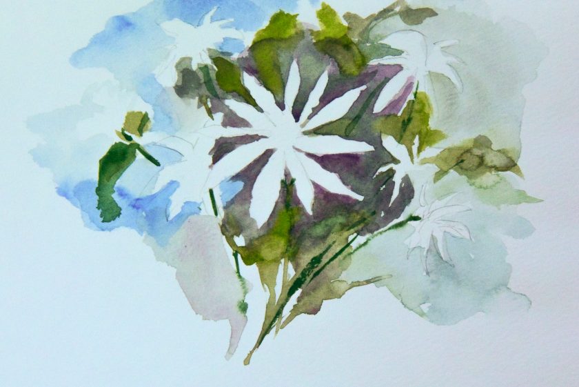
Well, I did succeed somewhat.  The crocuses above are one of Reid’s studies, and I was pretty pleased with it.  In reality, it doesn’t look half as good as the photo, but then it is on a piece of messy paper with scribbles on it and test swatches of color.

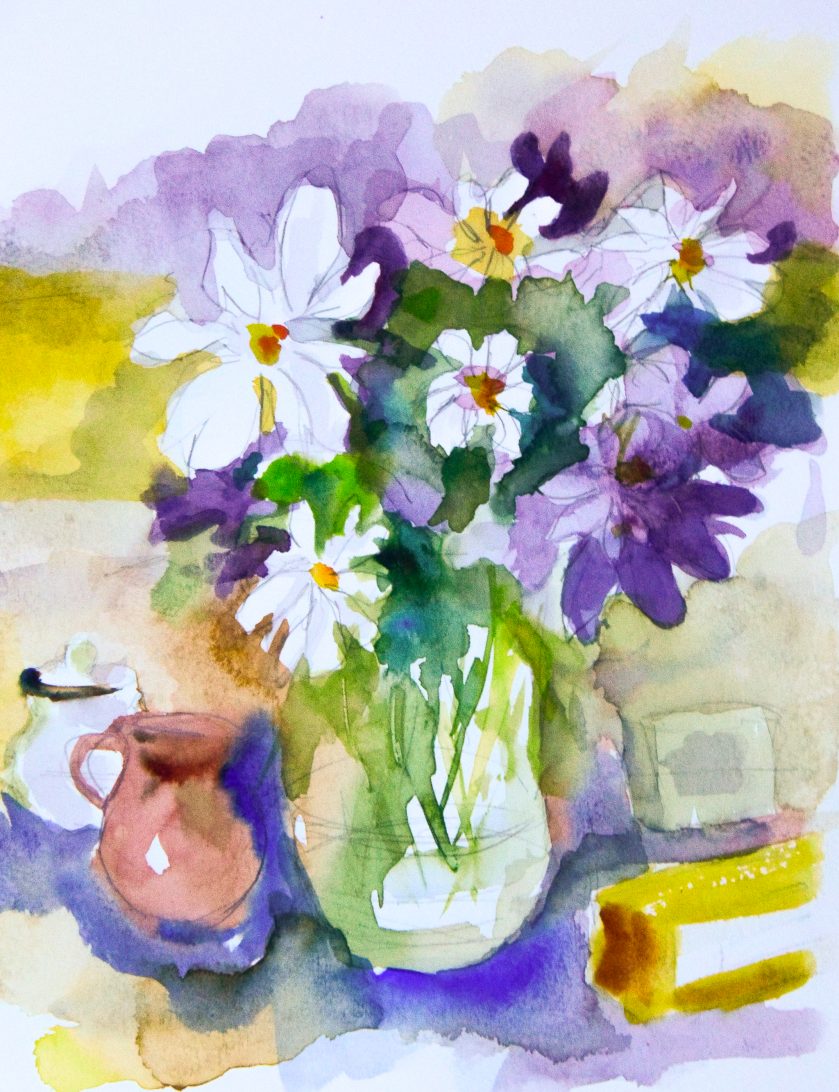
This was a quick study, more white space being left open.  I went back after I finished this study to use my pencil to add some shape to the white flowers.  I like lines – and it is a problem I find with my own sense of a “successful” painting – I need lines to define things.  Sometimes lines work – sometimes they don’t – but I do love the Renaissance ink studies I’ve seen, and lines have always held my eye.  Lines are expressive – but so are shapes of color.

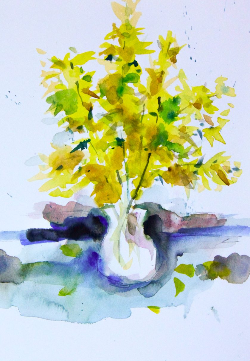
Here, simply color shapes to imply a flower or a leaf.  My experience in sumi-e brush painting makes my understanding of controlling a brush – even an inexpensive water brush with nylon bristles – much easier.

One thing Reid pulls out is shapes without definition – just implication of form.  This is great practice for my line addiction!

Another issue I find is contrast and value.  It’s hard for me to really get these right in a painting.  Reid mentions he makes his dark not super dark – not black – but installs a medium dark early on to establish value.  I struggle with this but with more practice I think I will get better at this.

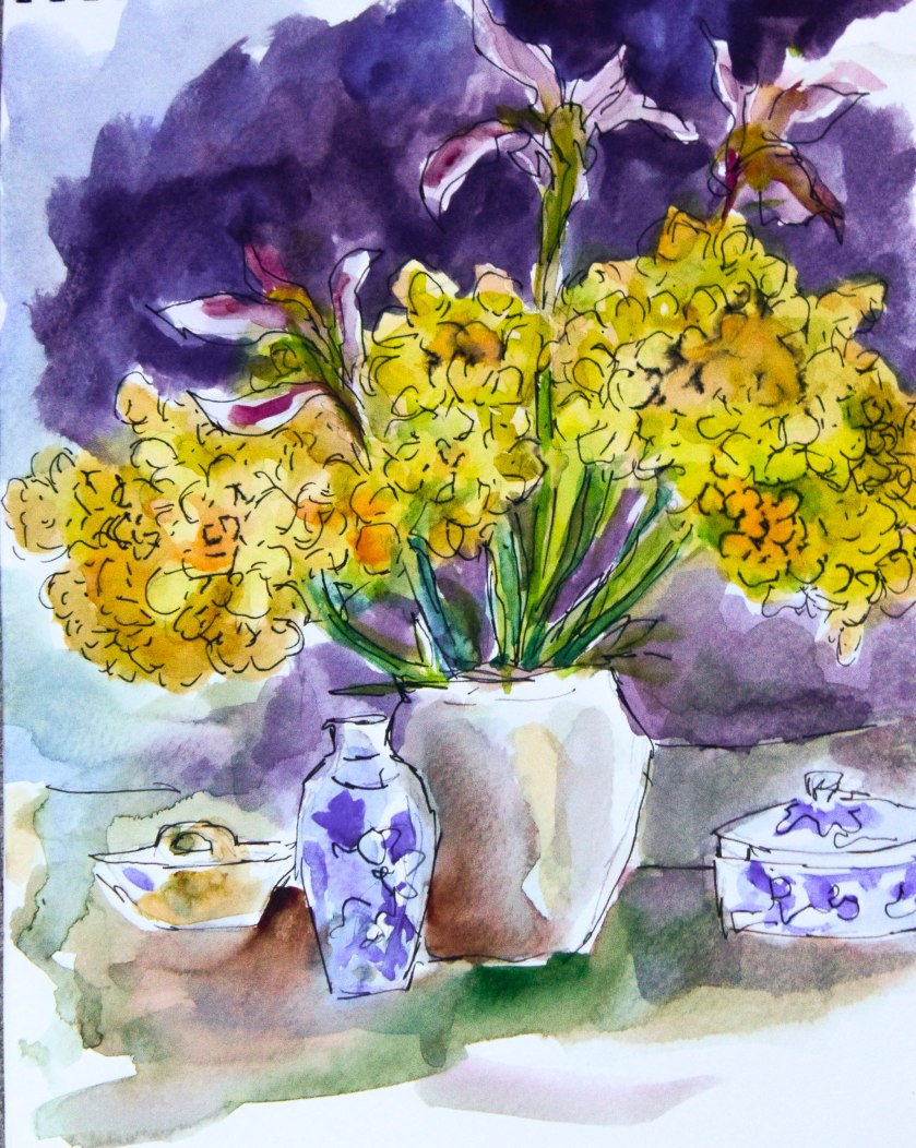
And here is the last one . . . not the best, but one which does have some good areas of contrast, and black lines from an India-ink pigmented pen.  Sketchy, painterly, and totally fun to do!

Quality paper is a must-have.  I have some tablets that I bought which I absolutely hate because of the texture and sizing in the paper.  However, I used them up and ordered more of the Canson’s Montval paper, in a spiral booklet form, 9×12 with 20 pages.  It’s a good working size – and it’s good paper, with a nice texture and sizing which doesn’t blotch up and look horrible.  It’s also very reasonably priced.  The Schmincke paint box may have Schmincke paints in them – or not.  My paint supplies include Schmincke, Winsor & Newton, Daniel Smith, Holbein, and M. Graham professional-grade watercolors.

I’m glad I sat down to paint – it’s such a wonderful feeling and one which gives me satisfaction.  Did I produce anything worthy of framing?  Not at all.  But working with my hands, seeing some success, is something which cannot be described – only experienced.  You know what I mean!  It’s like love!

Projects, or, Wonder Woman Does Not Live Here

3-365-corner-of-the-world-autumn-rain

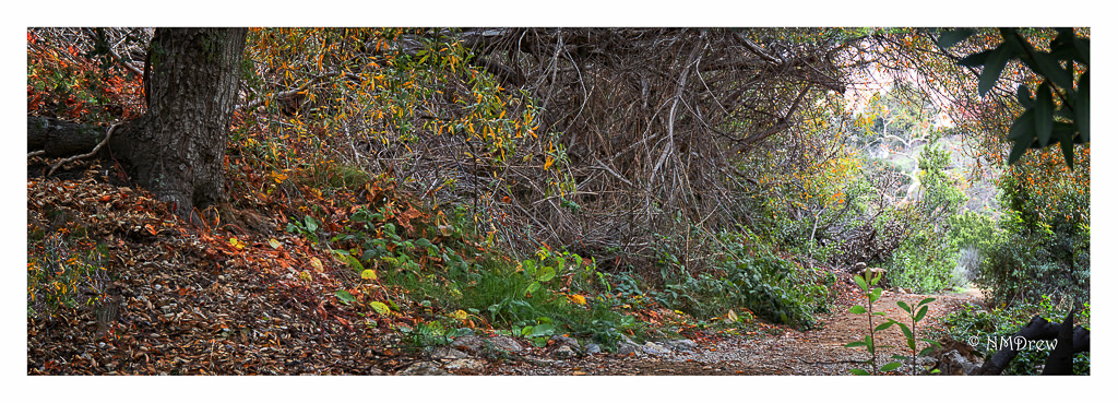
We have been enjoying rain for the past several weeks, and it shows.  Colors are more intense as the winter grasses emerge, the cold is shaking the leaves into color, and the subdued light intensifies the beauty of the trails nearby.  Of course, post-production helps, too.  I’ve enjoyed the weather – wind, rain, clouds, sunshine, cold.

The variety of weather has really helped, too, as this past week I’ve been dealing with dental problems and dental pain.  I didn’t know my teeth could be so annoying!!  However, things are calming down, and thank goodness for dental insurance, and good dentists.

Around here, there are a lot of things afoot, and not enough time to do them all.  I have been doing the following:

I thought I would be able to do it all, and still work my silly schedule, but it may be that I will need to scale back a bit.  I really want to do all these things, but find that an 11-hour day is so long that by the time I get home, I can just function.  This means eat dinner, do the dishes, and either fall asleep or watch a bit of TV, and then fall asleep.  How dull, eh?

What I am finding useful, though, is to actually schedule my creative time.   This means sit down and decide what I want to do on Friday, Saturday, and Sunday.  If I don’t, I get distracted, and other things just won’t happen.  And trust me, there are lots of things to distract me (besides aching teeth).  If I stay focused on my projects, I become a recluse and don’t get out of the house.  Friends and family help to keep me human, not a raving, obsessed something.

Looking Ahead to 2017

memories-of-last-spring

As I write, I am sitting down to lunch, looking at the total destruction and reconstruction of my studio.  Unlike those more fortunate, my studio is really a bedroom in the house that doesn’t even have a closet.  As a result, all storage is on shelves with plastic bins, all in the hope of keeping the dust to a minimum.  In addition to having shelves of cameras and lenses and other photography equipment in the studio, I also have my sewing supplies, a desk, a drafting table, two filing cabinets, two chairs, a computer, a printer, a scanner, and a couple of monitors.  The destruction of the studio is the cleaning out and throwing out of things, as well as reorganizing it to accommodate painting more readily.  Things are being moved around to make access to certain items more comfortable.

When I think about my focus on photography over the past several years, I am so glad I feel that I have mastered it to a degree that makes it comfortable, and gives a certain level of satisfaction.  Both digital and analog are areas where I feel a level of proficiency – I can take good pictures.  I know my cameras, I know my film, and can determine an exposure for a manual technique by looking at the light.  This is something that once learned is never lost – the knowledge may get a bit rusty without doing it, but it always comes back once being used again.

Photography, though, is not my first love in the visual arts.  Painting is always where I want to come home to roost.  The feel of a brush or pencil, the colors of paint or gradations of ink, the physical experience of painting and drawing:  all these combine for an experience that photography has never had.  I am not interested in painting realistic images – that’s what photography is for – but in the emotional expression or abstraction of whatever that painting provides.  Besides painting, I love woodblock printing, and sumi-e.  There is a sensual quality to working in these areas that, if I had a darkroom, I might find as satisfying.

With this focus on painting – mostly in watercolor, possibly in acrylic – I will need to revisit the skills I’ve lost over the past several years.  Because I tend to be rather fixated on painting in certain ways, I also hope that my sense of exploration and adventure will get piqued.  It’s easy to become formulaic in art, I think, but that doesn’t necessarily indicate a lack of focus.  Rather, being formulaic means a level of success in given techniques, but it may not open the door to that magical realm of creativity that leads to new insights and processes.  This is where I want to go.  I want to study botanical illustration because I am too splashy and undisciplined, but I also want to explore different ways of using colors, papers, paints, and pencils.  The process, ultimately, is the most important experience to me.  Whether or not I become an artistic celebrity is immaterial; it is the doing and being the art itself.

Tulip Painting – Day 1

Tulip 1


This past month has not been what I would have liked it to be. Instead of using my free time as I want to, I have had to use it for things that have to be done. The entire month of June seems to be that way. Sigh.

Today, though, I had time. Lots of it. Starting at 3 this afternoon, and going to 6, I got time to paint. (Yesterday, I did some baking.) The choice was to rummage through some of my paper in the paper portfolio, and see what I have. I have oodles of hot press 140# Arches, so I pulled out a sheet that was already cut, and went to work. Handling wet-into-wet and controlling color is today’s main goal. As I have also been watching some watercolor videos, I thought I would try to work with some of the information I observed, to see if I could remember it, as well as to see how well I could do.

Tulip 2

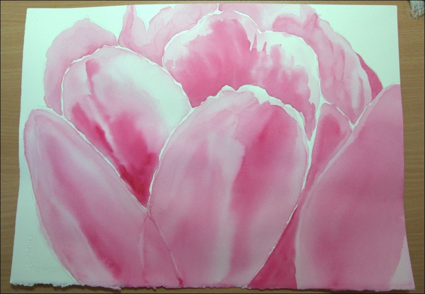
Subject matter is a pink tulip that has hints of yellow. The beginning task was to set down the first layer of washes, using WN Permanent Rose. Different layers of this color were used in increasing intensity to darken the areas. This took a lot of time. I applied clean water, and then worked in the paint as necessary, rotating the paper at times to have the color bleed, and at other times using a dry brush to pull out excess color. Other times, a damp brush was used to blur edges. I let the painting dry between sections.

After the pink was fairly well established, I pulled out some DS New Gamboge. Using clean water, I laid in a little wash in the areas of each of the petals. New Gamboge was blurred into the pinks, and edges softened using a large, dryish brush. Finally, around all of it, a combination of Phthalo blue and Hooker’s Green. Notice, I shaved off some of the tulip in the lower right corner, and probably will do more petal shaving with the next layer of color.

Tulip 4

So, that’s it for the day. Tomorrow more is planned to give the tulip more depth and dimension, and to do something with the background.

I’m rather pleased with it so far, but who knows what will happen tomorrow!