Through Many Seasons

While the peasants needing food and firewood in the past centuries in England were kept off the king’s land, it has left a wonderful legacy of old growth trees, unlike, I understand, in most of Europe. Here in the U.S. we have many old trees, and the wilder parts of our country have many stunning examples.

Personally, I am partial to oak trees because of their oddly twisting limbs and branches. As a kid in the mid-west, I grew up with a forest of oaks behind my house, and these trees have always held a special place in my heart. The Druids found them magical, and so do I. 

There are multiple species, distributed worldwide. Here in California, the overall objective is to give oak trees the protection they deserve, and while property owners can cut down trees, permits are generally required, and woe betide those who fail to follow those regulations. Sadly our fires are killing many.

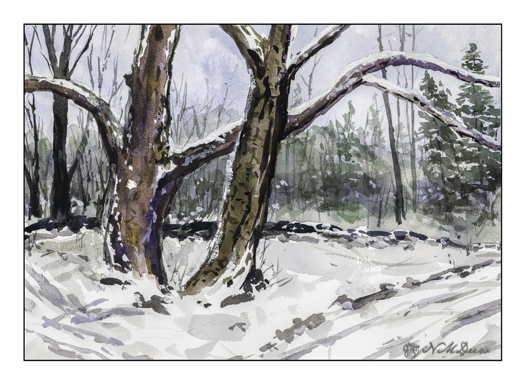
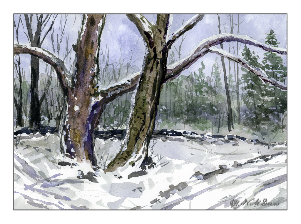
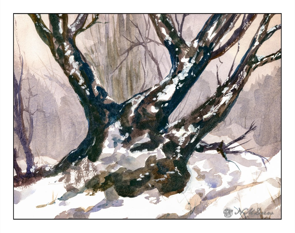
A return to the theme of snow and winter. Can you imagine what these old trees must have seen through the years and years they have stood? Changes in forest, change in season, spring to summer to fall to the desolation of winter. For me, a tree is more than a tree – it is a legacy of times gone by as well as, in many ways, a hope for the future.

Kilimanjaro 300# cold press paper, 11×14, limited palette of blues, umbers, and siennas.

Playtime Is Fluid

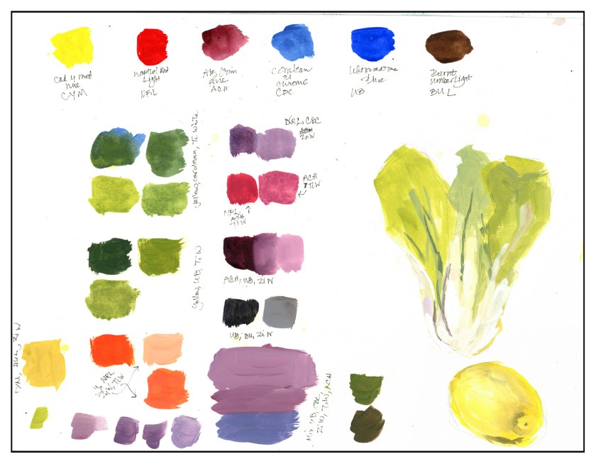
Several years ago I bought some Golden Fluid Acrylics in 1 oz. containers. I really didn’t appreciate them as I wanted them to do something they couldn’t. However, I have pulled them out lately and played with them here and there. Many of them are dried up and old, worthless to use, so I decided to pick up some newer ones and in a limited color palette – one yellow, two reds, two blues, a brown, and two whites.

Obligatory color testing – and mixing – to see what could show up. I like the oranges and red violets, but the greens are not the bright ones I like. I think the blues are not quite what I would like for mixing, so I am getting some cobalt teal. The same with the lavenders – they are okay, but, again, not exactly the shades I want. So, some dioxazine (aka carbazole) violet, as well as a quinacridone magenta as the alizarin is not to my liking either. Oh, let’s add a raw umber to that mix – not sure about the burnt umber.

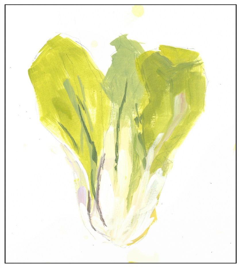
Anyway, some playtime with the paints, quick sketches to see how the fluid acrylics work. They are a lot smoother, but dry out quickly, too. I did a sad lemon and a decent bit of bok choi. I think the bok choi is worth a bigger glance.

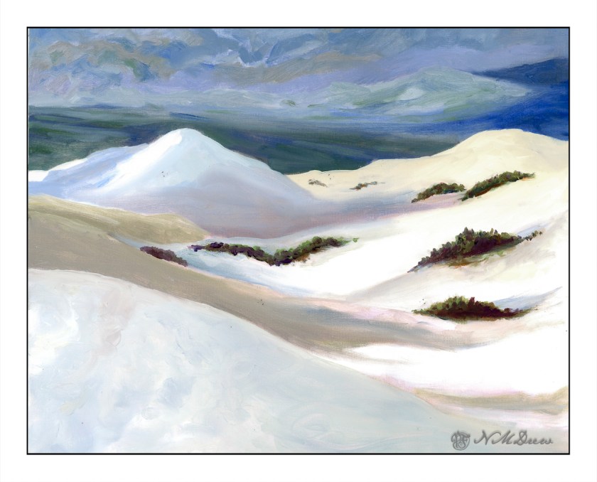
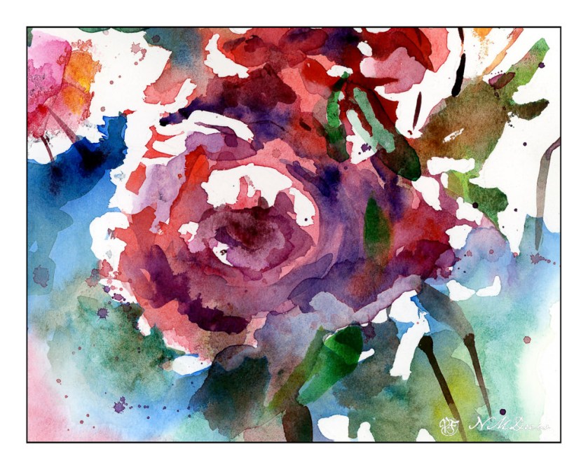
I may actually begin to enjoy the acrylics – working on 140# Canson watercolor paper – 16×20 – gives me plenty of room to explore. I am working on a bit of a landscape to see how to use the paints, and will report on my progress later on. I laid down a value study on the paper, and will next consider colors and layers, probably moving dark to light, and my brushwork, too.

Winter in Hill Country

I needed a change of pace – a way to relax – after yesterday’s very intense painting of buildings and people. It’s nice to visit familiar territory. But, I was not without goals. Here I worked on subtle gradations and color change in the sky; misty / soft trees in the horizon using moist paper to blur and indicate distance; a couple of buildings with subtle rooftops; snow. On Arches CP 140#, 9×12.

Things I Never Paint

After spending 7 hours yesterday sorting through books I hope to sell or donate, I was bushed. Dusty and dirty, too. It’s amazing how much of a mess your life can become when you aren’t paying attention! Painting definitely has its attraction as opposed to drudgery, but lately I feel like pushing myself into areas I don’t ordinarily venture. Cleaning and discarding shakes things up, and it seems to be carrying over into artwork.

Charles Reid, besides being great at landscapes, is also fascinating for me as his watercolor portraits are so loose and wonderful. I read a bit in one of his books about how he does skin tones. Colors for pale skin can be yellow ochre, alizarin, and cerulean – these are the ones I used to paint the figure on the left. For the one on the right I threw in some ultramarine and Hooker’s green at Reid’s suggestion. I worked to make the highlights warm and the shadows cool – more yellow in the light areas, more blue in the shadow areas.

Here are some gardeners laboring away. The color palette was pretty simple – ultramarine, orange, and a bit of ochre and green. I tried to create a sense of dimension in each pose, working with complementary colors to create shadows.

I then thought that after doing people, I should do an animal. I found a wonderful picture on Pixabay of an elephant striding along. I was rather teary when I thought about how we are losing so many wonderful creatures, large and small, because human beings are not the best. Of course, I’m not starving, so my perspective is very different. I was caught by the beauty of this elephant and think I will probably draw and paint creatures more. I have never painted or drawn an elephant before and enjoyed this one a lot.

Finally, a building, specifically Dunguaire Castle. It’s from the 16th century and has been restored. I think it would be a wonderful place to visit as it is right on Galway Bay in western Ireland.

Altogether, this afternoon’s romp in the paint was satisfying and challenging. Figures, animals, buildings – all of these really pulled me out of my comfort zone. I kept my palette simple and worked to create a 3D element with shading as well as contrasts of warm and cool. Initially I used rather cheap paper, but in reality, it sucked, so I pulled out my Arches 140# CP and was much happier with the results.

By Flashlight

With winds blowing at 40mph, the fear of fires was intense. Electrical lines spark, grasses and brush catch fire, and before you know it, the world is lit, not with electricity, but with flames. As a result of this – PSPS (Public Safety Power Shut-off) – we had no electricity for about 36 hours. What do you do when the sun goes down, there is no phone, no TV, no electricity? You read, you chat, you play games by candle, and paint by flashlight.

Rather than try to be creative, I got out a couple of art instruction books, one by Geoff Kersey, and one by Ted Kautzky. All of these paintings were done with limited palettes and by following some instruction to create a painting from the book.

The one above is from Geoff Kersey’s book, using only red, blue, and yellow. No more. It was the first one I did, and there was still some daylight, but very little, in my darkish studio. It was evening, and the studio window faces east. I used manganese blue, cadmium lemon, and cadmium red.

This one is from a Ted Kautzky study. Less light and more moving my little flashlight from book, to watercolor paper and drawing, to palette. Colors were verditer blue, cadmium red, Hooker’s green, and raw sienna. Verditer blue doesn’t seem to mix well with other colors, but is a lovely blue by itself. Four colors!

Now we are moving into big time! Here, five colors. Payne’s grey, ultramarine blue, aureolin yellow, Hooker’s Green, and burnt umber. Another study from Ted Kautzky.

I enjoy doing studies from books – it helps focus a bit. I also realized that daylight is a better way to paint, or using diffused electrical lighting. Flashlights are good to see with, but their light is not diffuse, but sharp and focused. I think I would have had better lighting with a few candles. Anyway, it was a good way to pass some time when the sun set and the vampires weren’t yet out.