Color Planes

As I mentioned a few days ago, I am experimenting with swaths of color. Not simple planes of one color, but variations of color within that plane is the goal. A number of artists do this beautifully, and the graphic quality is elegant to my way of thinking, with the simplification being the subject and the goal and the voice of the artist. As I am a dabber, this is a big challenge for me.

To begin this, I decided to try my hand at exploring a painting by Wolf Kahn. The one I copied is called Ground Fog, and it is a simple study of grey, white, yellow, green, and variations of each within each area of color. Below is my attempt.

This was a challenge to try as he painted this in oil and I am using Golden fluid acrylics. Blending the colors was hard and required a lot of thought and movement rather rapidly since acrylics dry quickly, and the fluid acrylics even more so than heavy bodied acrylics. I got frustrated, let me tell you! Despite that, I did learn a bit about color – not quite sure what, perhaps just that subtlety is hard to achieve.

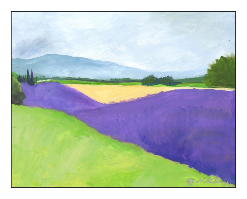
From there, once more a foray into fields of lavender and other crops, such as perhaps alfafa or wheat – no idea! I just know I see tawny colors and greens when I look at photos of lavender country.

While not especially low key or subtle, I was pretty pleased with the planes of color with the variations therein. The green and lavender are not too heinous when juxtaposed. I like the mountains and sky in the distance, as well as the trees. Sometimes nature is not subtle, and while bright, I think I did a decent job of catching a sunny day in a Mediterranean clime.

The lavender field with the green foreground was done with both large and smaller brushes. This one was done, for the most part, with a rather scraggly 2.5 inch bristle brush with a lot of scrubbing. In particular, you can see this in the sky. I applied varying layers of blue and white, painting up and down to use the brushwork to express the clouds in the sky. The same with the lavender field below. I used a smaller brush for the dried field area with trees, but worked to keep the brush strokes and colors to convey light and depth. I think it worked fairly well.

The study I did on Kahn’s painting gave me ideas on how to create the color planes, but of course I am not Wolf Kahn, and therefore have my own whatever method in creating such things. Acrylics, too, have qualities which oils do not, and blend differently. I am still learning them, and while I get annoyed and frustrated, each painting helps me gain skill and learn the language of the paints. These are invaluable lessons in technique and composition and methods.

Upward to the Beyond

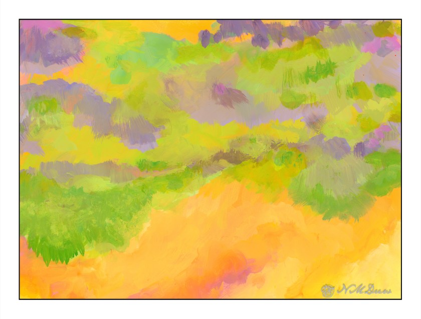
What is the “right” way to hang an abstract? Is it the artist’s choice – the viewer’s choice – the hanger’s choice? The painting “Into the Blazing Hills” is one thing – the title telling you what I see. Inverted, I see “Upward to the Beyond” – moving toward the other side. What is the other side?

Putting my digital signature on this one gives it a different sort of reality – the signature grounds the painting and says “this is the bottom so upward is the top.” What is the top? What is the bottom?

Sideways, the painting does nothing for me, with the yellows on the left or right, but yellows on the top or bottom create a totally different feeling, but somehow the feeling is right. I will say, the yellows on the bottoms are more disconcerting and unsettling to me than when it is on the top. So, upset or comfort?

If I were to critique this at all, I would find this painting bottom-heavy in yellow, and moving upward it seems as if there are trees silhouetted against the sky. However, there is all this stuff in between, and it lacks the harmony, I think, that “Into the Blazing Hills” has. Perhaps it is the ability for me to recognize my surroundings – the hills of California – with either a sky and brilliant, blazing sunset – or a wildfire encroaching a bit of paradise, destruction being moments away.

This is going to take time – maybe both are “right” – and perhaps the middle chaos in this painting is okay but needs a path of some kind to lead the eye upward.

A Touch of the Fauve in Cinque Terre

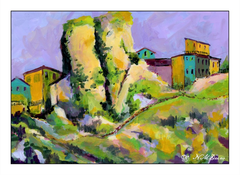
Cinque Terre is located in Liguria, in northwest Italy, and comprises 5 villages built into the steep cliffs along the coastline. You can find all sorts of articles, videos, photos about it, and to my thoughts it sounds like an incredible place to see. However, it is not something I will get to do next week, so I thought it would make a good painting study. The idea of living in a house, built on a cliff at the edge of the ocean – I don’t know, but it seems quite a fascinating way to live!

I was more interested in playing with the paint and experiencing how to use the Golden fluid acrylics than I was in making a finished work of art. I am finding I like them when they have dried a bit and become rather sticky but still maintain the consistency of cream. Opacity seems to improve as the paints become more viscous. This stickiness makes for some rather nice ways of creating color combinations – one on another – and texture. This is all play, and play is the best way to learn how to use something, I think. The plan is to continue and come up with an opinion about if I like them – I think I do, sometimes more than other times – as well as just exploring painting with them.

This painting was inspired by a photo taken offshore and looking landward. The houses cling to the cliffs, and if you look closely at the photo, you can see pathways and stairs leading from one area of houses to another. There were more outcroppings of rock in the photo than I have here, and I think it would have been a better painting to have included them. It looks like I have two rock columns madly in love, and having a good smooch! Despite that, I had fun playing with not just the colors, but ways in which to apply the paint – like rubbing it in with a paper towel in addition to a paint brush. Soft and hard brushes also have and impact, as does using a filbert, flat, or round brush. So much to learn . . .

Golden fluid acrylics, a bit of a fauvist or colorist approach, 15×20 paper.

First Painted Portrait

I have drawn people and done some half-witted attempts in paint, but this painting, for me, is my first more than half-witted portrait in paint. Source photo is from Pixabay.

9×12 canvas paper, Golden Fluid Acrylics. Limited palette of violet oxide, cobalt blue, yellow ochre, cad yellow, zinc and titanium white.