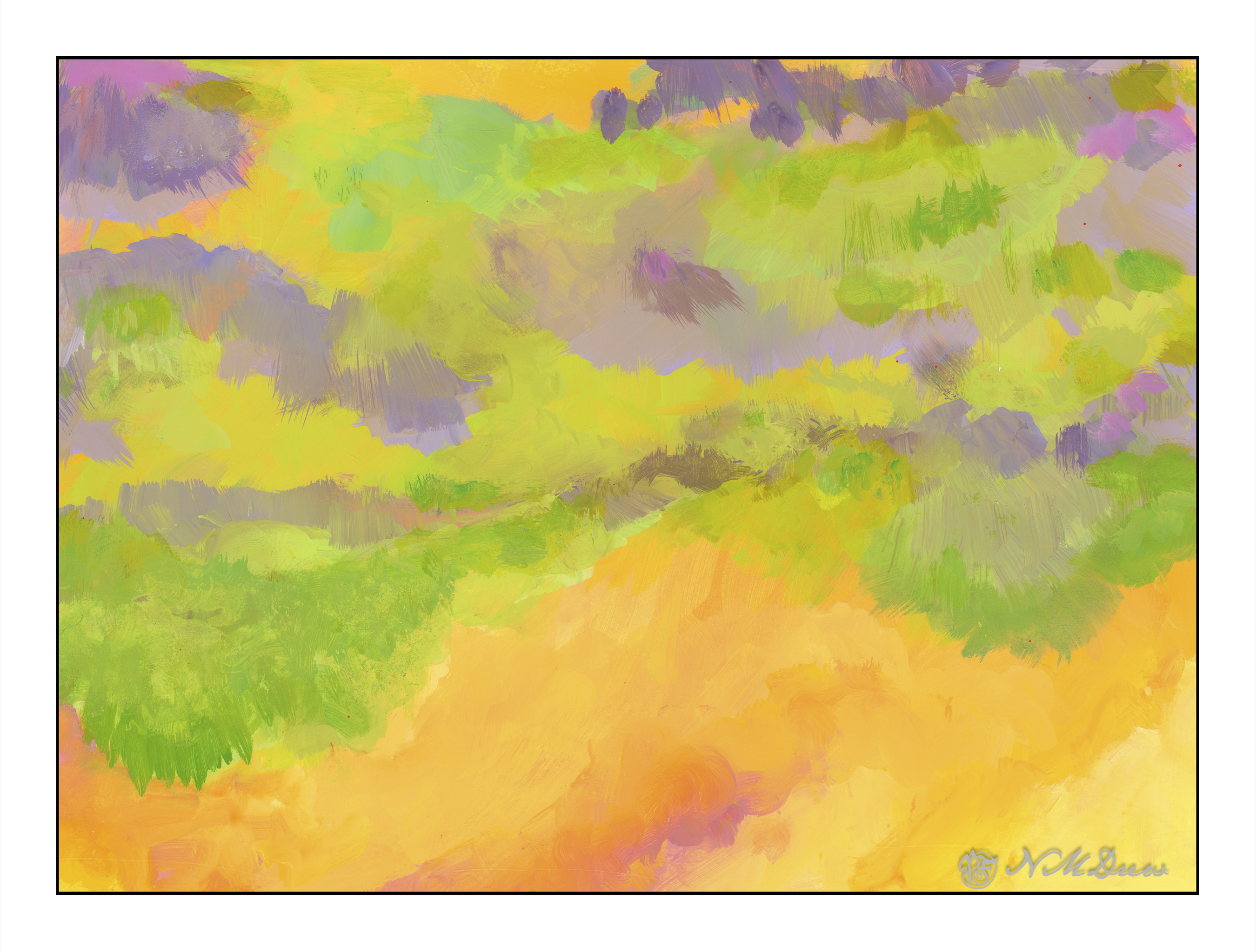
I’ve been taking a basic watercolor course at the local adult school with one of my favorite teachers. I decided to do this as it never hurts to return to basics as it can be eye-opening. Here, one of our studies. This one made me rethink using frisket as a resist quite a bit, and while I may never really embrace this – using frisket to maintain white paper – I really learned a lot from this little study.
First, the teacher provided us with a template to use – namely the rose. We transferred it to our watercolor paper by using graphite on the reverse of the template. We were to outline the white areas and then, using the liquid frisket, paint out the white areas. This way we could apply very wet washes to the paper without losing our hard edges and white paper.
Once the frisket dried, we wet our paper around the rose. Colors were dropped in using viridian, quin rose, and phthalo blue. We kept our paper flat and worked relatively quickly. Once the outside colors dried, we moved into painting the rose. Wetting the rose, the colors were then applied using cad red light and quin rose. The violet was a mixture of blue and rose, but I also used carbazole violet as it is a very clean purple. Once more, paper kept flat as the colors dried.
From there, little details were added, such as leaves, extra contrast, and so on, all using various tricks common to watercolor. In the end, once all was dried, the frisket was removed and little bits of color added here and there over the white areas. Lines, bits of color.
And this is the result! It is an abstract and very watercolory and painterly rose. Techniques were wet-in-wet, masking with frisket, and some dry brush. I also splattered a bit of quin rose and carbazole violet onto the surface to make it a bit more interesting to my eye.
Watercolor, frisket, 10×10 Canson XL watercolor paper, wet-in-wet and splatters. Colors were limited to carbazole violet, viridian, phthalo blue, cad red light, quin rose, and a smidgen each of burnt sienna and cad yellow.