Once more, it is hot and sticky, but not as miserable as yesterday. Today, I am a bit more energetic but still not running around in the 90F and then some heat. And I am in a far better mood, too! No flies. No mosquitos. And a replacement package for the stolen one arrived today. Now, September is here, and though summer is not yet over, Labor Day (American holiday always on the first Monday of the month) is, for many of us, the official end of summer.
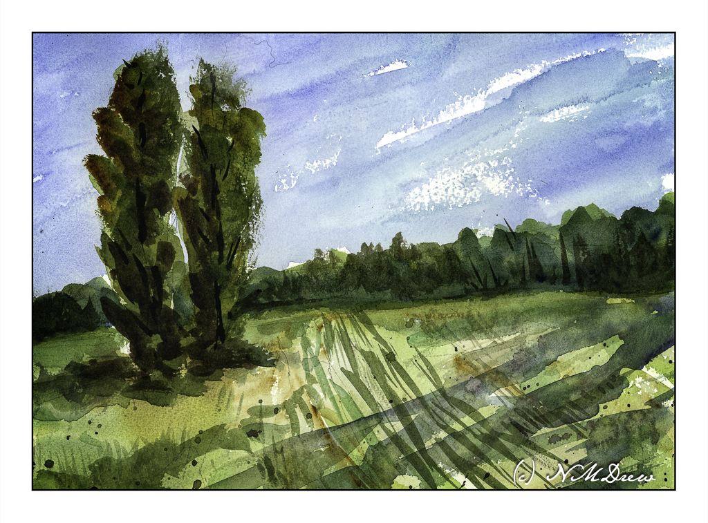
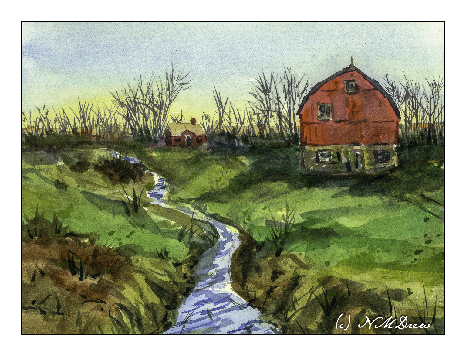
The end of summer means the fields are mown, crops and hay gathered in. Tracks and stubble leave lines behind in the shorn meadow. Heat, light, late afternoon.
That is all that this painting about. I did it after the one I posted the other day and, as with the other “Two Trees”, I am happy with the results here. I like the long shadows in the lower right, but if they are realistic or not is not the point – they just make for a bit more of an interesting picture!
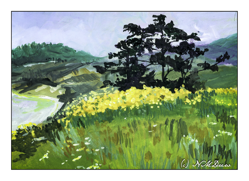
In landscapes, you are the goddess of your painting!
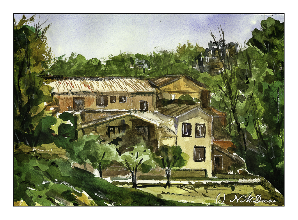
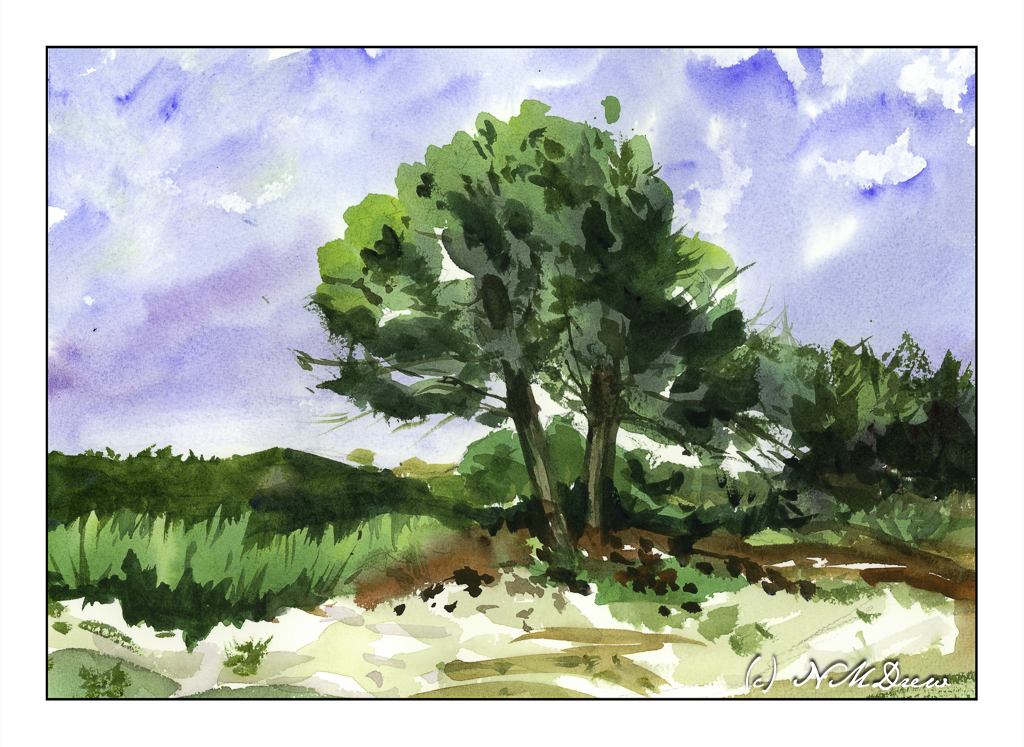
Watercolors, Arches rough 140# paper, 10×14.