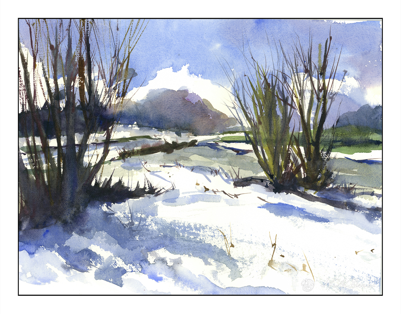
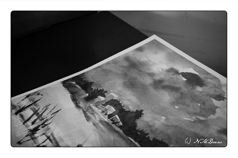
Heavy rains and foreboding skies give way to ragged clouds and brilliant blues as the storms recede. No snow here, but memories will do! I tried to express this sky in the distance, beneath the blue and white with the dark clouds moving away. Not so sure how it reads, but you can decide that. Could be trees, could be clouds, could be space ships. And there is a river behind the trees and the snow across the way.
Kilimanjaro Natural White Rough, 300#, Rough, 12×16.
Today the rains are pouring down. The backyard is flooded and the pump is working to keep the water levels acceptable by shunting it out to the the street and into the storm drains. This is the second of the two Pineapple Express atmospheric rivers causing concern and evacuations throughout the county and elsewhere in California. There is charm to living up a canyon until the rains erode it all – I live on a small hill in a tract with a creek in a park a ways down the hill. I’ll settle for that! Our clay soil and poor landscaping creates a boggy lake in the backyard, held in place with our clay soil, but we are lucky overall.
And on a rainy day, oil painting is not something I want to smell throughout the house even though I did think about it. Watercolors called – because of all the water around me? Who knows – but rain brings green growth and soggy ground, and that is a delight in our dry, dry land.
Over the next several weeks I am enrolled in a couple of oil painting classes. Acrylic paints really do frustrate me in a lot of ways, and please me in others, but it is time to work with oil paints on a more serious level. Let’s see where it goes.
To get ready for these classes, I pulled out some of my supplies. Of course, the oil paints come out – I have a smaller selection of colors than any other medium! I also have canvases in panel and mounted format. However, I did need to stock up on linseed oil, solvent, and other such stuff. And then paint.
Canvas mounted on panels is actually, I think, the easiest way to go. Canvas pads flop around and easily bend. Mounted canvas on stretcher bars takes up a lot of space but can provide a gratifying surface to paint on if properly and tightly mounted and prepared. For now I am using canvas panels which, while not super high quality, are relatively inexpensive and easy enough to prepare, if at all, prior to painting.
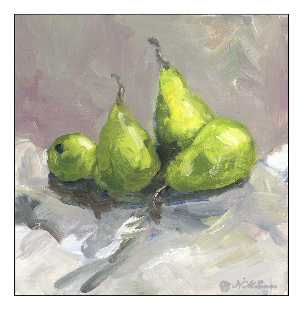
I love pears! Painting them is far less tasty than eating them, but they are by far one of my favorite winter fruits. Here, some d’Anjous, all cuddled together. My focus here was brushwork and getting a sense of the unctuous quality of oil paints. Some people use the paints straight out of the tube, but I like mine to slide around a bit. It really makes for fun blending. The colors, too, were rather limited here for the purpose of seeing how they can interact.
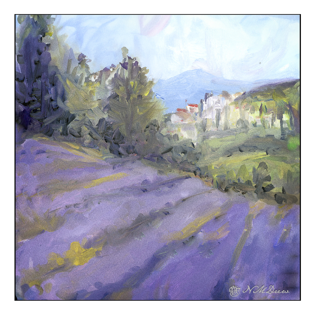
Here, more lavender fields. Why so many? It is because lavender and purple are honestly rather nasty colors to create from the standard mixes. I find that I like to have “convenience colors” on hand – namely, a good violet such as carbazole or dioxazine. Mixed with other colors and / or white, I get lavenders and such that appeal to me. I initially tried to just use variants of red, blue, and white for the lavenders, but gave up with frustration. Not worth the sweat! Maybe later I will master a good orchid lavender, but for now . . .
As with the pears, playing with the things you can add to the oil paints to thin them out. I used Gamsol and Soy-Thin, both low odor solvents. I didn’t use any linseed oil in either painting – that will come later – as will other things, such as drying agents like alkyds.
The pears and the lavender field were painting on pre-gessoed 10×10 cotton canvas panels measuring 10×10 inches square.
I have been spending the better part of the day watching the videos in a class in which I have enrolled before starting any of the projects. There are a lot of short videos in it pointing out this and that, but sitting still to watch the longer ones makes me restless. I need something to do with my hands rather than just sit on my butt! Knitting is out as I have a few projects at a point which need some focus, but oil pastels did the trick. I can draw / paint and watch at the same time. I may not get all of the video, but I do get a lot of it – just as I am now as I write this post.
I picked up a few brands of oil pastels and a 6-pack each of soft white and greys. These include Sennelier, Mungyo, and Caran d’Ache. The white and grey pack are labeled “Anders” I think. I also have been playing on various papers, but decided to check out the Sennelier oil pastel paper. It seems to do a pretty good job despite all the rubbing in of layers of pastels.
Oil pastels, at this point, are more like playing with crayons for me. I blur the colors using my fingers and tortillons. Harder oil pastels make up the underlayers with the softer, oilier ones going on top. This adheres to the adage of “fat over lean” in oil painting, so it makes sense that it would apply to the oil pastels as well.
Oil pastel on Sennelier paper; about 5×7 finished. Scanned on Epson V600.
I took this picture of a painting I recently did to check on my contrast values. There is always a struggle here, but with practice, I do “get it” better each time.
As with other photos of the past few days, monochrome and the Nikon 50mm f2.8 macro.