Today and yesterday were really rather discombobulating. Does getting older mean you are more set in your ways and less able to adapt to changes in the daily routine? Either that or my allergies just make me a bit crazy – this morning I had one of my sneezing fits where I sneeze about 30 times in a row. That is exhausting to the point I need a nap.
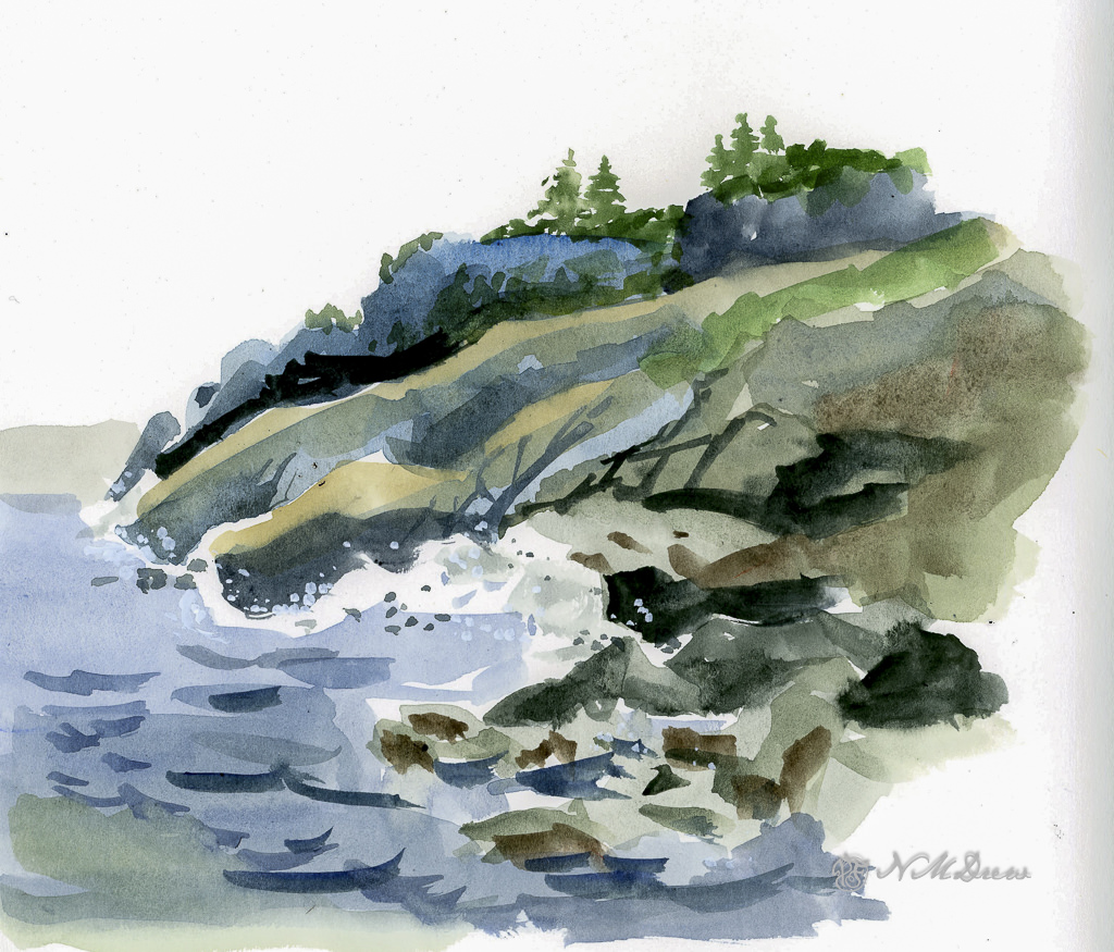
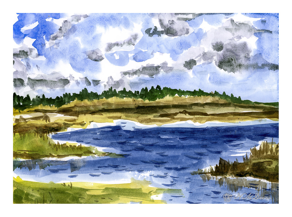
And nap I did. But then I decided to do something creative, and back to watercolor (my real first love in painting) and work on something idyllic, wet and watery, full of rocks, and put it in my sketchbook so I won’t take myself too seriously.
Click on the image to enlarge!
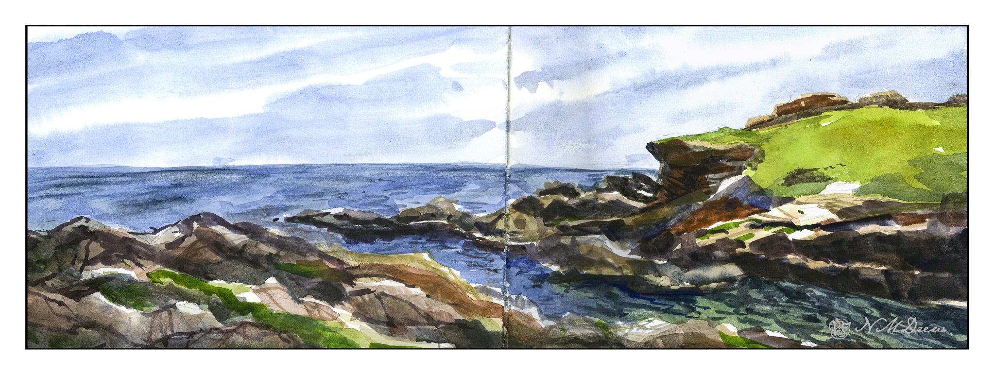
The Strathmore Vision paper works really well with little re-working of any part of the painting. I decided to see how the sketchbook would do with the same approach, as well as the more personal challenge of being more direct in color application.
With watercolor, many artists work with very wet paper, and while I like that, I prefer to have wet paper – as for the sky and the sea – but I also like to have layers. If you paint into wet color, your next incursion must be more pigment and less water than you are moving into, otherwise you get what are called blooms or cauliflowers. You can also paint onto dry paint and these won’t occur, and you can use thinner or thicker paint – less or more pigment combined with water. My sketchbook has good paper – far better than the Vision paper – so I could do all these things, and did.
First, wet the sky area, then drop in stripes of blues. Next, wet in the water, from horizon to the inlet area, all in about the same shades of blue, but darker than the sky. Let that dry. While that is going on, I painted in the greens on the right, blending colors into each other for gradations of green. The rocks, too, were painted with varying colors, working to leave bits of unpainted paper for a bit of pop and to indicate areas with more sun that shadow. Slowly I put in details, such as the waves or ripples in the lower right of the inlet, cracks in the rock, and so on. Large colors and masses first, finalized with contrast and detail.
I am pleased with this painting. I accomplished my task of direct painting with some modification – not a lot – later as I moved into detail. I drew in the general shapes with a pencil. The foreground rocks on the left and bottom were a challenge, but I think I have enough detail to make them interesting but not distracting. The same with the land mass on the right. Overall it took about 2 hours to do complete this watercolor.
Watercolor sketchbook, watercolor, about 7 x 18.