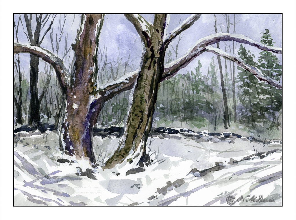
Old Trees in Winter

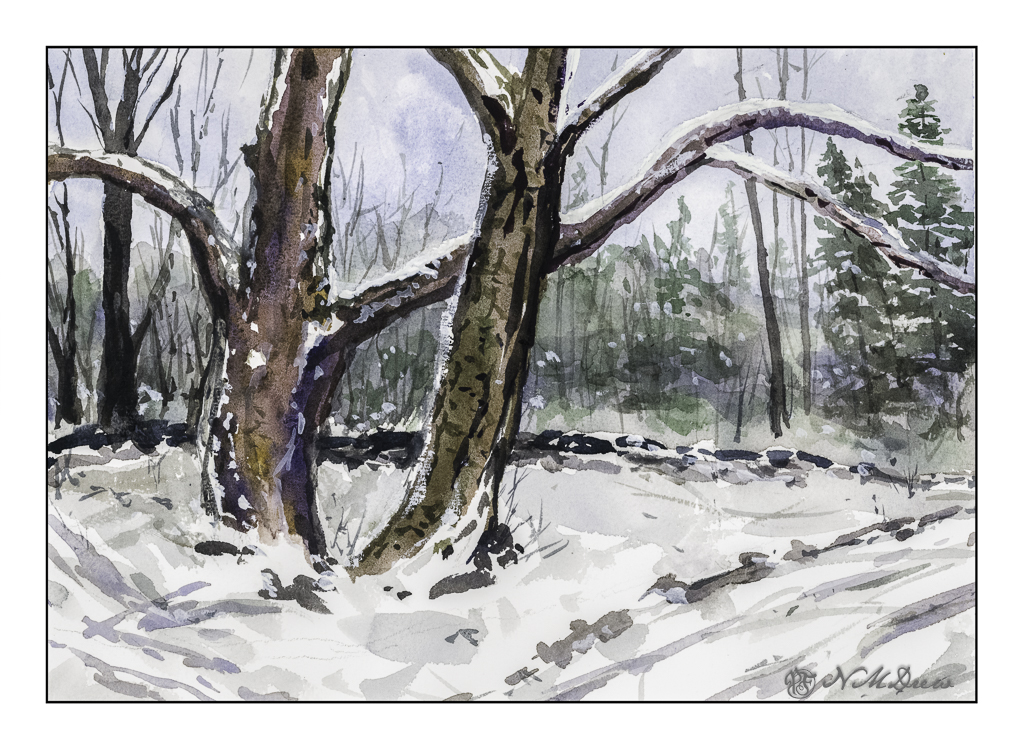
If you have been reading this blog awhile, you know I live where there is fire and not snow. Still, winter does come to my warm (ish) part of the world, and with it memories of tromping through the snow under spreading trees along a lake shore.

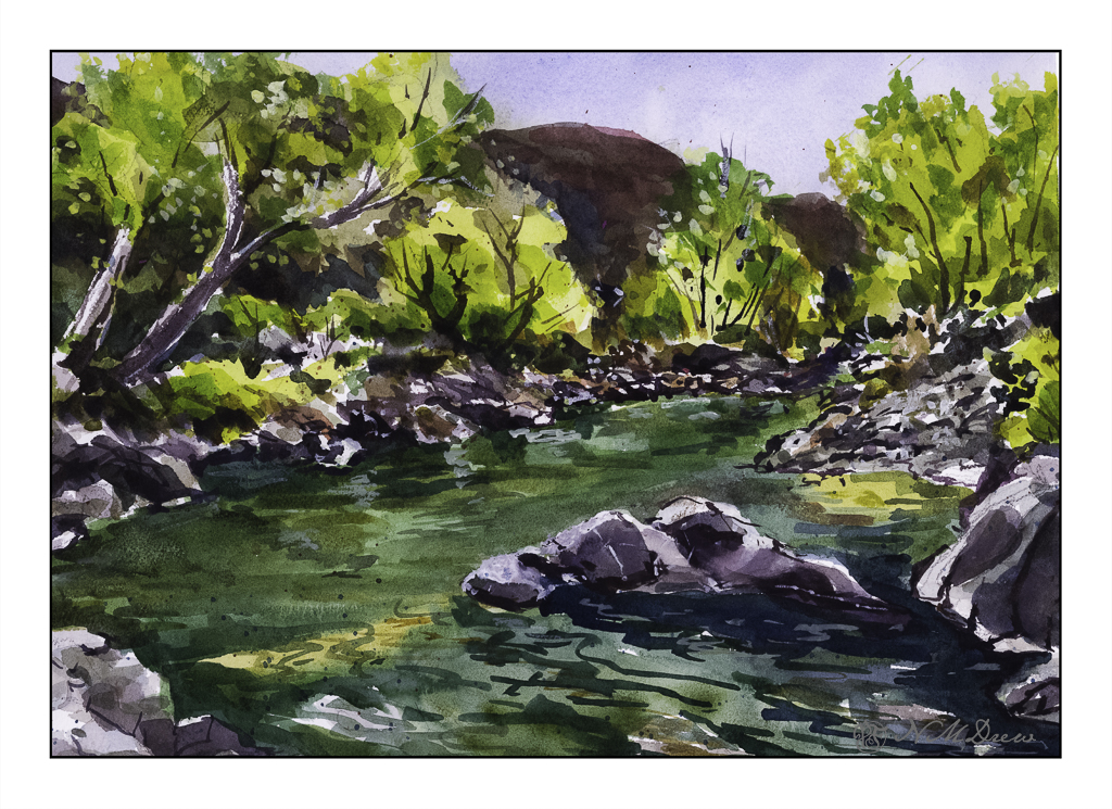
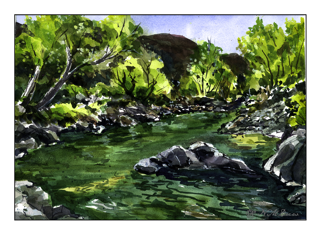
I use two software programs these days to scan my paintings – and I rather like the way they end up, similar but different. Above is the one using VueScan. Below is the one using Epson V600 and its software.

Epson software is more inclined to push colors, but in this case it does a decent job and pulls out more of the colors I put into the tree. Both scans are pretty much straight out of the scanner. Your choice as to preference!

Watercolor, Arches Rough 140#. Colors primarily burnt umber, ultramarine blue, Hooker’s green. 10×14.

Let’s Just Say It’s Colorful!

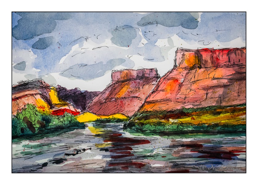
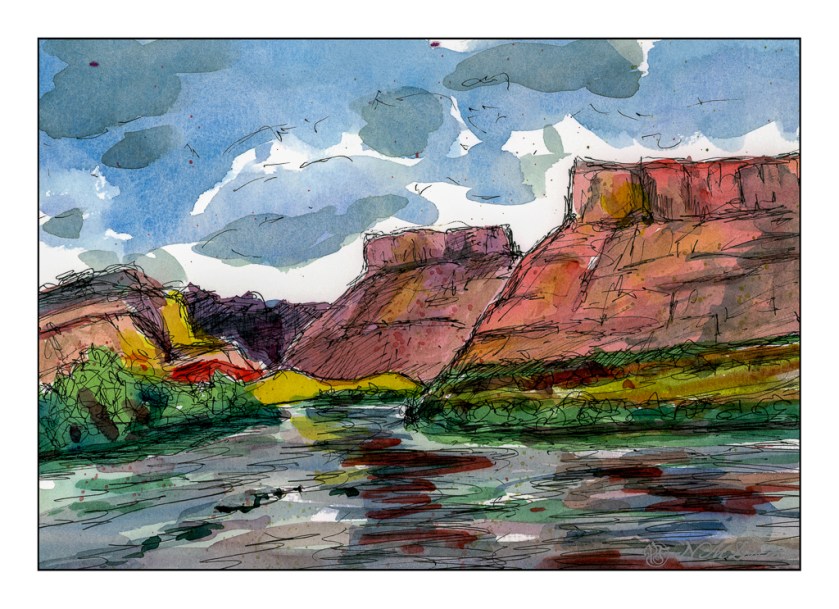
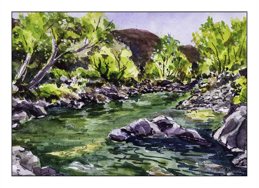
Autumn along the Virgin River is filled with trees turning orange and yellow from the greens of summer. The sky is bright, bright blue. The red-orange mountains all around are dynamic and rugged. The river is aqua and blue and green.

The light is full of contrast – bright, dark, shadow, reflections. The leaves add texture, as do grasses and trees and rocks. Wind plays through the canyons and trees. The whole world shimmers and vibrates with energy and color. Simplifying it seems impossible.

Watercolor, 10×14, Arches 140# Rough.

Impressions of San Gregorio State Beach

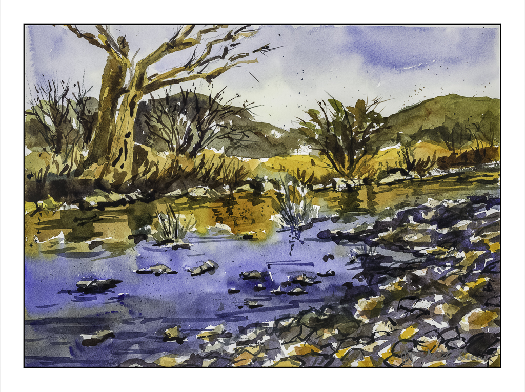
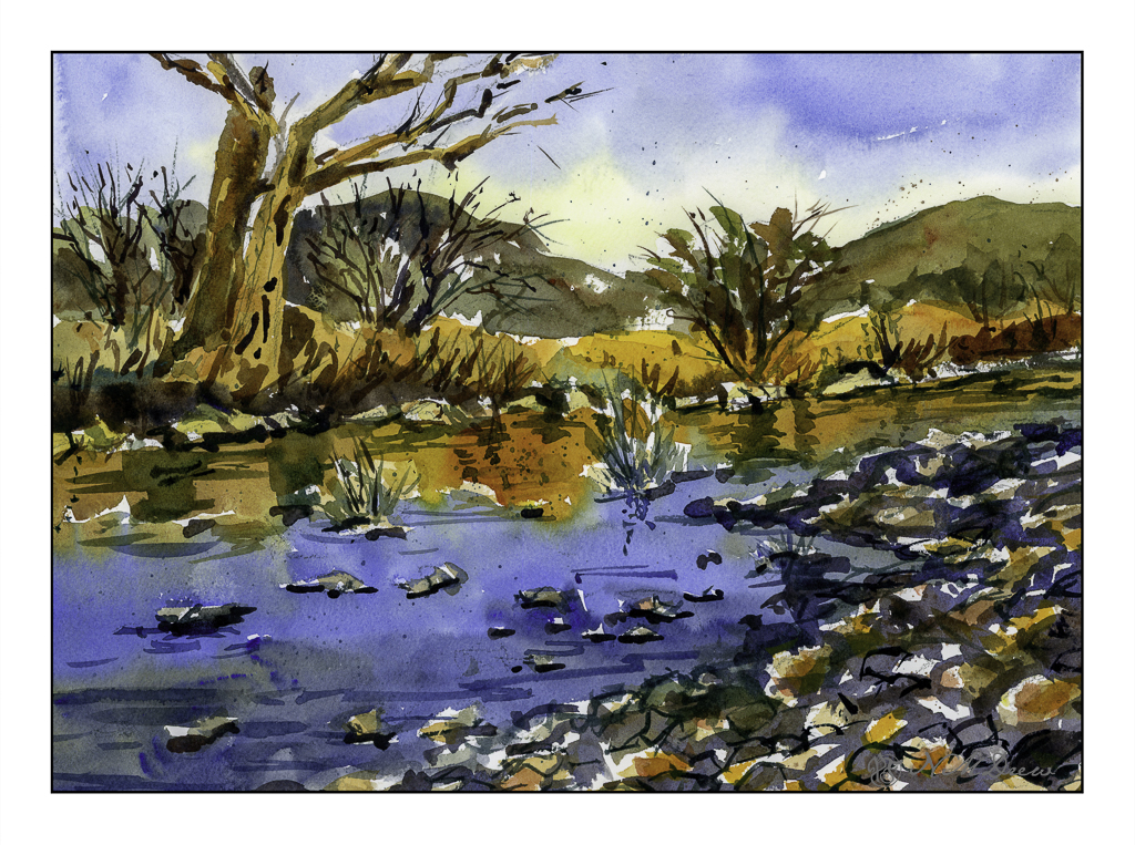
Scanning – sometimes I love it, sometimes I hate it. It is usually better than trying to take a photo of a painting though . . . .

I used Epson V600 Epson Scan on one of these; VueScan on the other.

Above was done using VueScan. It captures the colors better but is a bit dark. Below, the greens of the trees and bushes are better captured.

More of the colors show up using Epson Scan, but they are a little too intense.

Sigh.

The fact is that scanning and post-production can really influence how a painting looks. This goes whether the painting is scanned and interpreted using software, or photographed, and then interpreted and adjusted using software. If you look up a painting on the internet and then look at all the images of it, you know what I mean – colors can vary dramatically.

All this techno speak aside, I like them both for different reasons. Both do capture the moodiness of the original watercolor, which I like. Perhaps that is the most important thing – the mood is caught?

Watercolor, Arches 140# CP, 10×14.

Winter in the White Mountains

It is exactly a week before Christmas. Today, in SoCal, the wind is blowing, there are fire warnings, and it is about 77F (25C). It is a bit warm. Snow seems to be a good subject to watercolor!

The focal point of painting this picture, besides wanting a bit of snow for the season, is to see if I could catch the softness of the bare birch trees that act as a barrier between the snowy foreground and the mountainous background. Anyone who has seen the leafless birch trees at a distance knows that there is a sort of haziness as all their branches overlap and merge into a softness with some detail and without much detail at all.

I used a relatively limited palette – mostly ultramarine, Hooker’s green, burnt sienna and umber. In some areas I used titanium white gouache, partly to place definite snowy details as well as to blur into the birch branches to create that softness I wanted to express.

Not a bad way to spend an afternoon out of the wind!

Watercolors, Arches 140# CP, 10×14, some gouache.

Beach at Saint-Malo

Remember the story All the Light We Cannot See? Ever since, the city has intrigued me. The story is worth reading, and if I remember, the movie was decent as well.

This painting was a quick one, and it turned out pretty good in my opinion. The point was to just paint, as well as to try out a new-to-me watercolor paper. This paper is St. Cuthberts Mill’s Bockingford paper. It seems to be a fairly soft paper as the tape around the edges of the painting pulled up some of the paper even though the tape was on the paper itself for only a short time. Using the heat of a hair dryer solved this problem, like it usually does. I liked this paper, though it does buckle a bit more than I expected when wet, but in the end it has proven to be well behaved.

Initially I scanned this painting on my Epson V600 scanner using the Epson software. Contrast was harsh and the sky barely showed up. I have had issues with watercolors and the software before – not at all pleasant to see – and then I suddenly remembered I have VueScan by Hamrick. I closed out the Epson software and fired up VueScan – and, oh, what a beautiful difference! This software is something I bought years ago, and I never really thought about using it for watercolors – I use it for photos I plan to run through Negative Lab Pro. Well, I guess I will have another use for it as well! Sheesh.

Watercolor, St. Cuthberts Mill Bockingford, 12 x 16, CP 140#.