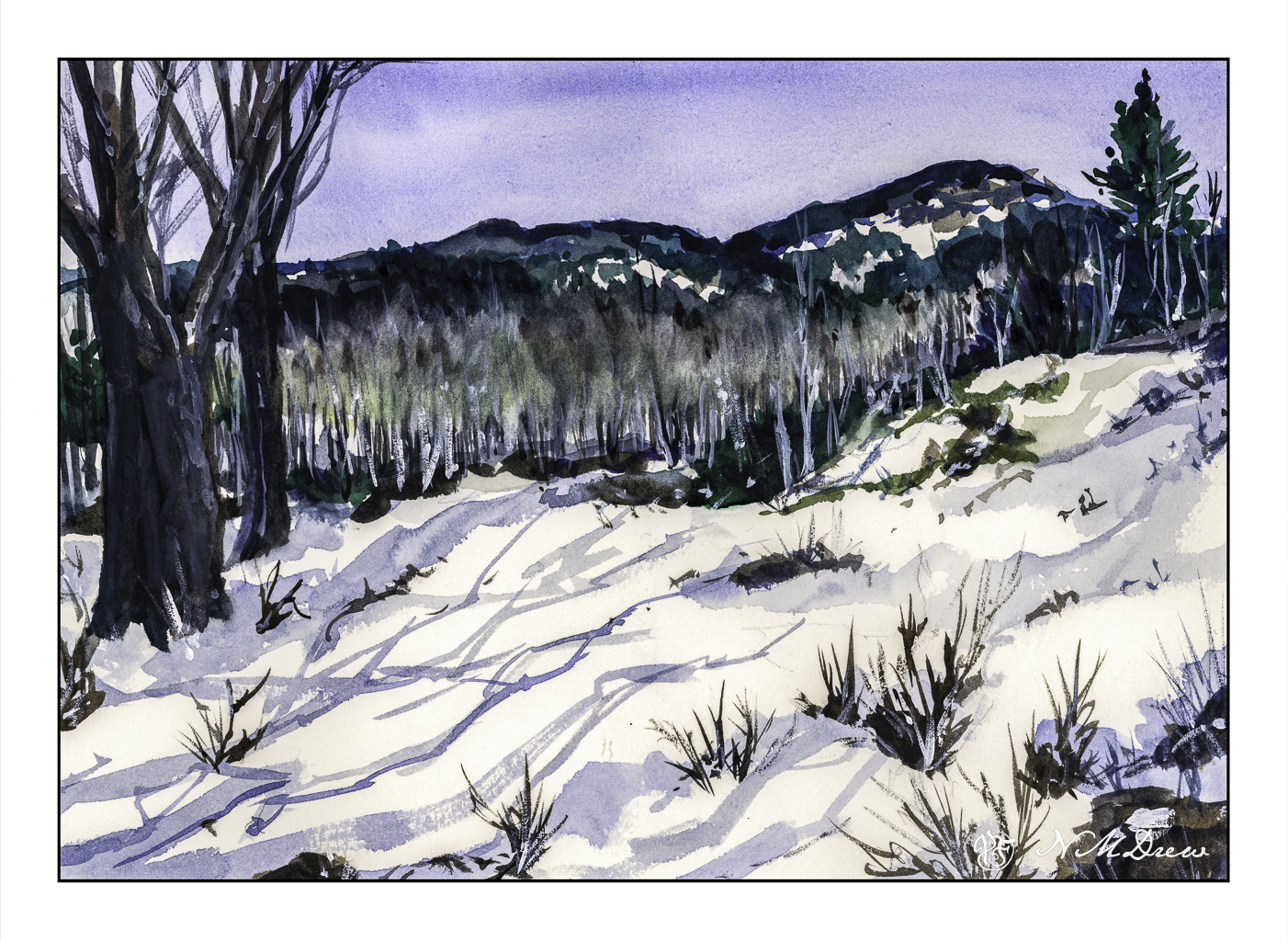
It is exactly a week before Christmas. Today, in SoCal, the wind is blowing, there are fire warnings, and it is about 77F (25C). It is a bit warm. Snow seems to be a good subject to watercolor!
The focal point of painting this picture, besides wanting a bit of snow for the season, is to see if I could catch the softness of the bare birch trees that act as a barrier between the snowy foreground and the mountainous background. Anyone who has seen the leafless birch trees at a distance knows that there is a sort of haziness as all their branches overlap and merge into a softness with some detail and without much detail at all.
I used a relatively limited palette – mostly ultramarine, Hooker’s green, burnt sienna and umber. In some areas I used titanium white gouache, partly to place definite snowy details as well as to blur into the birch branches to create that softness I wanted to express.
Not a bad way to spend an afternoon out of the wind!
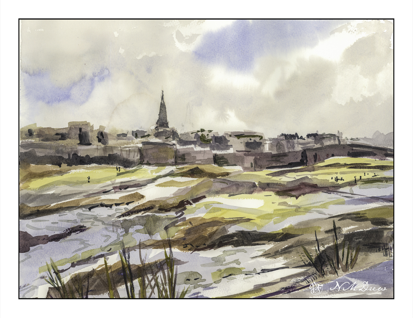
Remember the story All the Light We Cannot See? Ever since, the city has intrigued me. The story is worth reading, and if I remember, the movie was decent as well.
This painting was a quick one, and it turned out pretty good in my opinion. The point was to just paint, as well as to try out a new-to-me watercolor paper. This paper is St. Cuthberts Mill’s Bockingford paper. It seems to be a fairly soft paper as the tape around the edges of the painting pulled up some of the paper even though the tape was on the paper itself for only a short time. Using the heat of a hair dryer solved this problem, like it usually does. I liked this paper, though it does buckle a bit more than I expected when wet, but in the end it has proven to be well behaved.
Initially I scanned this painting on my Epson V600 scanner using the Epson software. Contrast was harsh and the sky barely showed up. I have had issues with watercolors and the software before – not at all pleasant to see – and then I suddenly remembered I have VueScan by Hamrick. I closed out the Epson software and fired up VueScan – and, oh, what a beautiful difference! This software is something I bought years ago, and I never really thought about using it for watercolors – I use it for photos I plan to run through Negative Lab Pro. Well, I guess I will have another use for it as well! Sheesh.
Watercolor, St. Cuthberts Mill Bockingford, 12 x 16, CP 140#.
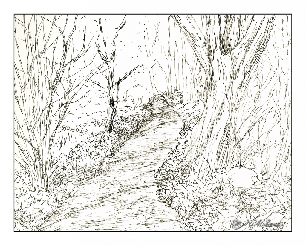
No, I don’t mean life. I mean trees and piles of leaves and undergrowth – all the stuff that makes up a good fall scene! Some trees have dropped a bazillion tons of leaves and others are hanging on to them. Years of detritus build up on the ground, creating a fertile place for new growth, plant, fungal, insect, which in turn supports other life in the wilder world outside the super market.
Anyone who has taken a walk in the woods or tried to photograph or paint this jumble knows exactly what I mean – it is really a busy-ness of color and texture and shape.
This is my sketch, done with a fountain pen and some Carbon Ink by Platinum. The paper is a bit rough so it could be what caused some difficulties with the pen nib – or the pen itself is not the best – or both. I tried to convey light and dark and texture with different pen marks. Straight lines to show trees and texture and the shadows of the trees across the pathway. Contrast is suggested rather than emphasized as I wanted to use paint to give the sense of shadows and so on. With that in mind, I pulled a palette of my out-of-the-tube paints rather than pan paints, cleaned them up and went to work.
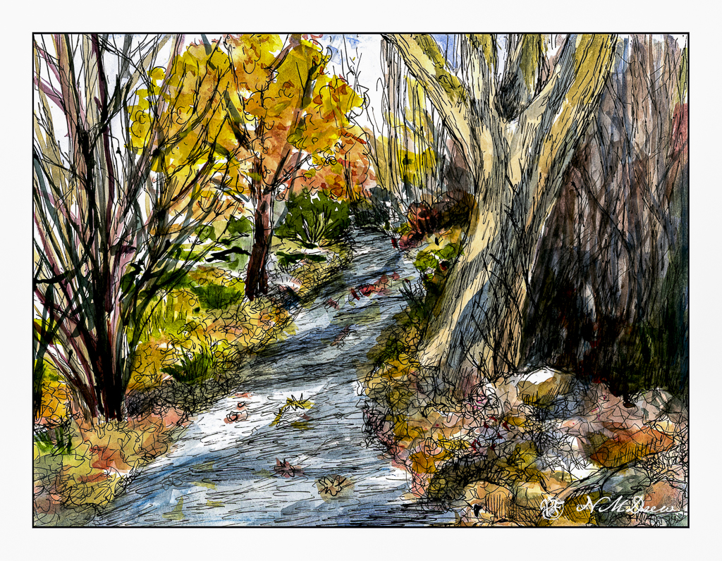
As you can see, light and dark are more emphasized with the use of color, as are the colors of the leaves and the complex shapes of trees on the left and undergrowth on the right. The leaves that have fallen have some variegation, depending on when they fell and how long they have been there. Green grasses and weeds peek through. There are a few rocks, too, and leaves on the pathway. Tree shadows fall across the trail and up onto the tree on the right. There is a brightness to the day despite the murk of the undergrowth.
After adding color, I waited for the picture to dry. I made some color adjustments. And then, back to the waterproof ink pens. This time I used Micron pens and my Uniball waterproof pens. Micron pens come in different nib widths (here 0.1, 0.2 and 0.5) and the Uniball is labelled as “fine” but in reality makes a darker, thicker mark than the Micron pens.
Overall, I am more pleased with today’s ink and wash sketch than the one I did yesterday of the plumeria. As usual, I did not do a preliminary pencil drawing but just worked from the end of the path and then moved back and forth to establish areas. I really like my tangled tree in the lower left and the shadows on the big tree on the right. The brightness of an autumn day is expressed. Now all I have to do is get to scuffling through those leaves and it will make my day.
Pen, ink, watercolor wash, on Strathmore Vision 140# CP paper, 9 x 12.
I have been busy. Some things I want to do, others things are in process, being forced to listen to really bad jokes (i.e. What do you call a dinosaur with really good teeth? A flossoraptor.), and just sort of shuffling along. Artwork has been rather time consuming as I have been painting in oils and those take time to dry, so no artwork is easily posted. And I have been working on my ukulele practice, which obviously cannot be posted unless I record myself. And who would want to hear that? I am no musical genius and notoriously tone deaf.
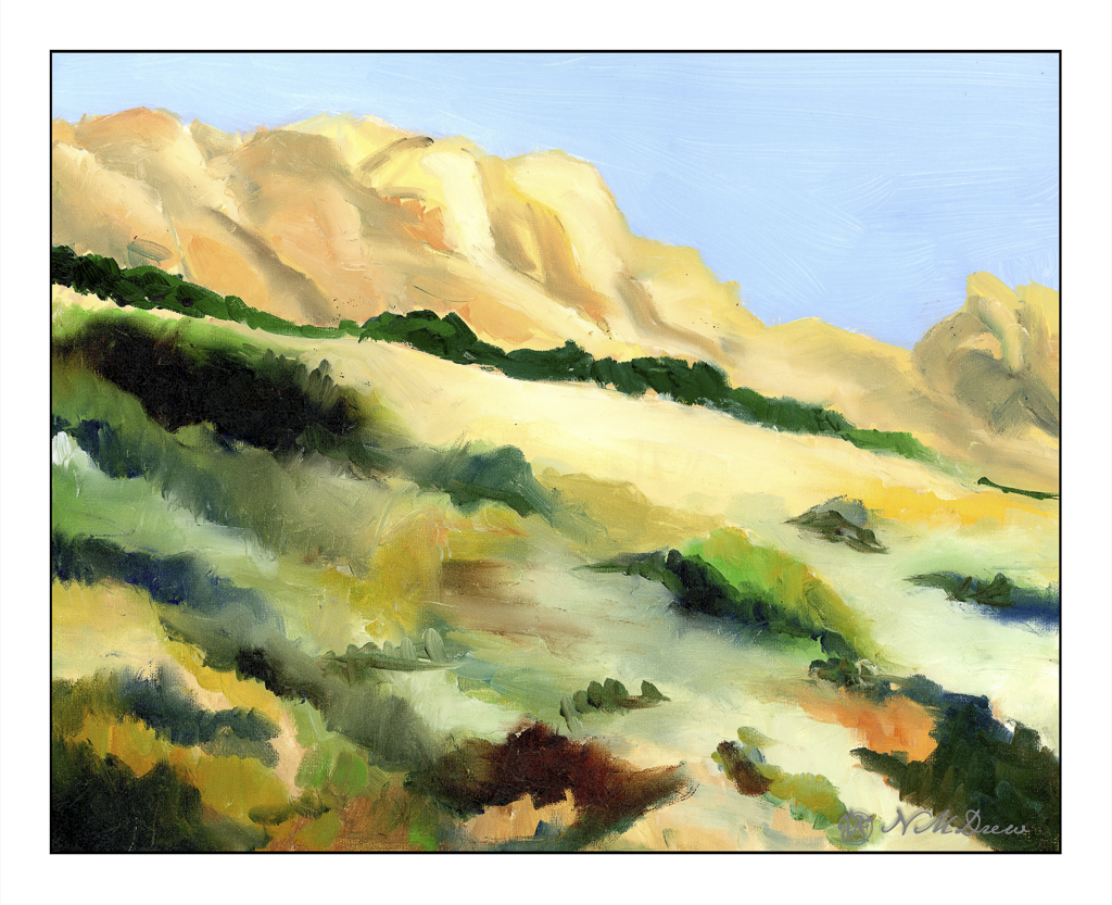
Today my next term of oil painting begins. This is the painting – in progress – I will bring to class this afternoon to work on. It’s been drying a bit so I scanned it rather than photographed it, which never really works out well as far as I am concerned.
It’s somewhere in the southwest. I am trying to make things very soft and blended and it is a challenge. We will see what happens this afternoon. Oil on panel, 16×20 inches. I also have a few small, blank canvases to play on should I get stuck or need to stop in class before the class time is up.
The other thing I have done is restrung a ukulele – my very first time changing strings. There are a lot of videos out there which discuss strings (i.e. nylon vs fluorocarbon, low G vs high G and which one is best). Different bridges have different tie-offs. Tools, too, can be used – or not. Me, I have a tuning peg winder, a wire cutter, a pair of pliers, and a Snark ukulele tuner. It took me an hour to replace 4 strings, but I am rather pleased with the results. I watched this video and learned a lot.
The ukulele I had was not an expensive one with nylon strings. I figured it would be a good idea to use fluorocarbon strings as they are easier on my fingers. I used D’Addario strings and pretty much followed along with Cynthia’s suggestions. It worked out quite well. Now I am playing and tuning the uke, and playing and tuning the uke, and playing and tuning the uke as the strings stretch and settle in. Amazing how often this has to be done.
So, there we are. Not an exciting post, but it feels good to write a bit!
Death Valley is up and off Hwy 395 along the Eastern Sierra Mountains in California. It’s a strange and eerily beautiful place with a lot of surprises and history. It is preserved as Death Valley National Park. The website is filled with great information and it is one of the best places to visit – in the right season, and in the right weather. People die in the desert because they do not understand it, so if you go, be careful!
Sand dunes always amaze me. I am still stuck in my child’s view of the world that sand dunes exist only in the Sahara, and can only be found by riding a camel. Silly, yes!
There are sand dunes everywhere – beaches and deserts mostly, but sometimes in places you least expect. Their shifting shape in the wind and blowing away foot prints or burying ancient cities all lead to a fascination as they make everything seem so temporal.
Anyway . . . . this is an oil painting using a limited palette. Some of the goals in doing this painting included smooth, smooth brushwork for the dunes. I tried to catch the gradual gradations and color changes I saw. In the distance is the flat valley before the towering mountains. For each I used directional brushwork and a deliberate vagueness to create a surreal effect. The mountains, when I look at them afresh, can also be visualized as swirling clouds. Interpretation I will leave to your eye.