A bit over a year ago I spent far too much money on a class I didn’t like. I liked the artist’s work, and some of the teaching methodology, but in the end felt it was like a big rip off. Most classes lack good content and good teaching as far as I am concerned, and being cheap, I am not inclined to spend the amount I did last year. The course was a gamble, and I lost.
On the other hand, I have been really happy with Shari Blaukopf’s short courses and demos, which are content rich and reasonably priced. I have been working to incorporate the simplicity and directness with which she paints to keep from overworking my own watercolors – and believe me, overworking a watercolor is awfully easy! Ian Roberts’ course and follow-up group for his Mastering Composition has also been a great group to belong to and participate in.
I have also decided to enroll in Matthew White’s course on a monthly basis – Learn to Paint Watercolor. He has monthly demos, and critiques. There is a nice group of watercolorists of different levels of experience and skill, and so far it is worthwhile. The fact I can stop my monthly subscription beats a year paid up front for not too much I couldn’t learn on my own. I’ve watched his critiques and they are valid, and he works to make sure that as many people get a brief but informative bit of feedback.
Anyhow, this is the first of the demos I did of Matt’s. He has a lot of things I don’t paint – like boats, buildings, cows, nights, hay bales. The challenge is there, and I am looking forward to them. His demos are clear and sequential, and even though I doubt I will follow them step by step, there is something definitely to be learned.
The title of this painting – from Matt’s demo – is “Boats on Land” – definitely a boat yard and storage facility. I liked doing this, and was really happy to see Matt paint around the light boat sections with darker paint. I need to see that and do that. I think my painting turned out okay!
Nothing like a slushy pile of dirty snow alongside the road to make you really appreciate bright, white clean snow!
I thought I would do this for more practice painting snow, using some of the things that stuck in my mind from the Shari Blaukopf’s class on painting snow. Add to that, I tried to recall and implement some of the things I have learned over the past several months from my courses with Ian Roberts. Something seems to be shifting!
Since February or March of this year I have been taking a series of online classes, complete with live Zoom meetings, with Ian Roberts. He has been the best online teacher because he is so diverse in his interests and he brings them into the world of creativity. I admire his artwork, too, and think his book on composition is an excellent resource. For me, art is more than a pretty picture – it is an expression of a person, a skill, a view point. All of this, in a painting, is more akin to me than any other form of art, such as photography or music. While I enjoy them, I just am not as I entranced by them as I am by color, paint, and the process of painting.
That said, the first of the three courses was about drawing and values, not as an art in and of itself, but as a means to move forward into preparing for a painting. Next came brushwork, using black and white to render shades of grey and to learn about value. By adding yellow ochre, the next step was discerning warm and cool variants of color – or monochrome. Finally, we have come to the third and final class in this series – colorwork.
What is color? As the title says, color varies with hue, value and intensity. This week our job is to mix greys from complementary colors. Easy enough – or is it? Part of it will depend on medium used, and then, it also depends on warmth and coolness of colors. Our preliminary palette begins with a warm and cool color of each of the primaries, along with white if necessary. Cool colors are Cerulean Blue, Alizarin Crimson, and Cadmium Yellow Lemon. Warm colors are Ultramarine Blue, Cadmium Red Light, and Cadmium Yellow Deep. I have stuck with these three colors and a bit of titanium white gouache where I couldn’t keep the highlights, or lost them in my painting, or forgot about them altogether!
Pretty dull painting! It makes me think of the Upside Down. The point of this study was to take the clashing and garish still life Ian Roberts provided and tone it down – dull down the colors. I am using watercolors here, and I used complementary colors to tone things down but still leave the original color recognizable. The foreground cloth was bright lavender-violet; back behind squash a dark blue, wall on the left a sea green. Bowl is pinkish rose, apples green, and squash an orange with ridges casting shadows. Some shadows were hard edges, others blurred together. It was a hard exercise because I had to test my colors over and over again on a piece of scrap watercolor. This was on Arches 140# CP.
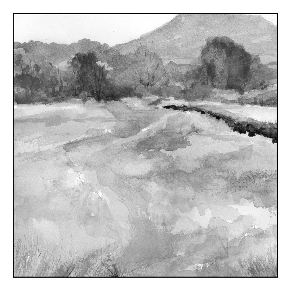
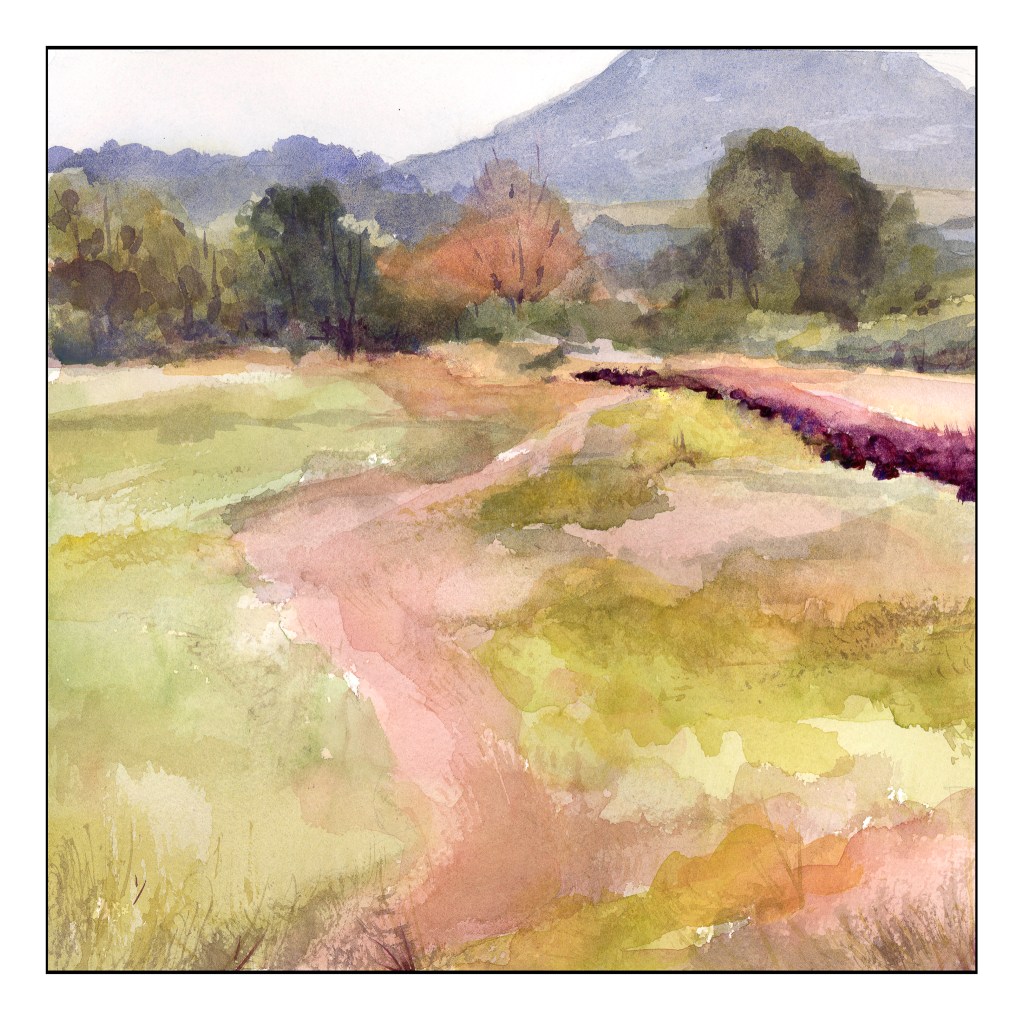
Our next study was a very low key (low key in color intensity) landscape. Evidence of a hazy day dulled all the colors so that while they were warm and cool, they all were similar in tonality. The above scan of my painting in black and white showed me I did accomplish by and large, especially in the field that makes up the lower 2/3 of the painting. The colors were very soft without a lot of bright or intense colors; rather, they all sort of blended into each other when I squinted my eyes. Only a few areas of dark contrast stood out – on the right of the field in the curve, and the bottoms of the trees at the edge of the field.
As you can see, there are no colors of high intensity. They are soft and subtle, even when dark. Hue means variations of color – and there are several, and as this is watercolor the colors are transparent and can be laid over one another or blended, depending on the wetness of the paper. The values are all in the middle of the spectrum. I used Kilimanjaro 300# Bright White paper, and this is a 10×10 inch square. My palette here are only the 6 colors I mentioned above, without any white at all.
In many ways, the still life is more “my style” insofar as the colors are laid in rather heavily. The landscape involves a more delicate and patient approach to the colors. Both were very challenging in their own way, but each taught me a lot. I liked the limited palette as I was forced to stay within its parameters, but could still achieve a lot of lovely colors, as well as darks and lights.
A few months ago I joined Ian Roberts’ online class “Mastering Composition.” First several weeks were simply drawing exercises, learning about values and shapes to create a 3D effect on the flat surface of paper. Two weeks ago we began the “Brushwork” component. I decided to use oils for this section simply because I have not painted with oils since high school – back in the last century.
What I like about Roberts’ class is he makes sense. He discusses things on very pragmatic terms as well as on a bit of a more esoteric plane. Both are satisfying. Exercises are clear and with stated purpose. The key components thus far are values and edges. He says, “If you can’t see it, you can’t paint it.” And that is true. If you don’t look and observe and get picky, well, it’s just not there.
Week One
Simple value studies of a landscape. I did 4, in 4 different mediums in order to decide which I wanted to default to – I chose oils (see above).
WatercolorGouacheAcrylic Oils
I won’t say any of them are great, but by posting them, fellow students give feedback. It’s useful as others see what you do not. As well, it is also useful to give feedback as it sharpens your eyes.
Week Two
Now, onto still life, demonstrated by Roberts and then practiced by students. This was followed by a landscape. The still life focused on edges and values – and so does the landscape. The landscape is ours alone to do – no demo! I tried to make my landscape simple masses. Parts work, parts are illogical, and taking a photograph of both was a pain as they are both still wet. Oh, well.
Still Life in Oils
This was a fun study, and it was a challenge to really take the time to look, and to see, edges, shadows, shapes, etc. Overall, I am pleased with it. My sphere is a bit on the floating side, but I can fix that later. As well, it is fairly bright but monitors make it look darker or lighter, depending on which one I am using.
Landscape in Oils
This one is a challenge. It is wet and hell to photograph! One thing I have learned is that I will need to come back with a fine brush after it has dried to clean up some of the whites on the guardrails and perhaps elsewhere.
Thoughts
By far, this is the best online course I have ever taken! If you want to paint and learn a few things, you might check out Ian Roberts. He is on YouTube, so how he is there is how he is in the Zoom class meetings.
I feel like a school kid – classes are taking up so much of my life! It is keeping me off the streets, so I am sure a few people are glad to know that! The classes are a series with Ian Roberts (online), Andy Evansen (online), handsewing 18th stays with Burnley & Trowbridge (far behind!), and a local class in oils / acrylics with a good teacher. Housework is falling by the wayside!
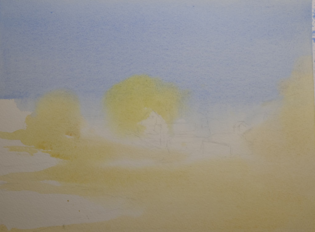
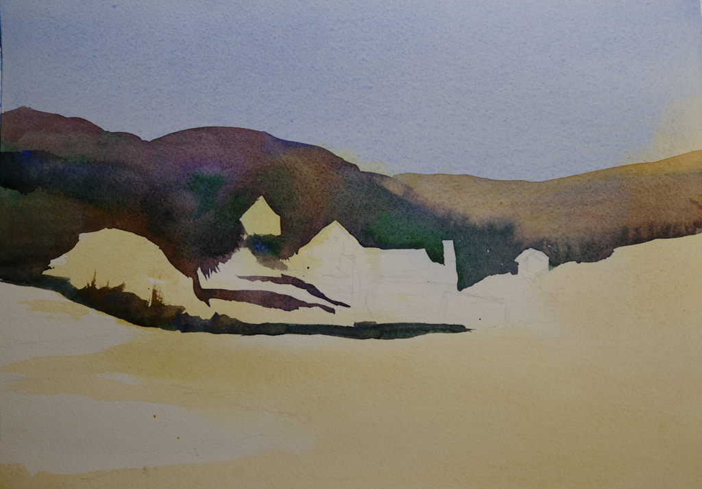
The above is a watercolor exercise from Evansen’s class. It’s a year-long course in watercolor, and the content needs me, the student, to work hard at the lessons. We began with skies – I am pretty comfortable with those. This module works with values, and I think I did a pretty good job with it.
What I found especially interesting was the beginning of the value study. Unlike Roberts who puts in all values in a pencil sketch, Evansen puts the middle value only as the first step. The white areas are bright spots and the sky, but the middle values are all created as one big shape. That was quite interesting, and not the usual route one takes with value studies.
Pencil drawing with middle value only added as a shape.
I messed up a bit, but it did lay out a map that was more clear to me than also including the darks. Once I got the idea in my head, the next step was to lay in soft colors on paper that was wetted on both front and back with a natural sponge. I used 9×12 140# CP Kilimanjaro paper here.
After doing the middle value shape, both as a prelim and then on the final painting, you are supposed to go back and add the dark areas to the prelim. I didn’t get there – I was too involved in the final product!
Light areas filled in on dampened paper. Includes the sky, white areas for buildings, and field and trees.
Doing the light areas on dampened paper allows the colors to bleed a bit, and create soft edges.
Thicker paint added once the light areas have been worked.
The next step was to work left to right so that the shape created for middle values in the preliminary study could be made on the painting. The idea is to work in one movement – left to right since I am right handed, but right to left if you are left handed. The idea is to create a bead of color that varies as you paint in a continuous design.
To me, this was really a dark based on the reference photo, but that is life! As I did this, I worked around the buildings and structures, as well as roads. The thicker paint and dryer paper allowed this to happen to create hard edges. I was happy with how easy it was to do!
Almost done!
This was perhaps the 3rd stage in my painting. I added furrows to the field and details to the structures. I scraped in tree branches and such with my finger nail only to realize I keep them trimmed too short to be of any use there!
After all the layers were dried, I did the heavier dry brush as well as glazes over the field and hills to create areas of warmth or coolness. I also did it on some of the structures to keep them from dominating .
Some thoughts . . .
It is really a lot of work to do these classes. My whole purpose is to stop my old ways of approaching painting and create some kind of shift so that I can become a better painter in my opinion. Also, I need to stay busy. I have felt like I have been floundering a bit, so an area of focus was important, especially in an arena I wanted to learn. I am still adjusting to all this, but in the big picture, I am happy I made the commitments.