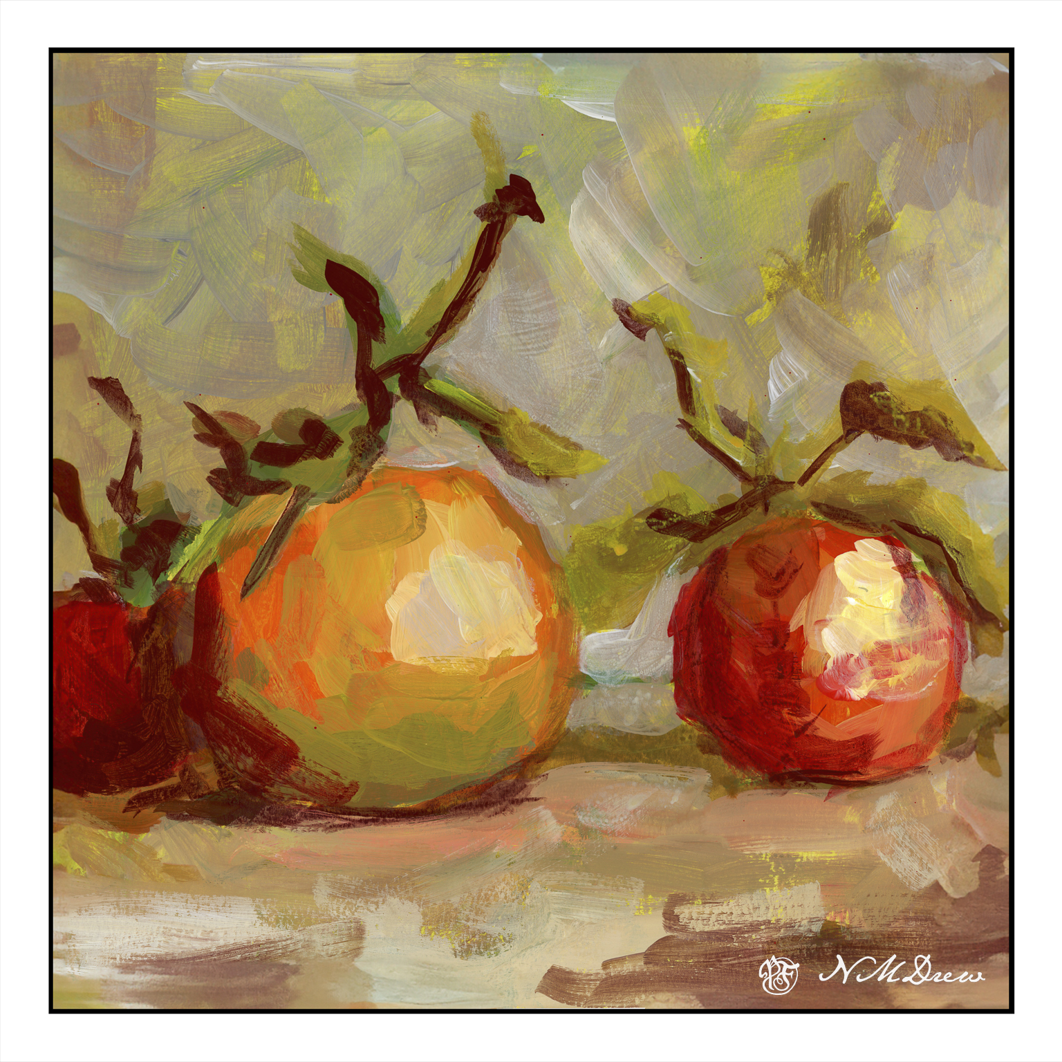
I love loquats! They are an odd fruit to most Americans, but they have a mild taste, beautiful seeds, and are borne on bushes or trees with glossy leaves. Over time, I have taken many photos of them and painted or drawn them.
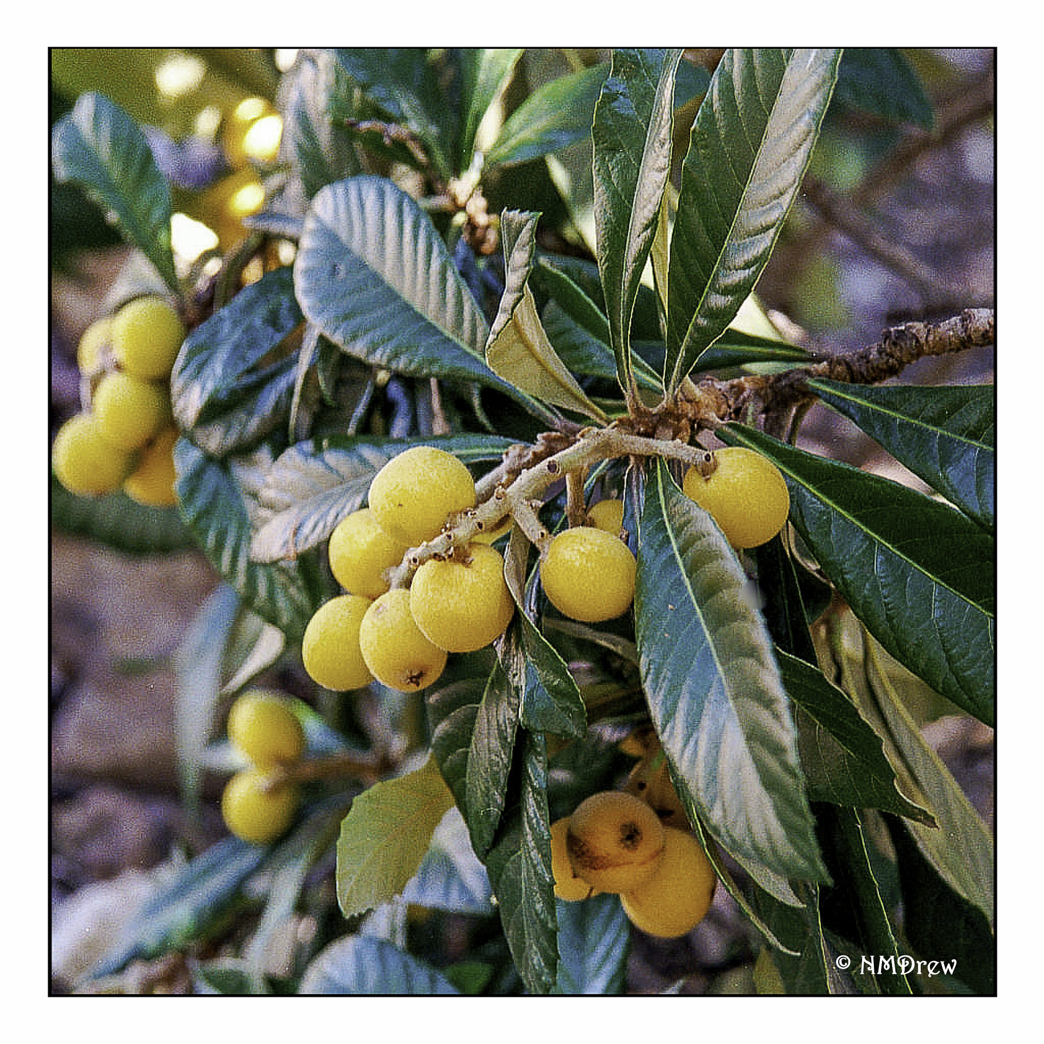
I don’t remember where or when I took this photo, but it really shows the loquat in its full beauty. The fruits are pale yellow to a more deeper orangish color.
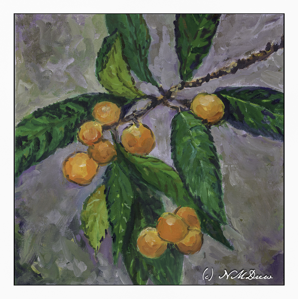
This is my most recent rendition of loquats, done in oil on a 12×12 canvas panel.
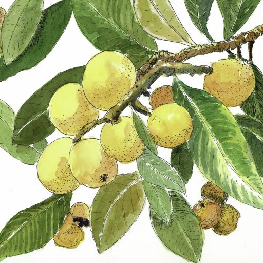
Above is one done in pen, ink, and watercolors.
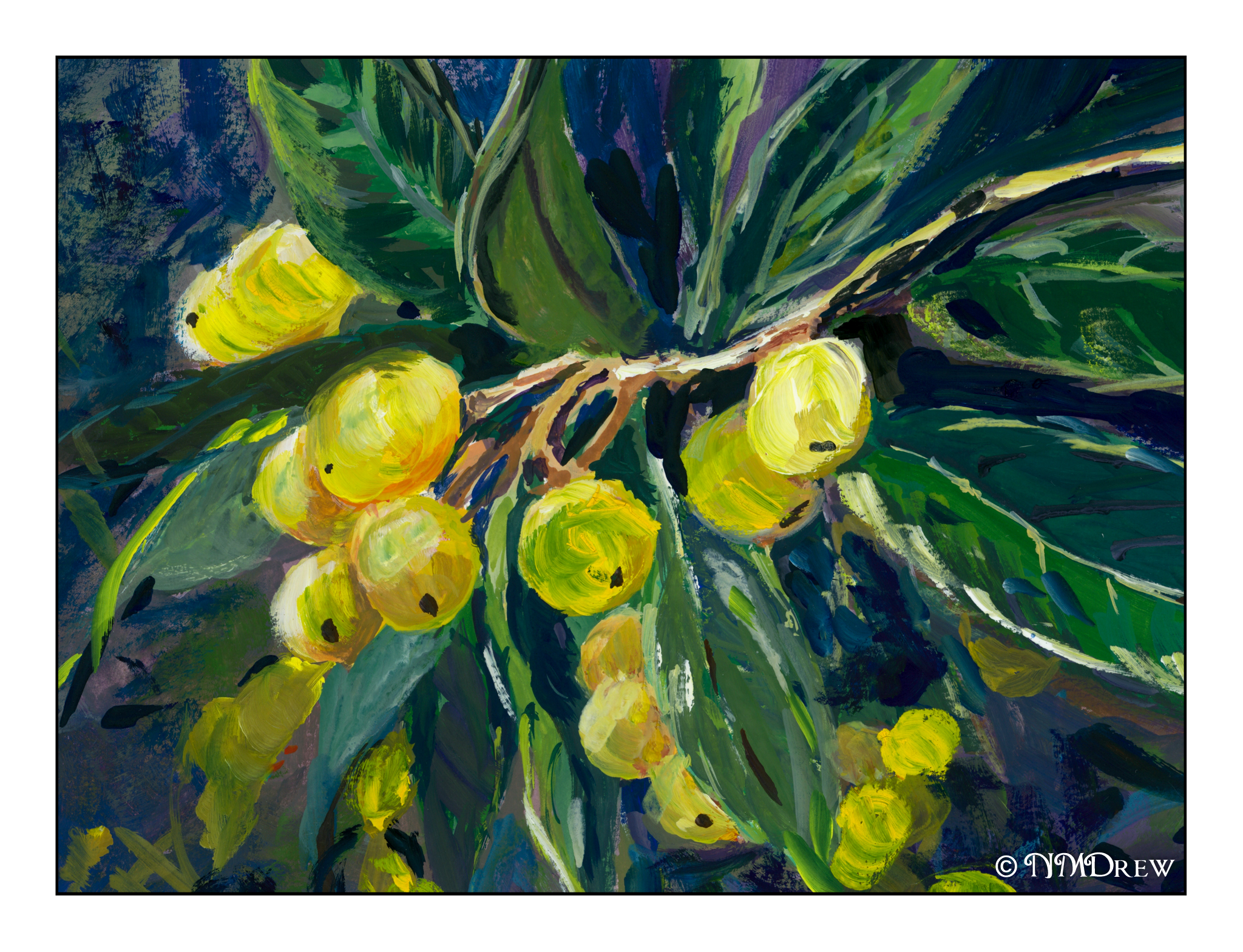
And the above is done in gouache.
The round shapes against pointy, glossy leaves is always a pleasure for the eye.
Gouache, oils, watercolor, pen and ink on various surfaces.
Over the next several weeks I am enrolled in a couple of oil painting classes. Acrylic paints really do frustrate me in a lot of ways, and please me in others, but it is time to work with oil paints on a more serious level. Let’s see where it goes.
To get ready for these classes, I pulled out some of my supplies. Of course, the oil paints come out – I have a smaller selection of colors than any other medium! I also have canvases in panel and mounted format. However, I did need to stock up on linseed oil, solvent, and other such stuff. And then paint.
Canvas mounted on panels is actually, I think, the easiest way to go. Canvas pads flop around and easily bend. Mounted canvas on stretcher bars takes up a lot of space but can provide a gratifying surface to paint on if properly and tightly mounted and prepared. For now I am using canvas panels which, while not super high quality, are relatively inexpensive and easy enough to prepare, if at all, prior to painting.
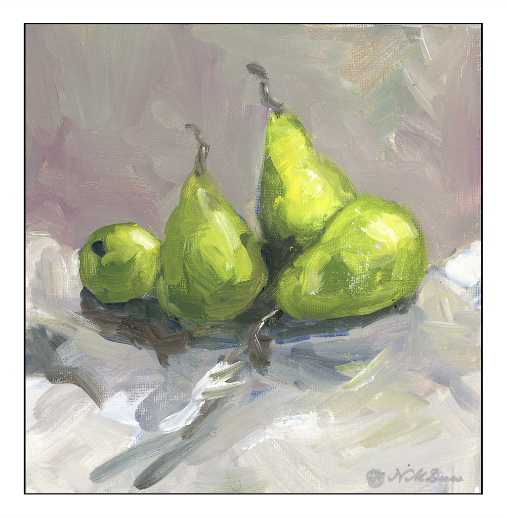
I love pears! Painting them is far less tasty than eating them, but they are by far one of my favorite winter fruits. Here, some d’Anjous, all cuddled together. My focus here was brushwork and getting a sense of the unctuous quality of oil paints. Some people use the paints straight out of the tube, but I like mine to slide around a bit. It really makes for fun blending. The colors, too, were rather limited here for the purpose of seeing how they can interact.
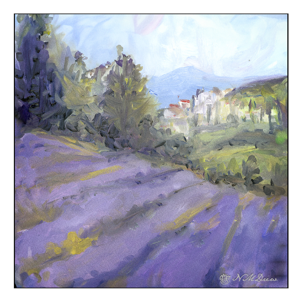
Here, more lavender fields. Why so many? It is because lavender and purple are honestly rather nasty colors to create from the standard mixes. I find that I like to have “convenience colors” on hand – namely, a good violet such as carbazole or dioxazine. Mixed with other colors and / or white, I get lavenders and such that appeal to me. I initially tried to just use variants of red, blue, and white for the lavenders, but gave up with frustration. Not worth the sweat! Maybe later I will master a good orchid lavender, but for now . . .
As with the pears, playing with the things you can add to the oil paints to thin them out. I used Gamsol and Soy-Thin, both low odor solvents. I didn’t use any linseed oil in either painting – that will come later – as will other things, such as drying agents like alkyds.
The pears and the lavender field were painting on pre-gessoed 10×10 cotton canvas panels measuring 10×10 inches square.
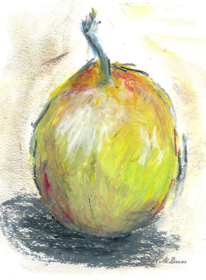
Ugh! I was in a rather bad mood today – you know how it is sometimes – so I decided to just play with oil pastels. Nothing great, but the fact is, drawing and such can be very soothing and change perspectives. So, I sat outside on the patio, a tablet of small, meh paper, and the different packages of the oil pastels. I decided to draw fruit. And there we are, about 3 hours later, with the following pear and two apples.
A pear . . .
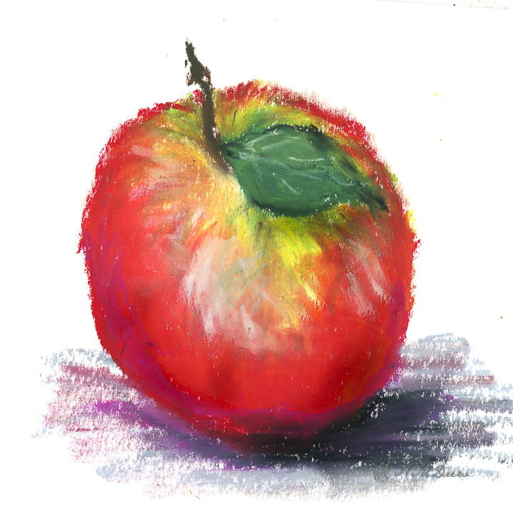
And a pair of apples . . . .
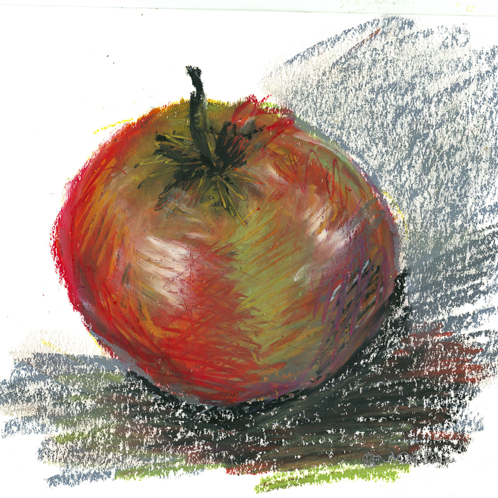
I think I would not be too tempted to eat the above apple, nor the one below, if I were Snow White.
I was feeling rather depressed by my rather poor watercolors of the other day – so, time for a break. What to do? Well, how about a bit of serious cleaning up of stuff that this gal has accumulated? What I am talking about is my bill and finance drawer. Need I tell you what was in it – nay! But let us say I shredded up about 4-5 fifteen gallon trash bags worth. Now there is a lot of room in the drawer, it is organized, and I have made the resolution to shred unnecessary items about every other month.
Okay, stop laughing. There is a definite pack-rat gene in the family, specifically on the paternal side (sorry, Dad!). De-pack-ratting requires a break, and a break from watercolors means using something else. Enter revisiting pastels. I did an apple.
I was doing pastels a few years ago and really enjoyed the medium. It is a combination of painting and drawing, both of which I like. Apples are rather generic and very recognizable, and cheerful, too, if you like bright red. I do like bright red, and so here we are.
I think I am going to be doing pastels for awhile. I need a bit of a break and a change from watercolor, even though I am really trying to work hard at it. The only drawback to pastels is the dust, but I wear an N95 mask and clean up the dust with a damp cloth afterwards. Here, Nupastels and Rembrandt soft pastels, and a touch here or there with a pastel pencil. I have some fixative arriving tomorrow which supposedly will not darken the pastel painting much. The paper is Mi-Teintes, reverse surface, painted upright.