Transition

Even though seasonal changes in SoCal are subtle, elsewhere in the state, further north or at higher elevations, shifts in color and temperature are more apparent. The tilt of the earth changes the light, winter pushes trees to change colors and lose their leaves. Temperatures drop. While today is about 73F, two weeks ago it was in the 50s (no snow, yay!) and nights are chilly. So, let’s celebrate the shift of summer to fall, and now fall to winter.

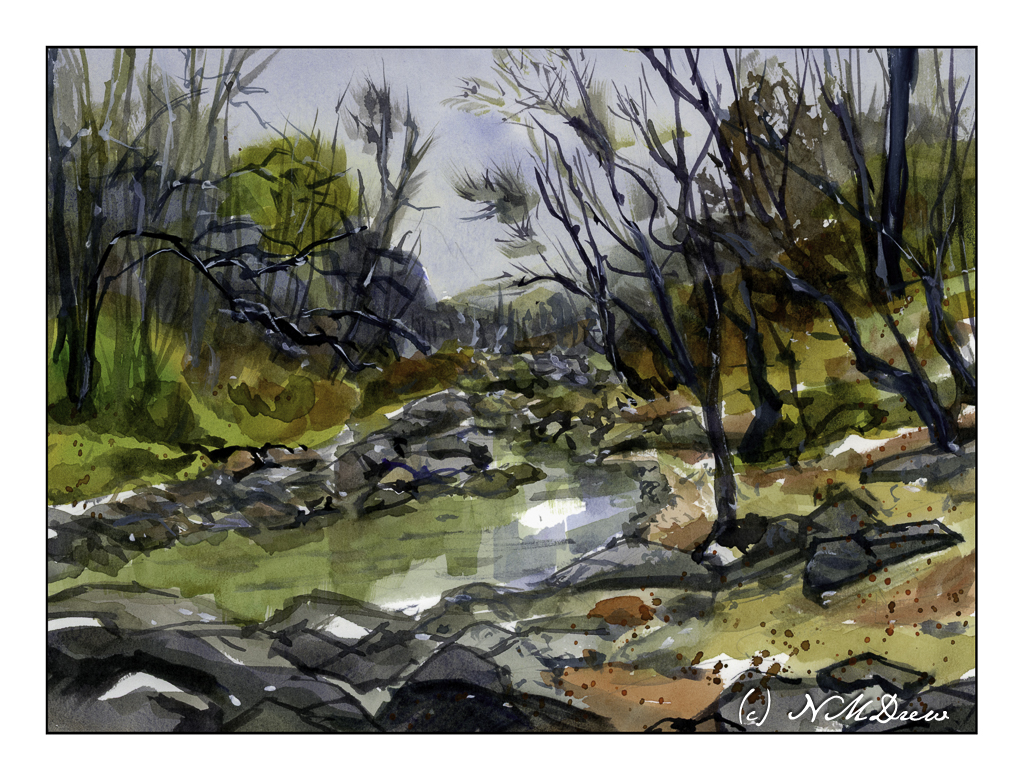
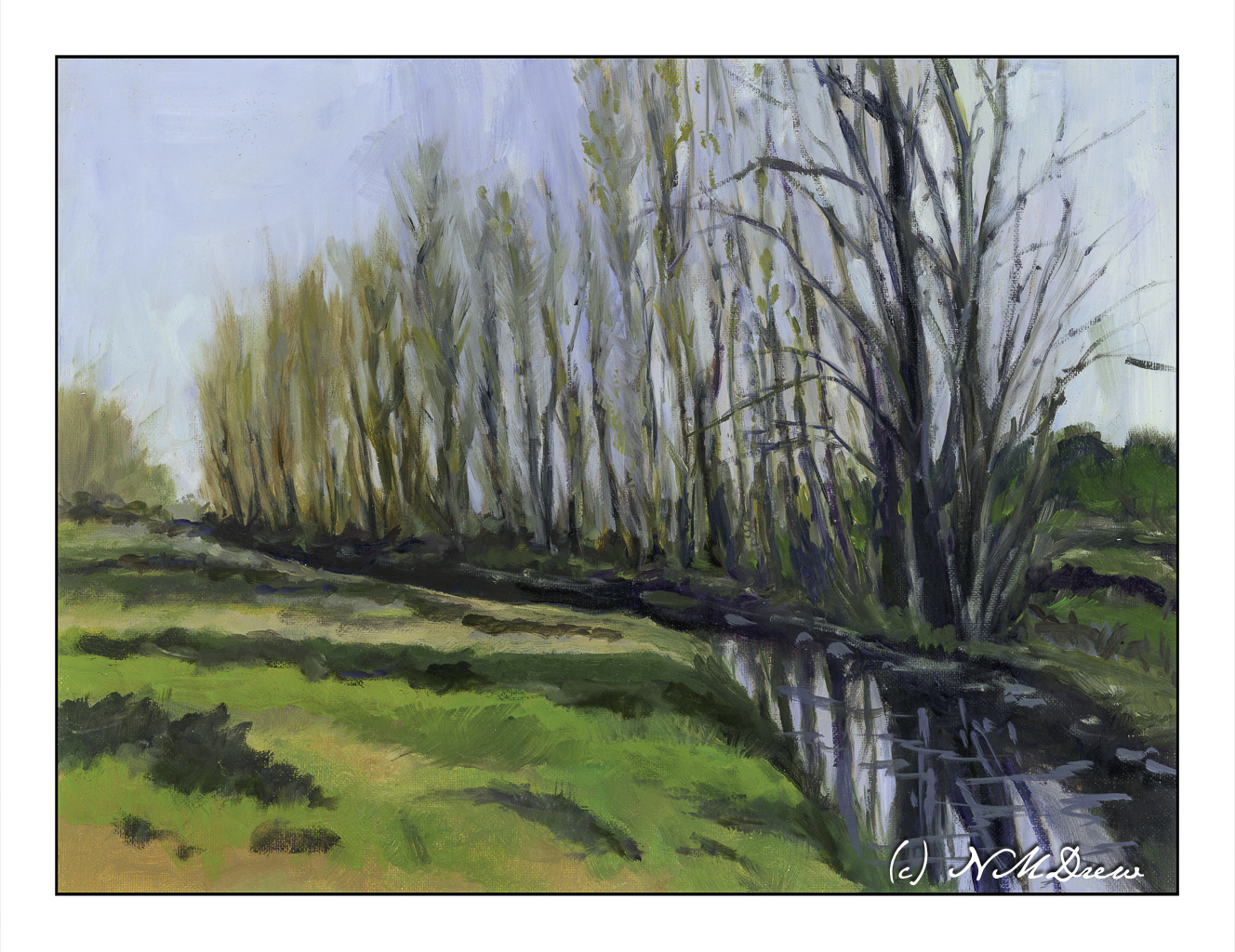
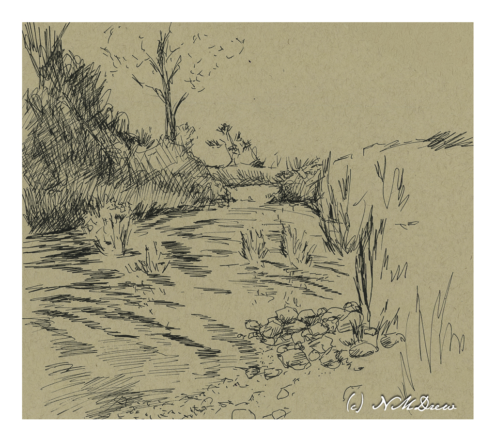
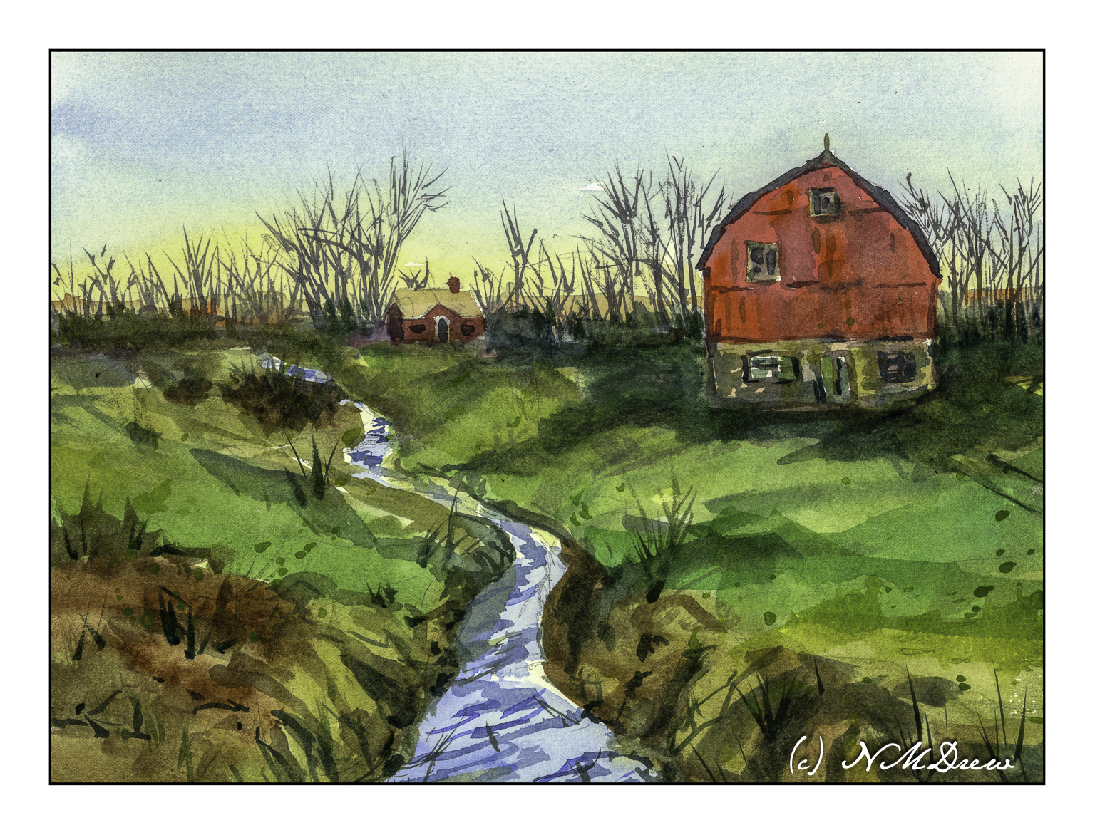
For me, this is a rather complex painting. Rocks and sandy shore, trees and brush, water, sky and reflections in the creek. Remembering the “rule” – simple big shapes, moderate shapes, details last, I worked by creating the most noticeable areas – or certainly the ones I felt could be the most challenging. This meant the creek in particular – keeping the water marked out. As well as that, the shoreline in the foreground coupled with bits of sandy shore on the right. After that, the rocks on the left and foliage of trees. I was all over the place working larger to smaller, light or dark, and then on to light or dark details.

Overall, I think this painting worked out. Analyzing its complexity and then breaking it into its larger components and areas of color helped. It is still not quite what I would have liked to produce, but much of it did succeed.

Watercolor, Hahnemuhle paper, about 10×12.

Poplars

I don’t know why, but I always thought these were called “plane trees,” but it turns out they are poplars. We don’t have them here in SoCal. The ones we do have that look similar – in the sense they are narrow trees that grow tall – can be a type of juniper or eucalyptus. I am really drawn to these trees because of their fine branches and leaves which change in the fall.

If you read my blitherings, you know that I am enrolled in an oil / acrylic painting class which meets weekly, and have been in it for several months. I chose oils as they can be worked on over several days with the paint remaining wet over a period of time. What I like about oils is they blend easily and a softness can be achieved (by me, at least) that I can never get when I use acrylics. In this painting, I worked on both simplification and abstraction of various elements of the painting as well as atmospheric perspective. I only considered this painting “finished” when I added some squiggles in the water to suggest movement.

Overall, I am pleased with my results. I have spent several months gazing at it. It never seemed done until those little squiggles showed up. Crazy, huh?

Oils, 12×16, cotton canvas panel

Sketches on a Hot, Lazy Afternoon

It’s over 90 F / 32 C today, muggy, and to do more than move around, even with air conditioning (which is not on at present), requires more energy than I want to spend. So, sitting at my computer, I decided to find pictures of things to draw.

My choice was carbon ink in a fine nib pen with a flexible point and the tan, toned paper I have been using for gouache. I get to sit still, cruise for a subject, and then scribble on smooth paper with a responsive pen. If you use pen and ink, you will know the pleasure it provides!

Above are my sketches. One piece of paper, both sides. Tan toned paper by Strathmore. I really like this paper.

I don’t think there is more to say other than it has been a very pleasant afternoon scribbling away. Each sketch is done freehand, no pencil prelims under the ink. Shapes and shadows and direction were all attempted to be expressed simply through the ink, hatching, dots, lines, etc.

Strathmore multi-media tan paper, 11 x 14, Platinum Carbon Ink.

Life on Wonky River

Scanning my watercolors shows me the flaws so readily – ones I don’t see when painting!

When I looked at this scan, the creek in the foreground looks definitely off! I went in and repainted it, and the second scan showed more wonkiness. Finally, just a heavy application of blue on the river / creek (whatever!) and some zinc white gouache in straight lines, and the geographical problems were somewhat solved.

Overall, not really thrilled with this painting. I like my sky and the spindly trees in the distance. The barn and house were one of my rare attempts at buildings. The barn seems really out of place for the environment – too big or something. The little house is okay. I tried to show the banks of the creek and the terrain leading down to it using color swaths in directional lines, horizontally and vertically. Meh.

Fabriano 140# CP paper; watercolors; 9×12.

Estuary

Estuaries are important connections between rivers and fresh water to the sea. The land may be marshy, the water brackish, and adapt to the influx of waves and sea water and the outward movement of fresh water. Consequently, the estuary provides high levels of nutrients in both the water and the sediment, creating highly productive habitats. Plants, animals, birds, fish, and all sorts of life thrive in the estuaries.

Additionally, the estuaries form a protective barrier between land and sea, but with the loss of estuaries, the damage from the sea increases. A good example of this is in areas where hurricanes and other fierce storms sweep inland, causing great damage – estuaries can survive such storms and recover, but further inland where the land and water are not adapted for saltwater, valuable land may be lost.

Estuaries are found worldwide. In northern California, the Pescadero Marsh Natural Preserve is found near San Francisco, and offers a wonderful environment for hiking and observing birds and plants. Currently, many trails are closed, but the visit to Pescadero State Beach is beautiful, as are many of the beaches found the length of the coast of California.

And, if you didn’t know, all beaches are public in California, so even if someone’s house fronts the shoreline, the beach is there for all. There may be a couple of exceptions to this law, but by and large, no one can tell you that you cannot walk along the shore.

Watercolor, Arches Rough 140#, 12×16.