This has been a terrible week out here. Where I grew up was burnt to the ground in a lot of areas with family and friends losing houses. Election week was a roller coaster. It is always surprising to me how such things can just cause my sense of world order and sanity to just blow away, as well as realizing the world is not as I see it – perceive it – want it to be. But connections with people and hobbies and doing things – normal, everyday things – does help settle the discomfort and chaos a bit. Not sure what the next several years will bring, so we will wait and see – what else can we do?
I guess we can paint!
Watercolors almost always soothe my troubled soul! Painting and drawing does in general. The act of doing is an act of being, an affirmation of life, and the validity of existence. Me, I am always searching for explanations, but there are times when the only explanation is to do something, like paint, watch a movie, read a book, go for a walk, watch the cloud pictures in the sky.
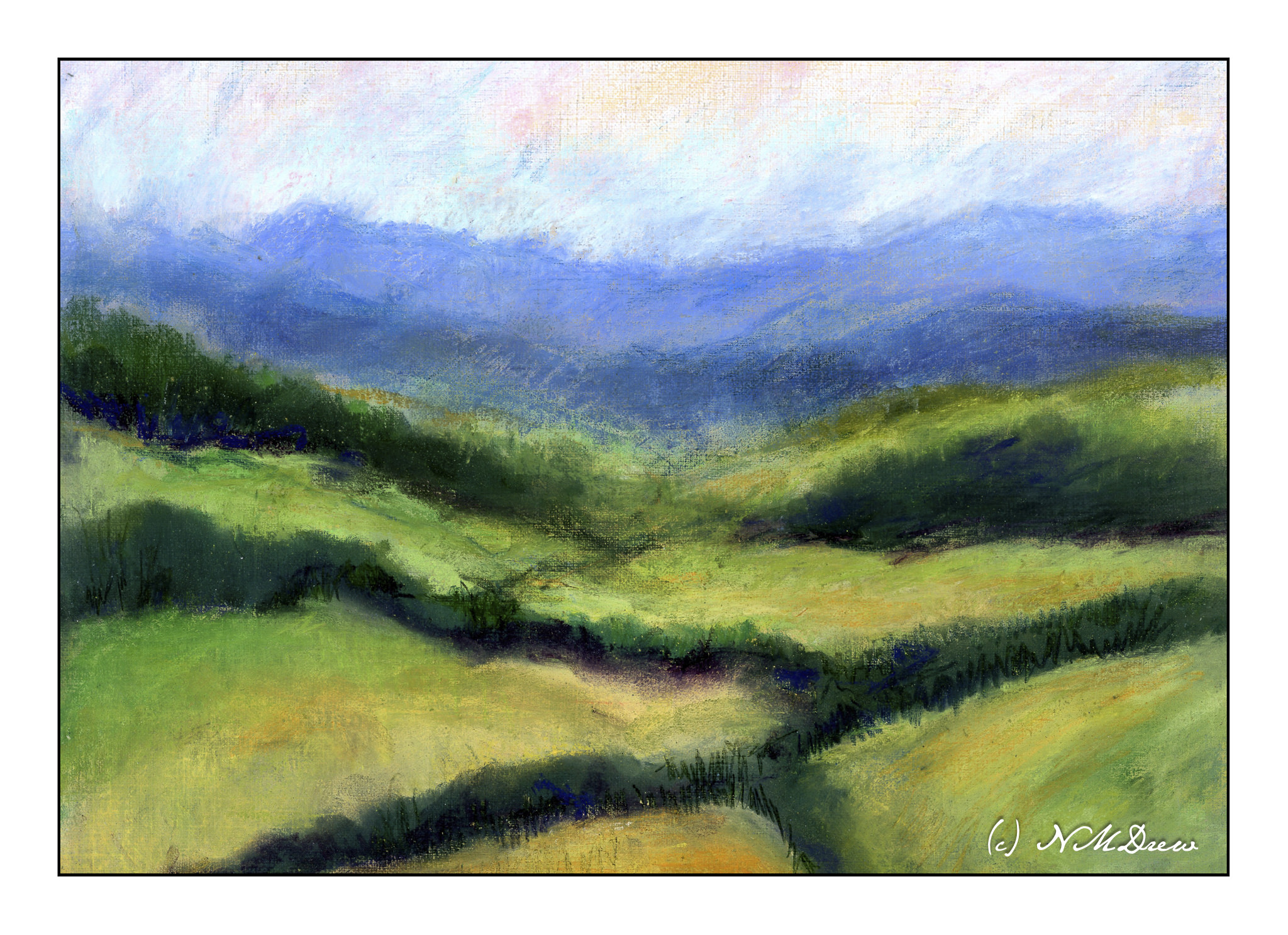
For some reason I remembered the fun I have had with pastels – soft, hard, pencil. I dug them out yesterday afternoon to play with, not to do anything great. I have not used them in a year or two, and with that comes the need to re-learn what to do with them. I figured an imaginary landscape somewhere would be good territory for exploration, so in the Land of Something, I began.
The first thing I did was to used Golden Pastel Ground which I mixed with some fluid yellow ochre acrylic paint and water, thinning it to the consistency of cream. I applied 3 thin layers onto Canson XL oil / acrylic painting paper, letting it dry in between each layer. This give a sanded surface with a bit of grit, and it held up really well.
After the paper and ground were dried, I pulled out all my pastels. I have soft pastels by Rembrandt and Terry Ludwig; harder pastels called Nupastel, and some reputable pastel pencils by Derwent and Faber-Castell. The first layers were done with soft pastels to lay in the values. I used rubbing alcohol and a paint brush to establish values. The alcohol seals the pastel pigment and once dried the colors do not flake off.
I applied layer after layer after layer of soft pastels, blending as needed, and using a very fine mist spray bottle with alcohol in it to settle each layer. In the end, I used the Nupastels and the pastel pencils to see what they can and cannot do. When finished, I sealed the painting with more alcohol and used a hair dryer to hasten the drying.
Last time I did pastels I got frustrated, and it seemed everything I did got worse and worse! My own thoughts are I am more accomplished or skilled with colors and such now than I was a few years ago, so this may be why I feel this is a successful foray into a forgotten medium. I expect I will be carrying on with pastels as they are a lot like drawing and painting, messy and bright. I think I may attempt a building with the next painting.
Working with pastels produces a lot of dust. I wore a face mask and damp wiped my work area after I finished. If I continue to paint in pastels, I plan to get a good air purifier with a HEPA filter to keep the potential dust hazard to a minimum.
9 x 12 Canson XL oil / acrylic paper; Golden pastel ground with yellow ochre and water; Terry Ludwig and Rembrandt soft pastels with pastel pencils and Nupastel. Rubbing alcohol used to seal dust. (Now let’s see how it works as a final fixative!)
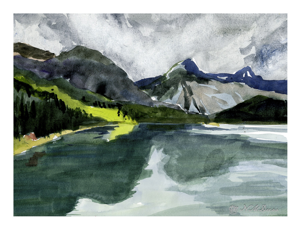
I have had a tablet of Strathmore’s Vision watercolor paper, 140# CP, lying around for some time but did not try it out until today. There are some things I liked about and some I didn’t like. Strathmore watercolor papers and I do not get along at all for watercolor painting, yet I really like them for acrylic and gouache. The papers’ textures never agree with me and with the Vision sizing seemed questionable. Canson XL is another watercolor paper I don’t like for watercolor painting but really enjoy for a lot of other things.
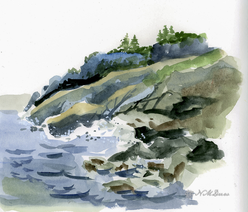
This is the first study I did – simple, free-flowing watercolor. The purpose was to lay down color with a bit of density, not overworking either paper or painting. I found it handled direct painting without any lifting or scrubbing quite well. I could paint over dried paint easily – such as where the darker blue wave shapes are – and add gouache to create a bit of sea spray or foam. Blending colors into each other as I moved the brush along in a wash worked well, too. Off to a good start!
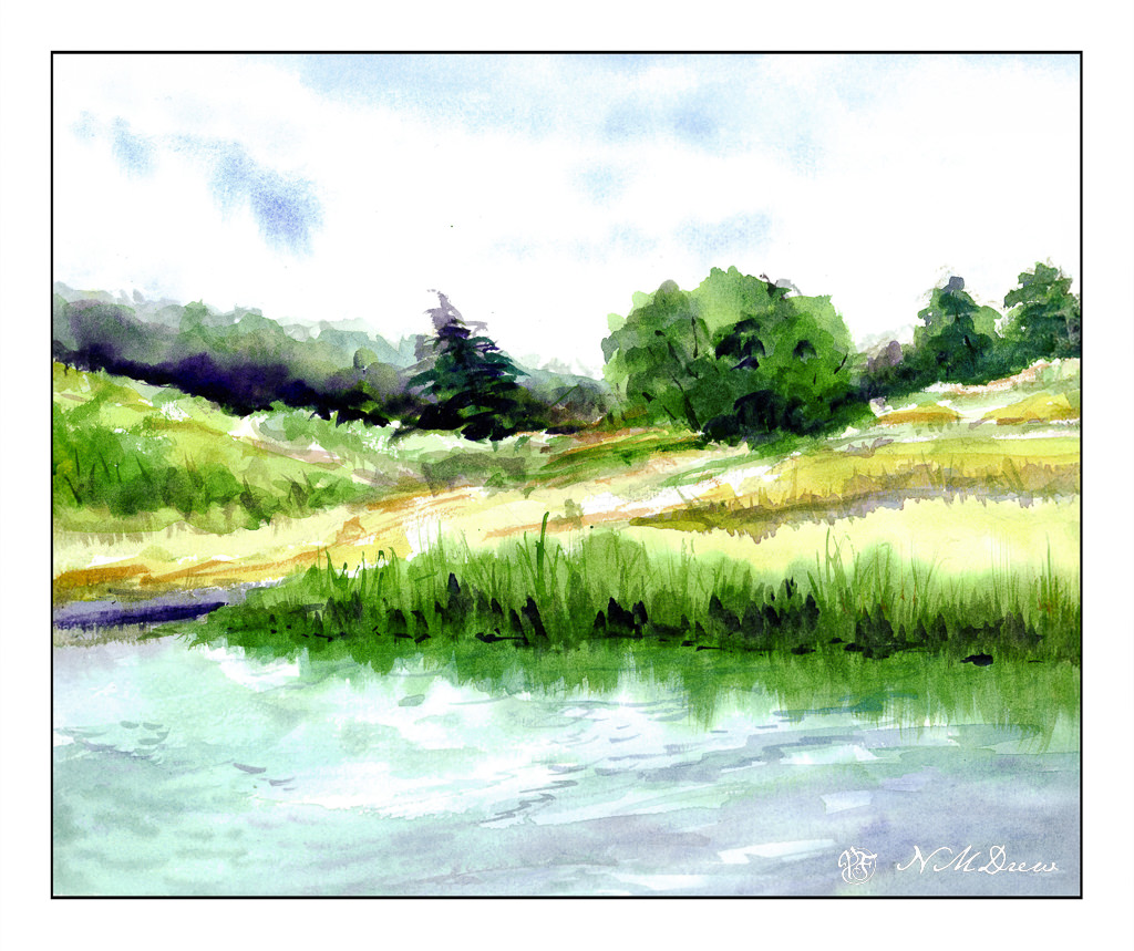
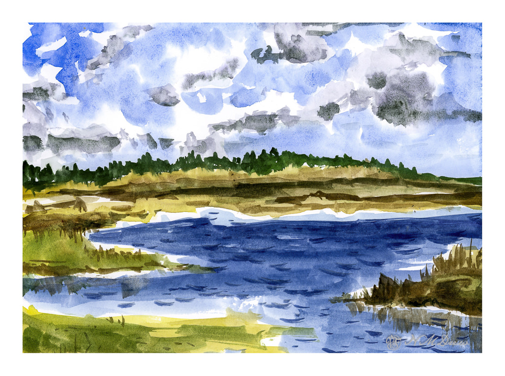
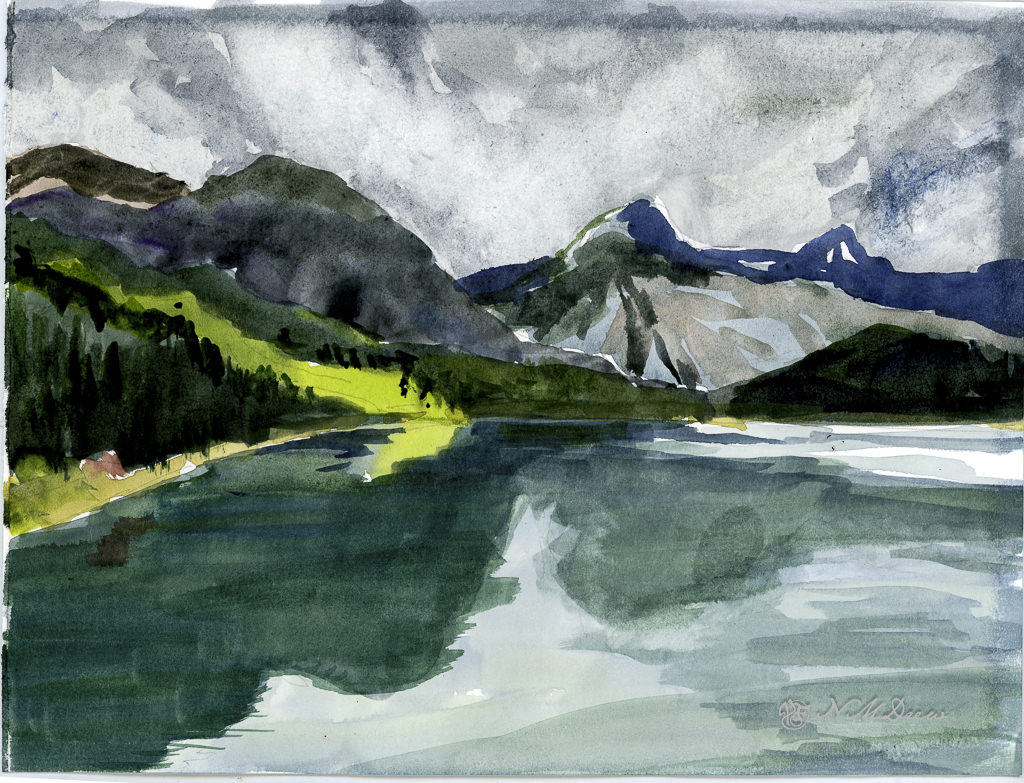
This was the second painting. As with the first one, I did direct painting for the most part – specifically the middle and foreground – and used many of the same techniques I used in the first one. However, on this one, I did the sky differently to see how a specific technique could work with this paper.
Clouds are white, right? Well, yes and no. Upper clouds can be quite bright and the paper is usually left untouched in watercolor to show it. To paint a sky with clouds you can use a lot of techniques, but here I chose to wet the paper around the cloud shapes and drop in the blues for the sky and then move the paint around a bit. Once dried, I dropped fresh water into the cloud shapes, at the lower ends, and then added greyish blues to represent the shadow on the underside of the cloud. I have not really worked with this technique, but I have been meaning to check it out, so this seemed to be the perfect opportunity.
I think Vision paper might be able to handle this technique for painting clouds, and I want to practice this technique more before deciding it will or won’t work with this paper. I know that scrubbing the paper will mess it up and as a result I have to be prepared to work very directly. This keeps a watercolor fresh and clean rather than overworked and ugly.
Here, I tormented the paper! I laid down a wash on the upper portion of the painting and then scrubbed out the paint for clouds. Then I came in a few more times and did the same. Some of the paper peeled a bit with the harsh treatment. This is good to know – how much damage can I do??
From there, I did the middle and foreground. The middle ground was pretty directly painted in one go, meaning one layer of color for the most part. I like the way this paper allows heavy paint to merge and blend as it makes for more interesting color areas. The foreground water and reflections is a series of washes, one laid atop the other once the underlying one is dry. I think in some areas I did up to 5 layers of glazing. Other areas I did a bit of wet-in-wet without a lot of scrubbing – just a gentle swipe of the brush.
Now here comes a complaint. In the lower right area of the painting you can see what looks like a thumb print. This is not – it is an area where the paper sizing is not good. You can also see problems with sizing around the upper and right edges of the paper. Poor sizing can ruin many a painting, and this is why professional watercolorists and amateurs alike go toward 100% cotton rag papers from reputable manufacturers.
Overall, I like this paper. I think it is really good for direct painting. Pleasingly, the paper does not buckle and ripple with fairly wet paint, but I have yet to lay down a traditional wash that covers a large area of the paper. That will be another experiment for a future posting. The sizing issue bugs me, but that is okay as this tablet of paper was not expensive. I prefer Vision to the Canson student watercolor paper for a lot of reasons, but in particular the way it handles pigment on its surface. I can see using this paper for practice, for studies, for preliminary work on a “serious” painting. Would I recommend it? Yes – but with some caveats.
Today has been a lot of fun. Being immobile is making me quite dull and uninterested in doing anything, but at least the boot is making life a lot less painful. Yesterday morning I met up with a friend, hobbling a short distance and then basking in the beautiful outdoors for several hours with a good bit of chit chat, croissants, and delicious coffee. Socializing and watercolors always make my day . . .
First, I am not at all sure where I found the photograph upon which this painting is based – public domain? If not, and it is yours, I am sorry I cannot give you credit. Let me know, ok?
Oil paints on Canson Oil/Acrylic paper.
Initially I started out with a brush and soon realized that whatever I tried to paint was just not working. The grasses were not clear and sharp and the clouds were blobby. In the end, and out of frustration, I took a palette knife and used it to smear color into the painting – and all of a sudden I found out what painting in oils with a palette knife is capable of doing.
I am prejudiced against heavy impasto just because I don’t find it interesting to look at. First in my mind is how much dust it could collect and what a pain heavy impasto paintings could be to clean. Much impasto is done with a knife – though brushes also do the job, as seen in the work of van Gogh. So, I have avoided it to date.
Smearing paint around with a knife gives some dimension (3D) on a flat surface, but the way the paint moves is so interesting! I also used the knife tip to scratch away in the colors for the grasses, and that was both doing what I wanted to do, as well as somehow felt deliciously rebellious against my conformist self.
The snow, though, and the river, are done with brush. Brushwork was laid down first pretty much throughout the painting, and my aggravation then brought out the knife. Learning experience. And, I don’t think I could have rendered either sky or grasses anywhere to my liking with a brush of any size.
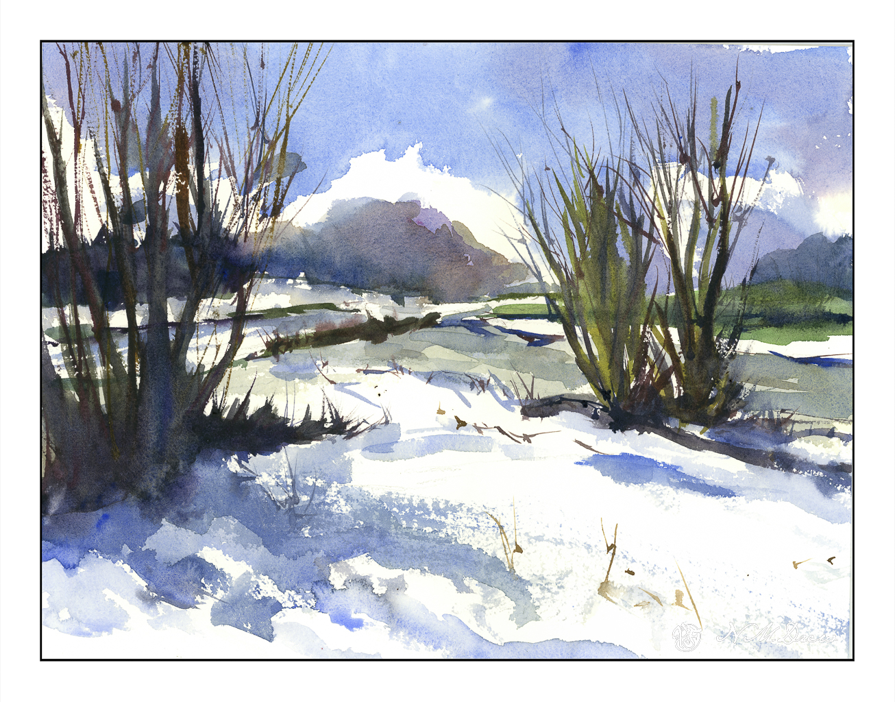
Heavy rains and foreboding skies give way to ragged clouds and brilliant blues as the storms recede. No snow here, but memories will do! I tried to express this sky in the distance, beneath the blue and white with the dark clouds moving away. Not so sure how it reads, but you can decide that. Could be trees, could be clouds, could be space ships. And there is a river behind the trees and the snow across the way.
Kilimanjaro Natural White Rough, 300#, Rough, 12×16.