The Strange Edges of the Sea

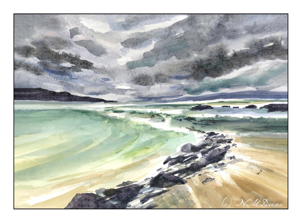
I got a few painterly goodies for Christmas, and one was a new tablet of watercolor paper, one which I have never heard of before. Of course, it needs checking out. How does it handle wet paper and washes? Dry brush? Bleeding? Etc. It is not an expensive paper – $20 for 32 pages of 9×12 pure cotton paper – but it is actually a decent one. I can lift colors from it pretty easily, too! It is a rather nice bit of paper overall, and while not Arches or Fabriano, I think it will do quite well for studies, and probably gouache as well.

Besides playing with new paper, I have also attempted to lead the eye in the composition to a small area of white. Rocks, waves, clouds, land masses, sand, whatever are all designed to catch your eye. I think it worked out pretty good. I also am rather pleased with the movement of the sand in the lower right hand corner.

9×12, CP 140# paper, watercolor.

Along Mystic Creek

I cannot believe it has been over 3 weeks since I last posted here! Suffice it to say I have been busy with learning how to handle oil paints and some drawing, and really not in the mood to look at the computer much.

That said, today a trip down to Pasadena’s Blick store was a fun morning’s journey and got my mojo going again. I didn’t spend too much, but did pick up some colors in oil and watercolor from brands not available locally (and that is not to say we don’t have a fantastic store nearby), and just had fun wandering around a well-stocked art store. The esposo did the driving as I am not a big fan of driving in L.A., even on a Sunday morning.

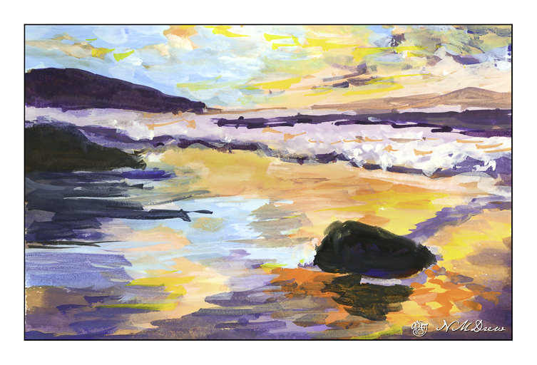
Anyhoo! I am trying a more subtle approach to my watercolors – perhaps less bright, more delicate? As well, trying to convey depth better along with leading the eye of the viewer where I want to go. Not too sure if it is working, but the process is fun.

9×12, Fabriano 140# CP.

21-24 / 30

I am getting burnt out on these drawings! I decided to take a few days off and will pick up again tomorrow. Since I have committed to 30, I only 6 more to go by 4/17. I think I can handle that!

Day 21

Cannon Beach, Oregon. Figure is too big, some foot prints too dark and too big in the distance.

Day 22

Initially I had drawn this shack so that the beach and waves in the distance were parallel to the edge of the paper. After scanning it, I realized it looked better with a bit of an angle to it. Interestingly, a comment said it made no sense because the ocean is out there, straight ahead. Obviously, too realistic of a person, or someone who hasn’t taken a photo. Really, to me, a very interesting and odd comment and viewpoint!

Day 23

Here is a scene of looking down onto a beach. The distant cliffs look okay, but the descent to the shore in the midground is definitely confusing.

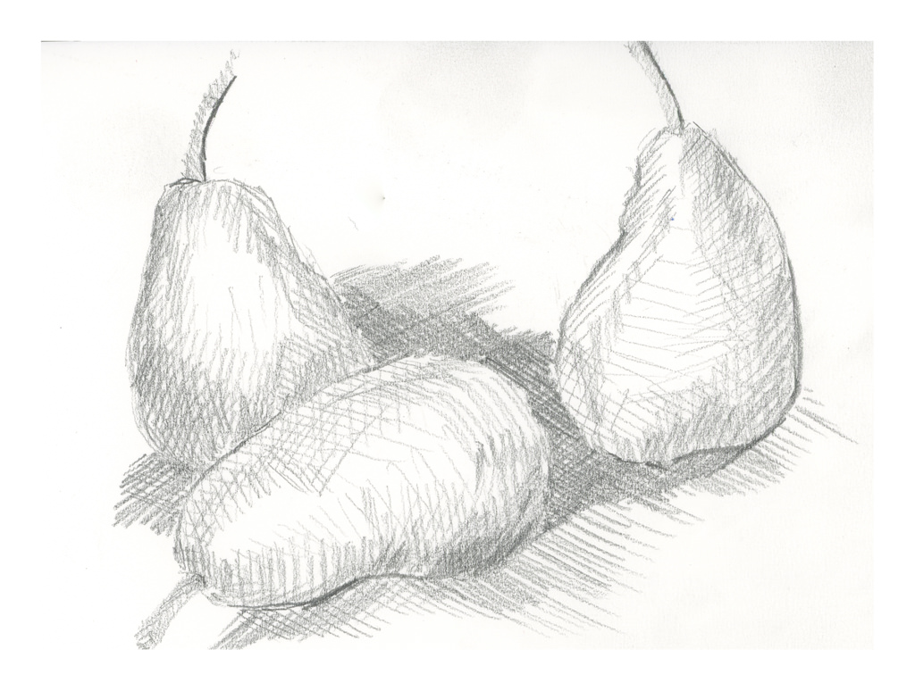
Day 24

During last Saturday’s zoom meeting, Ian talked about cross hatching. I use it a lot in ink drawing, but not in pencil since the idea for a lot of this 30-day challenge is to limit marks to horizontal and vertical. The idea is to create value studies, not finished drawings. Interesting lines do not make for good value studies of light, medium, dark. However, a simple use of lines, cross hatching, vertical, diagonal, horizontal, helps delineate shapes, such as curves. I based this drawing off a study of 3 pears by Cezanne.

Commentary

These studies are making more sense and getting easier to execute so that shapes have shape, even if not always understandable.

12 / 30

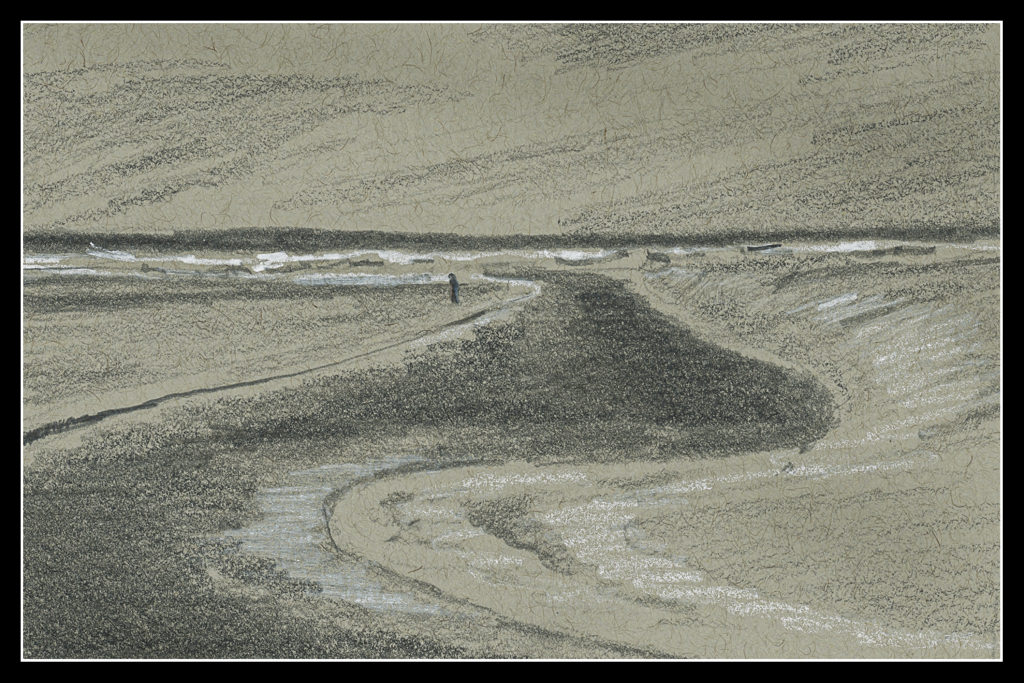
Day 12

Again, behind on the 30-Day Challenge. I do see the results. For instance, this drawing is very simple, done on grey-toned paper. It’s not an especially exciting picture, but I am beginning to think differently! That is the whole point.

What are the changes?

  • Focal point of the picture. Here, the lone figure.
  • The lines of the estuary into the distance.
  • Contrast – white (light) sand, crashing waves on shore.
  • Line direction to show changes in terrain, vertical, horizontal.

This paper – the grey – is very toothy, and the result is the lines are not very smooth. Midtones are a bit difficult to achieve – that is supposed to be represented by the plain paper – but that just doesn’t really seem to fit into my brain. This makes it difficult, challenging, and rather a bit of a visual tweak.

Overall, the point in these studies is to look at values, and to simplify. It is not easy as I am used to doing detailed work in pencil. Making simple marks on the paper which interplay well is difficult. “Noisy” marks distract from the point of the value study. In other words, lines which are scribbled and curly distract from the values. Value, value, value!

Onward!