6 / 30

Day 6

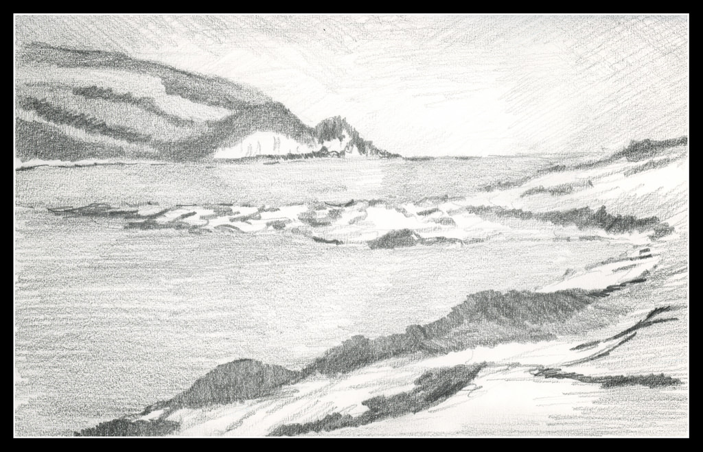
I think I am getting some of the points of this course and the usage of pencil to create value studies. First, I changed simply to an HB pencil and a smooth paper with a tiny bit of tooth. The bristol was too smooth a paper and the 2B and 4B pencils just smudged too easily despite my best efforts.

The teacher, Roberts, speaks of structure, rather than subject or detail, as the purpose of these drawings. This means masses of value, not picky details. The details can come in the painting, more so as it becomes larger. The value studies help sort out directing the eye to the point of interest.

The white cliff across the water is the focal point of the drawing, and, ostensibly, the painting. To lead the eye there I vignetted as one does in photography, but this time with graphite. The corners of the drawing are deliberately darker. A sort-of cloud or fog bank is light against the sky in the distance. I tried to use the pale reflection of the cliff in the water to draw the eye as well. Finally, I reworked the piles of sea weed and flotsam to aim the viewer toward the cliffs. The same can be said of the vegetation on the land above the cliffs.

I am beginning to get more comfortable with this approach to painting using a value study. 30 days of value studies is changing my eye and thought processes. Hopefully it will pay off in the future.

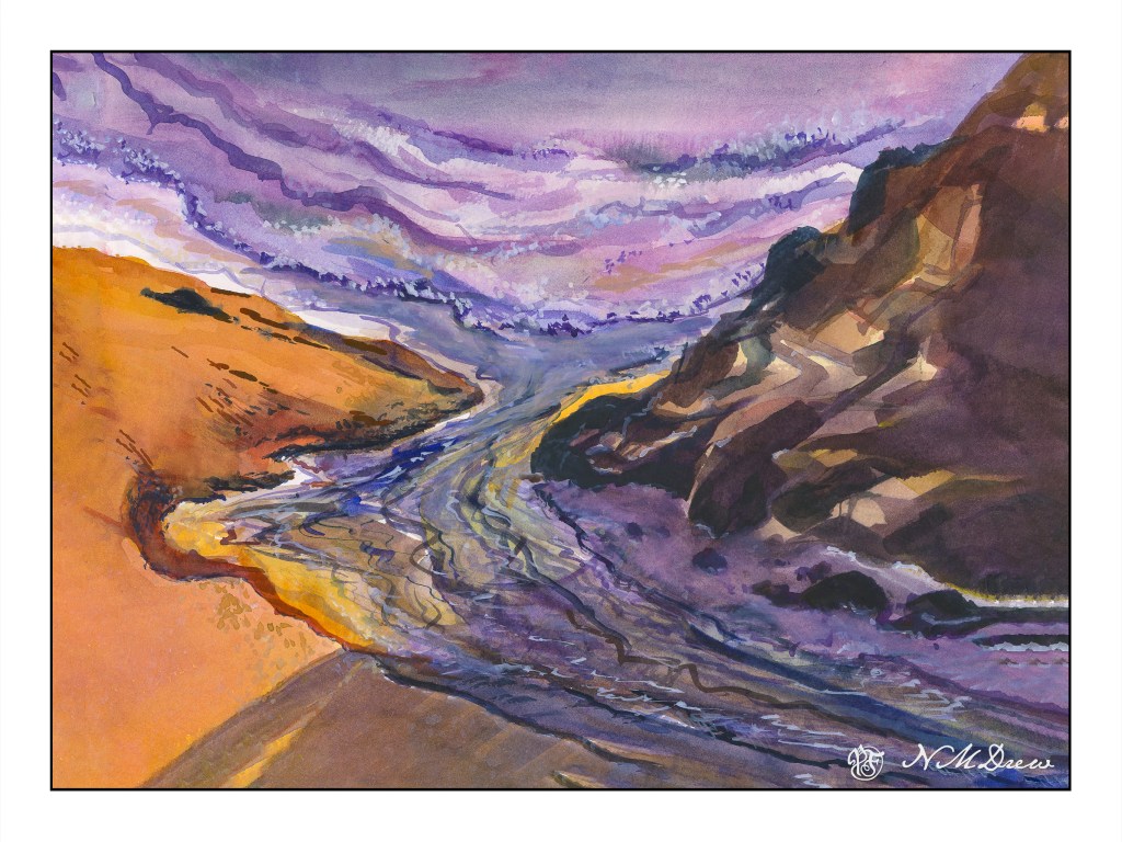
Along the Shore

It is always worthwhile looking at the works of various painters, regardless as the medium in which they are creating. The works of Edward Seago have a charm to them which is old world, peaceful, and hearkens to a quieter and simpler time. This painting is based loosely off one of his oil painting of the eastern English coastline. What attracted me was – and is – his vast skies. The low lying shoreline beneath such a magnificent sky is worth trying out. The same may be said of the watercolors of Edo Hannema – he, too, finds the work of Seago, and Edward Wesson, as sources for inspiration.

In Southern California, the sky, where I live, is almost always blue. No clouds, little haze. Humidity sits at zero. (I won’t discuss the vast amount of lotion I use!) However, the big skies of the midwest with towering clouds, or the piles of clouds over New Mexico, are in my memory, and so the clouds and moist skies of a wetter clime draw me.

Here, I used the 1.5 inch flat brush for 90% of the painting, resorting to a small flat brush – 1/4 inch – for some detail. Large washes, wet into wet, some glazing. Paper is Arches 140# CP, 16×20. The large brush is becoming a favorite for sure!

The large brush helps me keep my colors clean and think about masses rather than details. Big to small. I am also refreshing my water as I move along – this took about 2 or 3 refreshes – and cleaning off my palette, too. With a large brush, large washes, a lot of color is used. Clean palette, clean water, and, of course, a clean brush. The results are beginning to be seen.

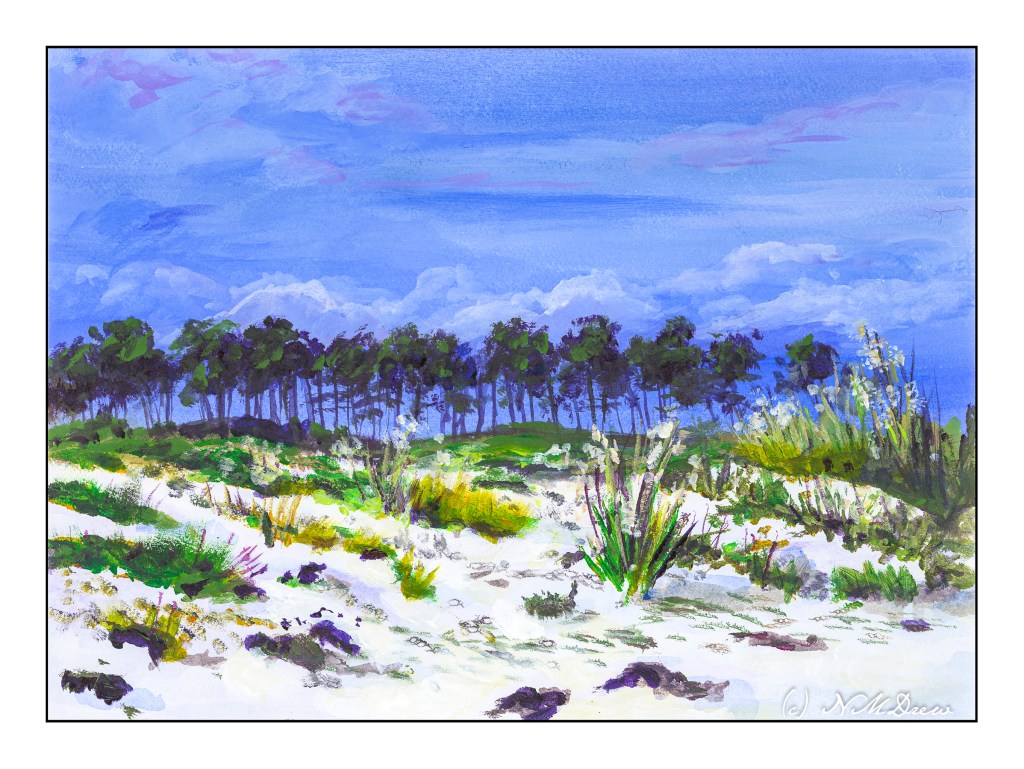
Across the Dunes

I enjoy gouache a lot because you can rework places and easily blur edges to soften them. That is a lot harder in acrylics. I decided to give it a shot. It worked rather well for the sky, but like gouache, the whites in the clouds darkened more than I thought they would. On the other hand, I did work on the sand a bit, using very thin water glazes for the shadows. That worked out pretty well.

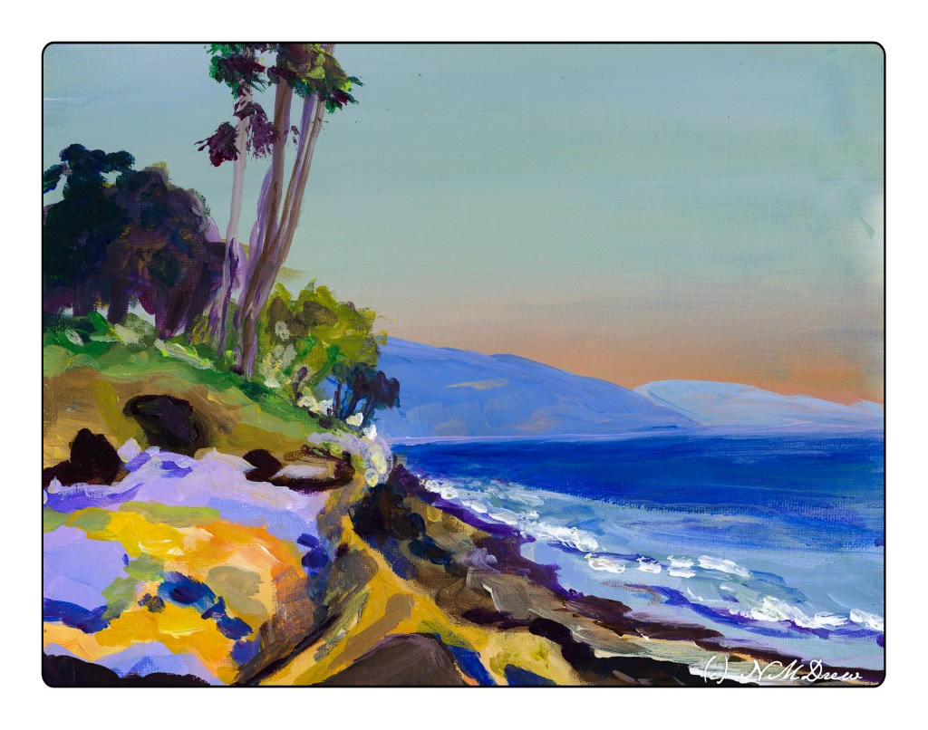
I realize the key to “getting” acrylic painting is to just keep doing it, experimenting, trying. Each painting, successful or not, is a lesson.

Acrylic paint on unprimed Arches 140# CP. 9×12.